3 General Data Preprocessing
3.1 Topics Covered
- Exploratory data analysis via summarization and graphing
- Feature engineering with the recipes package
- Principal component analysis (PCA) on tabulated data
- Exploration of PCA results
3.2 Introduction
The first two chapters focused on preprocessing geospatial raster data specifically. We now turn our attention to more general data preprocessing and feature engineering. In the first section of the chapter, we focus on general data summarization, visualization, and exploration. Next, we introduce the recipes package, which is part of the [tidymodels{.underline} metapackage, for general data preprocessing. Lastly, we more generally explore principal component analysis (PCA).
For general data wrangling, we load in the tidyverse and reshape2 packages. recipes is loaded for data preprocessing, corrplot and GGally for creating correlation visualizations, and gt for printing tables. factoextra is used for visualizing principal component analysis results.
The fourth, appendix section of the text includes an entire chapter devoted to data wrangling with dplyr (Chapter 18), two chapters devoted to making graphs with ggplot2 (Chapters 20 and 21), and a chapter on building tables with gt (Chapter 22). If you find the examples in this chapter difficult to follow, we recommend reviewing or working through the appendix material first.
In this chapter we make use of the EuroSat dataset. This dataset is available on GitHub and Kaggle. This paper introduced the data. The version of the dataset used here consists of 27,597 samples labeled to 10 categories: annual crop, forest, herbaceous vegetation, highway, industrial, pasture, permanent crop, residential, river, and sea/lake. The input data are 64-by-64 pixel image chips generated from the Sentinel-2 Multispectral Instrument (MSI) sensor, and we use 10 of the 13 bands: blue, green, red, red edge 1, red edge 2, red edge 3, near infrared (NIR), NIR (narrow), shortwave infrared 1 (SWIR1), and SWIR2. The imagery have a spatial resolution of 10 m, so each chip covers an area of 640-by-640 m. All of the data are from European countries. Since we are working with tabulated data in this chapter, each 64-by-64 pixel chip has been aggregated to 10 band means.
We begin by (1) saving our folder path to a variable, (2) defining a vector of colors using hex codes for visualizing the different land cover classes, and (3) reading in the tabulated version of the EuroSat dataset. These data have already been partitioned into training, validation, and test subsets. These data are read using read_csv() from readr. We also convert all character columns to factors and drop unneeded columns. After these processing steps, each tibble consists of a factor column that provides the land cover class for each sample (“class”) and 10 columns representing the image band means for the blue, green, red, red edge 1, red edge 2, red edge 3, NIR, narrow NIR, SWIR1, and SWIR2 bands.
fldPth <- "gslrData/chpt3/data/"

classColors <- c("#ff7f0e","#2ca02c","#8c564b","#d62728","#9467bd","#bcbd22","#e377c2","#7f7f7f","#1f77b4","#17becf")

euroSatTrain <- read_csv(str_glue("{fldPth}train_aggregated.csv")) |>
  mutate_if(is.character, as.factor) |>
  select(-1, -code)

euroSatTest <- read_csv(str_glue("{fldPth}test_aggregated.csv")) |>
  mutate_if(is.character, as.factor) |>
  select(-1, -code)

euroSatVal <- read_csv(str_glue("{fldPth}val_aggregated.csv")) |>
  mutate_if(is.character, as.factor) |>
  select(-1, -code)
3.3 Explore Data
It is generally a good idea to explore your data prior to performing any preprocessing or feature engineering or before using them in a modeling workflow. For classification tasks, and especially multiclass classification, class imbalance is often of concern. Using dplyr, we count the number of records or rows belonging to each class. The number of samples per class varies between 1,200 (pasture) to 2,158 (sea/lake). There does not appear to be a high degree of class imbalance. However, if class imbalance were an issue, some means to combat this may be considered, such as oversampling the minority class, generating synthetic samples, or using a class-weighted loss metric.
If you are incorporating some categorical predictor variables, it is also good practice to count the number of occurrence of each factor level for those variables. If there are a large number of levels and/or if some factor levels have a small number of occurrences, you may want to recode the variable. Also, some algorithms, such as artificial neural networks (ANNs), and support vector machines (SVMs), cannot natively accept categorical predictor variables. As a result, such variables need to be converted to a different representation, such as dummy variables. In contrast, some algorithms, such as tree-based methods, can natively accept categorical predictor variables.
| class | cnt |
|---|---|
| AnnualCrop | 1800 |
| Forest | 1800 |
| HerbaceousVegetation | 1800 |
| Highway | 1500 |
| Industrial | 1500 |
| Pasture | 1200 |
| PermanentCrop | 1500 |
| Residential | 1800 |
| River | 1500 |
| SeaLake | 2158 |
It is also good to explore the distribution of each continuous predictor variable. If the data are heavily skewed, you may choose to perform a data transformation, such as a logarithmic or square root transform. The need for this will vary based on the learning algorithm being used.
Below, we have created histograms to show the distribution of each image band. Since the tibble is not in the correct shape to create the graph, melt() from reshape2 is used to convert the table into a tall format with the band values stored in the “value” column, the name of the band stored in the “variable” column, and the class name stored in the “class” column, which is defined as an ID field when using melt().
euroSatTrain |> melt(ID = c(class)) |>
  ggplot(aes(x=value))+
  geom_histogram()+
  facet_wrap(vars(variable))+
  theme_bw(base_size=12)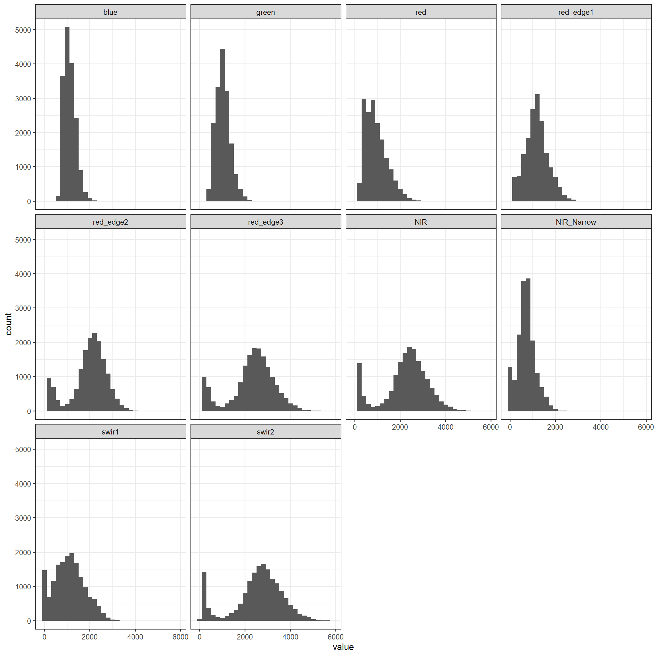
We can also explore the distribution of each predictor variable by class. In our example, we are making use of a box plot via geom_boxplot(). It is also possible to use a violin plot (geom_violin()). Assigning the class to the x-axis position allows for differentiating each class to generate grouped box plots. Since the data are not in the correct shape, melt() is used again. Generally, the visualization suggests that there are differences in the distribution and combination of channel digital number (DN) values between the different classes; as a result, supervised learning algorithms may be able to accurately differentiate the classes of interest.
euroSatTrain |> melt(ID = c(class)) |>
  ggplot(aes(x=class, y=value, fill=class))+
  geom_boxplot()+
  facet_wrap(vars(variable), ncol=3)+
  scale_fill_manual(values = classColors)+
  theme_bw(base_size=10)+
  theme(axis.text.x = element_text(size=8,
                                   color="gray20",
                                   angle=90,
                                   hjust=1))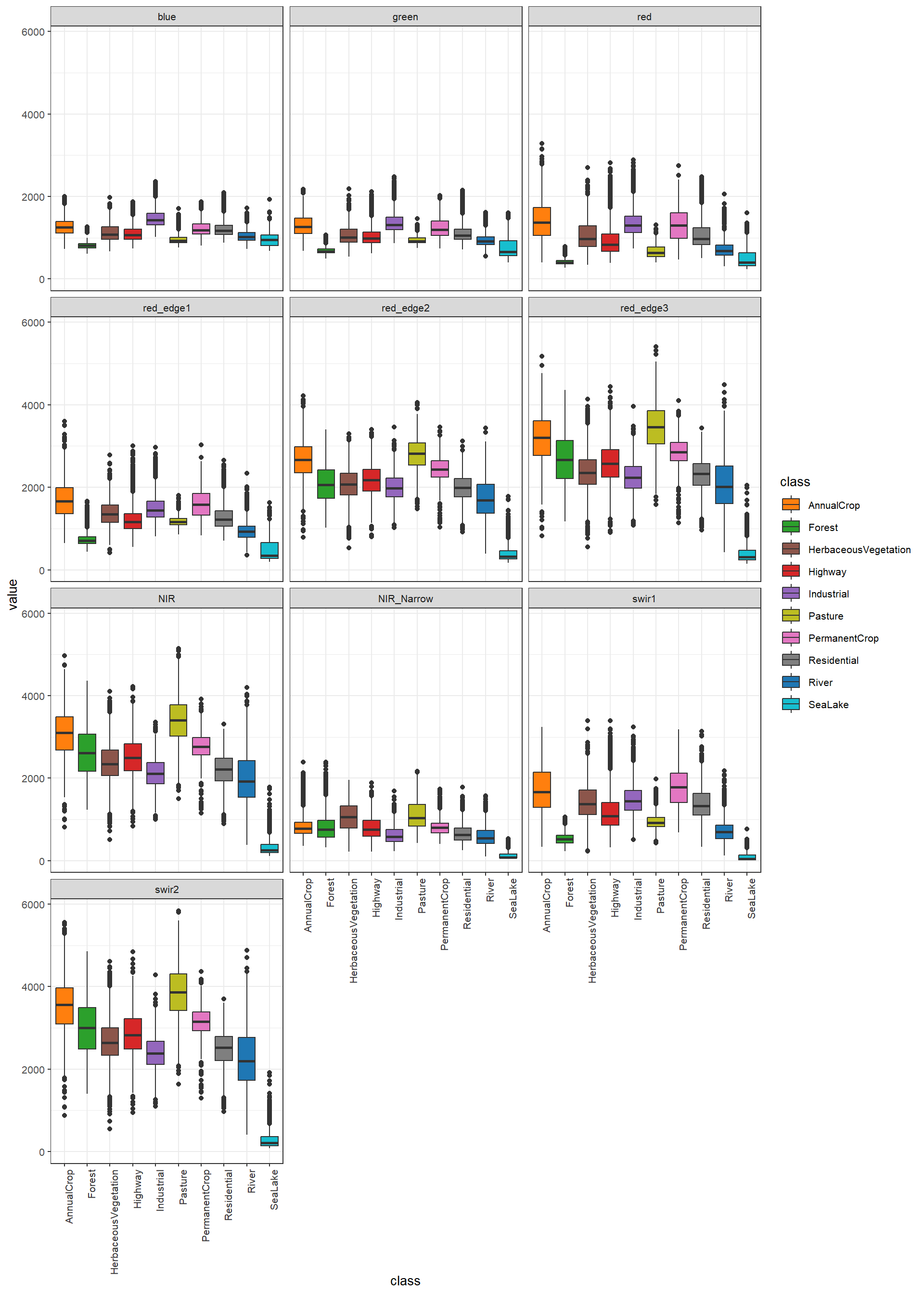
Correlation coefficients can be used to characterize the degree of correlation between pairs of numeric variables. As configured below, the cor() function returns the Pearson correlation coefficient, which is a measure of linear correlation. This function can also calculate Kendell and Spearman correlations, which use ranks and assess for monotonic correlation more generally. The corrplot package provides a variety of plots for visualizing pair-wise correlation. As configured, our example shows the Pearson correlation coefficient in the lower triangle and a circular symbol representing the degree of correlation in the upper triangle. Darker shades of blue indicate increasing positive linear correlation while darker shades of red indicate increasing negative linear correlation. The size of the symbol indicates the direction but not the magnitude of correlation. This article provides additional examples of correlation plots generated using corrplot.
cor(euroSatTrain[,2:11]) |>
  data.frame() |>
  mutate(across(where(is.numeric), ~ round(.x, digits = 3))) |>
gt()| blue | green | red | red_edge1 | red_edge2 | red_edge3 | NIR | NIR_Narrow | swir1 | swir2 |
|---|---|---|---|---|---|---|---|---|---|
| 1.000 | 0.932 | 0.885 | 0.777 | 0.263 | 0.152 | 0.133 | 0.036 | 0.703 | 0.131 |
| 0.932 | 1.000 | 0.959 | 0.919 | 0.476 | 0.368 | 0.351 | 0.211 | 0.824 | 0.346 |
| 0.885 | 0.959 | 1.000 | 0.942 | 0.452 | 0.342 | 0.330 | 0.213 | 0.888 | 0.330 |
| 0.777 | 0.919 | 0.942 | 1.000 | 0.695 | 0.596 | 0.591 | 0.471 | 0.924 | 0.587 |
| 0.263 | 0.476 | 0.452 | 0.695 | 1.000 | 0.989 | 0.987 | 0.758 | 0.643 | 0.984 |
| 0.152 | 0.368 | 0.342 | 0.596 | 0.989 | 1.000 | 0.998 | 0.741 | 0.548 | 0.997 |
| 0.133 | 0.351 | 0.330 | 0.591 | 0.987 | 0.998 | 1.000 | 0.774 | 0.544 | 0.998 |
| 0.036 | 0.211 | 0.213 | 0.471 | 0.758 | 0.741 | 0.774 | 1.000 | 0.446 | 0.744 |
| 0.703 | 0.824 | 0.888 | 0.924 | 0.643 | 0.548 | 0.544 | 0.446 | 1.000 | 0.543 |
| 0.131 | 0.346 | 0.330 | 0.587 | 0.984 | 0.997 | 0.998 | 0.744 | 0.543 | 1.000 |
eurosatCorr <- cor(euroSatTrain[,2:11])
corrplot.mixed(eurosatCorr, order = 'AOE')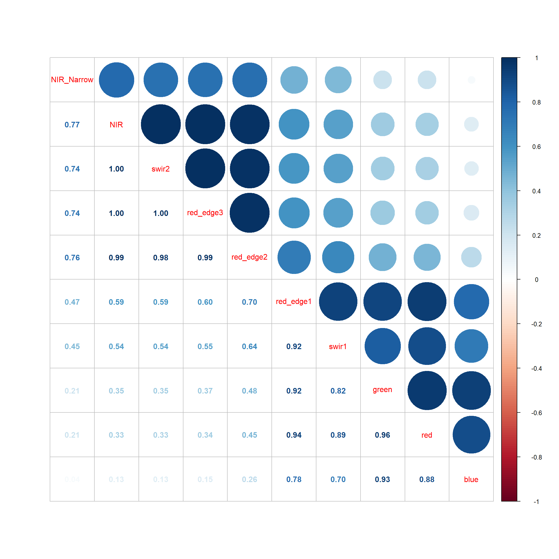
Another option for visualizing pair-wise variable correlation is a scatter plot matrix. The ggpairs() function for the GGally package allows for creating a scatter plot matrix using ggplot2. The lower triangle provides the scatter plot for each pair while the upper diagonal provides the associated Pearson correlation coefficient. The main diagonal characterizes the distribution of each variable using a kernel density plot.
set.seed(42)
euroSatTrain |>
  sample_n(200) |>
  ggpairs(columns = c(2:11),
          axisLabels = "none")+
  theme_bw(base_size=18)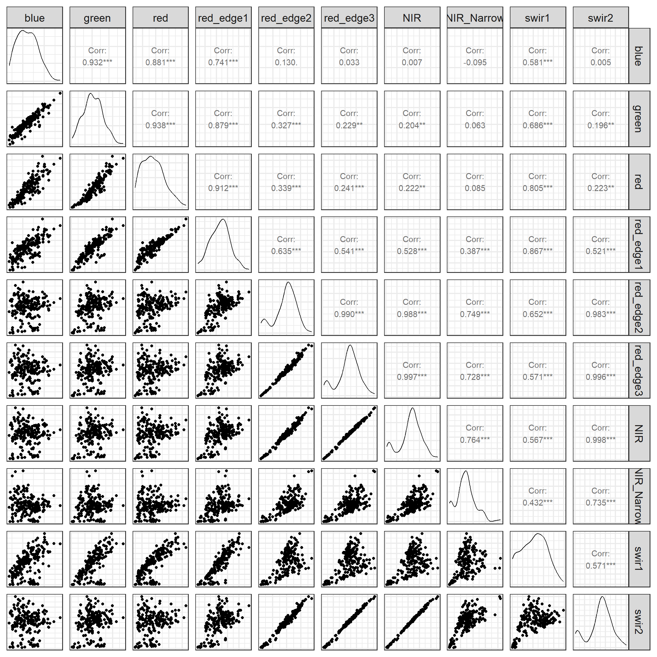
Generally, the correlation measures and visualizations suggest a high degree of correlation between the image bands. For example, the red edge 2 and 3 bands are highly correlated with each other and also with the NIR band. More generally, bands tend to be positively correlated.
It may also be informative to calculate summary statistics for each numeric predictor. In the next example, we calculate the mean, standard deviation, median, and interquartile range (IQR) for all image bands.
euroSatTrain |>
  summarise(
    across(
      where(is.numeric),
      list(mean = ~ mean(.x, na.rm = TRUE),
           sd   = ~ sd(.x,   na.rm = TRUE),
           median = ~ median(.x, na.rm = TRUE),
           iqr = ~ IQR(.x, na.rm = TRUE)),
      .names = "{.col}_{.fn}"
    )
) |> gt()| blue_mean | blue_sd | blue_median | blue_iqr | green_mean | green_sd | green_median | green_iqr | red_mean | red_sd | red_median | red_iqr | red_edge1_mean | red_edge1_sd | red_edge1_median | red_edge1_iqr | red_edge2_mean | red_edge2_sd | red_edge2_median | red_edge2_iqr | red_edge3_mean | red_edge3_sd | red_edge3_median | red_edge3_iqr | NIR_mean | NIR_sd | NIR_median | NIR_iqr | NIR_Narrow_mean | NIR_Narrow_sd | NIR_Narrow_median | NIR_Narrow_iqr | swir1_mean | swir1_sd | swir1_median | swir1_iqr | swir2_mean | swir2_sd | swir2_median | swir2_iqr |
|---|---|---|---|---|---|---|---|---|---|---|---|---|---|---|---|---|---|---|---|---|---|---|---|---|---|---|---|---|---|---|---|---|---|---|---|---|---|---|---|
| 1116.076 | 255.5433 | 1082.944 | 361.6446 | 1035.312 | 312.2988 | 996.797 | 395.2883 | 937.8773 | 479.8577 | 853.9935 | 675.3386 | 1184.292 | 500.9336 | 1163.053 | 621.9081 | 1971.095 | 779.6658 | 2099.205 | 822.2243 | 2334.381 | 976.8461 | 2464.24 | 1015.767 | 2262.04 | 970.0852 | 2394.394 | 1018.417 | 724.9527 | 384.4926 | 708.1434 | 444.3475 | 1103.834 | 670.8869 | 1080.137 | 943.1074 | 2552.018 | 1120.9 | 2713.485 | 1164.891 |
Missing data can also be an issue. Our code below confirms that there are no missing values in the table. If there were missing values, it may be necessary to remove rows with missing data or attempt to fill or impute the missing values.
3.4 Recipes
The recipes package is part of the tidymodels metapackage, and its primary purpose is to support data preprocessing and feature engineering within machine learning workflows. We have found it to be generally vary useful for data manipulation and use it regularly even outside of tidymodels.
It implements a variety of functions for manipulating single numeric variables, single categorical/nominal predictor variables, and multiple numeric predictor variables. It also provides functions for performing imputation, or estimating missing values. Table 3.1 lists some of the functions provided and provides brief explanations of their uses. As a few examples, a logarithmic transformation can be applied to a single predictor variable using a user-defined base via the step_log() function. Non-negative numeric predictor variables can be transformed to a more normal distribution via a Box-Cox transformation (step_BoxCox()) while positive and negative values can be transformed using a Yeo-Johnson transformation (step_YeoJohnson()). step_normalize() can rescale data to have a mean of zero and a standard deviation on one. For categorical data, dummy variables can be created using step_dummy(). Feature reduction can be implemented using principal component analysis (PCA) (step_pca()), kernel-PCA (kPCA) (step_kpca()), or independent component analysis (ICA) (step_ica()).
Variables with no variance (step_zv()) or near zero variance (step_nzv()) can be removed along with variables highly correlated with other variables (step_corr()). Lastly, a variety of imputation methods for missing data are provided including using bagged trees (step_impute_bag()), k-nearest neighbor (step_impute_knn()), and linear models (step_impute_linear()). Alternatively, missing values can be filled with the mean (step_impute_mean()), median (step_imnpute_median()), or mode (step_impute_mode()) of the available values.
Other than these functions, a variety of helper functions are provided to select variables on which to perform transformations. For example, all_numeric() selects all numeric variables while all_numeric_predictors() selects only numeric predictor variables. All predictor variables, regardless of their data type, can be selected with all_predictors(). All predictor variables with a factor data type can be selected using all_factor_predictors().
If you are interested in learning more about preprocessing and feature engineering using recipes, please consult the package documentation, which includes examples along with descriptions of all provided functions.
| Function | Description |
|---|---|
| Individual Numeric Variable | |
step_center() |
Center to mean of 0 |
step_normalize() |
Convert to mean of 0 and standard deviation of 1 |
step_range() |
Convert data to a desired data range (min-max rescaling) |
step_log() |
Logarithmic transform using user-defined base |
step_inverse() |
Take inverse of values |
step_sqrt() |
Take square root of values |
step_BoxCox() |
Used for non-negative values; make data more normally distributed |
step_YeoJohnson() |
Used for negative and positive values; make data more normally distributed |
| Categorical/Nominal Variable | |
step_dummy() |
Create dummy variables |
step_num2factor() |
Numeric to a factor data type |
step_ordinalscore() |
Ordinal data to numeric scores |
step_srings2factor() |
Convert character/string data to factor data type |
| Multiple Numeric Variables | |
step_interact() |
Generate interaction variable |
step_pca() |
Convert to principal components |
step_kpca() |
Perform kernel-PCA |
step_ica() |
Perform independent component analysis |
step_pls() |
Perform partial least squares feature extraction |
step_spatialsign() |
Perform spatial sign processing |
step_corr() |
Remove highly correlated variables |
step_zv() |
Remove variables with zero variance |
step_nzv() |
Remove variables with near zero variance |
step_lincom() |
Remove variables that are linear combinations of other variables |
| Imputation | |
step_filter_missing() |
Remove predictor variables with missing values |
step_impute_bag() |
Estimate missing values using bagged trees |
step_impute_knn() |
Estimate missing values using k-nearest neighbor |
step_impute_linear() |
Estimate missing values using linear model |
step_impute_mean() |
Fill missing values with mean of existing values |
step_impute_median() |
Fill missing values with median of existing values |
step_impute_mode() |
Fill missing values with mode of existing values |
A data preprocessing pipeline is generally implemented using recipes as follows:
- The modeling problem and pipeline are defined using
recipe(). - The recipe is prepared using
prep(). - The prepared recipe is applied to data using
bake().
We have provided three example workflows below.
3.4.1 Example 1
The goal of this first workflow is to simply rescale all numeric predictor variables from a scale of zero to one via min-max rescaling, which is implemented in recipes via step_range(). The first step is to define the recipe. The model or problem is defined using the following formula syntax: class ~ . This reads as “class is predicted by all other columns in the data table.” We also specify the data table (data=euroSatTrain). It is necessary to define the formula so that the role of each variable is clear. In other words, defining the model indicted that “class” is the response or dependent variable while all other columns are predictor variables. Next, we indicate to perform min-max rescaling using step_range() for all numeric predictor variables using all_numeric_predictors(). Since all of the predictor variables are numeric, in this case this yields the same result as all_predictors(). We also specify to rescale to a range of zero to one.
Once the recipe is defined it must be prepared sing prep(). It is important to note that we are only using the training set here. Data transformations should be specified using only the training set. Using all the data, or just the validation or test samples, is considered a data leak since using these data during the preprocessing stage allows the model to learn something about these withheld data.
myRecipe <- recipe(class ~ ., data = euroSatTrain) |>
  step_range(all_numeric_predictors(), min=0, max=1)

myRecipePrep <- prep(myRecipe, training=euroSatTrain)
Once the model is defined, it can be applied to each dataset using bake(). If new_data=NULL, the data used to define the recipe, in this case the training set, is processed.
To verify that the data have been rescaled we replicate the histograms created above. This confirms that all bands are now scaled between zero and one.
trainProcessed |> melt(ID = c(class)) |>
  ggplot(aes(x=value))+
  geom_histogram()+
  facet_wrap(vars(variable))+
  theme_bw(base_size=12)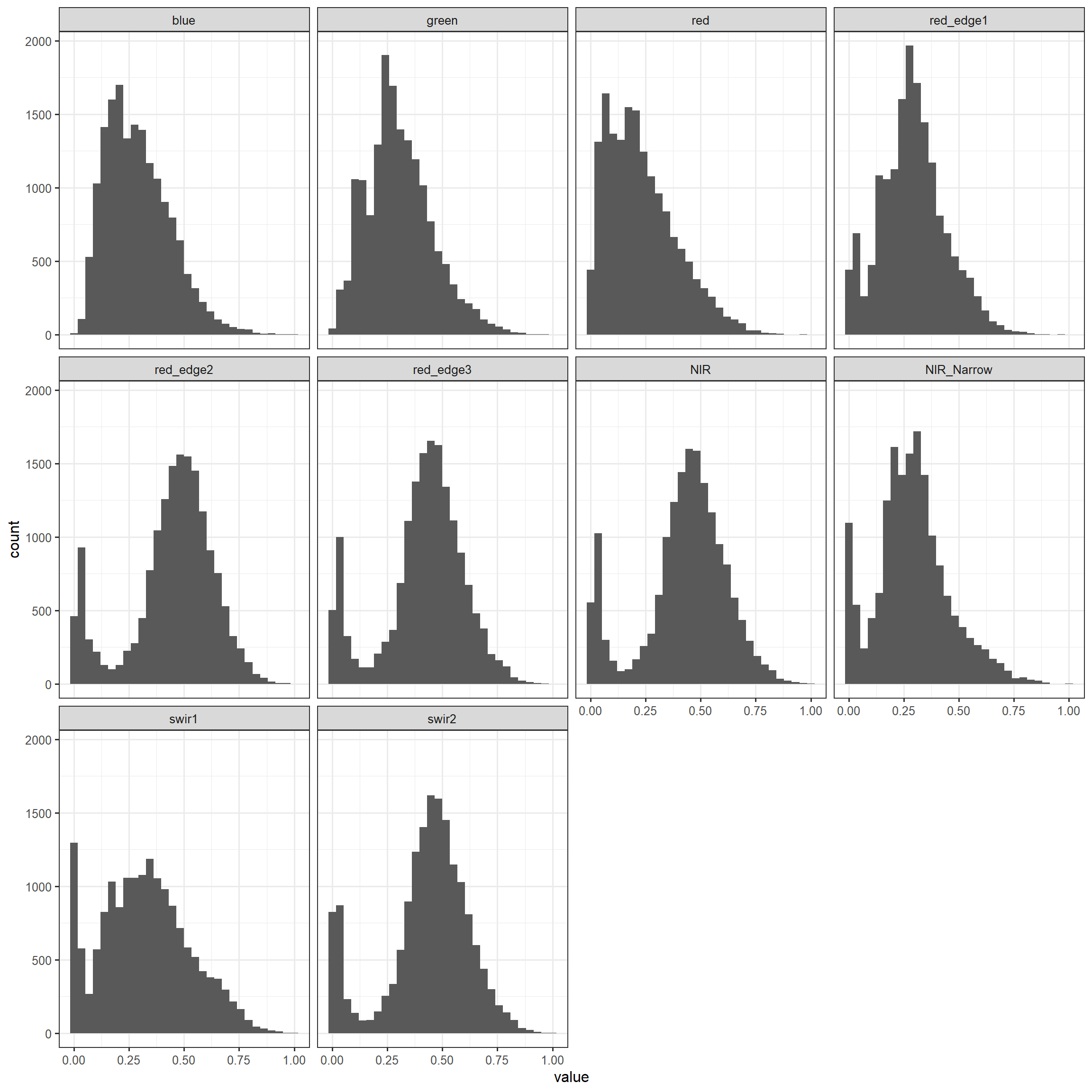
3.4.2 Example 2
Adding to the last example, we now perform min-max rescaling followed by principal component analysis, which is implemented with step_pca(). There are a total of 10 image bands or predictor variables; as a result, the maximum number of PCA bands that can be generated is 10. Here, we specify to extract the first five principal components (num_comp=5). The transformations are applied to only the numeric predictor variables using all_numeric_predictors(). The required Eigenvectors are generated using prep(). Again, only the training data are used to avoid a data leak. Lastly, all three tables are processed using bake().
Printing the first six rows of the table, you can see that the processed data now consist of the dependent variable (“class”) and five principal components. The second block of code displays the samples within a space defined by the first two principal component values.
myRecipe2 <- recipe(class ~ ., data = euroSatTrain) |>
  step_range(all_numeric_predictors(), min=0, max=1) |>
  step_pca(all_numeric_predictors(), trained=FALSE, num_comp = 5)

myRecipePrep2 <- prep(myRecipe2, training=euroSatTrain)

trainProcessed2 <- bake(myRecipePrep2, new_data=NULL)
valProcessed2 <- bake(myRecipePrep2, new_data=euroSatVal)
testProcessed2  <- bake(myRecipePrep2, new_data=euroSatTest)

trainProcessed2 |> head() |> gt()| class | PC1 | PC2 | PC3 | PC4 | PC5 |
|---|---|---|---|---|---|
| AnnualCrop | -1.444476 | -0.200027534 | -0.053225523 | -0.04677407 | 0.12586640 |
| AnnualCrop | -1.180831 | -0.007249725 | 0.019563326 | -0.03126833 | 0.06238193 |
| AnnualCrop | -1.740357 | -0.197465575 | -0.102684014 | -0.05571302 | 0.16976016 |
| AnnualCrop | -1.551906 | 0.061390630 | -0.137713366 | -0.12116799 | 0.03138270 |
| AnnualCrop | -1.661165 | -0.191002264 | 0.017887586 | -0.03739950 | 0.18641233 |
| AnnualCrop | -1.744396 | -0.307589852 | -0.008958601 | -0.14514547 | -0.02851730 |
trainProcessed2 |>
  ggplot(aes(x=PC1, y=PC2, color=class))+
  geom_point()+
  scale_color_manual(values = classColors)+
  theme_bw(base_size=11)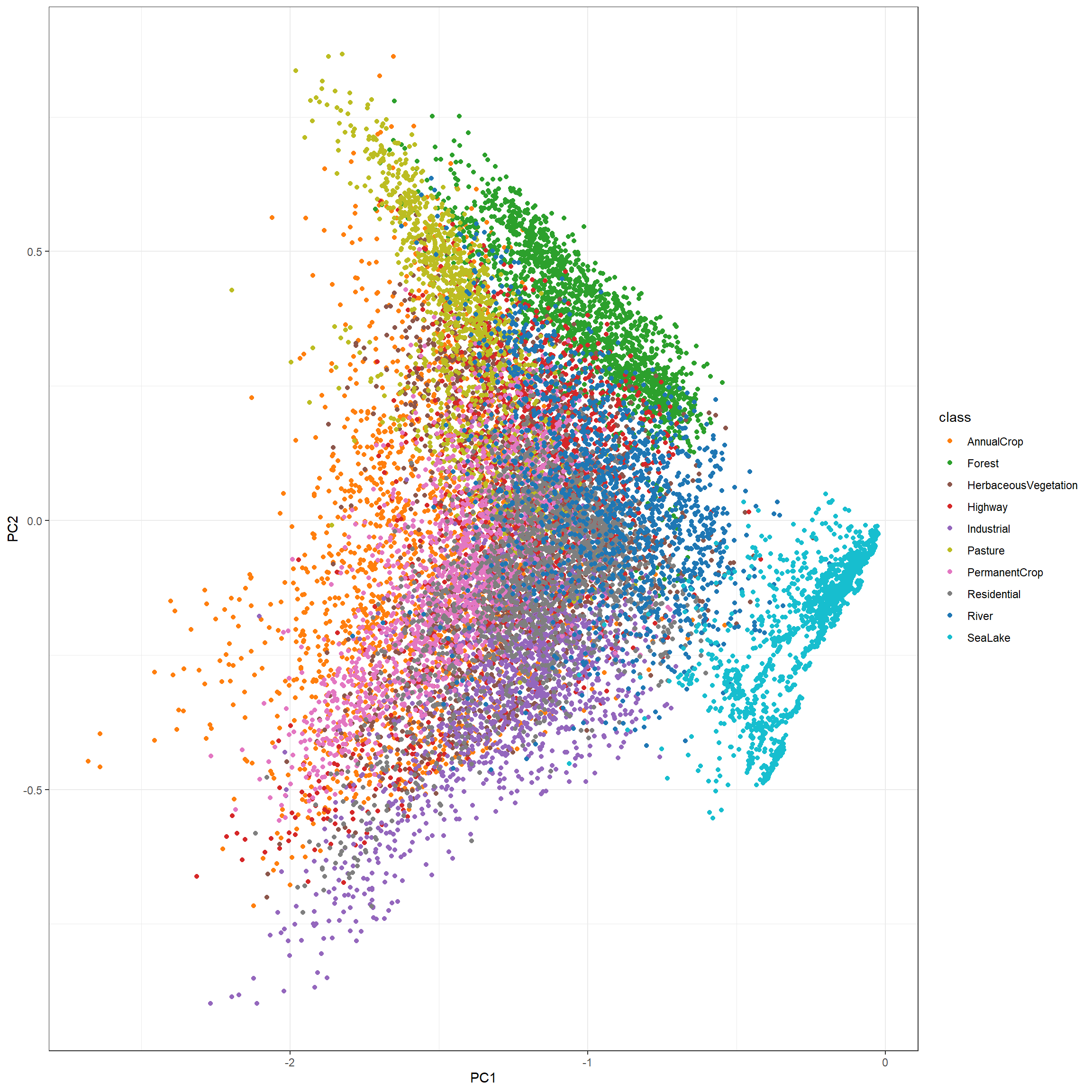
3.4.3 Example 3
As a final example using recipes, we convert the class labels into dummy variables. This is not generally necessary for the dependent variable; we are just using this as an example of processing categorical/nominal data. all_outcomes() is used to specify that we want to apply the dummy variable transformation to the dependent variable (i.e., outcome). As with our prior two examples, once the recipe is defined and prepared, it can be applied to each table using bake().
Printing the first five rows, we can see that dummy variables have been created and added to the end of the table. There are a total of n-1 new columns. This is because if the classification is known for nine of the 10 columns, the other one can be determined. A row is coded to one for only the column representing the class to which it belongs, and all other columns are coded to zero. So, if one already exists in the dummy variable columns for a sample, then the sample associated with the row does not belong to the missing class. If all dummy variables are zero for a sample, then it must belong to the missing class. Another reason for creating only n-1 dummy variables is that perfect correlation would exist since all columns would have to sum to 1. This is an issue for some modeling methods.
myRecipe3 <- recipe(class ~ ., data = euroSatTrain) |>
  step_dummy(all_outcomes())

myRecipePrep3 <- prep(myRecipe3, training=euroSatTrain)

trainProcessed3 <- bake(myRecipePrep3, new_data=NULL)
valProcessed3 <- bake(myRecipePrep3, new_data=euroSatVal)
testProcessed3  <- bake(myRecipePrep3, new_data=euroSatTest)

trainProcessed3 |> head() |> gt()| blue | green | red | red_edge1 | red_edge2 | red_edge3 | NIR | NIR_Narrow | swir1 | swir2 | class_Forest | class_HerbaceousVegetation | class_Highway | class_Industrial | class_Pasture | class_PermanentCrop | class_Residential | class_River | class_SeaLake |
|---|---|---|---|---|---|---|---|---|---|---|---|---|---|---|---|---|---|---|
| 1301.216 | 1310.900 | 1690.943 | 1882.683 | 2300.972 | 2693.981 | 2679.530 | 674.3467 | 1461.916 | 3229.571 | 0 | 0 | 0 | 0 | 0 | 0 | 0 | 0 | 0 |
| 1042.025 | 1032.954 | 1146.716 | 1371.954 | 2059.983 | 2428.848 | 2392.777 | 758.6294 | 1189.457 | 2714.708 | 0 | 0 | 0 | 0 | 0 | 0 | 0 | 0 | 0 |
| 1411.485 | 1490.846 | 1949.925 | 2199.880 | 2840.266 | 3354.370 | 3278.168 | 761.7170 | 1621.122 | 3900.247 | 0 | 0 | 0 | 0 | 0 | 0 | 0 | 0 | 0 |
| 1188.904 | 1186.154 | 1303.843 | 1526.593 | 2638.546 | 3538.587 | 3379.391 | 638.5325 | 1469.149 | 3986.078 | 0 | 0 | 0 | 0 | 0 | 0 | 0 | 0 | 0 |
| 1313.137 | 1403.036 | 1935.128 | 2199.130 | 2620.265 | 3031.684 | 3112.547 | 948.0181 | 1656.649 | 3609.165 | 0 | 0 | 0 | 0 | 0 | 0 | 0 | 0 | 0 |
| 1494.215 | 1542.500 | 1762.494 | 1988.496 | 2771.243 | 3218.373 | 3092.701 | 730.0217 | 2437.478 | 3556.718 | 0 | 0 | 0 | 0 | 0 | 0 | 0 | 0 | 0 |
3.5 Principal Component Analysis
We discussed principal component analysis (PCA) as applied to image data in the last chapter. In this final section of the chapter we will further explore PCA as applied to tabulated data.
3.6 Calculate Principal Components
There are multiple implementations of PCA available in R. Here, we use the prcomp() function from the stats package, which is included with a base R implementation.
For our example, we use the data that have been rescaled from 0 to 1. We only consider the numeric predictor variables, not the categorical response variable since PCA is not applicable to categorical data. When scale=TRUE, the data are rescaled to have unit variance (i.e., a standard deviation of one), which is generally recommended.
Once the PCA executes, summary() can be applied to the resulting object to obtain the proportion of variance explained by each component and the associated cumulative variance. The results suggest that the first four principal components capture ~99% of the variance in the original image bands. The first principal component captures ~66% while the second captures ~27%. In other words, ~93% of the variance in the original data are captured by only two new variables. Thus, due to the correlation between the original image bands, PCA offers a significant feature reduction.
Importance of components:
                          PC1    PC2     PC3     PC4     PC5     PC6     PC7
Standard deviation     2.5678 1.6490 0.61350 0.45025 0.26931 0.14352 0.10266
Proportion of Variance 0.6593 0.2719 0.03764 0.02027 0.00725 0.00206 0.00105
Cumulative Proportion  0.6593 0.9313 0.96892 0.98919 0.99644 0.99850 0.99956
                           PC8     PC9    PC10
Standard deviation     0.05716 0.02977 0.01672
Proportion of Variance 0.00033 0.00009 0.00003
Cumulative Proportion  0.99988 0.99997 1.00000
3.7 Explore PCA Results
The Eigenvectors are stored in the rotation object within the list object created by the prcomp() function. These values represent the coefficients that the 10 original image bands must be multiplied by in order to obtain the component. Negative values indicate that the original variable is negatively correlated with the component while a positive value indicates that it is positively correlated with the component. Larger magnitude values indicate that the input contributes more to the component.
pcaOut$rotation |> as.data.frame() |> gt()| PC1 | PC2 | PC3 | PC4 | PC5 | PC6 | PC7 | PC8 | PC9 | PC10 |
|---|---|---|---|---|---|---|---|---|---|
| -0.2332634 | -0.4499598 | -0.09592833 | -0.55918371 | -0.543608333 | 0.3291772660 | 0.12301040 | -0.001778931 | -0.04701750 | -0.0047617102 |
| -0.3022350 | -0.3656105 | -0.08623443 | -0.27708812 | 0.225995289 | -0.7519375536 | -0.19483653 | 0.174788435 | 0.07597545 | 0.0004594956 |
| -0.3007377 | -0.3732250 | 0.03542181 | 0.18152349 | 0.374574593 | 0.4406563880 | -0.55950411 | -0.265823234 | 0.13360553 | -0.0036017235 |
| -0.3592516 | -0.2110618 | 0.09649944 | 0.12167750 | 0.465114161 | 0.1719181056 | 0.68421544 | 0.180699463 | -0.23473280 | 0.0220022517 |
| -0.3544881 | 0.2400222 | -0.17453459 | -0.03672366 | -0.026899167 | -0.1322480621 | 0.31263076 | -0.653070559 | 0.48852054 | -0.0617412527 |
| -0.3307472 | 0.3037438 | -0.26486505 | -0.04236619 | -0.038152324 | -0.0529464411 | -0.16993956 | -0.226867213 | -0.63654051 | 0.4864223404 |
| -0.3295254 | 0.3152591 | -0.18440194 | -0.04018152 | -0.014196488 | 0.0622893750 | -0.14702228 | 0.162590327 | -0.23712850 | -0.8050114813 |
| -0.2626938 | 0.3036496 | 0.85553680 | -0.30337990 | -0.003373832 | -0.0001312174 | -0.10444142 | 0.001153149 | 0.01871505 | 0.0594584771 |
| -0.3388080 | -0.2013612 | 0.20855286 | 0.68248338 | -0.541717226 | -0.1943846527 | 0.00137486 | 0.056490989 | -0.02986709 | -0.0075382556 |
| -0.3275605 | 0.3130695 | -0.25047381 | 0.01409093 | -0.030482109 | 0.2013457311 | -0.08104717 | 0.598776660 | 0.46664633 | 0.3277586720 |
The fvix_screeplot() function from the factoextra package generates a Scree plot, which shows the proportion of the variance explained by each principal component. Again, the majority of the variance in the original data is captured by the first two principal components.
fviz_screeplot(pcaOut, addlabels = TRUE)+
  theme_bw(base_size=11)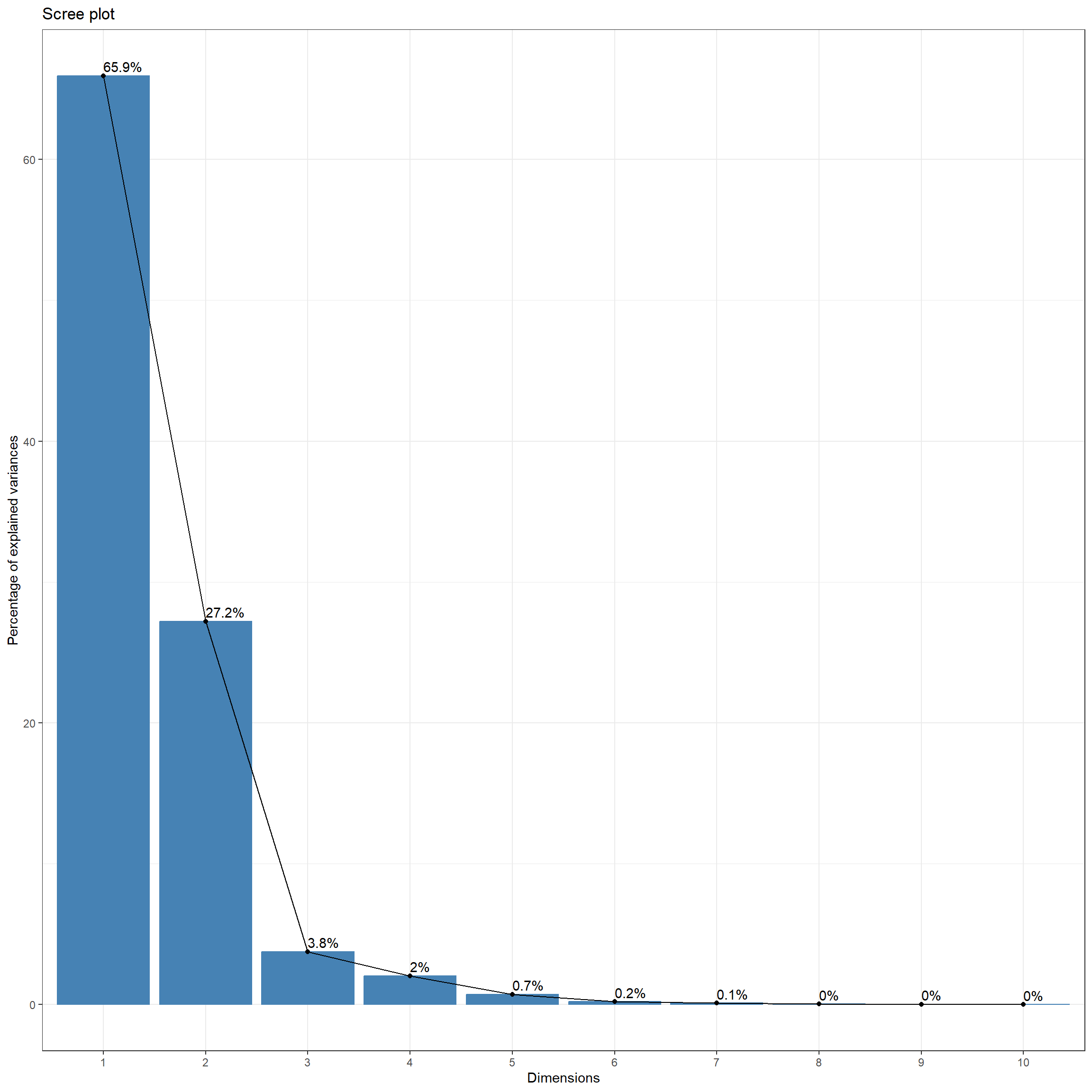
A biplot visualizes how the input predictor variables correlate with the first two principal components. The magnitude of the arrow in the x direction relates to the contribution of the variable to the first principal component while the magnitude in the y direction relates to its contribution to the second principal component. The direction relates to the sign of the Eigenvector for the two principal components. Vectors occurring in the right portion of the plot correspond to input variables that are positively correlated with the first principal component while those in the left are negatively correlated. In our example, all the input predictor variables are negatively correlated with the first principal component. All the Eigenvectors for the first principal component are negative, as is evident in the table above. Vectors occurring in the top portion of the plot correspond to input variables that are positively correlated with the second principal component while those in the lower portion are negatively correlated. Some of the input channels, such as the NIR band, are positively correlated with the second principal component while others, such as the red band, are negatively correlated with the second principal component.
fviz_pca_var(pcaOut)+
  theme_bw(base_size=11)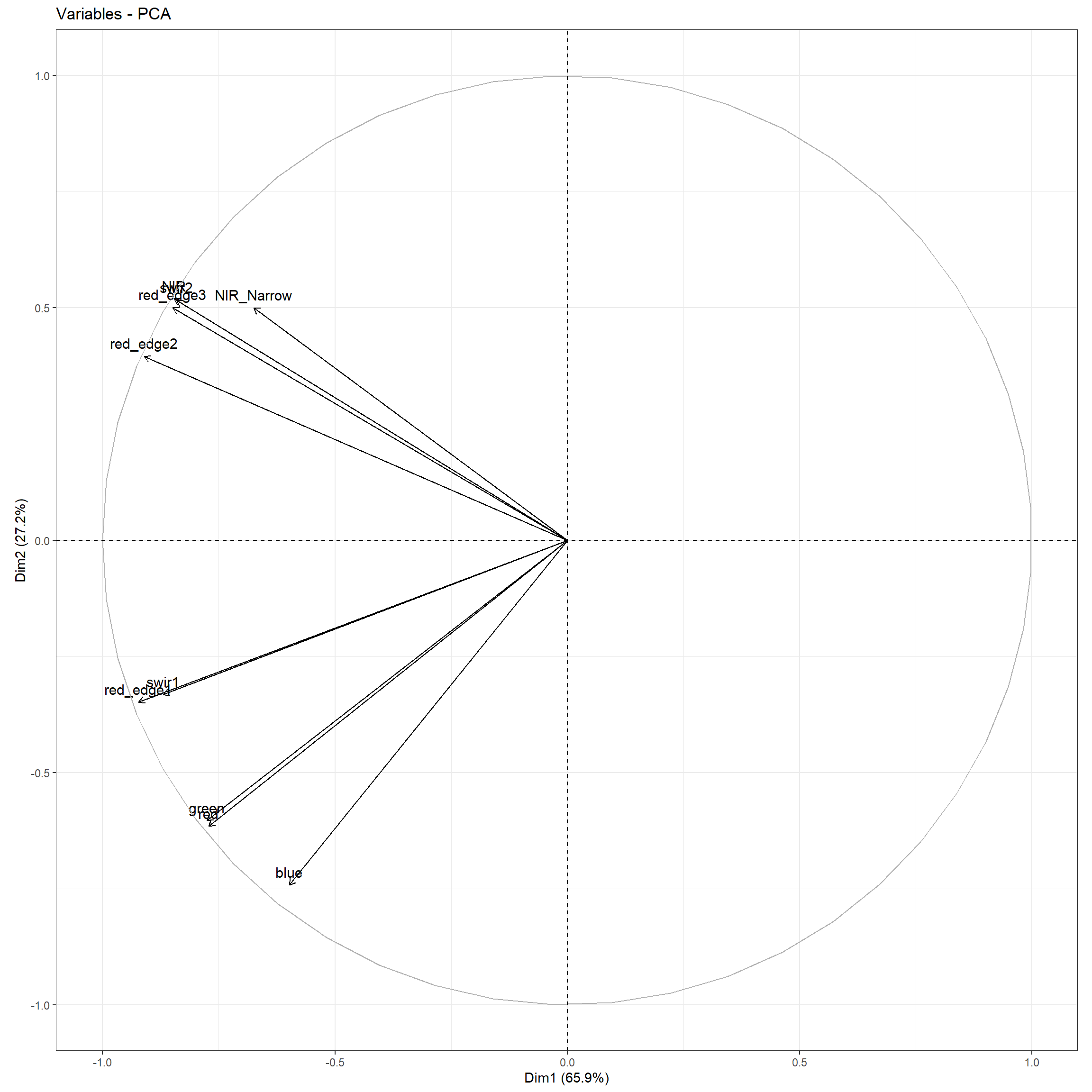
3.8 Concluding Remarks
We have now covered preprocessing considerations and methods for raster data in general and multispectral imagery and digital terrain models more specifically. This chapter focused on data preprocessing not specific to raster geospatial data. The next chapter is our final chapter associated with data preprocessing, and we discuss processing light detection and ranging (lidar) point clouds using the lidR package.
3.9 Questions
- Explain the difference between one-hot encoding and dummy variables.
- Explain how the Box-Cox transformation is applied.
- Explain how the Yeo-Johnson transformation is applied.
- Explain the relative impact of a natural log transformation on numbers based on their magnitude. In other words, does a natural log transformation result in compressing ranges of larger values or ranges of smaller values? Why might this be desirable?
- Explain the relative impact of calculating the square of numbers based on their magnitude. In other words, does a square transformation result in compressing ranges of larger values or ranges of smaller values? Why might this be desirable?
- From the recipes package, explain the difference between the
step_center(),step_normalize(),step_range(), andstep_scale()functions. - What is the difference between principal component analysis (PCA) and kernel PCA?
- What is the difference between principal component analysis (PCA) and independent component analysis (ICA)?
3.10 Exercises
You have been provided two CSV files: training.csv and test.csv in the exercise folder for the chapter. Both represent data for a object-based image classification. Multiple data layers have been summarized relative to image objects including red, green, blue, and near infrared (NIR) image bands derived from National Agriculture Imagery Program (NAIP) orthophotography; feature heights, return intensity, and topographic slope derived from lidar; density of man-made structures; and density of roads. Your task is to perform preprocessing to prepare the tables for subsequent analysis.
- Read in both tables
- For both tables, complete the following tasks using the tidyverse:
- Extract out the “class” column and all other columns beginning with the word “Mean” (should result in 16 columns)
- Convert all character columns to factors
- Drop any rows with missing data in any column
- Some of the rows have missing values that contain a very low numeric placeholder value as opposed to
NA(< 1e-30). Remove rows that have a value lower then 1e-30 in any numeric column - Remove “Mean” from all extracted column names
- Count the number of records within each class differentiated in the “Class” column in the training table
- use
ggpairs()to compare the correlation between all 15 extracted predictor variables (all columns other than “class”) in the training table; to speed this up, extract out a random subset of 200 samples prior to generating the correlation plot - Create grouped box plots using the “class” column and training set for the following predictor variables:
- “nDSM” (object-level mean normalized digital surface model; mean height above ground)
- “NDVI” (object-level mean normalized difference vegetation index)
- “Int” (object-level mean first return lidar intensity)
- “Slp” (object-level mean topographic slope)
- “Str250” (object-level mean structure density using a 250 m circular radius for kernel density calculation)
- “Roads250” (object-level mean road density using a 250 m circular radius for kernel density calculation)
- Use recipes to perform the following preprocessing steps:
- Rescale all the predictor variables to a range of 0 to 1
- Convert the 15 predictor variables into 8 principal components
- Prepare the recipe using the training data
- Apply the prepared recipe to both the training and test tables
- Using the results of your exploratory analysis, generate a short write up that discusses the following:
- Issues of class imbalance
- Issues of correlation between predictor variables
- How well specific classes are differentiated by the graphed predictor variables