23 Static Maps (tmap)
23.1 Topics Covered
- Adding base maps/raster tile layers
- Visualizing point, line, and polygon features and associated aesthetic mappings
- Visualizing continuous and categorical raster data
- Defining color ramps and binning
- Editing scales, legends, and titles
- Adding map elements/surrounds and labels
- Implementing faceting with
tm_facets() - Generating multi-map layouts with
tmap_arrange() - Plots vs. views
- Saving maps
23.2 Introduction
This chapter focuses on the creation of static maps using the tmap package. There are some other options for static map design in R, such as ggmap. We will not focus on the creation of interactive web maps; instead, in the final chapter of the text (Chapter 25), we explore creating interactive maps with leaflet. There are several reasons why we prefer to use tmap for static map design in R. It is fairly intuitive, and its syntax is very similar to ggplot2 and follows a similar philosophy. We tend to use it as we are undertaking geospatial analyses in R to visualize input data or intermediate or final outputs. In such cases, it is generally not necessary to refine the layout. However, tmap does offer tools to generate publication- or presentation-quality map layouts, which will be explored in this chapter. When we use tmap in other chapters for data visualization, we generally don’t worry about refining them, similar to using ggplot2 for simple data visualization vs. designing a final figure.
There have been some significant changes made to tmap between versions 3.x and 4.x. This chapter reflects 4.0 syntax.
Other than tmap, the following packages are required to execute the examples:
- sf: read in and work with vector geospatial data
- tmaptools: adds additional functionality to tmap
- terra: read in and work with raster grids
- OpenStreetMap: load base map tiles
- cols4all: define color palettes
First, we load in our example data using sf and terra. The vector data include city point locations, state boundaries, and Amtrak lines for the contiguous United States. A raster-based digital terrain model (DTM) from the National Elevation Dataset (NED) and a categorical raster grid of land cover types from the National Land Cover Database are also provided for areas within the state of West Virginia, USA. Lastly, a DTM and derived hillshade are provided for the extent of Tucker County, West Virginia, USA. Note that the US-level data are re-projected to the WGS84 Web Mercator projection using st_transform().
The sf package is discussed in more detail in the next chapter. For now, we are just using it to read in vector geospatial data with the st_read() function, re-project data layers with the st_transform() function, and extract the rectangular extent of layers using st_bbox().
fldPth <- "gslrData/chpt23/data/"

cities <- st_read(dsn=str_glue("{fldPth}chpt23.gpkg"),
                  "cities2",
                  quiet=TRUE) |>
  st_transform(3857)

states <- st_read(dsn=str_glue("{fldPth}chpt23.gpkg"),
                  "states",
                  quiet=TRUE) |>
  st_transform(3857)

tracks <- st_read(dsn=str_glue("{fldPth}chpt23.gpkg"),
                  "tracks",
                  quiet=TRUE) |>
  st_transform(3857)

dem <- rast(str_glue("{fldPth}lycomingDTM.tif"))

lc <- rast(str_glue("{fldPth}lycomingLC2.tif"))

tucker_dem <- rast(str_glue("{fldPth}tuckerDTM.tif"))

tucker_hs <- rast(str_glue("{fldPth}tuckerHS.tif"))
23.3 Base Maps
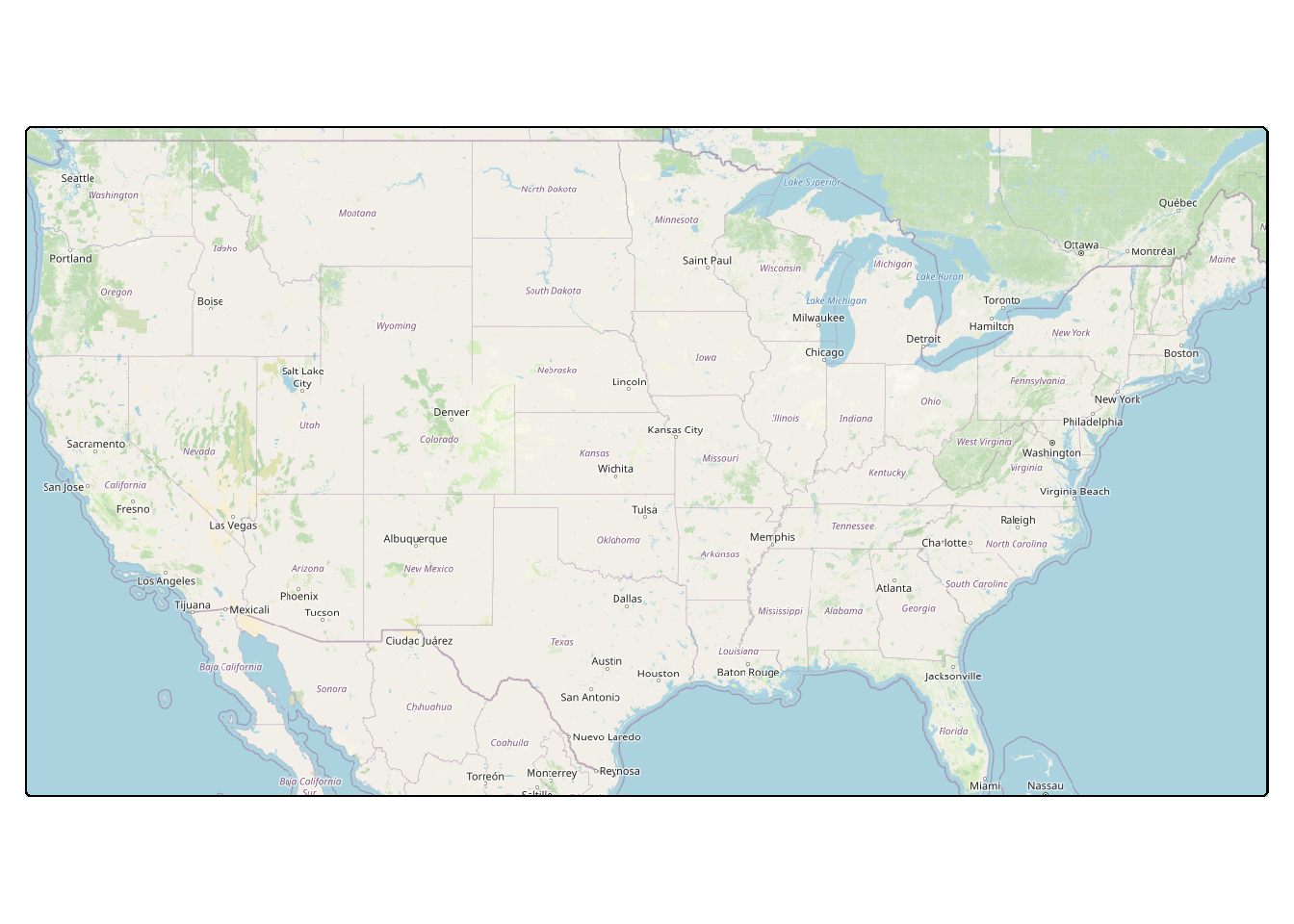
A tmap object is initiated using tm_shape(). The required argument is the variable associated with the geospatial data to be displayed. In our first example, we are reading base map data from OpenStreetMap using the OpenStreetMap package. The required tiles are defined using the extent of the contiguous United States, which is extracted as a bounding box using st_bbox() from sf. Following tm_shape(), it is necessary to define how the data should be drawn or displayed. For the base map data, since it consists of pictures or image tiles, we use tm_rgb(). The result is a map of the contiguous United States with only a base map and no operational layers.
23.4 Operational Layers
We now experiment with adding operational layers to the map. There are a wide variety of means to display geospatial data with tmap, and the best choice depends on (1) the type of data being displayed and (2) the optimal graphical parameter for showing the quantity or category of interest. Table 23.1 describes common methods for visualizing point, line, and polygon vector geospatial data and raster grids. It is important to note that the graphical parameters that a variable can be mapped to vary between methods. Again, this is a key consideration when selecting a visualization method.
| Symbol | Data Type | Fill Color | Fill Alpha | Outline/Line Color | Outline Alpha | Outline/Line Width | Size | Line/Outline Type | Shape/Type | Background Color | Background Alpha |
|---|---|---|---|---|---|---|---|---|---|---|---|
| tm_dots() | Point | X | X | X | X | X | |||||
| tm_bubbles() | Point | X | X | X | X | X | X | X | |||
| tm_squares() | Point | X | X | X | X | X | X | X | |||
| tm_markers() | Point | X | X | X | X | ||||||
| tm_lines() | Line | X | X | X | X | ||||||
| tm_polygons() | Polygon | X | X | X | X | X | X | ||||
| tm_borders() | Polygon | X | X | X | X | ||||||
| tm_fill() | Polygon | X | X | ||||||||
| tm_raster() | Raster | X | X | ||||||||
| tm_rgb() | Raster | X | |||||||||
| tm_rgba() | Raster | X | X | ||||||||
| tm_basemap() | Base map tiles | ||||||||||
| tm_tiles() | Base map tiles |
We do not discuss displaying multiband raster data, such as multispectral imagery, with tmap. We prefer to display multiband imagery with the plotRGB() function from terra.
23.4.1 Vector Operational Layers
23.4.1.1 Points
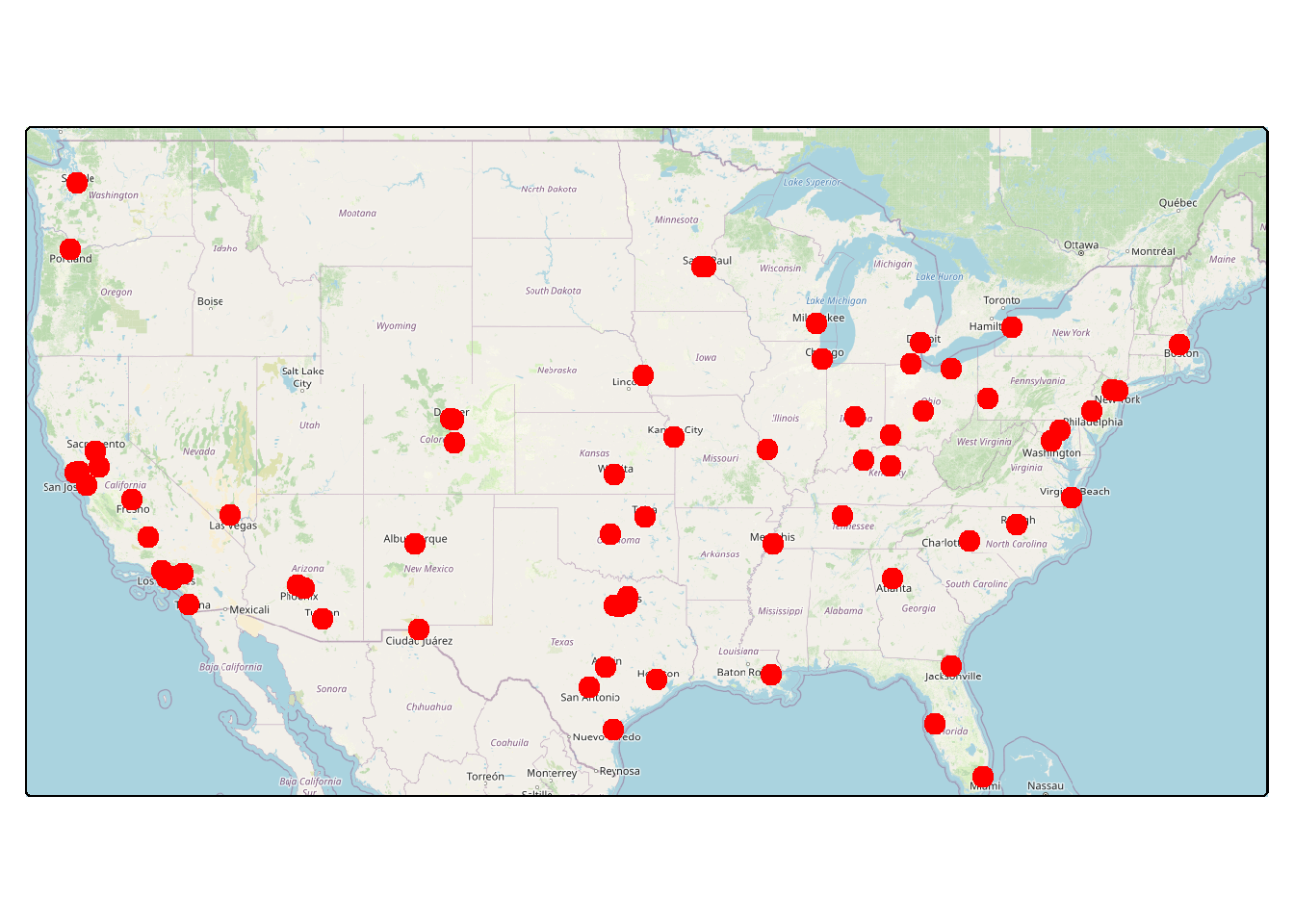
Below we demonstrate the visualization of point vector data using tm_bubbles() and tm_dots(). The key difference between tm_bubbles() and tm_dots() is thattm_bubbles() allows you to assign variables to both the fill color and the outline color while tm_dots() only allows for mapping to the fill color (i.e., there is no outline associated with the dot symbol). Both allow for mapping a continuous variable to the size parameter or a categorical variable to the shape parameter. tm_markers(), which is not demonstrated here, uses a vector or raster image to display the data and allows for using different icons for different categories, changing the background color, and mapping a continuous variable to the size of the icon.
For both tm_bubbles() and tm_dots() in our examples, the size of the city point symbol maps to the the city’s population. We are also defining a title to show in the legend and the orientation of the legend. By default, the legend plots outside of the map space. For a specific graphical property, there are commonly PROPERTY.scale and PROPERTY.legend parameters. For size, size.scale is used to define the range of sizes used while size.legend allows for formatting different components of the legend or excluding a legend when not necessary.
When multiple layers are being displayed, each layer requires a call to tm_shape(), and later layers draw above prior layers.
us_bb <- st_bbox(states)
osm_map <- read_osm(us_bb)
tm_shape(osm_map)+
tm_rgb()+
tm_shape(cities)+
tm_bubbles(size="pop2007b",
size.legend = tm_legend(title = "Population of City",
orientation="landscape"))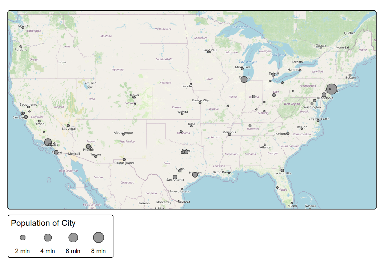
In contrast to ggplot2, tmap requires placing quotes around variable names.
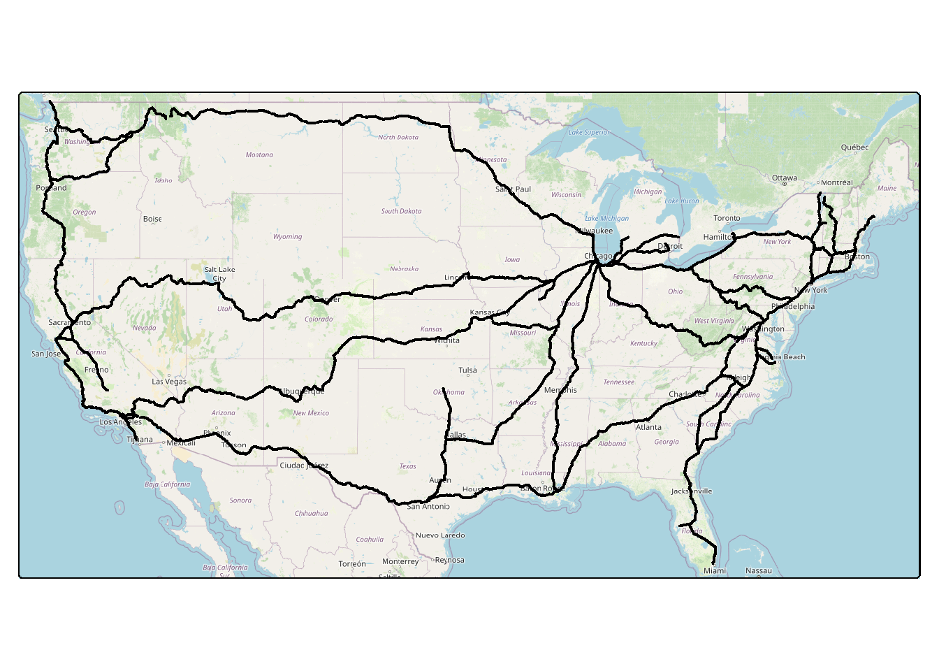
23.4.1.2 Lines
tm_lines() supports visualizing line vector data. The user can map a continuous variable to the width of the line, a categorical or continuous variable to line color, and/or a categorical variable to line type. In our example, we are not displaying variables with the graphical parameters, only constants. A description of the available line types in R is available here.
23.4.1.3 Polygons
Vector polygon data are generally drawn using tm_polygons(). tm_fill() can be used if you only want to set the fill color while tm_borders() allows for a border but no fill (i.e., a hollow symbol). As the last example in this section demonstrates, you can stack tm_borders() and tm_fill(); however, tm_polygons() makes this unnecessary.
When using tm_polygons(), variables can be mapped to the fill color, fill transparency/alpha, outline color, outline alpha/transparency, outline width, and outline line type. Size is not available for polygon features. However, the tmap_cartograms extension allows for generating cartograms. A proportional or graduated point symbol for each areal object could also be used to represent a continuous variable.
tm_shape(states) +
  tm_polygons(col="gray")

tm_shape(states) +
tm_borders(col="red", lwd=2)
tm_shape(states) +
tm_fill(col="gray")+
tm_borders(col="red", lwd=2)
23.4.2 Raster Operational Layers
23.4.2.1 Continuous Raster Data
The code block below demonstrates the display of a continuous raster grid, specifically a DTM where each cell holds an elevation measurement. The raster values are mapped to the color parameter; however, this does not need to be explicitly stated since there is only one value associated with the raster cell, and color is the only available graphical parameter. We define a color ramp using the col.scale parameter and the tm_scale_intervals() function. The color ramp is defined using the col4all package.
Table 23.2 lists scales that are available in tmap. In our first set of examples for raster data we use tm_scale_intervals() to display numeric data in bins. This requires defining a binning method. We demonstrate equal interval, where there is an equal range of values in each bin, and quantile, where there is an equal number of features (i.e., pixels or cells) in each bin. We also use tm_scale_continuous() to display the elevation data using a stretch or continuous ramp as opposed to a discrete set of colors mapped to data ranges or bins. If you want to use an inverted version of a color ramp, simply place - in front of the name as demonstrated in the last example for the grayscale ramp. We also use the col.legend parameter and the tm_legend() function, which allows for configuring a legend associated with the color symbology.
If you want to explore available color ramps from cols4all, you can launch an interactive shiny app using c4a_gui().
| Scale | Use |
|---|---|
| tm_scale_continuous() | Continuous scaling for numeric data |
| tm_scale_continuous_log() | Continuous scaling for numeric data with natural log transform |
| tm_scale_continuous_sqrt() | Continuous scaling for numeric data with square root transform |
| tm_scale_intervals() | Binned numeric data |
| tm_scale_discrete() | Numeric data with finite set of discrete values |
| tm_scale_ordinal() | Ordered categorical data |
| tm_scale_categorical() | Non-ordered categorical data |
| tm_scale_rank() | Rank-based data |
| tm_scale_rgb() | Map raster band values to red, green, and blue channels |
| tm_scale_rgba() | Adds alpha/transparency to tm_scale_rgb() |
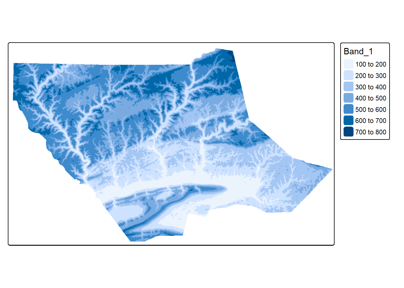
tm_shape(dem)+
tm_raster(col.scale= tm_scale_intervals(style="equal",
n=7,
values = "brewer.yl_or_br"),
col.legend = tm_legend("Equal Interval"))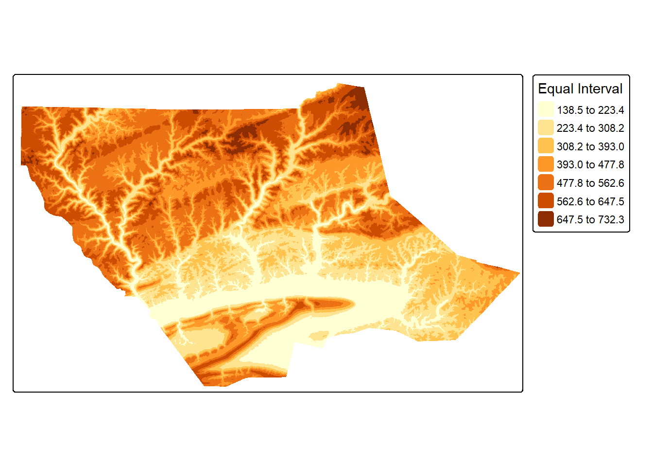
tm_shape(dem)+
tm_raster(col.scale= tm_scale_intervals(style="quantile",
n=7,
values = "brewer.yl_or_br"),
col.legend = tm_legend("Quantile"))
tm_shape(dem)+
tm_raster(col.scale= tm_scale_continuous(values = "brewer.yl_or_br"),
col.legend = tm_legend("Continuous"))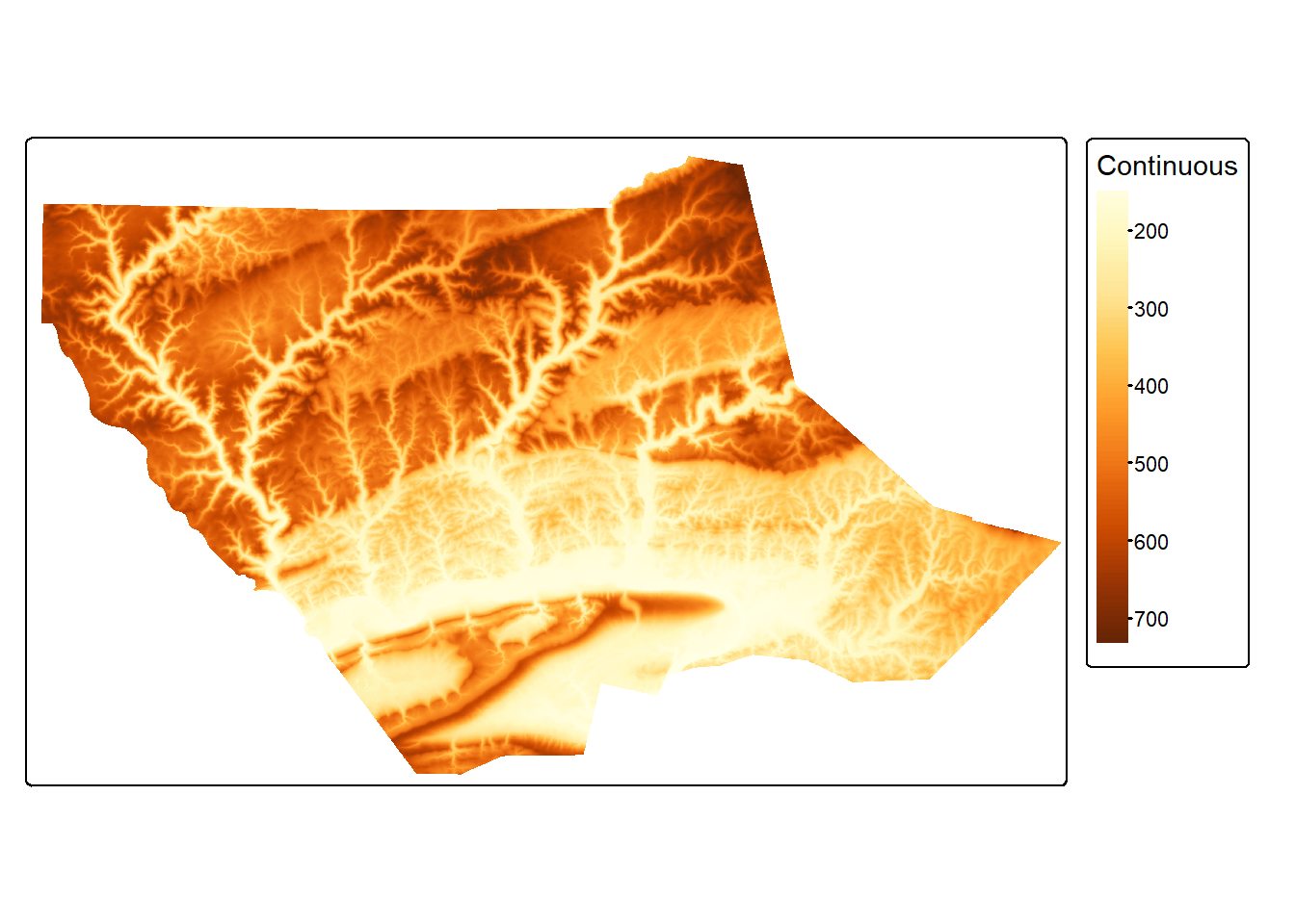
tm_shape(dem)+
tm_raster(col.scale= tm_scale_continuous(values = "-brewer.greys"),
col.legend = tm_legend("Continuous"))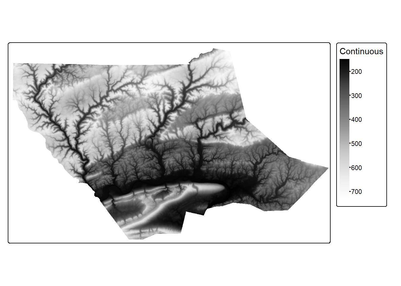
23.4.2.2 Categorical Raster Data
Categorical data can be visualized using different colors or symbols associated with each type. For raster data, colors make the most sense. However, different symbols can be useful for point or line vector features. For the land cover raster grid below, we are using color. To use an unordered set of colors, we implement tm_scale_categorical().
Using the default colors will likely not be optimal. As demonstrated in the second example, we can specify the colors to use inside the tm_scale_categorical() function using the values parameter and update the class names using the labels parameter. Using names is much more meaningful in our example then using the raster cell codes. The colors and names are matched based on their position within the vector, so it is important that we know what numeric code maps to each class.
tm_shape(lc)+
tm_raster(col.scale = tm_scale_categorical(),
col.legend = tm_legend("Land Cover"))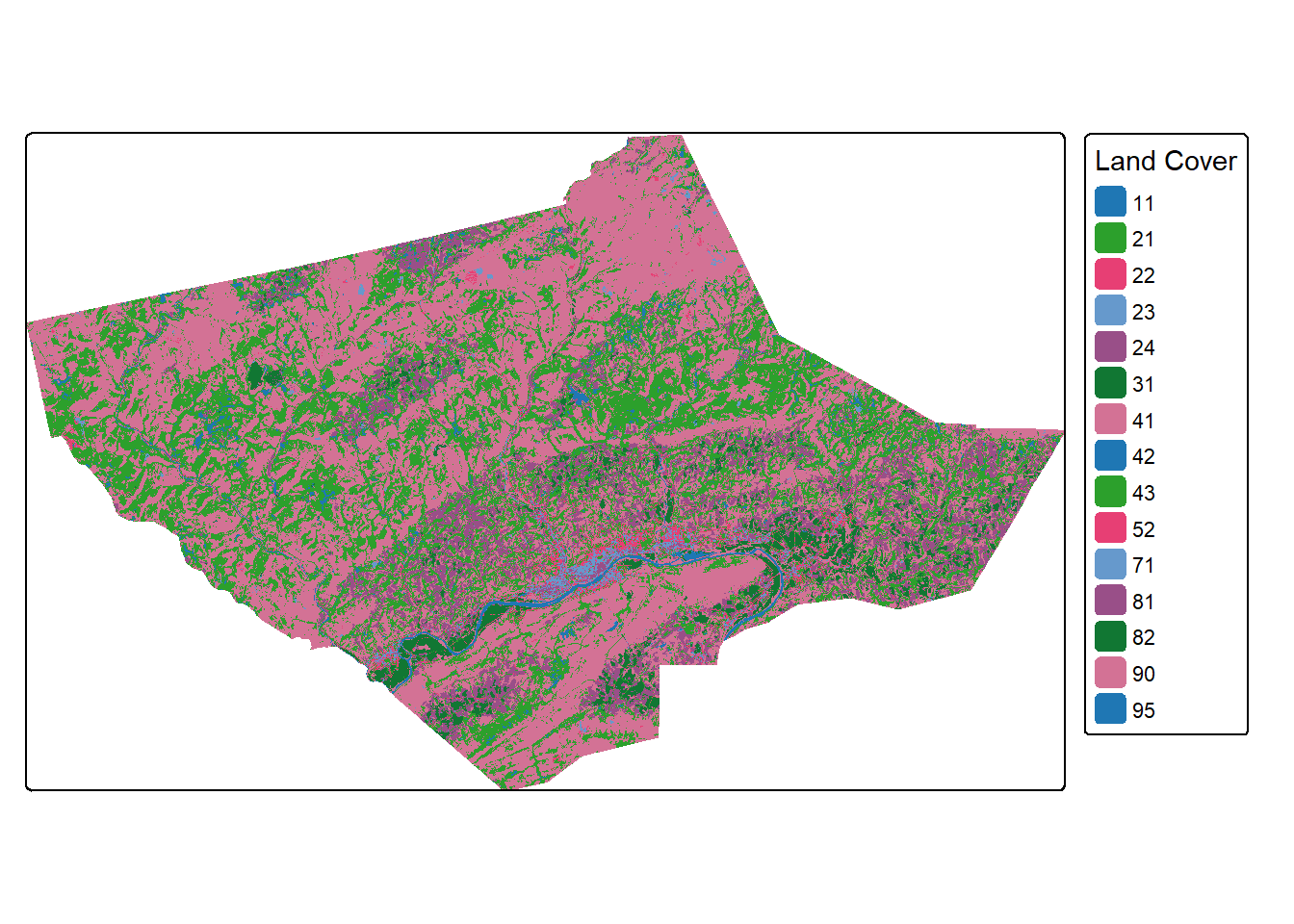
tm_shape(lc)+
tm_raster(col.scale = tm_scale_categorical(labels = c("Open Water",
"Developed Open",
"Developed Low Int.",
"Developed Med. Int.",
"Developed High Int.",
"Barren",
"Deciduous Forest",
"Evergreen Forest",
"Mixed Forest",
"shrub/Scrub",
"Grassland/Herbaceous",
"Pasture/Hay",
"Cultivated Crop",
"Woody Wetland",
"Emergent Wetland"),
values = c("deepskyblue",
"brown1",
"brown2",
"brown3",
"brown4",
"darkgrey",
"darkolivegreen",
"darkolivegreen1",
"darkseagreen1",
"cornsilk2",
"khaki2",
"goldenrod3",
"darkorange",
"darkorchid1",
"darkorchid4")),
col.legend = tm_legend("Land Cover"))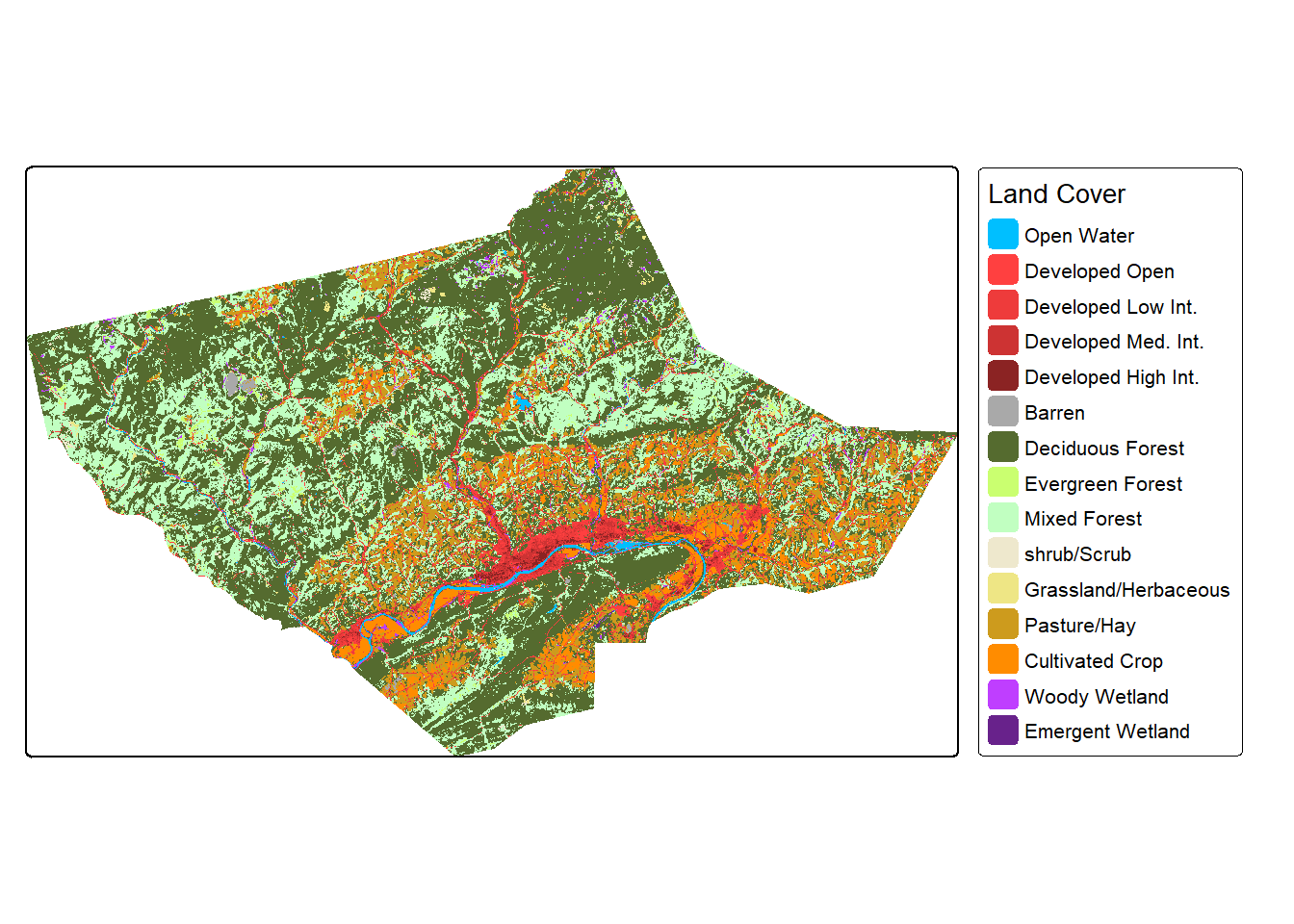
23.5 Additional Components
Now that we have explored how to include base map and operational layers and customize the associated symbology, legends, and labels, we will move on to discuss map elements or surrounds and map text.
23.5.1 Map Elements
Table 23.3 describes the functions used to add different map surrounds or elements while the first block of code demonstrates adding a scale bar with tm_scalebar(), a north arrow, or indicator of orientation, with tm_compass(), and a main title with tm_title(). Later in the module, we demonstrate the use of tm_graticules() and tm_credits(). Similar to ggplot2, it is also possible to specify the position of map elements.
| Function | Description |
|---|---|
| tm_compass() | Map orientation |
| tm_credits() | Data credit text |
| tm_graticules() | Lat and long grid, labels, and/or markings |
| tm_legend() | Map legend |
| tm_logo() | Logo graphic |
| tm_minimap() | Inset map |
| tm_scalebar() | Map scale |
| tm_title() | Main title |
tm_shape(osm_map)+
tm_rgb()+
tm_shape(states) +
tm_borders(col="red", lwd=2)+
tm_compass(position = c("left", "bottom"))+
tm_scalebar(position = c("left", "bottom"))+
tm_title("States")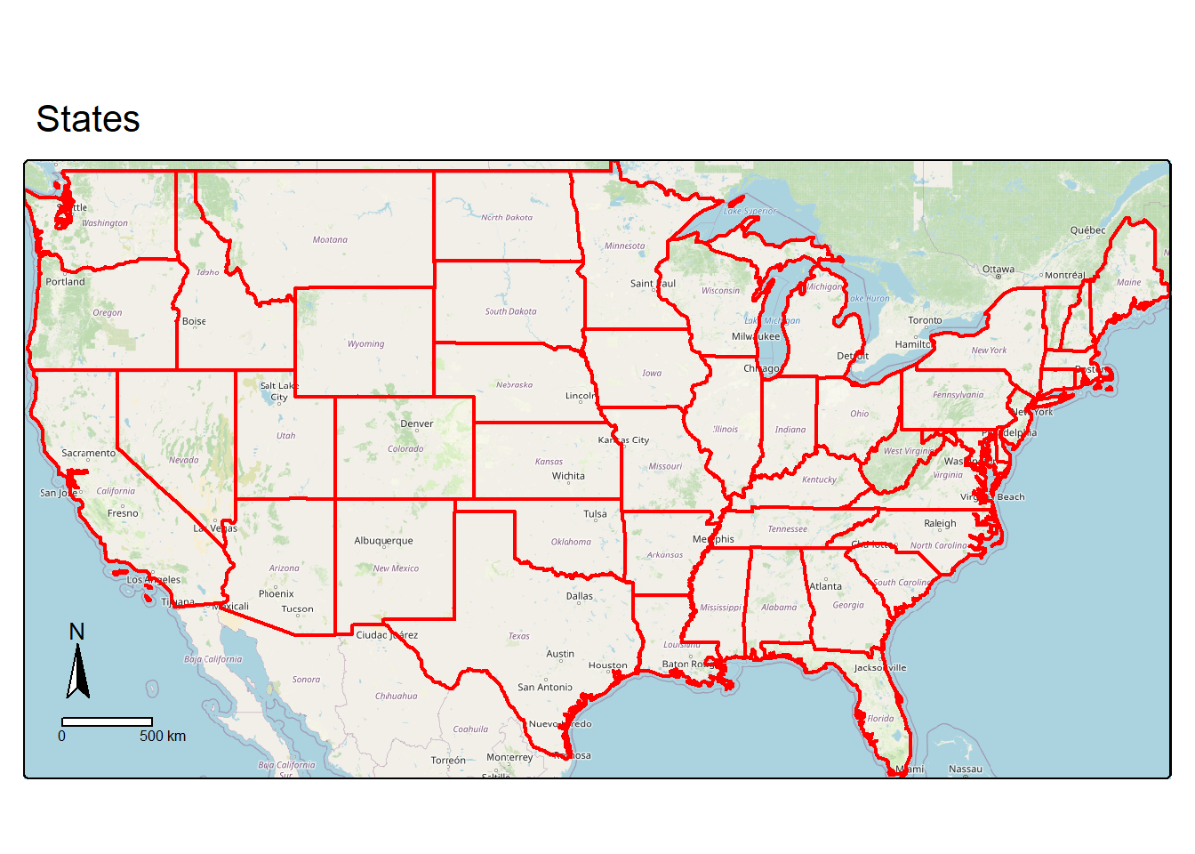
23.5.2 Labels
tm_text() allows for associating labels or text with individual features within operational layers. The label can be a constant for each object or reference an attribute. In our example, we label each state with its abbreviation, which is stored in the “STATE_ABBR” column. We also vary the size of the label relative to the state land area by providing a size argument.
In the second example, we further refine the map by using fill color to visualize state population density. Specifically, we make use of seven bins and a quantile classification method. In the final example, we use un-ordered colors to differentiate the different sub-regions. We specifically make use of the Brewer Set 3 ("brewer.set3") color ramp via the col4all package.
tm_shape(states) +
  tm_polygons(fill="gray")+
  tm_compass(position = c("left", "bottom"))+
  tm_scalebar(position = c("left", "bottom"))+
  tm_title("States")+
  tm_text("STATE_ABBR",
          size="AREA")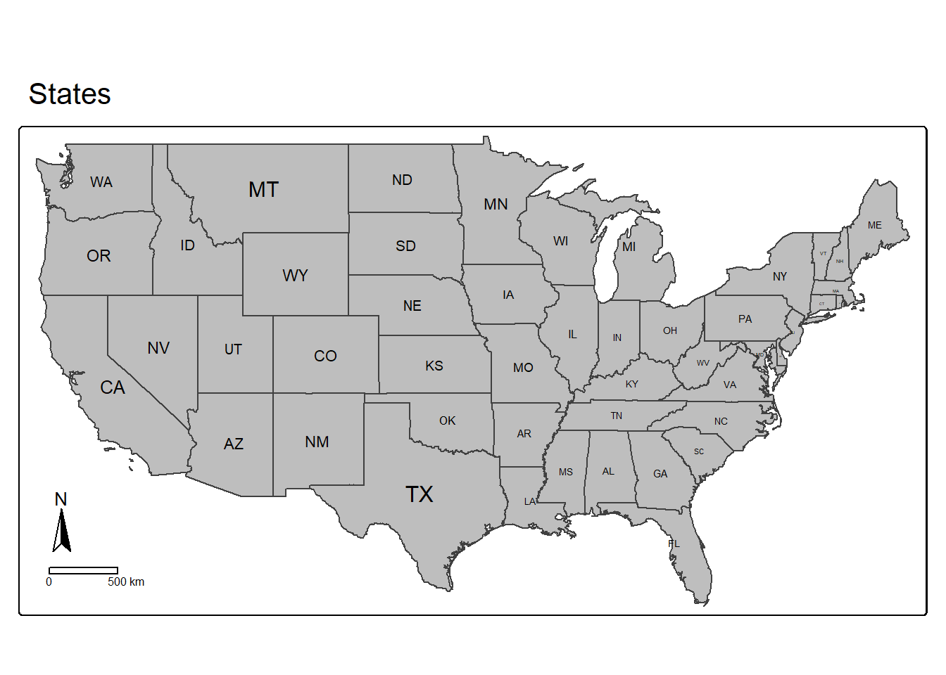
tm_shape(states) +
  tm_polygons(fill="POP05_SQMI",
              fill.scale=tm_scale_intervals(n=7,
                                            style="quantile",
                                            values="brewer.yl_or_rd"   ),
              fill.legend= tm_legend(outside=TRUE,
                                     title="People/Sq. Mi."))+
  tm_compass(position=c(.85, .3))+
  tm_scalebar(position=c(.05,.15))+
  tm_title("Population Density",
           size = 1)+
  tm_text("STATE_ABBR",
          size="AREA")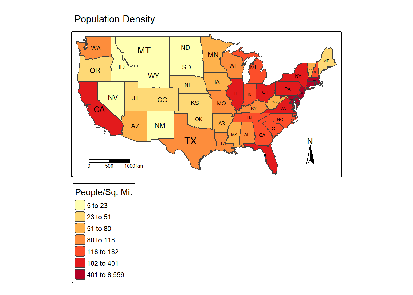
tm_shape(states) +
  tm_polygons(fill="SUB_REGION",
              fill.scale= tm_scale_categorical(n=9,
                                               values = "brewer.set3"),
              fill.legend = tm_legend(title="Sub-Region"))+
  tm_compass(position = c("left", "bottom"))+
  tm_scalebar(position = c("left", "bottom"))+
  tm_title("Sub-Regions",
           size = 1.5)+
  tm_text("STATE_ABBR", size="AREA")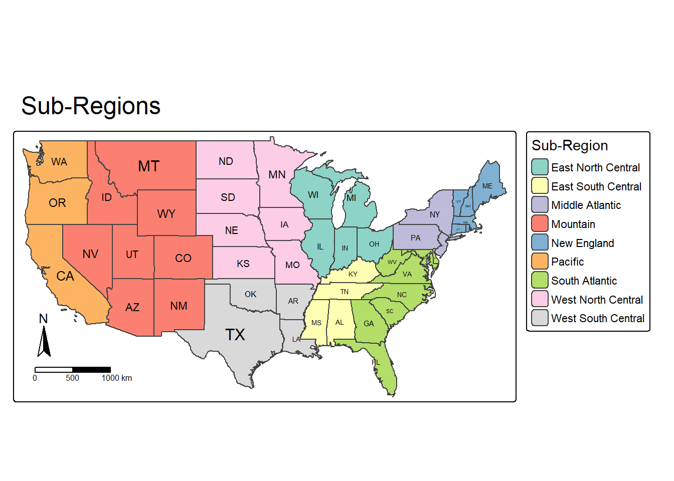
23.6 Examples
23.6.1 Vector Example
We now pull what we have learned so far together to make a final layout with multiple vector layers. The states are differentiated by sub-region using a categorical color ramp while the Amtrak lines are drawn in black. The size of the points representing cities are scaled relative to the city’s population. We also add a north arrow, scale bar, and main title.
You may be interested in using a different projection. The map, by default, takes on the projection of the first layer referenced in the first call to tm_shape(). It is also possible to explicitly define the projection using tm_crs(). In the first code block, the map is using the WGS84 Web Mercator projection since this is the projection of the layers being used. To generate the map using a different projection, we can first re-project all of the layers to the desired projection using st_transform() from sf then recreate the map with these new layers. This is demonstrated in the second code block where the NAD83 Lambert Conformal Conic projection is used.
tm_shape(states) +
  tm_polygons(fill="SUB_REGION",
              fill.scale= tm_scale_categorical(n=9,
                                               values = "brewer.set3"),
              fill.legend = tm_legend(title="Sub-Region"))+
  tm_shape(tracks)+
  tm_lines(col= "black",
           lwd= 2)+
  tm_shape(cities)+
  tm_bubbles(size="pop2007b",
             size.legend = tm_legend(title="Population of City",
                                     orientation="landscape"))+
  tm_compass(position = c(.9, .3))+
  tm_scalebar(position = c(.05, .15))+
  tm_title("Amtrak Map",
            size = 1)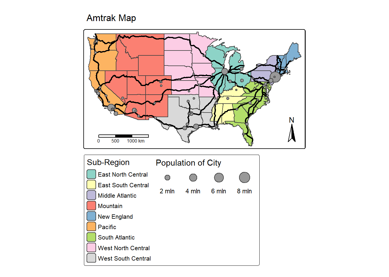
cities2 <- st_transform(cities,
                        crs="+proj=lcc +lat_1=20 +lat_2=60 +lat_0=40 +lon_0=-96 +x_0=0 +y_0=0 +datum=NAD83 +units=m +no_defs")
states2 <- st_transform(states,
                        crs="+proj=lcc +lat_1=20 +lat_2=60 +lat_0=40 +lon_0=-96 +x_0=0 +y_0=0 +datum=NAD83 +units=m +no_defs")
tracks2 <- st_transform(tracks,
                        crs="+proj=lcc +lat_1=20 +lat_2=60 +lat_0=40 +lon_0=-96 +x_0=0 +y_0=0 +datum=NAD83 +units=m +no_defs")
crs(cities2)

tm_shape(states2) +
  tm_polygons(fill="SUB_REGION",
              fill.scale= tm_scale_categorical(n=9,
                                               values = "brewer.set3"),
              fill.legend = tm_legend(title="Sub-Region"))+
  tm_shape(tracks2)+
  tm_lines(col= "black",
           lwd= 2)+
  tm_shape(cities2)+
  tm_bubbles(size="pop2007b",
             size.legend = tm_legend(title="Population of City",
                                     orientation="landscape"))+
  tm_compass(position = c(.9, .3))+
  tm_scalebar(position = c(.05, .15))+
  tm_title("Amtrak Map",
            size = 1)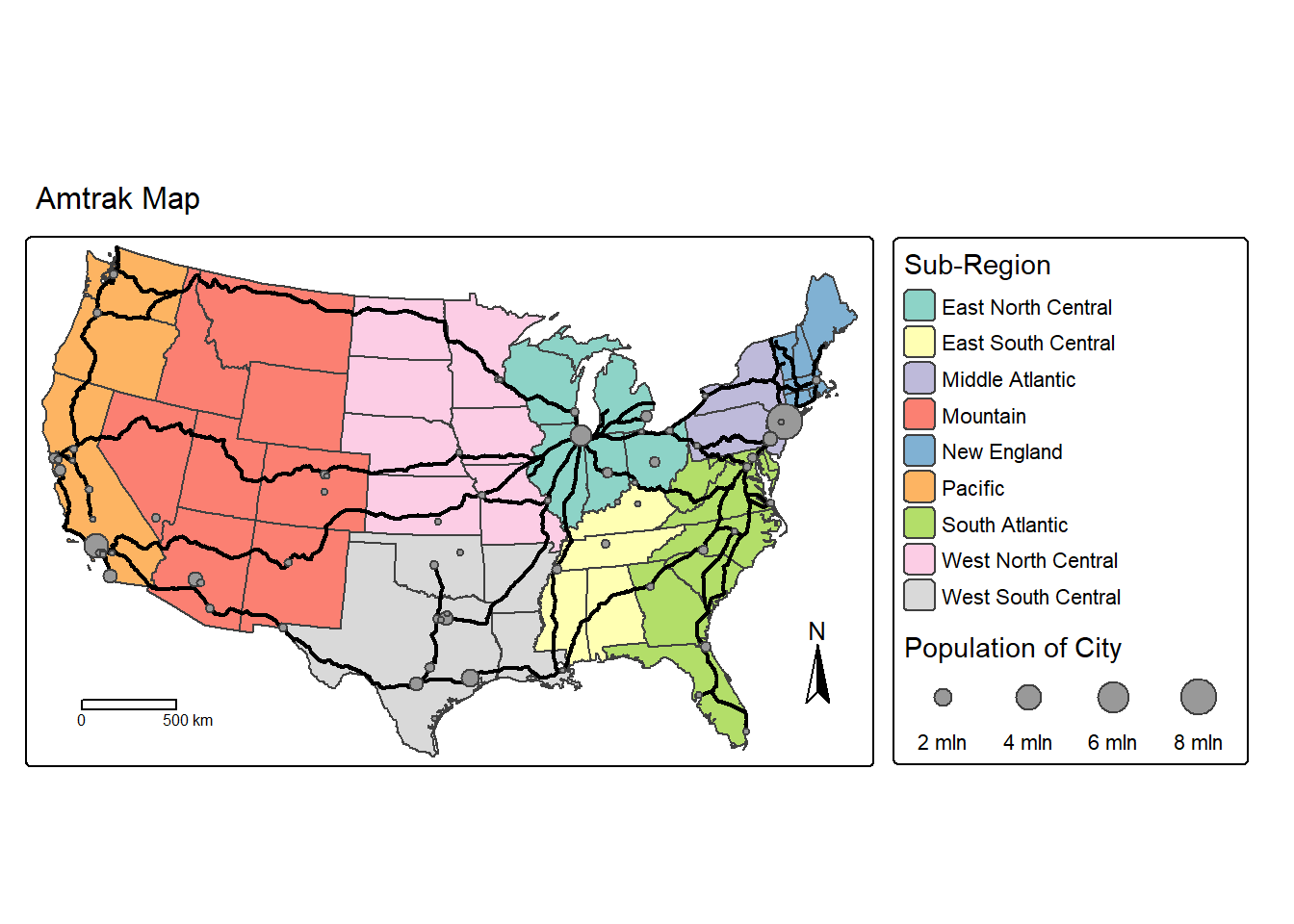
23.6.2 Raster Example
In this second example focused on raster data, we create a map showing the topography and elevation of Tucker County, West Virginia, USA. The hillshade is add using a continuous color ramp followed by the elevation surface, which also uses a continuous color ramp. We add a 50% transparency to the elevation data using col_alpha to allow for the hillshade to be visible under the other raster layer, which allows for incorporating both the elevation color ramp and the terrain texture. The result is a hypsometrically tinted hillshade. We also add a compass, scale bar, and main title. Within tm_legend() for the hillshade data, we set show=FALSE so that no legend is included for this layer. For the elevation layer, we orient its legend to landscape and define the associated title.
tm_shape(tucker_hs)+
  tm_raster(col.scale = tm_scale_continuous(values="-brewer.greys"),
            col.legend = tm_legend(show=FALSE))+
  tm_shape(tucker_dem)+
  tm_raster(col.scale = tm_scale_continuous(values="-brewer.oranges"),
            col.legend = tm_legend(orientation= "landscape",
                                   title="Elevation"),
            col_alpha=.5)+
  tm_compass(type="arrow", position=c(.01, .2))+
  tm_scalebar(position = c(0.06, .14),
               text.size=.8)+
  tm_title("Tucker County Elevation",
            size = 1.5,
            position = c(.45, .98))+
  tm_credits("Data from NED",
             position= c(.84, .05))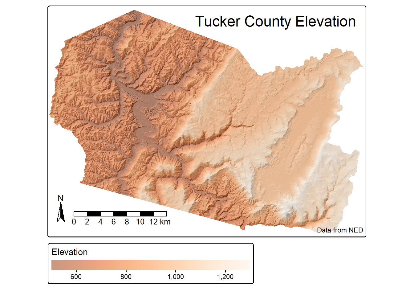
23.7 Multi-Map Layouts
23.7.1 Using tm_facets()
It is possible to make layouts with multiple maps. Similar to ggplot2, we can facet on a variable. This is accomplished using tm_facets(). In our example, we facet on the “SUB_REGION” variable to obtain a separate map for each of the nine sub-regions of the United States.
tm_shape(states) +
  tm_polygons(fill="tan")+
  tm_title("Sub-Regions",
           size = 1.5)+
  tm_text("STATE_ABBR", size="AREA")+
  tm_facets(by="SUB_REGION", nrow=3)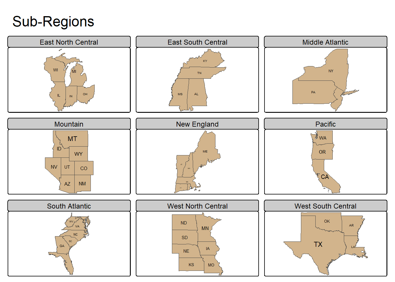
23.7.2 Using tmap_arrange()
It is also possible to create a layout with multiple maps that are not faceted using a variable. This is accomplished using tmap_arrange(). In the example below, we display the US states using different map projections by first using st_transform() to change the projection of the input layer. We then generate all four tmap objects and save them to variables. Lastly, they are merged into a single layout using tmap_arrange(). We have also used tm_title() to differentiate the projections and added graticules, or latitude and longitude grids, using tm_graticules(), which helps us understand how the curved surface of the earth is being flattened.
If a categorical color ramp does not provide enough unique colors to differentiate the number of included classes, value.repeat can be used to allow for the same color to be used multiple times.
states_geog <- states
states_albers <- st_transform(states_geog, crs="+proj=aea +lat_1=20 +lat_2=60 +lat_0=40 +lon_0=-96 +x_0=0 +y_0=0 +ellps=GRS80 +datum=NAD83 +units=m +no_defs")
states_lambert <- st_transform(states_geog, crs="+proj=lcc +lat_1=20 +lat_2=60 +lat_0=40 +lon_0=-96 +x_0=0 +y_0=0 +datum=NAD83 +units=m +no_defs")
states_mercator <- st_transform(states_geog, crs="+proj=merc +lon_0=0 +k=1 +x_0=0 +y_0=0 +datum=WGS84 +units=m +no_defs")

geog_map <- tm_shape(states_geog)+
  tm_polygons(fill="MAP_COLORS",
              fill.scale = tm_scale_categorical(values="met.degas",
                                                values.repeat=TRUE))+
  tm_title("Geographic")+
  tm_graticules()

albers_map <- tm_shape(states_mercator)+
  tm_polygons(fill="MAP_COLORS",
              fill.scale = tm_scale_categorical(values="met.degas",
                                                values.repeat=TRUE))+
  tm_title("Mercator")+
  tm_graticules()


lambert_map <- tm_shape(states_lambert)+
  tm_polygons(fill="MAP_COLORS",
              fill.scale = tm_scale_categorical(values="met.degas",
                                                values.repeat=TRUE))+
  tm_title("Lambert Conformal Conic")+
  tm_graticules()


mercator_map <- tm_shape(states_albers)+
  tm_polygons(fill="MAP_COLORS",
              fill.scale = tm_scale_categorical(values="met.degas",
                                                values.repeat=TRUE))+
  tm_title("Albers Equal Area")+
  tm_graticules()


tmap_arrange(geog_map,
             mercator_map,
             albers_map,
             lambert_map,
             nrow=2)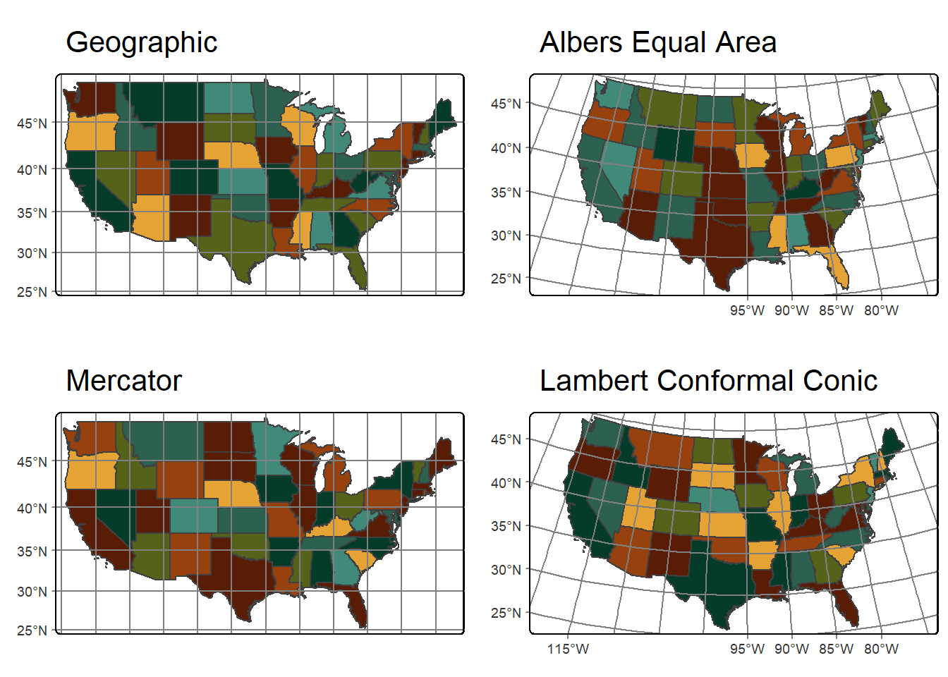
23.8 Plots vs. Views
We have primarily demonstrated the use of tmap to generate static maps. However, it can also be used to generate interactive maps. This requires changing the mode from “plot” to “view” using the tmap_mode() function. We generate the same map but using the two different modes below. For the interactive map, we do not define a base map; instead, we allow tmap to use a default set of base maps and allow users to switch between three options. Interactive mode makes use of Leaflet. We will explore the leaflet package for interactive map generation in Chapter 25.
Once you have created an interactive map, it is recommend to revert the mode back to “plot”.
tmap_mode("plot")
us_bb <- st_bbox(states)
osm_map <- read_osm(us_bb)
tm_shape(states)+
  tm_borders()+
  tm_shape(osm_map)+
  tm_rgb()+
  tm_shape(states) +
  tm_borders(col="red", lwd=2)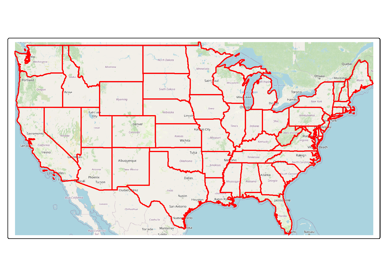
tmap_mode("view")
tm_shape(states)+
  tm_borders()+
  tm_shape(states) +
tm_borders(col="red", lwd=2)tmap_mode("plot") 23.9 Saving Maps
Lastly, we demonstrate saving a map object. First, we regenerate the Amtrak map and save it to a variable. tmap_save() allows saving a map to a vector graphic (e.g., SVG), raster graphic (e.g., TIF, JPEG, or PNG), or a PDF. All three options are demonstrated below. You can also specify the height and width of the output, associated units, and the resolution or DPI.
outFld <- "gslrData/chpt23/ouput/"

amtrak_map <- tm_shape(states2) +
  tm_polygons(fill="SUB_REGION",
              fill.scale= tm_scale_categorical(n=9,
                                               values = "brewer.set3"),
              fill.legend = tm_legend(title="Sub-Region"))+
  tm_shape(tracks2)+
  tm_lines(col= "black",
           lwd= 2)+
  tm_shape(cities2)+
  tm_bubbles(size="pop2007b",
             size.legend = tm_legend(title="Population of City",
                                     orientation="landscape"))+
  tm_compass(position = c(.9, .3))+
  tm_scalebar(position = c(.05, .15))+
  tm_title("Amtrak Map",
size = 1)tmap_save(amtrak_map,
filename=str_glue("{outFld}amtrak.svg"),
height=8.5,
width=11,
units="in",
dpi=300)
tmap_save(amtrak_map,
filename=str_glue("{outFld}amtrak.png"),
height=8.5,
width=11,
units="in",
dpi=300)
tmap_save(amtrak_map,
filename=str_glue("{outFld}amtrak.pdf"),
height=8.5,
width=11,
units="in",
dpi=300)If raster layers or base maps are included, it generally makes more sense to save the output as a raster graphic; however, raster graphics have more limited editing capability than vector graphics. Below, we demonstrate saving the Tucker County, West Virginia, USA terrain/elevation map to both PNG and PDF format.
tucker_map <- tm_shape(tucker_hs)+
  tm_raster(col.scale = tm_scale_continuous(values="-brewer.greys"),
            col.legend = tm_legend(show=FALSE))+
  tm_shape(tucker_dem)+
  tm_raster(col.scale = tm_scale_continuous(values="-brewer.oranges"),
            col.legend = tm_legend(orientation= "landscape",
                                   title="Elevation"),
            col_alpha=.5)+
  tm_compass(type="arrow", position=c(.01, .2))+
  tm_scalebar(position = c(0.06, .14),
               text.size=.8)+
  tm_title("Tucker County Elevation",
            size = 1.5,
            position = c(.45, .98))+
  tm_credits("Data from NED",
position= c(.84, .05))It is also possible to save an interactive map, created with the mode set to “view”, to an HTML webpage. This is demonstrated below. Again, we explore this in more detail in Chapter 25 using the leaflet package, which allows for a greater degree of customization. However, tmap can be useful for generating a simple interactive map.
tmap_mode("view")
interactive <-
  tm_basemap("OpenStreetMap")+
  tm_shape(states)+
  tm_borders(col="red",
             lwd=2)

tmap_save(interactive,
          str_glue("{outFld}interactive.html"))
tmap_mode("plot")
23.10 Concluding Remarks
We find tmap to be especially useful for visualizing input data, intermediate output, or final output. In fact, it is used throughout this text for those purposes. However, it can also be used to create more polished map output for use in a publication or presentation. If the map is exported as a vector graphic, it can be further refined using a vector graphic editing software, such as Inkscape, which is freely available. In the next chapter, we further explore working with vector geospatial data using the sf package. We use tmap throughout that chapter to display our data and results. We return to map generation in Chapter 25 where we explore interactive web map generation with leaflet.
23.11 Questions
- Explain the difference between
tm_bubbles(),tm_dots(), andtm_markers()for point features. - Explain the difference between
tm_polygons(),tm_fill(), andtm_borders()for polygon features. - What aesthetic mappings are available when using
tm_lines()to show line vector data? - What aesthetic mappings are available when using
tm_bubbles()to show point features? - Explain the difference between
tm_scale_categorica(),tm_scale_discrete(), andtm_scale_intervals(). - Explain the difference between the equal interval and quantile data binning methods.
- What are graticules and what are their purpose in a map layout?
- Explain the difference between
tm_facets()andtmap_arrange().
23.12 Exercises
Generate the following maps using tmap.
Map 1: Indiana Voting Results Map
You have been provided a vector polygon layer of counties in Indiana (chpt23.gpkg/indiana) in the exercises folder for the chapter. Use tmap to map the 2012 presidential race results.
- The voting results are in the “winner12” column. Counties where the democratic candidate won should be shown in blue while republican wins should be displayed in red.
- Make sure to define the labels as “Democrat” and “Republican” and include a legend.
- Add a compass and scale bar.
- Add the following title: “Election Results”.
- Try to minimize overlap of map elements by adjusting positions and sizes.
- Cite the US Census.
Map 2: Indiana Median Income Map
You have been provided a vector polygon layer of counties in Indiana (chpt23.gpkg/indiana) in the exercises folder for the chapter. Use tmap to map the median income by county.
- The median income data are in the “med_income” column.
- Make sure to use a continuous color palette to visualize the data.
- Add a compass and scale bar.
- Add the following title: “Median Income”.
- Try to minimize overlap of map elements by adjusting positions and sizes.
- Cite the US Census.
Map 3: WV Population Data
The following data layers for West Virginia are provided in the exercise folder for the chapter. These data layers were obtained from the West Virginia GIS Technical Center.
- chpt23.gpkg/wv_counties: polygon county boundaries with associated attributes
- chpt23.gpkg/wv_towns: point features of town with associated attributes
- chpt23.gpkg/wv_interstates: line features of interstates in the state
- chpt23.gpkg/wv_rivers.shp: line features of major rivers in the state
Use tmap to map these West Virginia data layers with a focus on visualizing population data.
- All four layers (counties, interstates, rivers, towns) should be included.
- Use fill color to visualize the population of each county.The population in the year 2000 is provided in the “POP2000” field.
- Map the interstates as red lines with a width of 2.
- Map the rivers as blue lines with a width of 1.5.
- Use size of the point features to represent the population of the town. Population data are provided in the “POPULATION” field.
- Add a compass and scale bar.
- The legend for the county population should be titled “Population in 2000.” The title for the town legend should be “Population of Towns.”
- The layout should include the title” “WV Population Data.”
- Try to minimize overlap of map elements by adjusting positions and sizes.
Map 4: Great Valley Land Cover Map
Make a map of land cover for a subset of counties in the Great Valley in the eastern United States. The following layers have been provided in the exercise folder for the chapter.
- gvLC2.tif: raster grid of land cover from the 2011 National Land Cover Database (NLCD). The legend is available here.
- chpt23.gpkg/greatValleyCNTYs: polygon county boundaries for a subset of Great Valley
Use tmap to map these data layers with a focus on visualizing categorical land cover data.
- County boundaries should be displayed above the land cover with an outline and no fill color.
- Use a line width of 2 and a color of your choosing.
- Symbolize the raster as categorical data. Choose colors for each land cover category and use meaningful labels in the legend. Make sure the legend title is “Land Cover.”
- Add a compass and scale bar.
- Add a title: “Land Cover”.
- Add credits to cite the NLCD.
- Try to minimize overlap of map elements by adjusting positions and sizes.