| Graphical Parameter | Description | Discrete | Continuous |
|---|---|---|---|
| X | Position along x-axis | X | X |
| Y | Position along y-axis | X | X |
| Color | Symbol fill color or outline color | X | X |
| Shape | Symbol type or line type | X | |
| Size | Size of symbol or thickness of line | X |
20 Graphing with ggplot2 (Part I)
20.1 Topics Covered
- ggplot2 philosophy and the Grammar of Graphics
- Aesthetic mappings and assigning variables to graphical parameters
- Using geoms
- Univariate graphs (histograms, kernel density plots, and box plots)
- Comparing groups (grouped box plots, violin plots, and alternatives)
- Multivariate graphs (scatterplots and line graphs)
- Combating overplotting
- Using different coordinate systems
20.2 Introduction
Multiple packages are available to produce graphs or data visualizations in R. Graphing functionality is even made available through base R. The grids package provides a low-level graphics system that other packages have used to expand the graphing capabilities of R. These packages include lattice and ggplot2. In this text, we use ggplot2, which is based on the Grammar of Graphics by Leland Wilkinson. This philosophy suggests breaking graphs up into semantic components such as scales and layers. In fact, the package name means “Grammar of Graphics Plots 2.” Practically, this translates to mapping constants, such as specific colors, sizes, or symbols, or variables, such as your data values, to graphical parameters, such as position along the x-axis or y-axis, size or shape of point symbols, width of lines, and color of point symbols or lines. This is the concept of aesthetic mappings.
ggplot2, which is part of the tidyverse, is our preferred method for making graphs. We have found it to be very intuitive, powerful, and adaptable to a wide variety of needs. Once a graph is produced, you can easily export it as a vector graphic for editing outside of R. In this first chapter on ggplot2 we focus on the basics of the package and how to define aesthetic mappings. We also explore a variety of different types of graphs. In the next chapter, we explore methods to improve and refine graphs. So, for now, don’t worry about polishing up the presented graphs. Instead, focus on understanding aesthetic mappings and the basic syntax of ggplot2.
20.2.1 Aesthetic Mappings
A variety of graphical parameters can be used to represent data including position relative to an axis, color, shape or different symbols, and size. These are summarized in Table 20.1. The optimal choice depends on the type of graph being produced, the type of relationship you wish to represent, and the type of data being presented. For example, nominal or categorical data may be represented using unordered colors or different point or line symbols. A numeric or continuous variable could be visualized with ordered colors or symbol sizes.
ggplot2 provides a variety of geom_() functions for generating different types of graphs. Table 20.2 provides some example geoms, the types of data they are meant to visualize, and the aesthetic mappings available. Some geoms have more specific mappings available. This is just a generalization. In this chapter, we explore a wide variety of different graph types using the provided geoms with a specific focus on defining mappings.
| geom | Variables | X | Y | Color | Fill | Alpha | Size/Line Width | Shape/Line Type |
|---|---|---|---|---|---|---|---|---|
geom_area() |
1 continuous |
X |
X |
X |
X |
X |
X |
X |
geom_density() |
1 continuous |
X |
X |
X |
X |
X |
X |
X |
geom_dotplot() |
1 continuous |
X |
X |
X |
X |
X |
||
geom_frequency() |
1 continuous |
X |
X |
X |
X |
X |
||
geom_histogram() |
1 continuous |
X |
X |
X |
X |
X |
X |
X |
geom_qq() |
1 continuous |
X |
X |
X |
X |
X |
X |
X |
geom_bar() |
1 discrete |
X |
X |
X |
X |
X |
X |
|
geom_point() |
2 continuous |
X |
X |
X |
X |
X |
X |
X |
geom_quantile() |
2 continuous |
X |
X |
X |
X |
X |
X |
|
geom_rug() |
2 continuous |
X |
X |
X |
X |
X |
X |
|
geom_smooth() |
2 continuous |
X |
X |
X |
X |
X |
X |
|
geom_col() |
1 discrete, 1 continuous |
X |
X |
X |
X |
X |
X |
X |
geom_boxplot() |
1 discrete, 1 continuous |
X |
X |
X |
X |
X |
X |
X |
geom_dotplot() |
1 discrete, 1 continuous |
X |
X |
X |
X |
X |
||
geom_violin() |
1 discrete, 1 continuous |
X |
X |
X |
X |
X |
X |
X |
geom_bin2d() |
Continuous bivariate distribution |
X |
X |
X |
X |
X |
X |
X |
geom_density2d() |
Continuous bivariate distribution |
X |
X |
X |
X |
X |
X |
|
geom_hex() |
Continuous bivariate distribution |
X |
X |
X |
X |
X |
X |
|
geom_area() |
Continuous function |
X |
X |
X |
X |
X |
X |
X |
geom_line() |
Continuous function |
X |
X |
X |
X |
X |
X |
|
geom_step() |
Continuous function |
X |
X |
X |
X |
X |
X |
Before starting, we load in the tidyverse, which includes ggplot2. We will make use of the us_county_data.csv data used in prior modules. It is read in with readr, and all character fields are converted to the factor data type.
20.3 Univariate Graphs
Univariate graphs involve visualizing a single variable and include histograms, kernel density plots, and box plots.
20.3.1 Histograms
A histogram plots the count or number of data points in each defined data range or bin. The x-axis represents the data values while the y-axis represents the count of observations occurring within the range of values encompassed by the bin. Our goal with the first graph is to inspect the distribution of percent forest cover by county. Since this is the first example of a ggplot2 graph, we explain the syntax in detail. All ggplot2 graphs start with the ggplot() function. Within this function we specify the data frame/tibble being referenced and the aesthetic mappings using the aes() function. Here, we only need to define what is mapped to the x-axis. Next, we must define the geometry desired. geom_histogram() is used to create histograms. The binwidth argument specifies the range of values to aggregate into each bin for counting. We use five, so each bin contains a range of 5%. Note that multiple lines of code are associated using +. This is a key component of how ggplot2 works. Also, note that field names do not need to be placed in quotes.
Multiple lines are connected when building a ggplot2 graph using +. The forward-pipe operator is not used.
cntyD |> ggplot(aes(x=per_for))+
  geom_histogram(binwidth=5)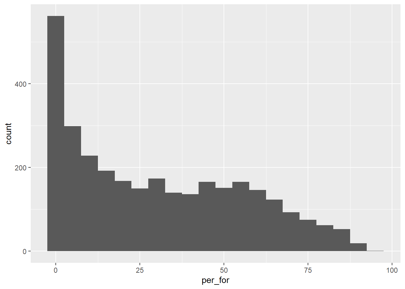
There are other aesthetics available when using geom_histogram() that data or constants can be mapped to. In the next example, we are defining the fill color and outline color by assigning constant color values to these aesthetics. We have also decreased the width of each bin.
cntyD |> ggplot(aes(x=per_for))+
  geom_histogram(binwidth=2,
                 fill="darkgreen",
                 color="darkgray")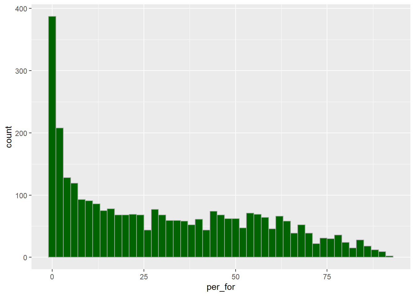
20.3.2 Kernel Density Plots
Another means to represent the distribution of a single variable is a kernel density plot, in which a kernel density function is used to represent a generalized or smoothed version of the distribution of a variable. The syntax is very similar to that for the histograms created above. Percent forest cover is assigned to the x-axis position. The y-axis represents the density, as specified using after_stat(density). We are now using geom_density() as opposed to geom_histogram(). Lastly, we provide a fill argument to make the density area green, a color argument to make the outline black, and increase the outline width using the size argument. In the following graph, we have removed the fill color using fill=NA.
The after_stat() function is used to make use of statistical output associated with a variable for use inside of a graph. For example, it can be used to obtain counts, densities, or proportions.
cntyD |> ggplot(aes(x=per_for,
                    y=after_stat(density)))+
  geom_density(fill="darkgreen",
               color="black",
               size=1.5)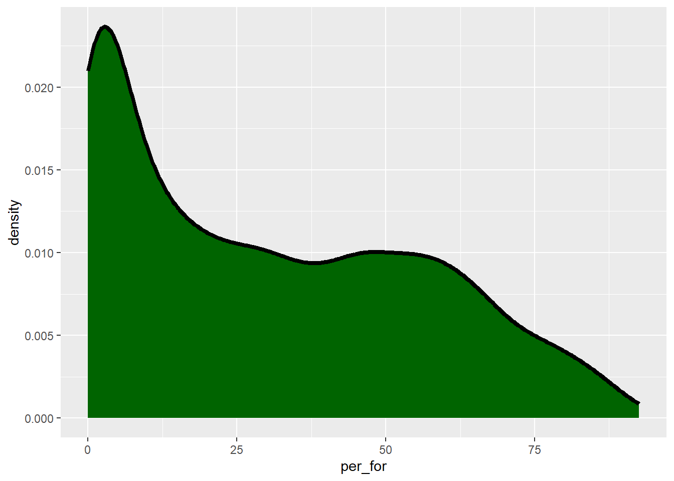
cntyD |> ggplot(aes(x=per_for,
                    y=after_stat(density)))+
  geom_density(fill=NA,
               color="darkgreen",
               size=1.5)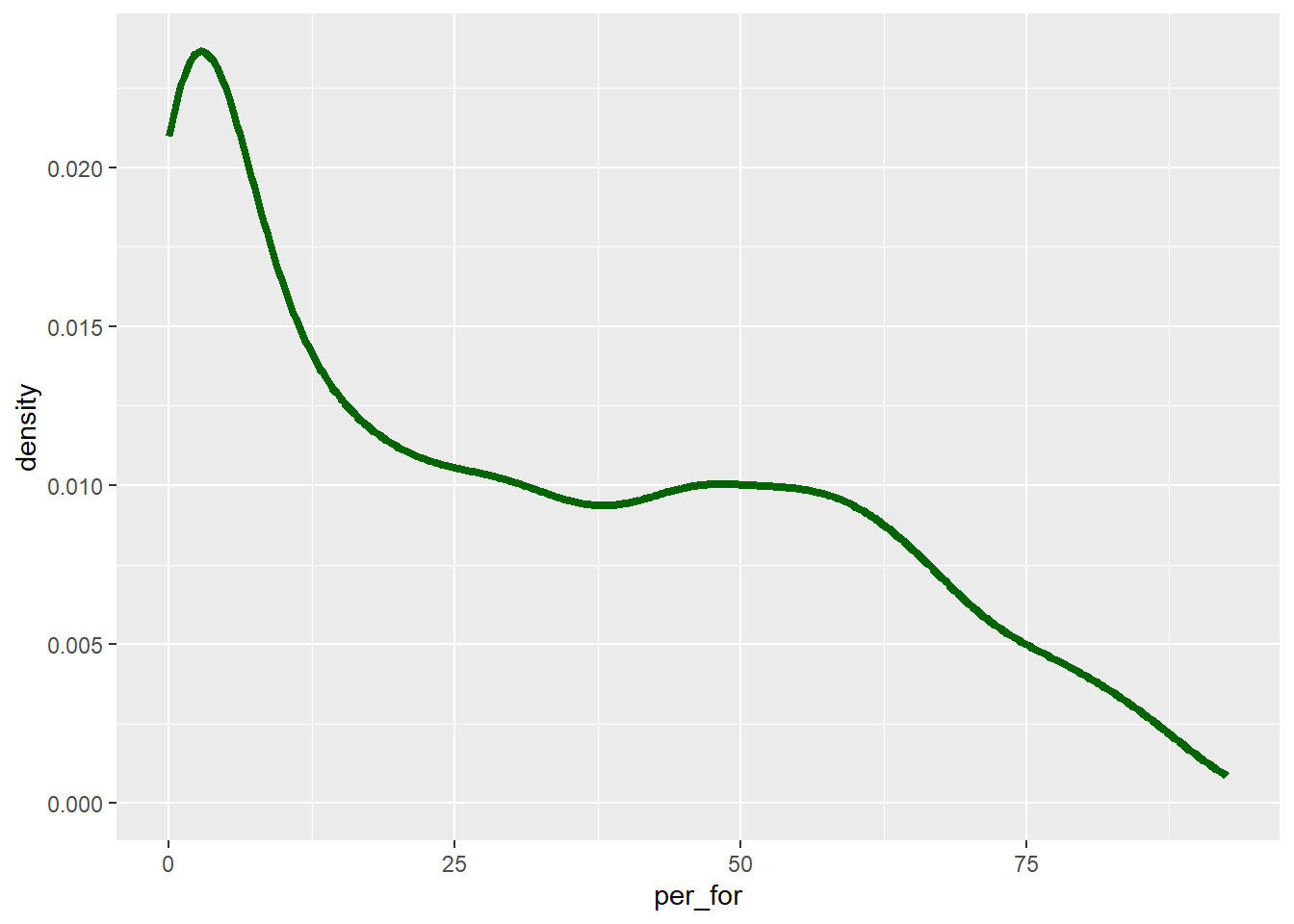
The “smoothness” of the kernel density function is controlled with the adjust parameter. Lower values result in more localized patterns while larger values result in a more generalized or smooth trend, as demonstrated in the next two graphs.
cntyD |> ggplot(aes(x=per_for,
                    y=after_stat(density)))+
  geom_density(fill="darkgreen",
               color="black",
               size=1,
               adjust=.25)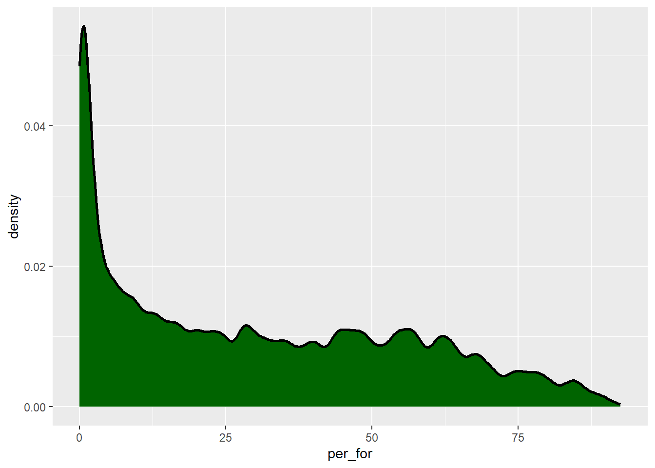
cntyD |> ggplot(aes(x=per_for,
                    y=after_stat(density)))+
  geom_density(fill="darkgreen",
               color="black",
               size=1,
               adjust=5)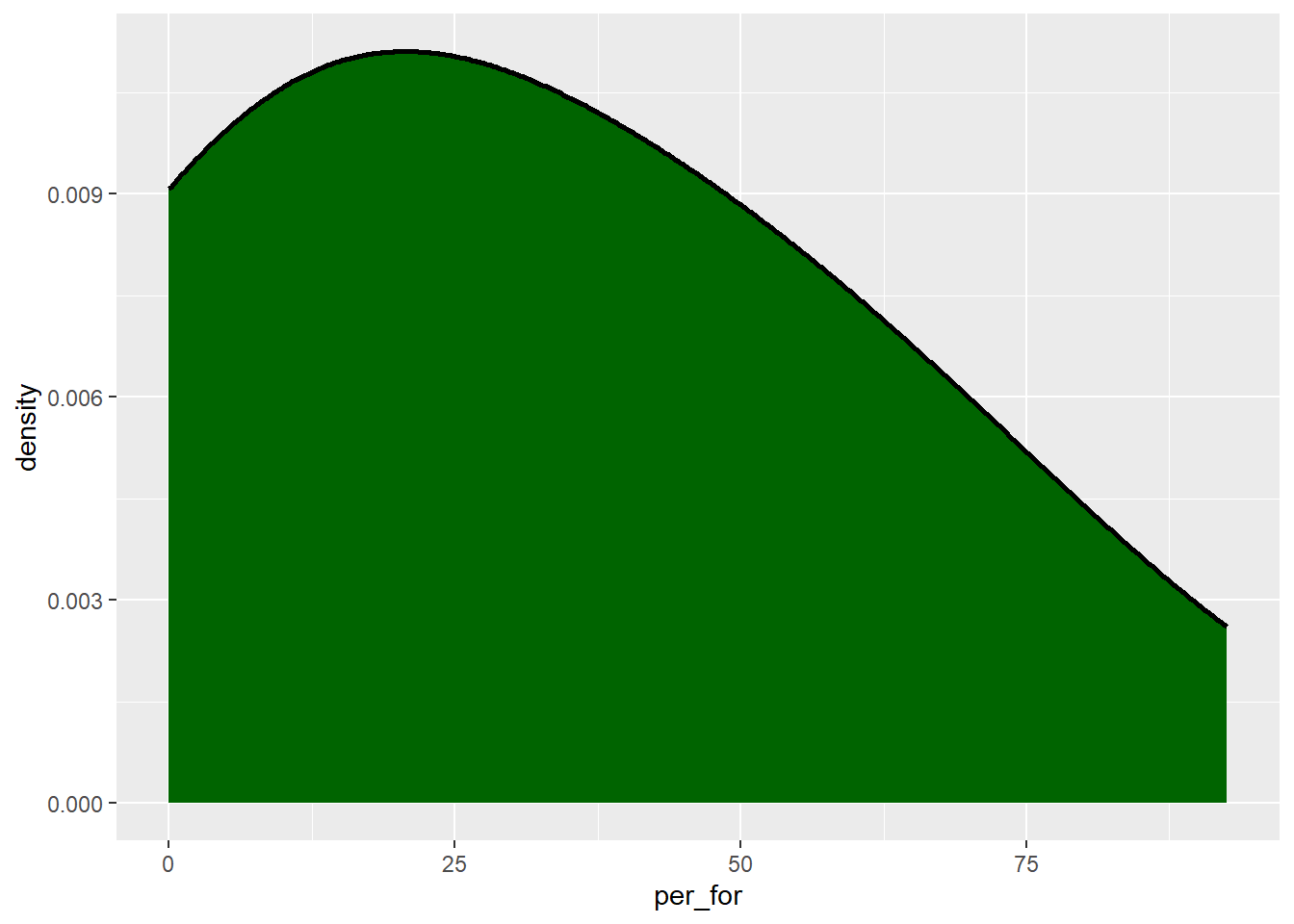
20.3.3 Multiple geoms
When two geoms share the same x- and y-axes, they can be used within the same graph space. This is demonstrated below using geom_histogram() and geom_density(). Since geom_histogram() maps the count to the y-axis, we have adjusted the y-axis for the kernel density plot to use count as opposed to density. Specifically we use after_stat(count) as opposed to after_stat(density).
Aesthetic mappings can be defined within ggplot() or within the geom. Regardless, if data are mapped to an aesthetic then this must be defined within aes(). If a constant is mapped to an aesthetic, this should not be defined inside of aes(). In the combined histogram and kernel density plot example, the histogram takes on the mappings defined inside of ggplot(). We also define the y-axis mapping for the kernel density plot within the geom_density() call. Aesthetics defined inside of the geom calls supersede those defined inside of ggplot().
cntyD |> ggplot(aes(x=per_for))+
  geom_histogram()+
  geom_density(fill="darkgreen",
               color="black",
               adjust=.1,
               size=1,
               aes(y=after_stat(count)))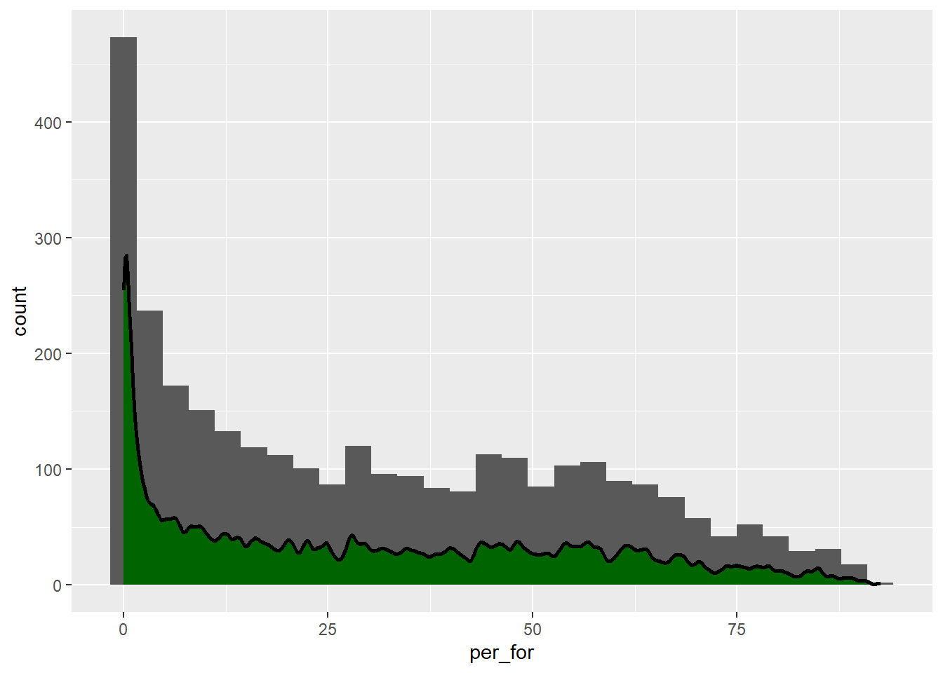
20.3.4 Box Plots
Box plots, as conceptualized in the Figure 20.1 below, show the distribution of a variable using the minimum, maximum, median, and interquartile range (IQR). The IQR is defined as the range of values between the 1st and 3rd quartile. Quartiles break the data range into quarters, so 25% of the data fall below the 1st quartile while 25% fall above the 3rd quartile. As a result, 50% of the data fall within the IQR. The median is equivalent to the 2nd quartile.
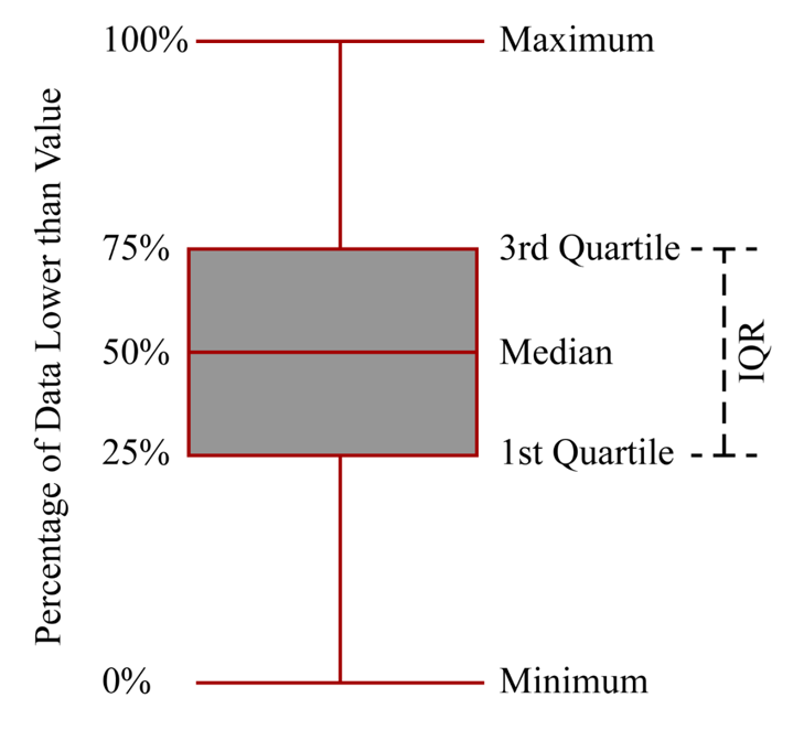
A box plot is generated using geom_boxplot() and requires mapping the variable of interest to either the x-or y-axis. The orientation of the plot changes depending on which axis is used. Note that any low values that are more than 1.5 IQR from the 1st quartile and any high values that are more than 1.5 IQR from the 3rd quartile are plotted as points by ggplot2. If you would like to not show these points, then you can set the outlier.shape parameter equal to NA, as demonstrated in the third example. However, this may be a misrepresentation of your data as it implies that these more extreme values don’t exist. If you do choose to not plot outliers, we recommend at least noting that this was done so that viewers are aware.
cntyD |> ggplot(aes(y=per_for))+
  geom_boxplot()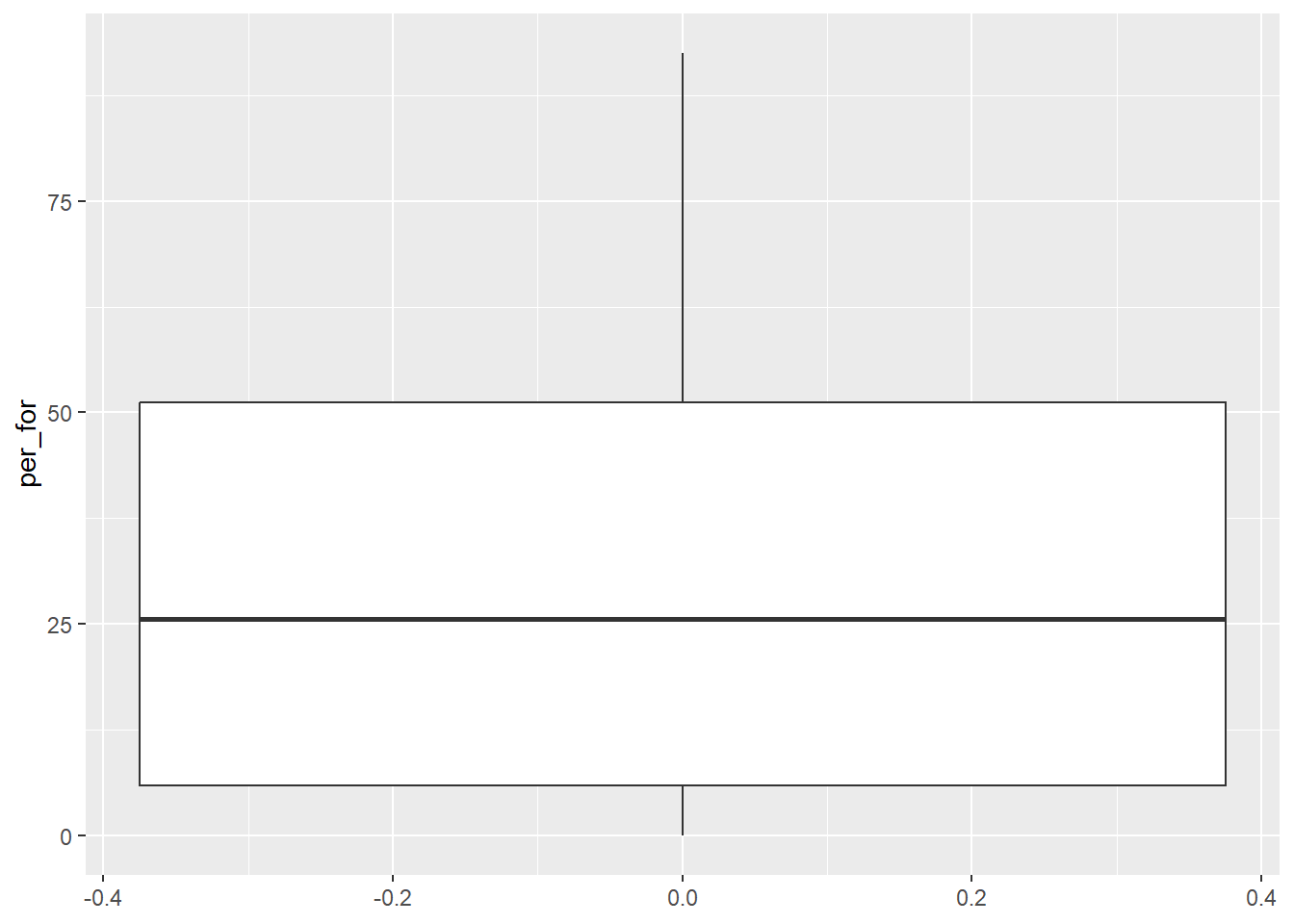
cntyD |> ggplot(aes(x=per_for))+
  geom_boxplot()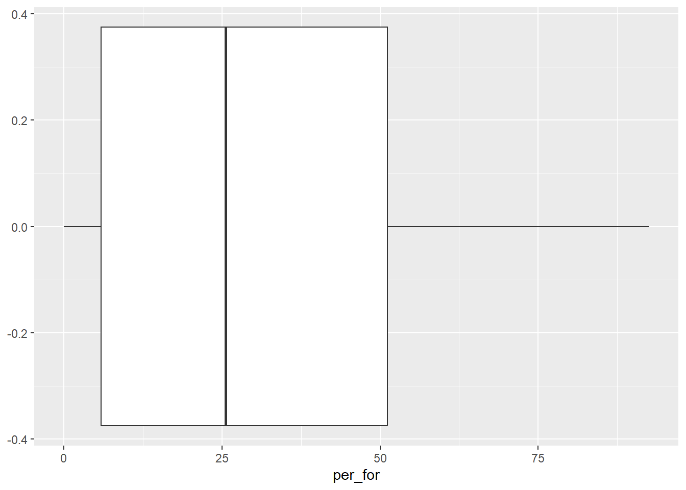
cntyD |> ggplot(aes(y=dem))+
  geom_boxplot(outlier.shape=NA)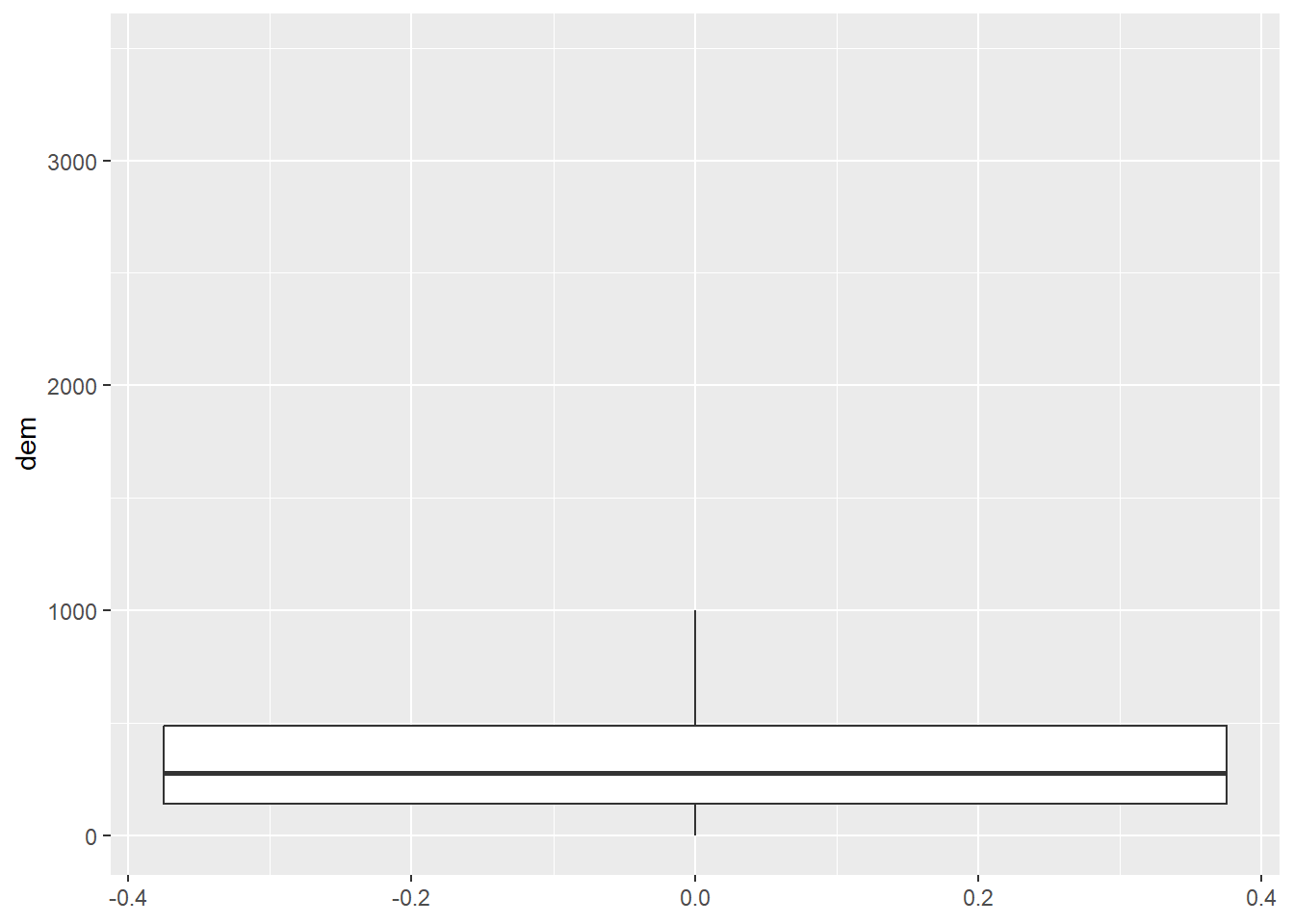
20.4 Comparing Groups
It is common to compare the distribution of a continuous variable for different categories of a nominal variable in the same graph space. We explore this using grouped box plots, grouped violin plots, and some alternatives in the falling sections.
20.4.1 Grouped Box Plots
A grouped box plot is created using geom_boxplot() and by assigning the categorical variable to an axis and the continuous variable being compared between the groups to the other axis. In the first example, the categorical variable, in this case the sub-region of the country, is assigned to the x-axis while the continuous variable, percent cropland, is assigned to the y-axis. To further differentiate the classes, the categorical variable can be assigned to another aesthetic. In the second example, we use the fill color, and in the third example we use the outline color. This isn’t necessary, since the x-axis position already differentiates the sub-regions. However, it does add some visual appeal and further visual differentiation. Given that the sub-regions are labeled on the x-axis, the legend is not necessary. We discuss how to remove legends in the next chapter.
cntyD |> ggplot(aes(x=SUB_REGION, y=per_crop))+
  geom_boxplot()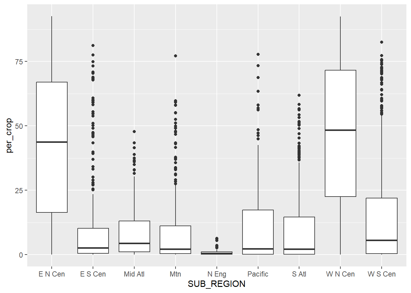
cntyD |> ggplot(aes(x=SUB_REGION,
                    y=per_crop,
                    fill=SUB_REGION))+
  geom_boxplot()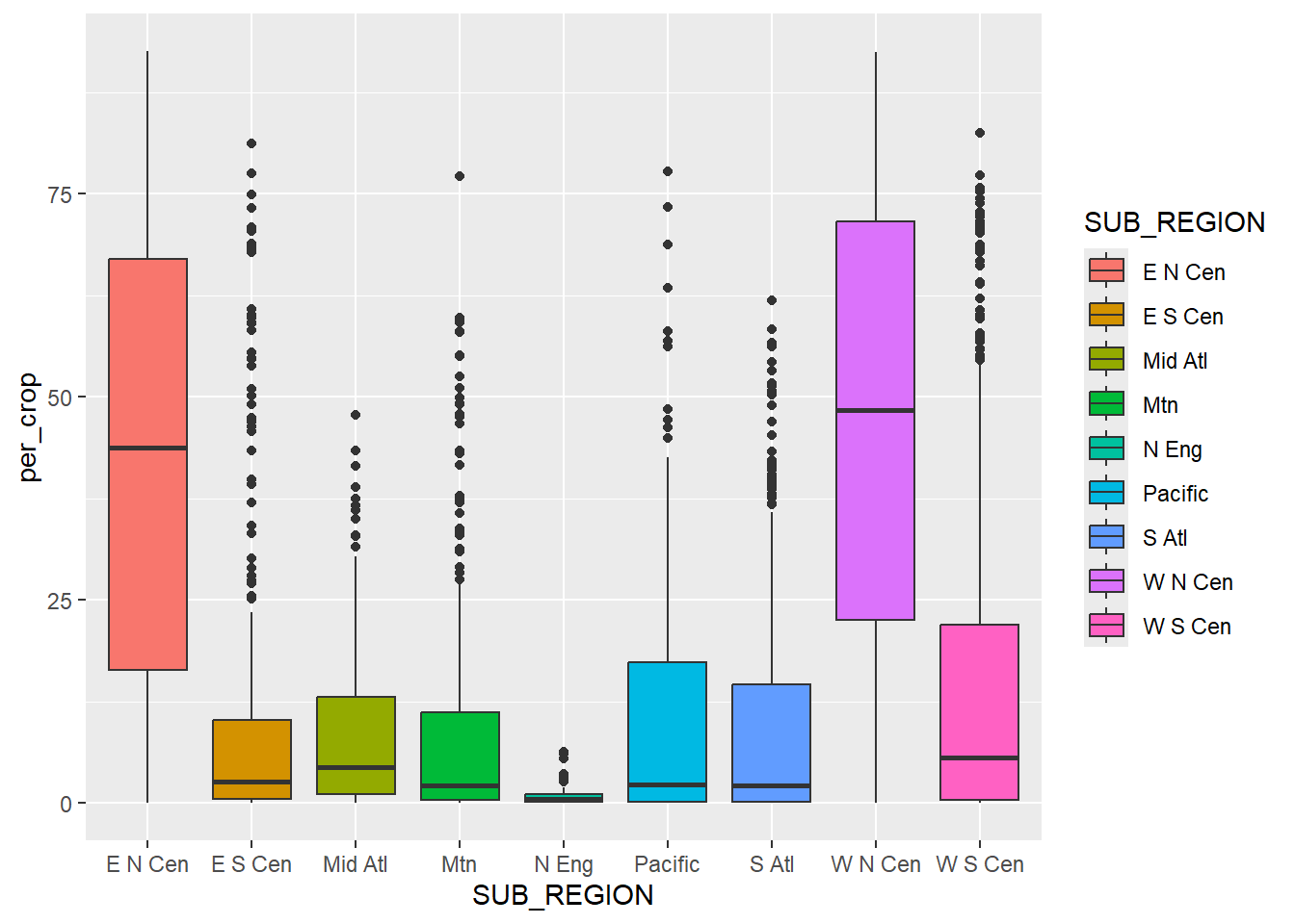
cntyD |> ggplot(aes(x=SUB_REGION,
                    y=per_crop,
                    color=SUB_REGION))+
  geom_boxplot()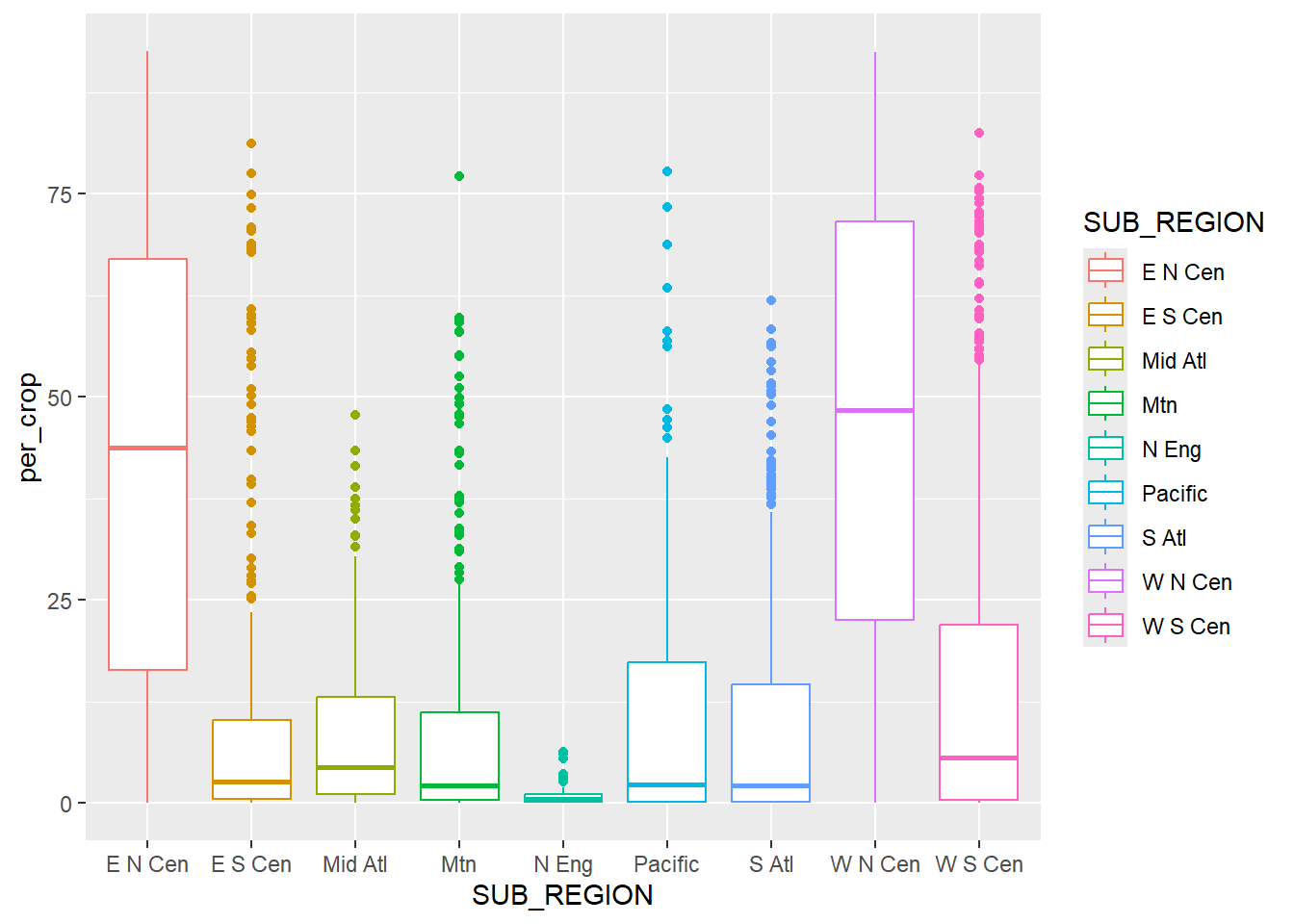
To further aid the comparison, you may be interested in displaying the data in descending or ascending order relative to the continuous variable of interest as opposed to using alphabetical order or the original order of the factor levels. This can be accomplished with fct_recode() from the forcats package.
cntyD |> ggplot(aes(x=fct_reorder(SUB_REGION,
                                  per_crop,
                                  .fun=median,
                                  .desc=TRUE),
                    y=per_crop,
                    fill=SUB_REGION))+
  geom_boxplot()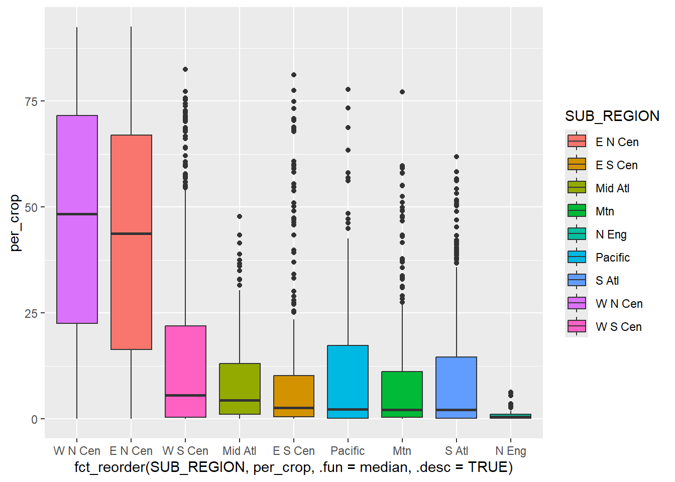
20.4.2 Violin Plots
Violin plots are an alternative or complement to box plots for showing the distribution of a continuous variable or the distribution of a continuous variable by group. They are effectively kernel density plots that are rotated and mirrored. With ggplot2 they are created using geom_violin(). In the first example below, we use a violin plot to show the distribution of mean county-level elevation by sub-region.
cntyD |> ggplot(aes(x=SUB_REGION,
                    y=dem,
                    fill=SUB_REGION))+
  geom_violin()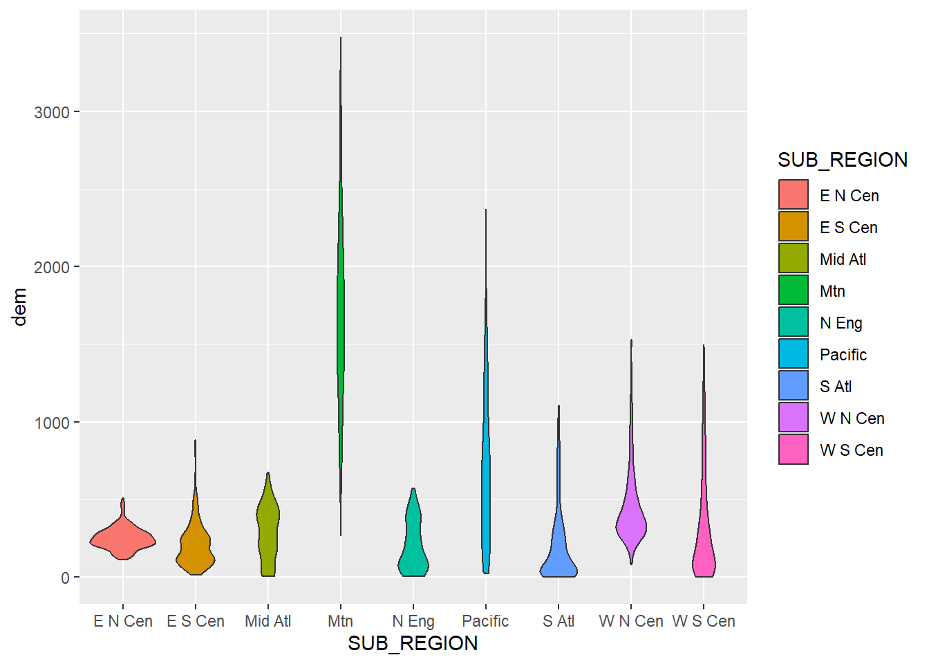
Since box plots and violin plots have the same x- and y-axis mappings, they can be plotted in the same graph space, similar to kernel density and histogram plots, as demonstrated above. We create a combined violin and box plot below using the same mappings for both geoms. In the second example, we override the fill mapping for the box plot to use a constant. We also narrow the box plots so that they fit within the violin plots and remove the outlier points. In the last example, we use dplyr to subset out three sub-regions and re-generate the same plot with the reduced set of categories.
cntyD |> ggplot(aes(x=SUB_REGION,
                    y=dem,
                    fill=SUB_REGION))+
  geom_violin()+
  geom_boxplot()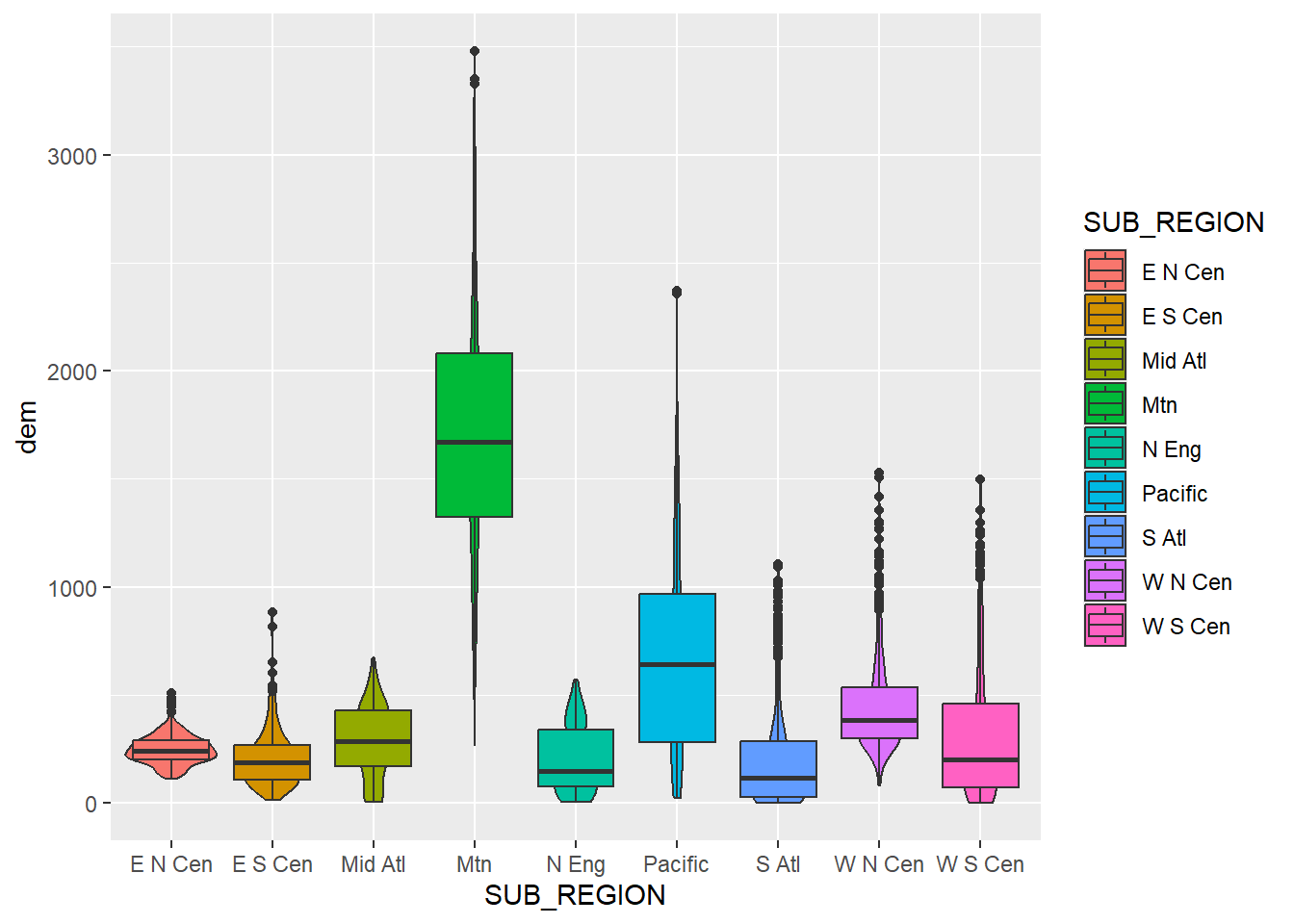
cntyD |> ggplot(aes(x=SUB_REGION,
                    y=dem,
                    fill=SUB_REGION))+
  geom_violin()+
  geom_boxplot(width=.05,
               fill="darkgray",
               outlier.shape=NA)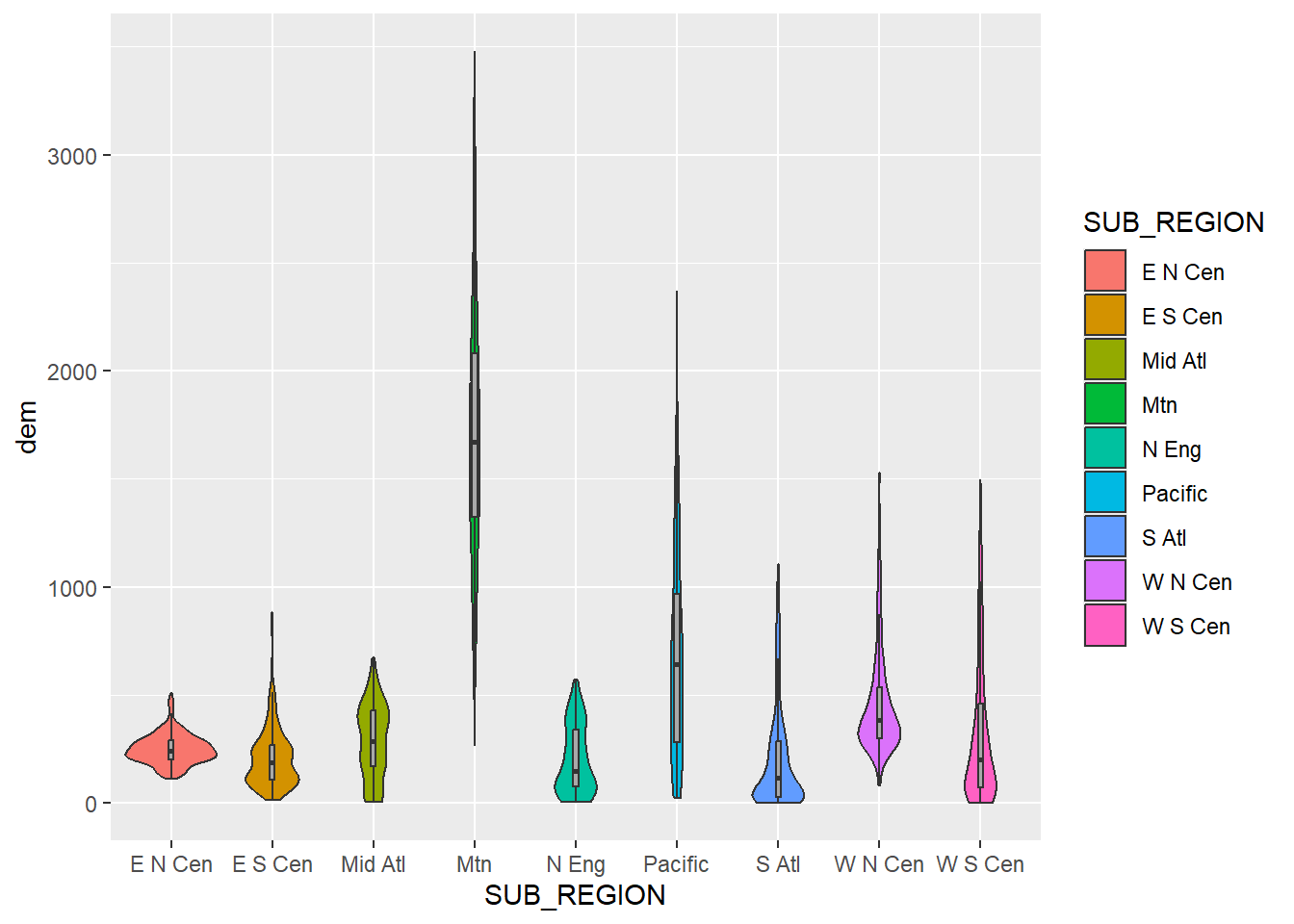
cntyD |> filter(SUB_REGION %in% c("E N Cen", "E S Cen", "Mid Atl")) |>
  ggplot(aes(x=SUB_REGION,
             y=dem,
             fill=SUB_REGION))+
  geom_violin()+
  geom_boxplot(width=.08,
               fill="darkgray",
               outlier.shape=NA)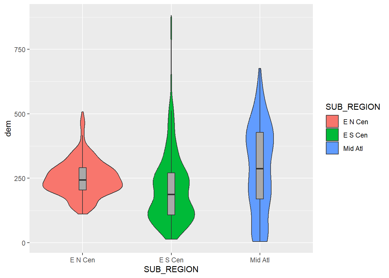
20.4.3 Other Group Comparison Plots
There are other means to compare data between groups. Below, we use a dot plot to compare the mean elevation by sub-region. This first requires aggregating the county-level data to sub-regions using dplyr. We specifically calculate the mean of the mean county-level elevation by sub-region.
cntyD |>
  group_by(SUB_REGION) |>
  summarize(mnElev = mean(dem)) |>
  ggplot(aes(x=fct_reorder(SUB_REGION, mnElev, .desc=TRUE),
                      y=mnElev))+
  geom_point(size=2)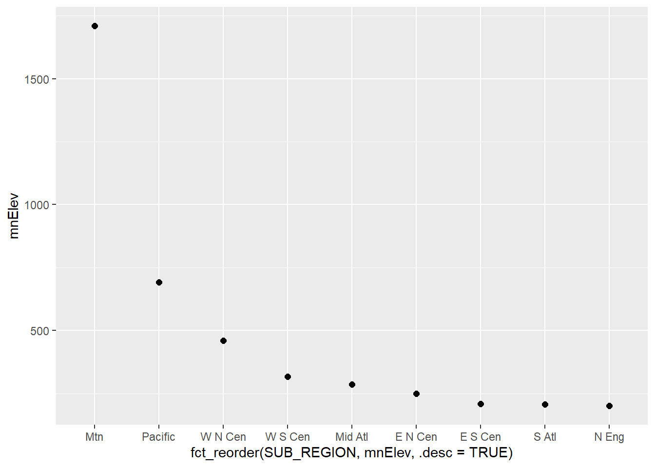
Expanding upon the prior graph, we now show the minimum, maximum, mean, and median of the mean county-level elevations by sub-region using a combination of geom_pointrange() and geom_point(). Make sure you understand how the aesthetic mappings are defined. For geom_pointrange() we use two new mappings: ymin and ymax. The minimum and maximum elevations are mapped to these aesthetics, respectively. The mean and median elevations are mapped to the y-axis positions within geom_pointrange() and geom_point(), respectively. Also, note the need to summarize the data with dplyr prior to making the graph. In the second example, we plot the range of elevations that are within 1 standard deviation of the mean along with the mean using a combination of geom_errorbar() and geom_point(). The values to map to ymin and ymax are calculated by subtracting and adding the standard deviation to the mean, respectively.
cntyD |>
  group_by(SUB_REGION) |>
  summarize(mnElev = mean(dem),
            minElev = min(dem),
            maxElev = max(dem),
            mdElev = median(dem)) |>
  ggplot(aes(x=fct_reorder(SUB_REGION,
                           mnElev,
                           .desc=TRUE)))+
  geom_pointrange(aes(ymin=minElev, ymax=maxElev, y=mnElev), color="salmon", size=1, lwd=1)+
  geom_point(aes(y=mdElev), shape=15, color="black", size=3)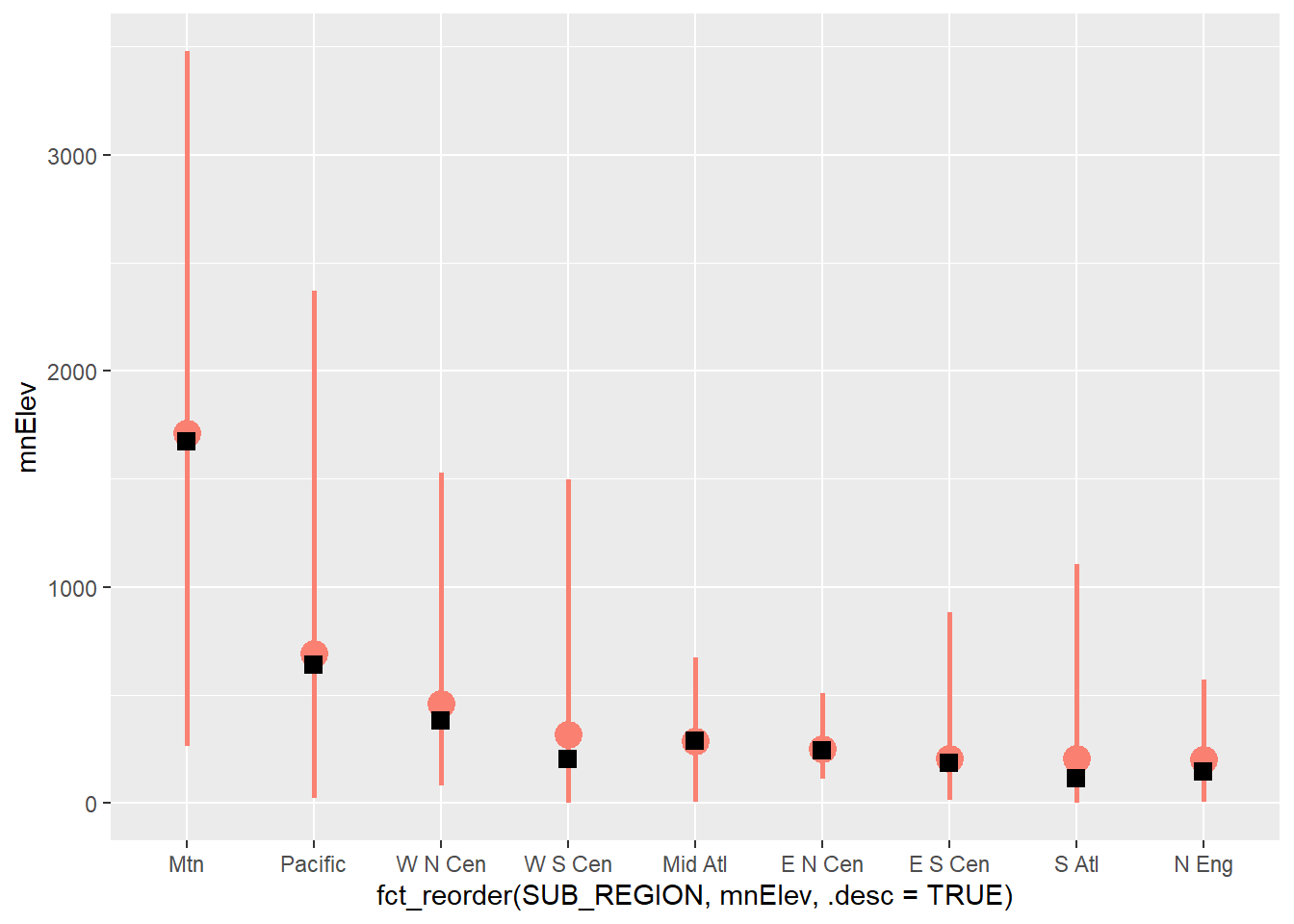
cntyD |>
  group_by(SUB_REGION) |>
  summarize(mnElev = mean(dem),
            sdElev = sd(dem)) |>
  ggplot(aes(x=fct_reorder(SUB_REGION,
                           mnElev,
                           .desc=TRUE),
                      y=mnElev))+
  geom_errorbar(aes(ymin=mnElev-sdElev, ymax=mnElev+sdElev), color="salmon", size=1, lwd=1)+
  geom_point(aes(y=mnElev), color="black", size=3)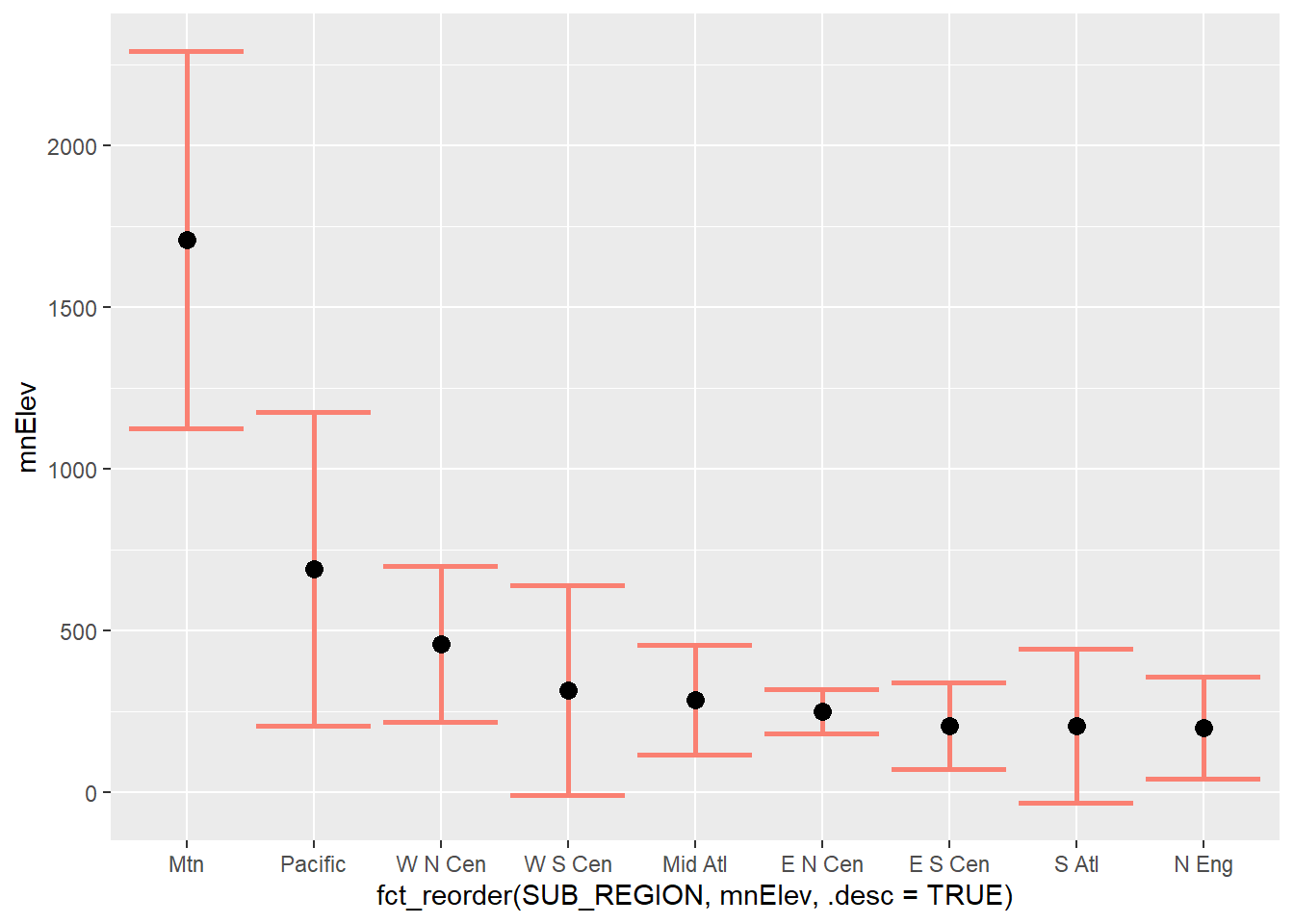
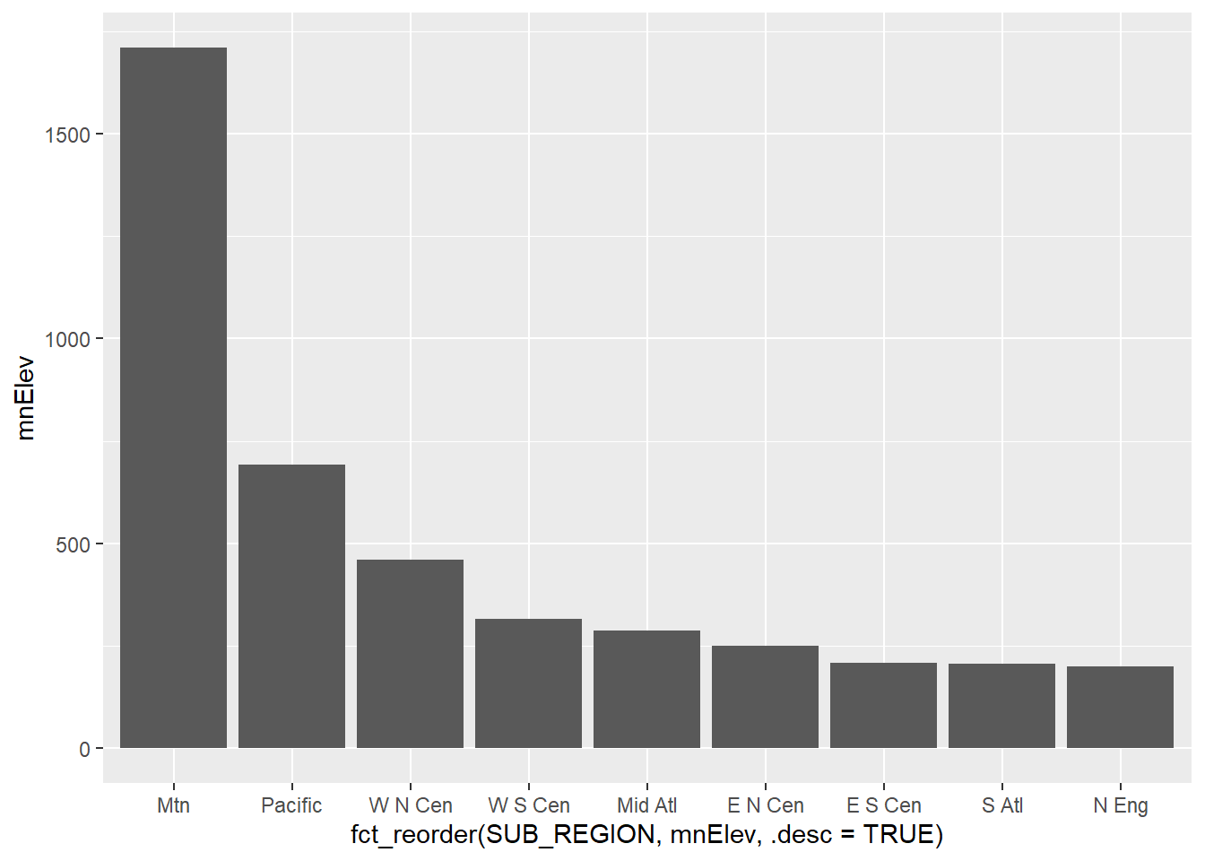
Another option is a column graph. Below, we are using a column graph, which uses geom_col(), to show the mean of the mean county-level elevations by sub-region.
20.5 Multivariate Graphs
Multivariate graphs involve visualizing the relationship between two or more variables, and they include scatter plots and line graphs. We now explore these graph types.
20.5.1 Scatter Plots
Scatter plots in ggplot2 are created using geom_point() with continuous variables mapped to both the x-axis and y-axis. In this first example, we map elevation to the x-axis and temperature to the y-axis. You can see evidence of an inverse or indirect relationship between temperature and elevation: lower temperatures tends to correlate with higher elevations.
For scatter plots, you must determine which variable to place on the x-axis and which to place on the y-axis. Generally, the independent variable should be mapped to x while the dependent variable is mapped to y. In our example, we map elevation to the x axis since it is assumed to have an impact on temperature. In some cases there is not a clear independent and dependent variable, and the mappings are more arbitrary.
cntyD |> ggplot(aes(x=dem,
                    y=tempmn))+
  geom_point()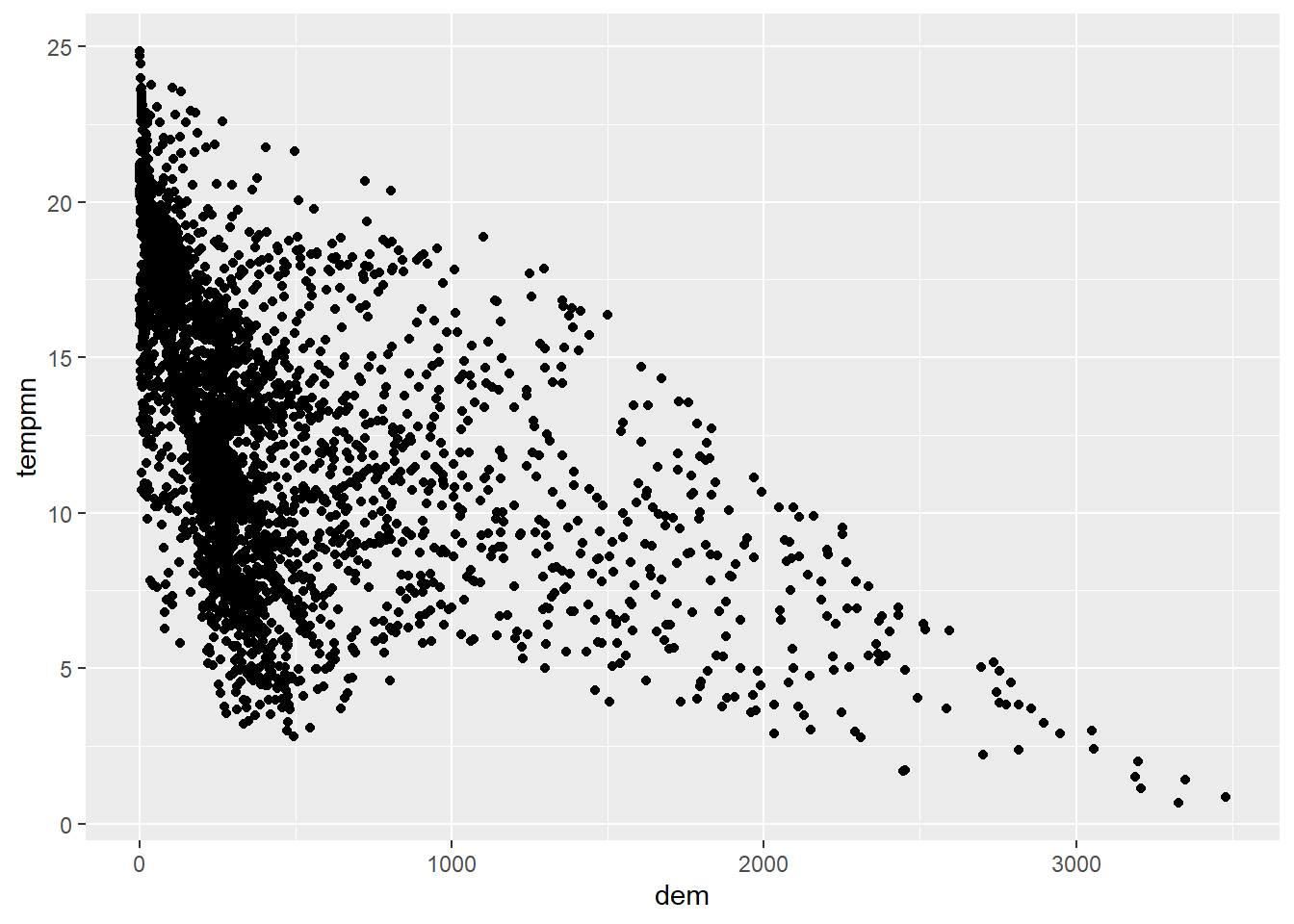
We now further modify the graph by changing (1) the point symbol, (2) the point fill color, (3) the point outline color, and (4) the point size. Available point symbols in R can be viewed here. Note that symbols 0 through 14 only have an outline color, symbols 15 through 20 only have a fill color, and symbols 21 through 25 have both a fill and outline color. In short, the mappings available change based on the point symbol used.
cntyD |> ggplot(aes(x=dem,
                    y=tempmn))+
  geom_point(shape=23,
             color="darkgreen",
             fill="salmon",
             size=2)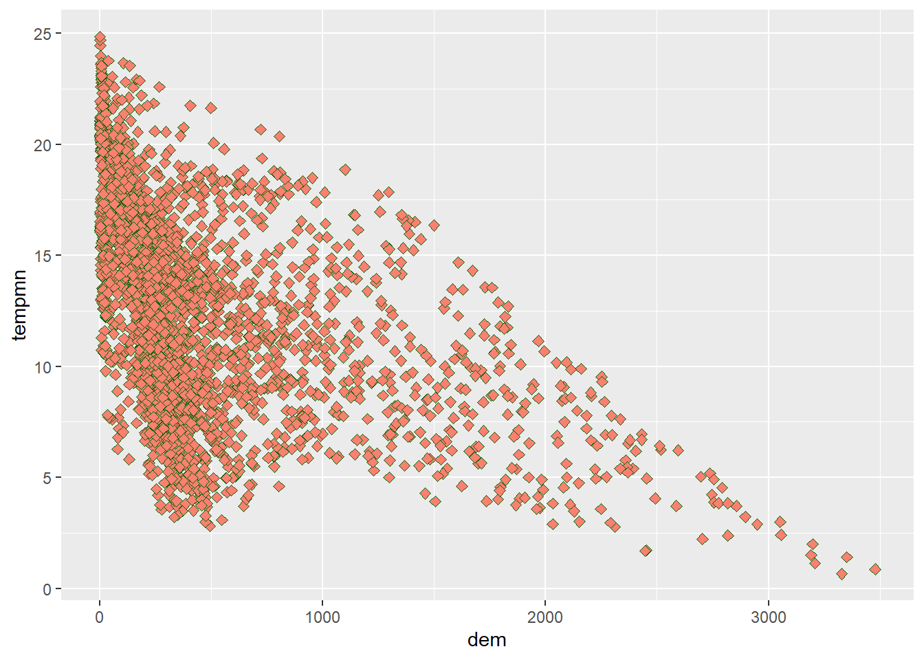
It is also possible to add a trend line using geom_smooth() to further conceptualize the relationship between the two variable. In our first example, we include a linear relationship using method=lm. This is generated using ordinary least squares regression. Note that this also includes a confidence interval by default. In the second example, we have changed the line symbol and width. Available lines symbols in R are available here. The third example shows how to remove the confidence interval using se=FALSE. The last example uses locally estimated scatter plot smoothing (LOESS), a form of local regression, via method=loess.
cntyD |> ggplot(aes(x=dem,
                    y=tempmn))+
  geom_point()+
  geom_smooth(method=lm)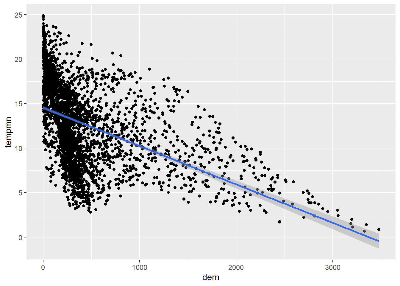
cntyD |> ggplot(aes(x=dem,
                    y=tempmn))+
  geom_point()+
  geom_smooth(method=lm,
              lty=2,
              lwd=1.5)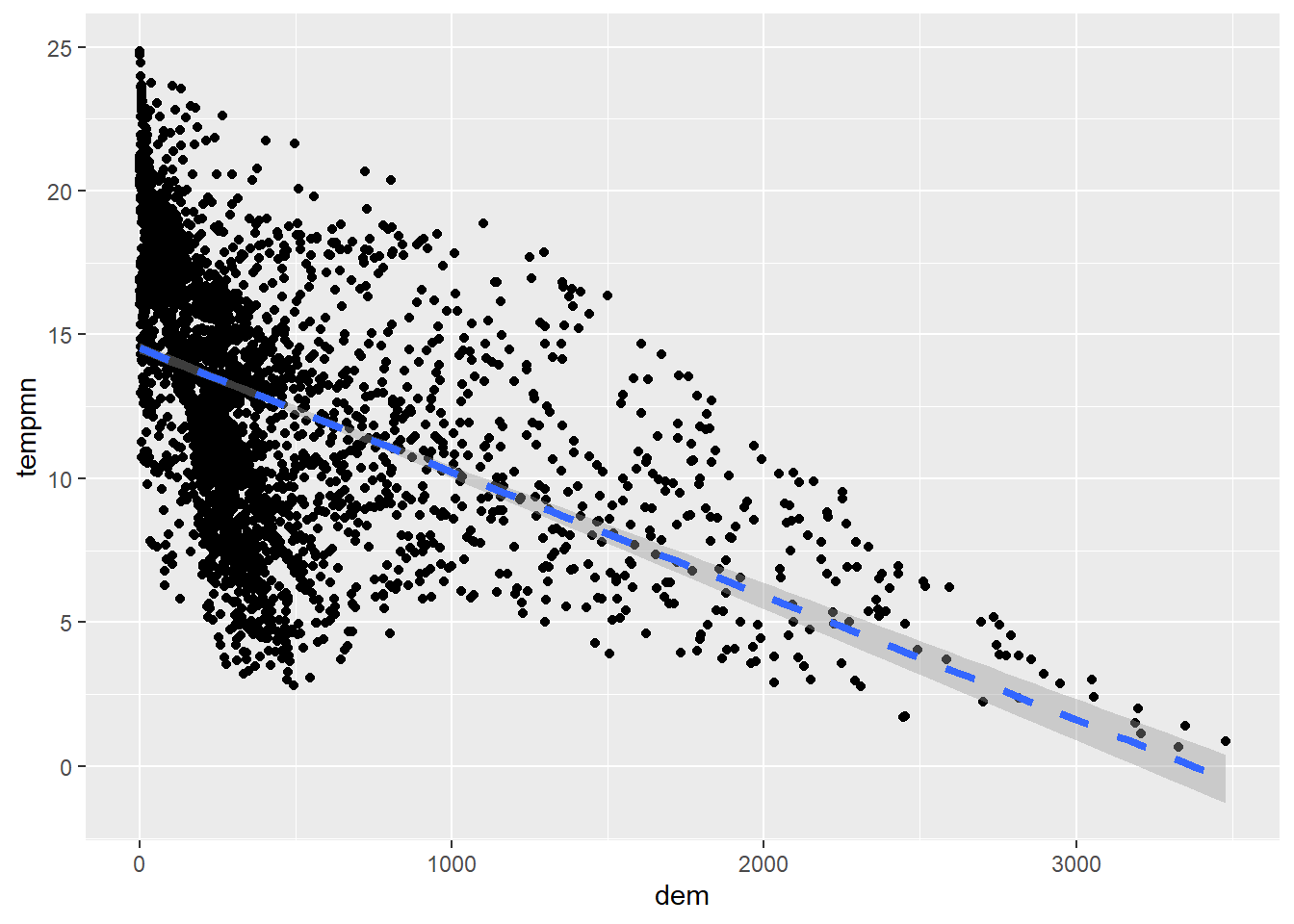
cntyD |> ggplot(aes(x=dem,
                    y=tempmn))+
  geom_point()+
  geom_smooth(method=lm,
              se=FALSE)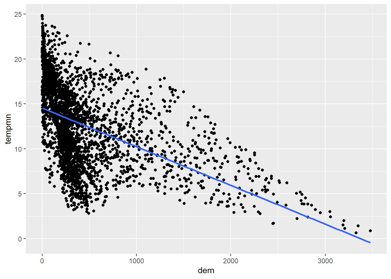
cntyD |> ggplot(aes(x=dem,
                    y=tempmn))+
  geom_point()+
  geom_smooth(method=loess)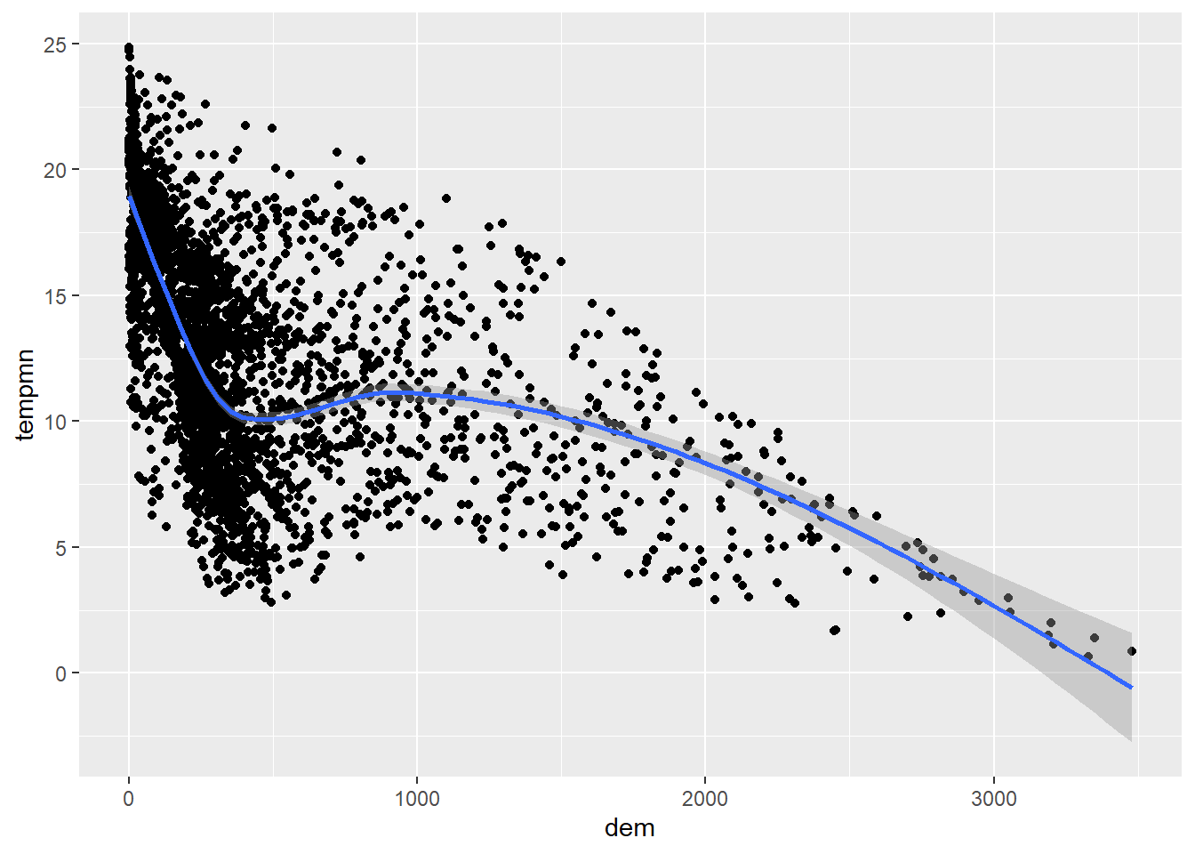
We now visualize more variables by mapping the sub-region to the point symbol color using unordered colors and the population to the point symbol size. We feel that this is not very effective. It has been provided to simply demonstrate different aesthetic mappings available when generating a scatter plot. In the second example we first use forcats to collapse the sub-regions into three factor levels. We then use the point shape or symbol to differentiate the sub-regions as opposed to using the symbol color.
cntyD |> ggplot(aes(x=dem,
                    y=tempmn,
                    size=POPULATION,
                    fill=SUB_REGION))+
  geom_point(shape=23)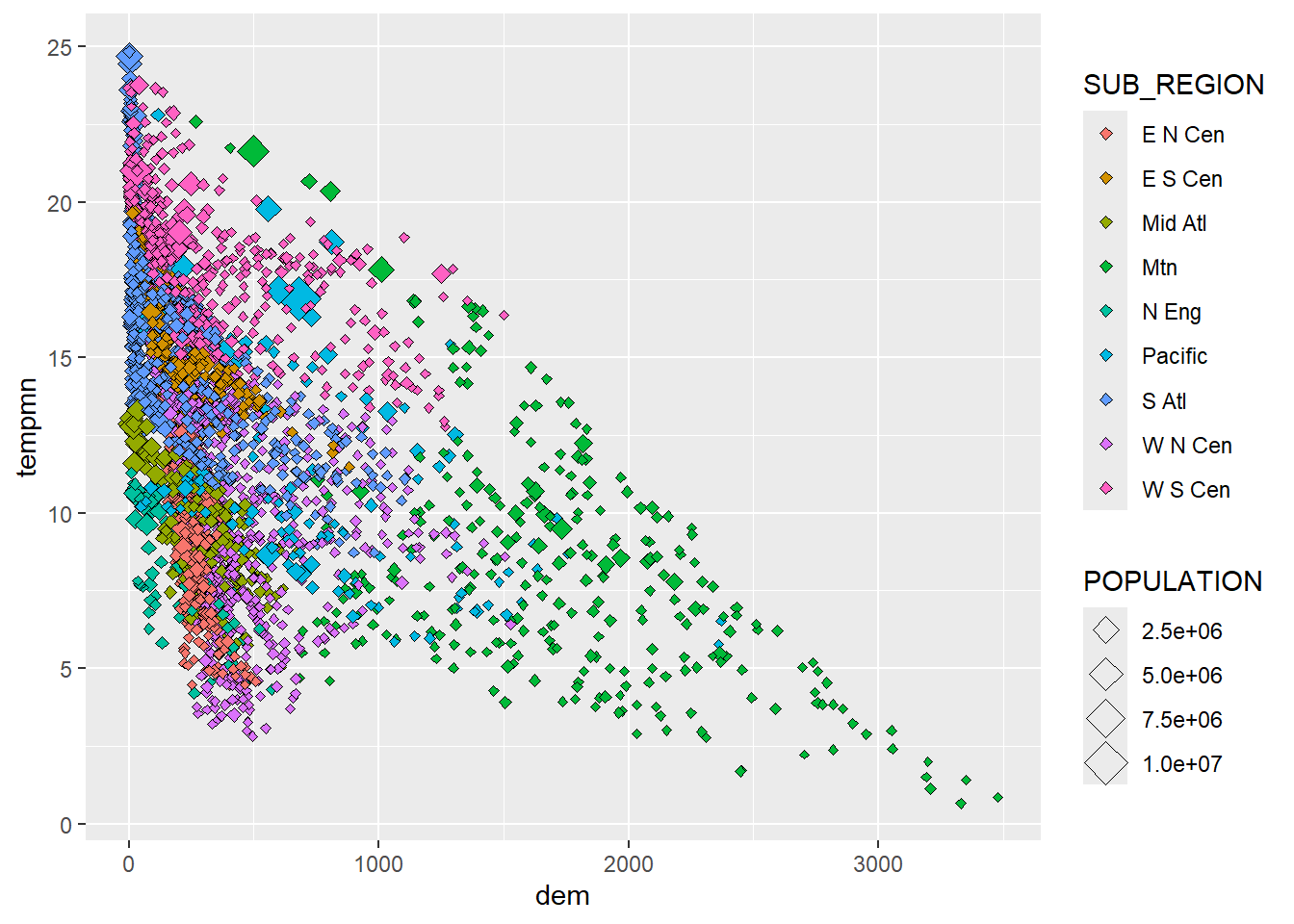
cntyD2 <- cntyD

cntyD2$SUB_REGION <- cntyD2$SUB_REGION |>
  fct_collapse("Central" = c("E N Cen", "E S Cen", "W N Cen", "W S Cen"),
               "East" = c("Mid Atl", "N Eng", "S Atl"),
               "West" = c("Mtn", "Pacific"))
cntyD2 |> ggplot(aes(x=dem,
y=tempmn,
size=POPULATION,
shape=SUB_REGION))+
geom_point()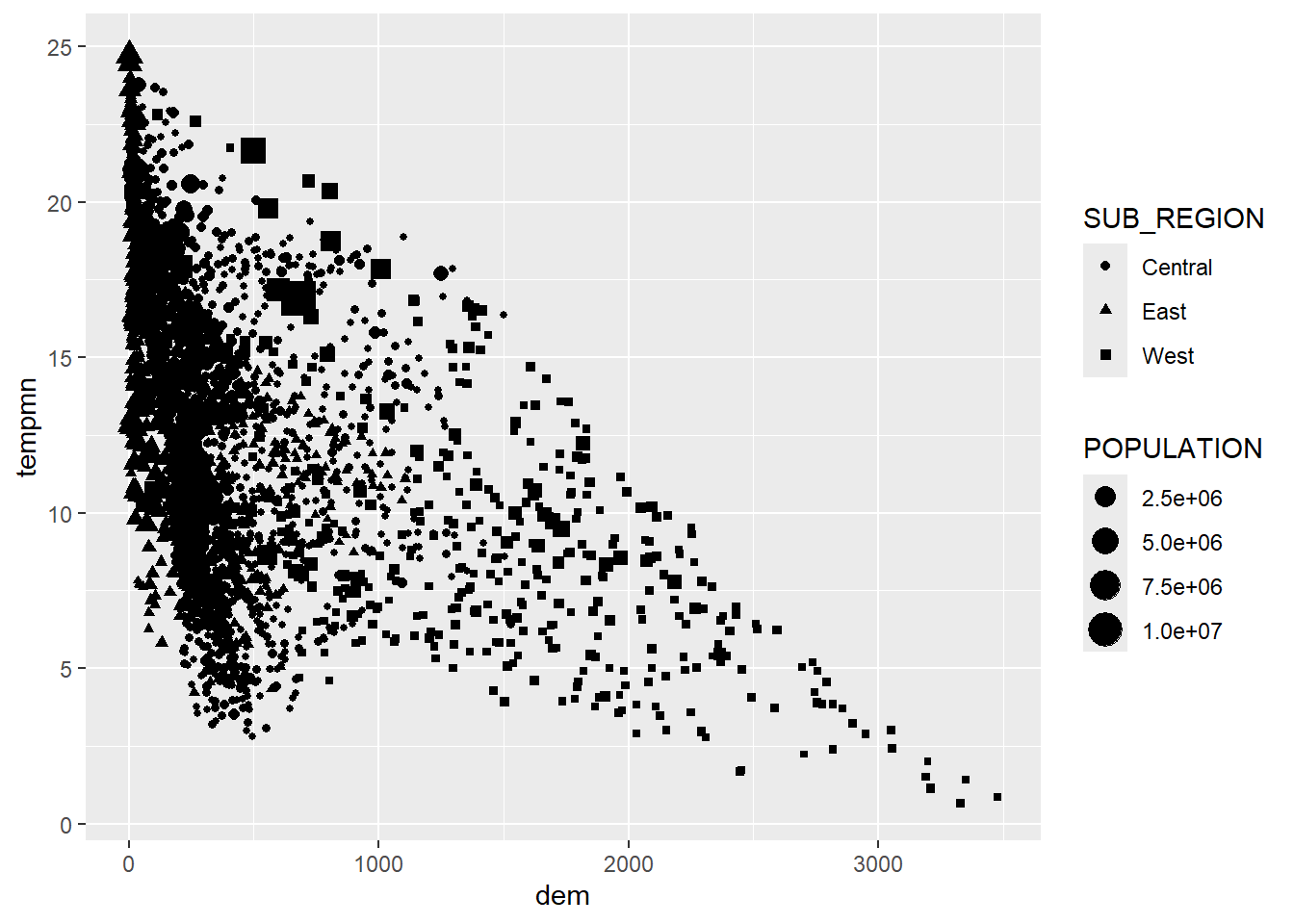
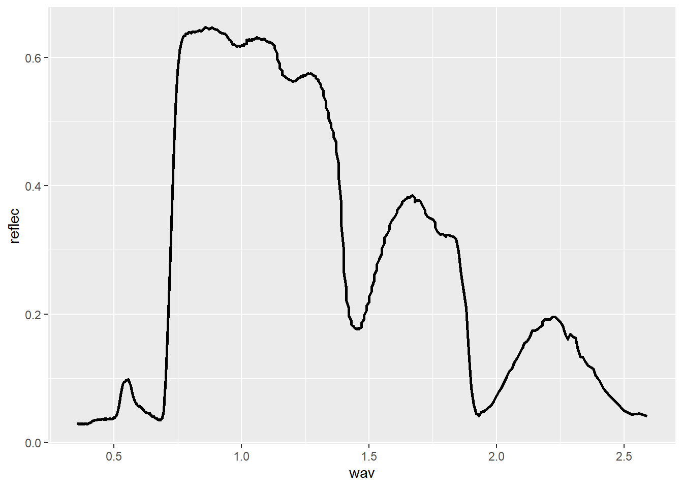
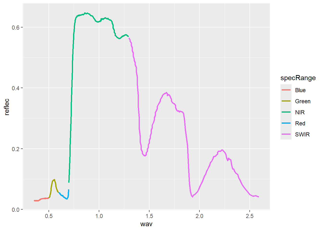
20.5.2 Line Graphs
Line graphs connect adjacent data points with a line as opposed to representing each data value as a separate point. They are often used to represent trends, such as trends over time in a time series graph. Since the x-axis and y-axis can be the same for scatter plots and line graphs, they can be combined to one plot using multiple geoms (i.e., geom_point() and geom_line()).
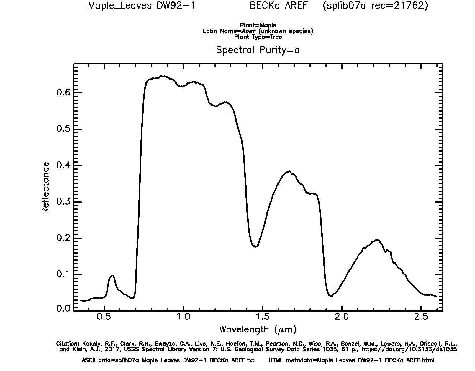
We now read in a new data set: maple_leaf.csv, which consist of spectral reflectance data for a maple leaf from the United States Geological Survey (USGS) Spectral Library. The original data can be found here.
In the first example, the spectral reflectance curve is generated by mapping the wavelength to the x-axis, mapping spectral reflectance as a proportion to the y-axis, and using geom_line(). In the second example, we use dplyr to generate a new column that differentiates the spectral ranges using names. We then use different colors for each range by mapping the new variable to the color aesthetic.
20.6 Overplotting
We now discuss means to deal with overplotting. Overplotting occurs when there is large number of data points that cannot be easily distinguished in the graph space due to crowding and overlap.
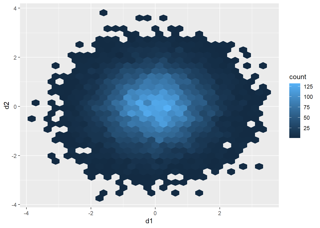
20.6.1 Hexagonal Binning
As an example, the graph below contains 15,000 points, which were generated using the rnorm() function. This creates a set of coordinate pairs using a normal distribution with a mean of zero and a standard deviation of one. There are too many data points in the plot space to see a clear pattern.
d1 <- rnorm(15000, mean=0, sd=1)
d2 <- rnorm(15000, mean=0, sd=1)
d3 <- data.frame(d1, d2)
d3 |> ggplot(aes(x=d1, y=d2))+
geom_point()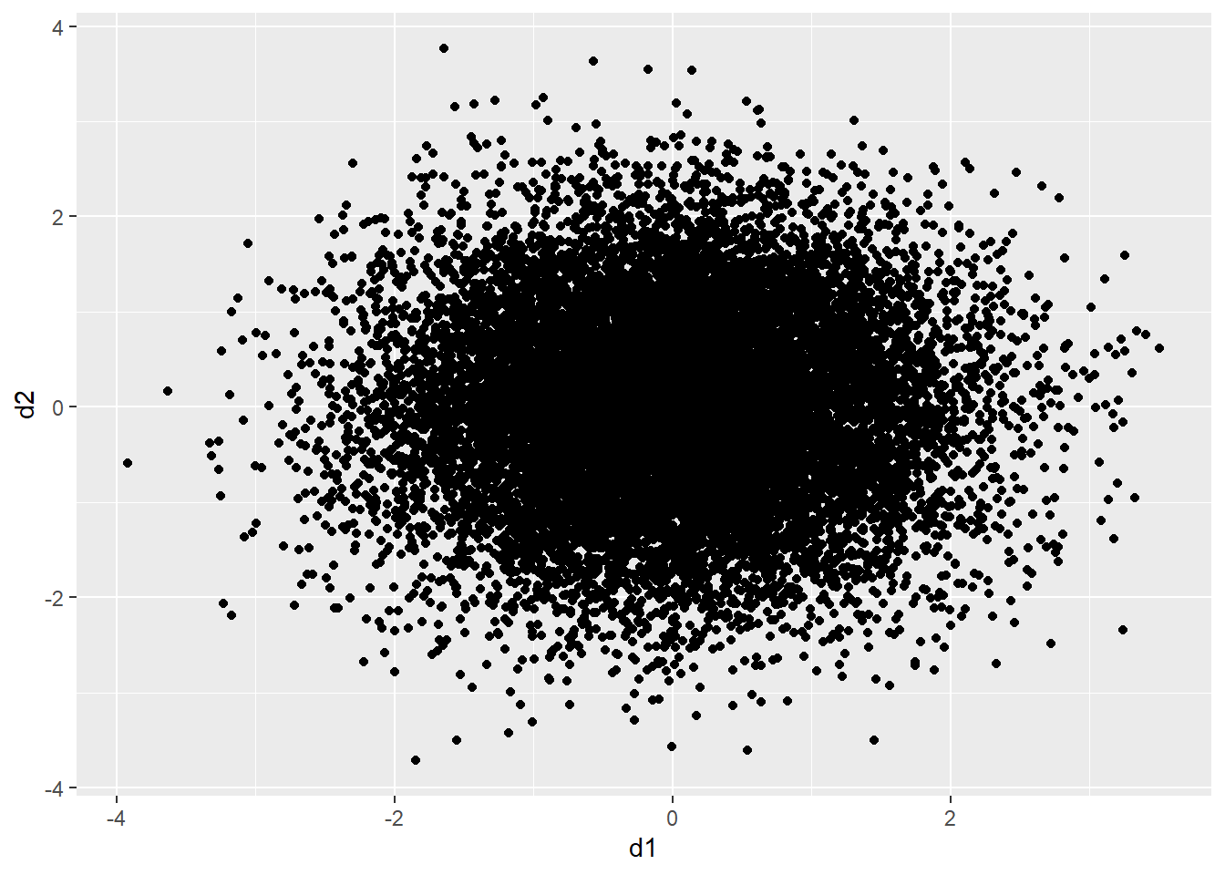
One method to deal with this issue is to use hexagonal binning where the two-dimensional graph space is divided into hexagons of equal size and the number of data points in each hexagon are counted. You can change the size argument to obtain larger or smaller hexagons. Creating hexagonal bins with ggplot2 requires the hexbin package, so this package may need to be installed to execute the example.
20.6.2 Rectangular Binning
As opposed to using hexagonal bins, you can obtain rectangular or square bins with geom_bin2d(). Here, each bin measures one-by-one units.
d3 |> ggplot(aes(x=d1, y=d2))+
  geom_bin2d(binwidth=c(1,1))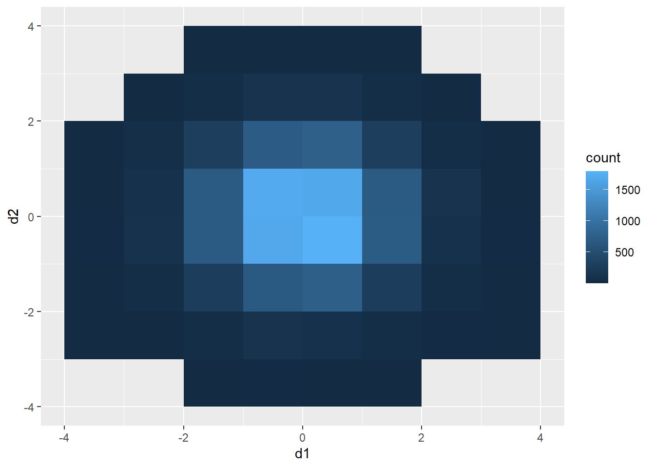
20.6.3 2D Kernel Density
Another option is using a two-dimensional kernel-density surface. This is the same as a raster-based kernel density surface that is used to estimate the density of point features over a map space. We use stat_density2d() to generate the kernel density estimate. We then plot contours using geom_density2d().
d3 |> ggplot(aes(x=d1, y=d2))+
  stat_density2d(aes(fill=..level..),
                 alpha=.5,
                 size=2,
                 bins=10,
                 geom="polygon")+
  geom_density2d(color="black")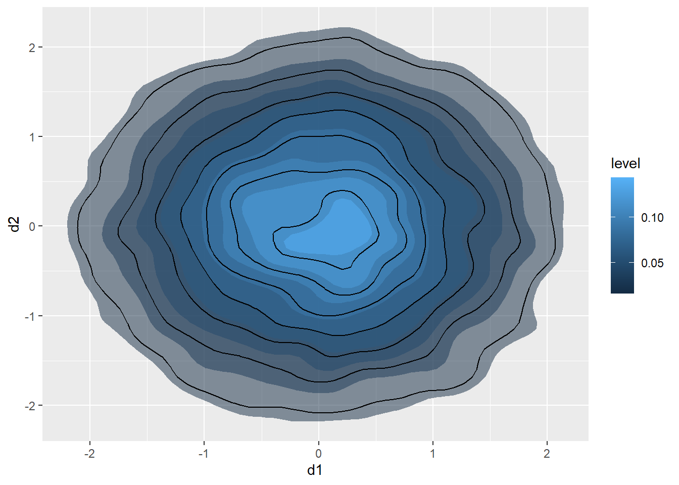
20.6.4 Jitter
You can also add random noise to data points to provide more separation. This can be accomplished using geom_jitter(). In the first graph, the points are being plotted at the exact specified coordinates. In the second graph, random noise has been added in the x- and y-directions.
a1 <- rep(c(1, 2, 3, 4, 5), 5)
l1 <- rep(c(1), 5)
l2 <- rep(c(2), 5)
l3 <- rep(c(3), 5)
l4 <- rep(c(4), 5)
l5 <- rep(c(5), 5)
a2 <- c(l1, l2, l3, l4, l5)
a3 <- data.frame(a1, a2)
a3 |> ggplot(aes(x=a2, y=a1))+
  geom_point(size=3)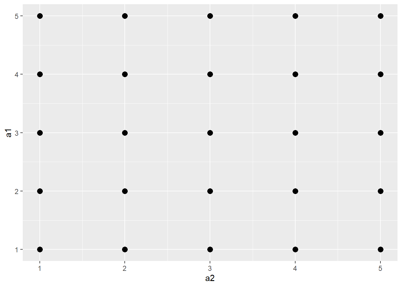
a3 |> ggplot(aes(x=a2, y=a1))+
  geom_jitter(size=3)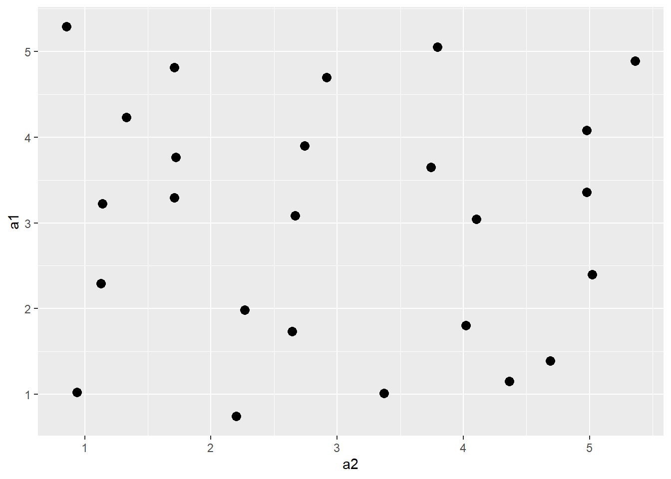
20.7 Graphical Primitives
All graph elements in ggplot2 are created using graphic primitives to plot line segments, curves, paths, polygons, etc. This is demonstrated in the following graph where we define coordinates to represent a polygon, a rectangle, and a line segment to plot in the graph space. These primitives can be used to generate more complex graph features.
poly <- data.frame(y=c(4,2,1,2),
                   x=c(2,4,1,1))
ggplot(poly)+
  geom_polygon(aes(x=x, y=y),
               colour="gray",
               fill="red",
               size=2)+
  geom_rect(xmin=1,
            xmax=3,
            ymin=3,
            ymax=4,
            fill=NA,
            color="Yellow",
            size=2)+
  geom_segment(aes(x=2,
                   xend=4,
                   y=2,
                   yend=3),
               size=2,
               color="blue")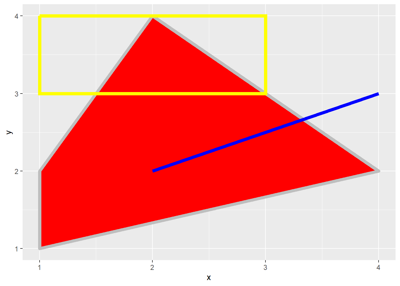
It is possible to generate line features using three different methods:
-
geom_abline(): define a line based on a slope and y-intercept (y = mx+b) -
geom_hline(): define a horizontal line based on a y-intercept (y = b) -
geom_vline(): define a vertical line based on an x-intercept
These three geoms are demonstrated below.
poly <- data.frame(y=c(0,0,1,1),
                   x=c(0,1,0,1))

ggplot(poly, aes(x=x, y=y))+
  geom_point(size=3)+
  geom_abline(intercept = 0, slope = 1, color="orange", size=1)+
  geom_hline(yintercept = .5, color="purple", size=1)+
  geom_vline(xintercept=.5, color="green", size=1)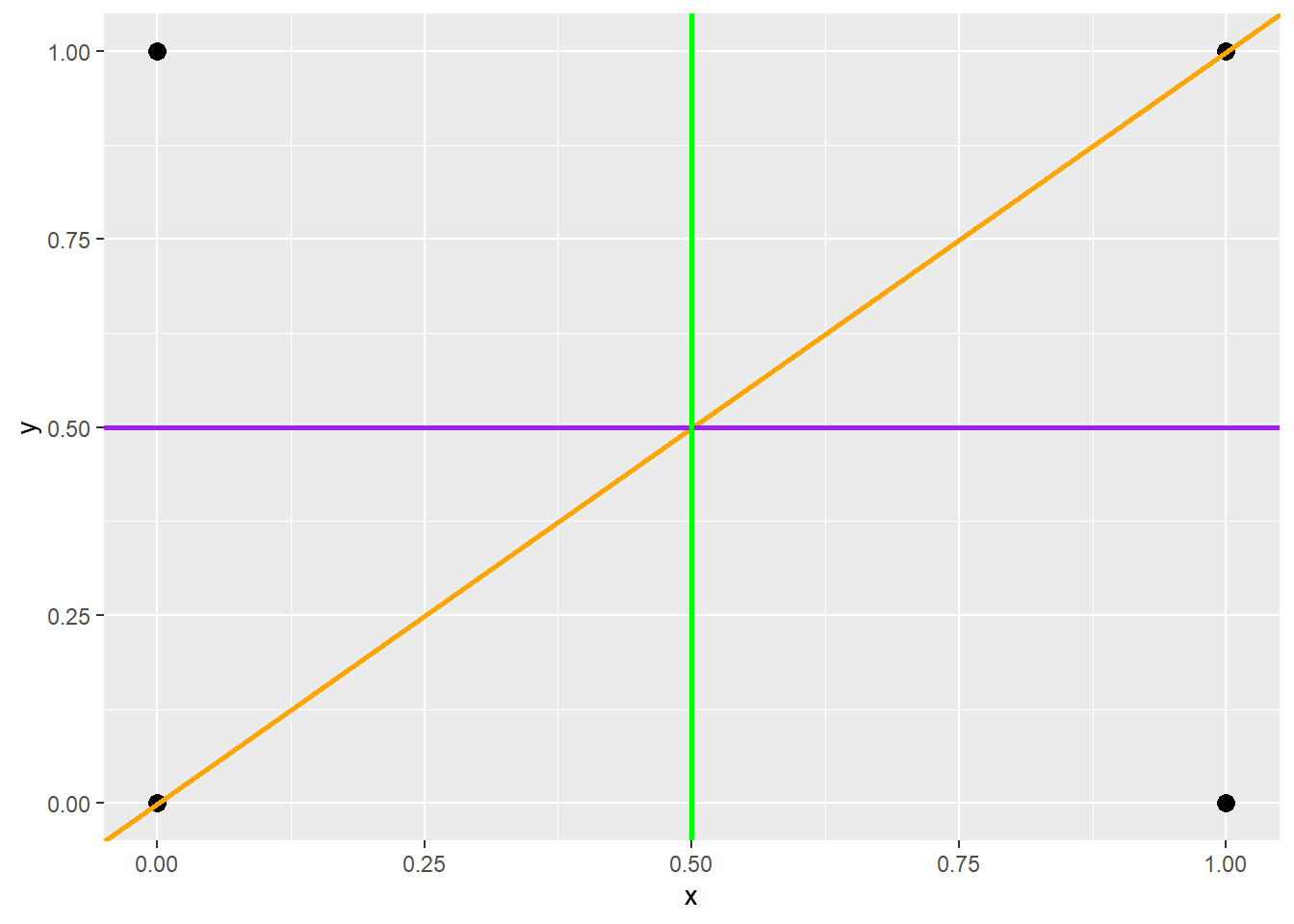
20.8 Alternate Coordinate Systems
We have been making use of Cartesian coordinate systems throughout this chapter. However, other systems are available. Below is an example of a graph created using polar coordinates. This is a Coxcomb Plot where the angle represented a category and the size represents a quantity. You can also make maps using map coordinates and the ggmap package.
x1 <- c("A", "B", "C", "D", "E")
y1 <- c(14, 28, 31, 17, 14)
data1 <- data.frame(x1, y1)
pcord <- ggplot(data1, aes(x=x1, y=y1))+
  geom_bar(stat="identity")
pcord + coord_polar()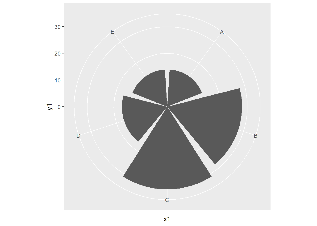
When using a Cartesian coordinate system, it is also possible to define or constrain the aspect ratio. In the example below, we locked the aspect ratio to 9/16 to mimic a TV screen using coord_fixed().
poly <- data.frame(y=c(0,0,1,1),
                   x=c(0,1,0,1))

ggplot(poly, aes(x=x, y=y))+
  geom_point()+
  coord_fixed(ratio=9/16)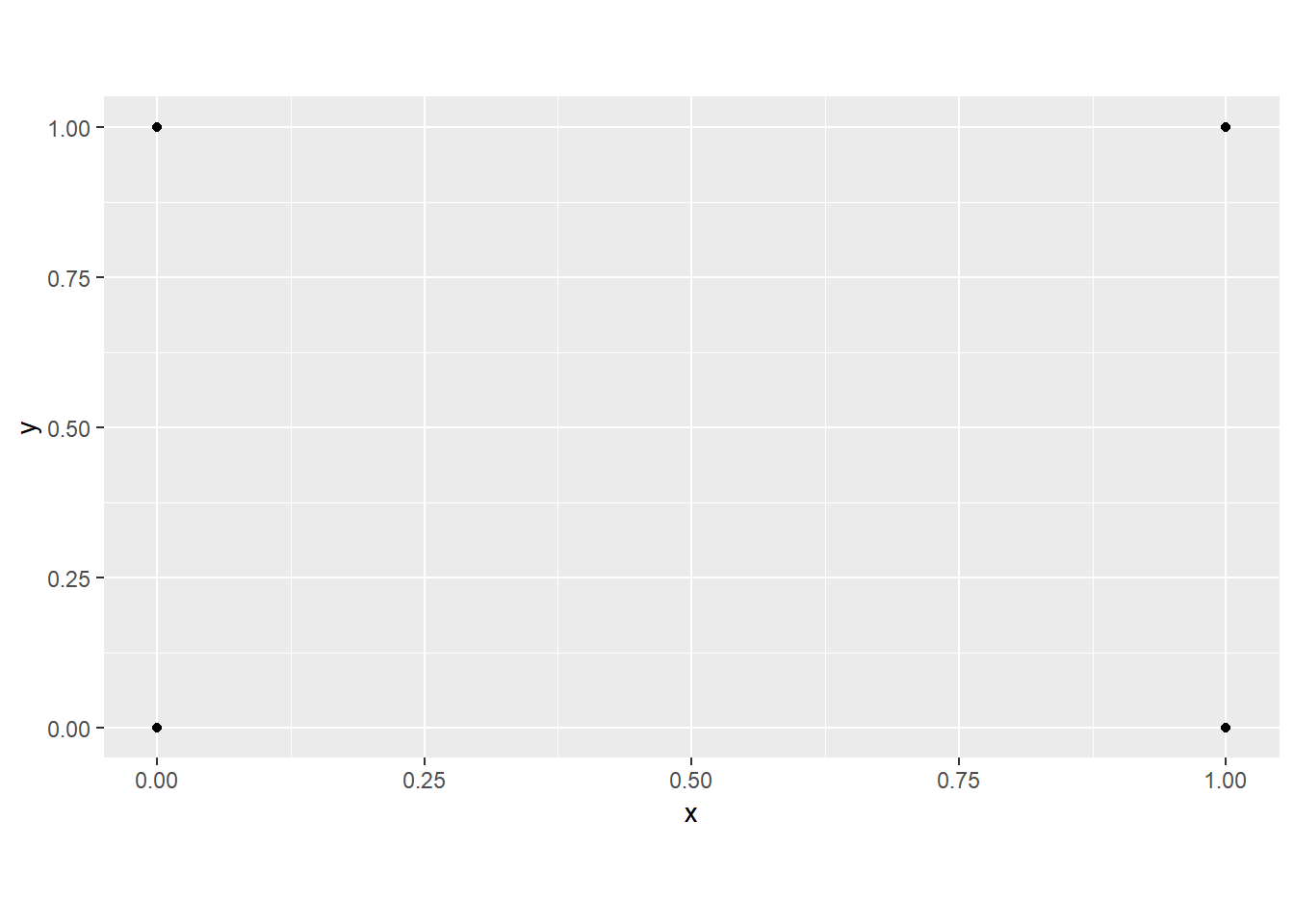
It is also possible to reverse the x- and y-axes in the output graph using coord_flip()
cntyD |> filter(SUB_REGION %in% c("E N Cen", "E S Cen", "Mid Atl")) |>
  ggplot(aes(x=SUB_REGION,
             y=dem,
             fill=SUB_REGION))+
  geom_violin()+
  geom_boxplot(width=.08,
               fill="darkgray",
               outlier.shape=NA)+
  coord_flip()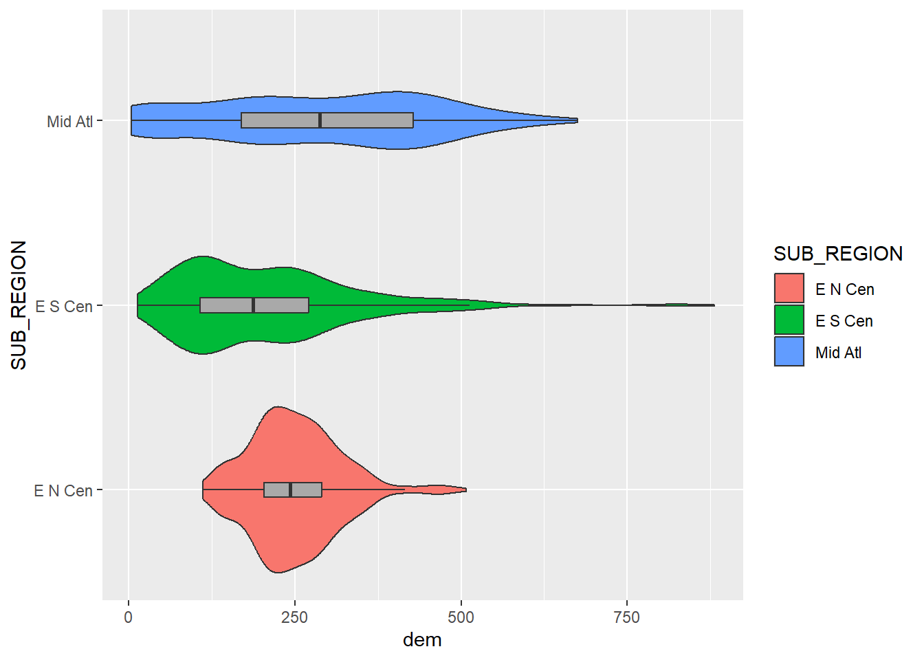
20.9 Concluding Remarks
We hope this introduction to ggplot2 has provided you an adequate understanding of the package’s terminology, syntax, and aesthetic mappings. The graphs generated here would need some work before they could be considered final products for a presentation, report, write-up, or publication. In the next chapter, we explore a variety of techniques to make ggplot2 graphs pretty including adding text, editing axis scales and labels, changing fonts and colors, using themes, customizing legends, adding geometric features, and combining multiple graphs into a single layout. We also explore how to export graphs as raster and vector graphics.
20.10 Questions
- Why is the size of a point symbol or the thickness of a line not used to show a categorical or nominal variable?
- Why is the shape of a point symbol not used to show a continuous variable?
- What is the interquartile range (IQR) of a set of values?
- Explain how a violin plot is similar to a kernel density plot.
- Explain the difference between
geom_bar()andgeom_col(). - Explain the purpose of
geom_rug(). - Explain the purpose of
geom_count(). - Explain the difference between
geom_abline(),geom_hline(), andgeom_vline().
20.11 Exercises
You have been provided with a urban tree dataset for Portland, Oregon in the exercise folder for the chapter. These data are also avaialble here.
Task 1
Complete the following pre-processing tasks using the tidyverse.
- Read in portlandTrees.csv
- Select out following columns: “Common_nam”, “Genus_spec”, “Family”, “Genus”, “DBH”, “TreeHeight”, “CrownWidth”, “CrownBaseH”, and “Condition”
- Convert all character columns to factors
- Rename columns as follows:
- “Common_nam =”Common”
- “Genus_spec” = “Scientific”
- “Family =”Family”
- “Genus” = “Genus”
- “DBH” = “DBH”
- “TreeHeight” = “Height”
- “CrownWidth” = “CrownWidth”
- “CrownBaseH” = “CrownBaseHeight”
- “Condition” = “Condition”
- Remove all trees from the dataset that have a condition of “Dead”
- Create a new common name column and lump all species that have less than 200 samples in the dataset into an “Other” class
- Drop any rows with missing data
Task 2
Generate the following graphs using ggplot2:
- Histogram of DBH for just trees in the Acer genus
- Histogram+kernel density plot of DBH for just trees in the Acer genus
- Grouped box plot of DBH for all maple species (grouped by species)
- Grouped kernel density plot for DBH of all maple species with transparency (grouped by species)
- Grouped box plot of different genera for height (grouped by genera) for just the following genera: Quercus, Acer, Pseudotsuga, Umus, Pinus, and Fagus
- Violin plot of different genera for height (grouped by genera) for just the following genera: Quercus, Acer, Pseudotsuga, Umus, Pinus, and Fagus
- Violin + box plot for different genera by height (grouped by genera) for just the following genera: Quercus, Acer, Pseudotsuga, Umus, Pinus, and Fagus
- Mean height by genera with error bars showing +/- 1 standard deviation for just the following genera: Quercus, Acer, Pseudotsuga, Umus, Pinus, and Fagus
- Column plot for count of trees by genera for just the following genera: Quercus, Acer, Pseudotsuga, Umus, Pinus, and Fagus
- Count of features in each combination of factor levels for condition and genus for the following genera: Quercus, Acer, Pseudotsuga, Umus, Pinus, and *Fagus (hint: use
geom_count()) - Scatter plot of DBH vs. Height for just the Douglas-Fir species
- Hexagonal bin of DBH vs. Height for just the Douglas-Fir species with a bin size of 5
- Scatter plot with separate point symbol color and linear trend lines for DBH vs. height for the Douglas-fir and Giant Sequoia species.
- Scatter plot with separate point symbol/shape and linear trend lines for DBH vs. height for both the Douglas-fir and Giant Sequoia species
- Scatter plot for only Giant Sequoia with x = DBH, y = height, and size = crown width