21 Graphing with ggplot2 (Part II)
21.1 Topics Covered
- Using themes
- Defining colors
- Adding text and labels
- Formatting scales
- Using faceting
- Merging multiple graphs to a single layout
- Exporting figures as raster and vector graphics
21.2 Introduction
In the last chapter we explored the basics of ggplot2 with a focus on syntax and defining aesthetic mappings. In this section, we demonstrate methods to improve ggplot2 output. There are a wide variety of graph editing options. We have tried to focus on techniques that we find particularly useful or common. Since ggplot2 has a large user base, there is a lot of help available online if you are struggling with a specific task.
To follow along, you will need to load the following packages: the tidyverse (this includes ggplot2), ggthemes, hrbrthemes, ggpubr, cowplot, and scales. We work with the same data sets used in the last chapter: us_county_data.csv and mapleLeaf.csv.
21.3 Basic Editing
21.3.1 Using Themes
There are multiple theme_*() functions that are provided by ggplot2 or other packages including ggthemes, hrbrthemes, and ggpubr themes. Several different themes are visualized below. The package that provides the theme is stated in parenthesis in the plot title. These base themes can be further edited, as we explore below. A specific theme may serve as a better starting point than the base ggplot2 theme.
cntyD |> ggplot(aes(x=fct_reorder(SUB_REGION, per_crop, .fun=median, .desc=TRUE), y=per_crop, fill=SUB_REGION))+
  geom_boxplot()+
  ggtitle("Default ggplot2 Theme")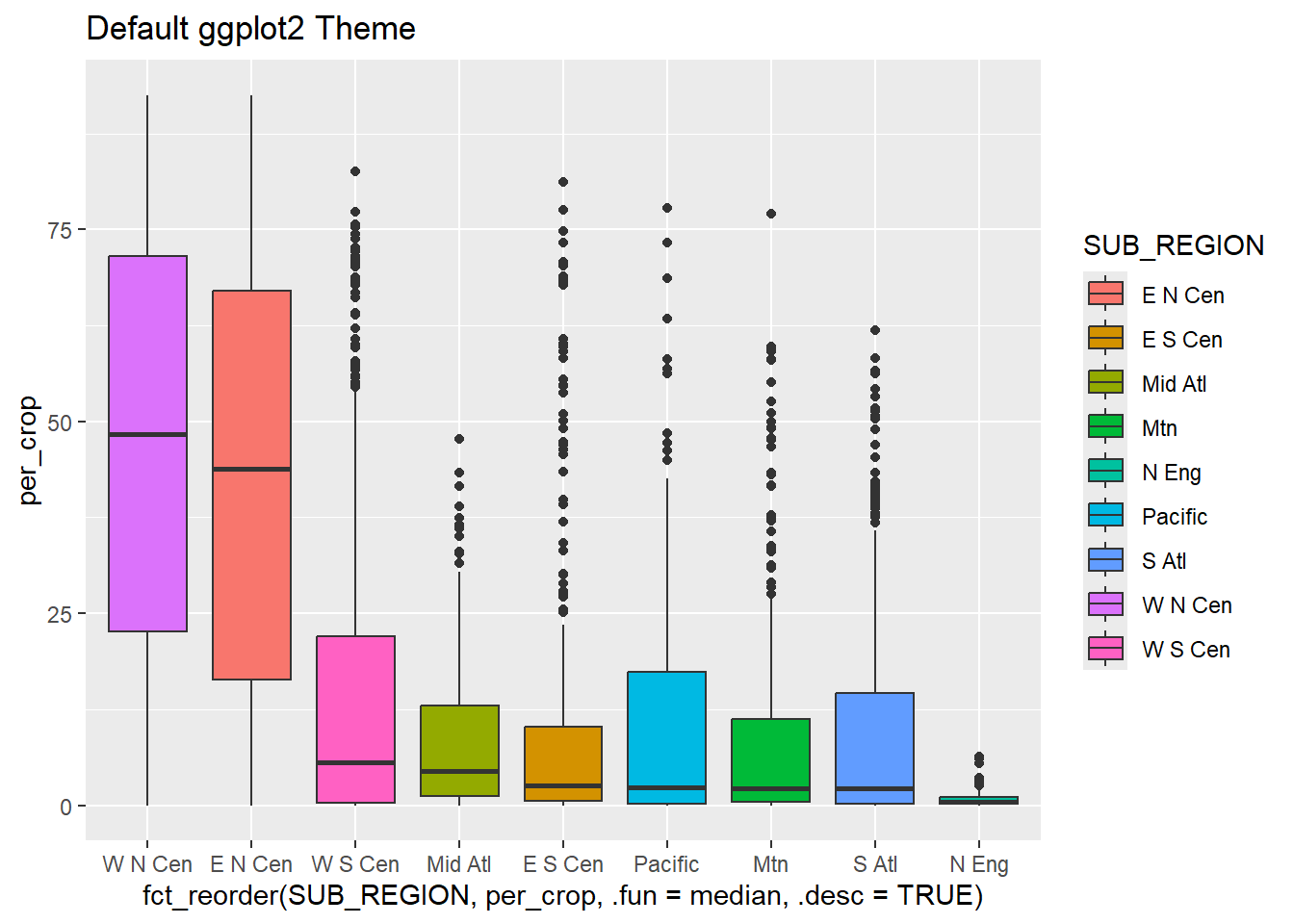
cntyD |> ggplot(aes(x=fct_reorder(SUB_REGION, per_crop, .fun=median, .desc=TRUE), y=per_crop, fill=SUB_REGION))+
  geom_boxplot()+
  theme_economist()+
  ggtitle("Economist Theme (ggthemes)")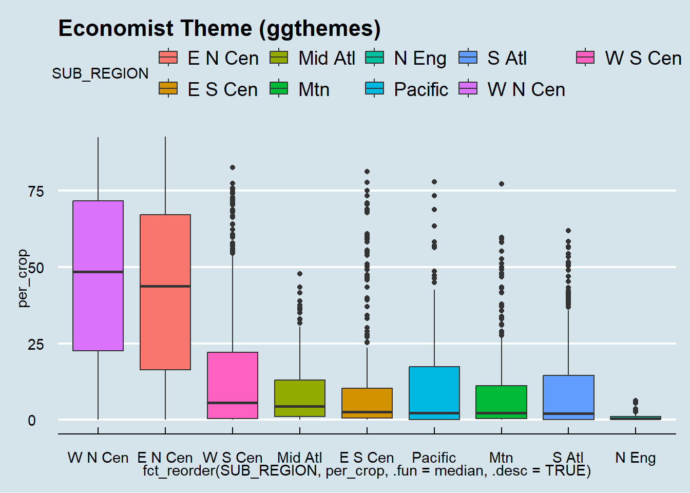
cntyD |> ggplot(aes(x=fct_reorder(SUB_REGION, per_crop, .fun=median, .desc=TRUE), y=per_crop, fill=SUB_REGION))+
  geom_boxplot()+
  theme_gdocs()+
  ggtitle("Google Docs Theme (ggthemes)")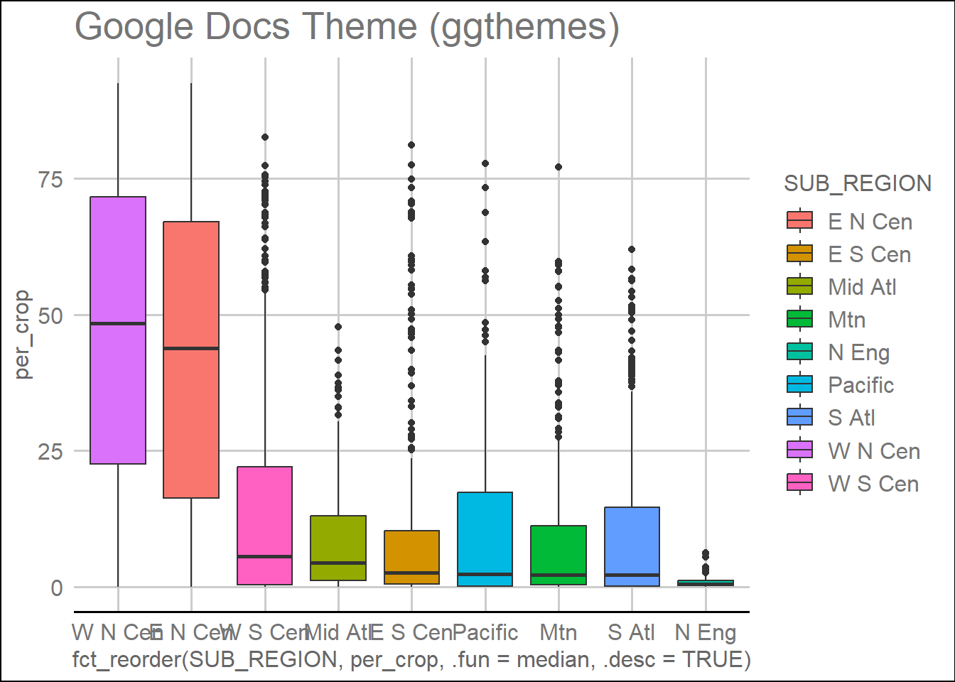
cntyD |> ggplot(aes(x=fct_reorder(SUB_REGION, per_crop, .fun=median, .desc=TRUE), y=per_crop, fill=SUB_REGION))+
  geom_boxplot()+
  theme_excel()+
  ggtitle("Excel Theme (ggthemes)")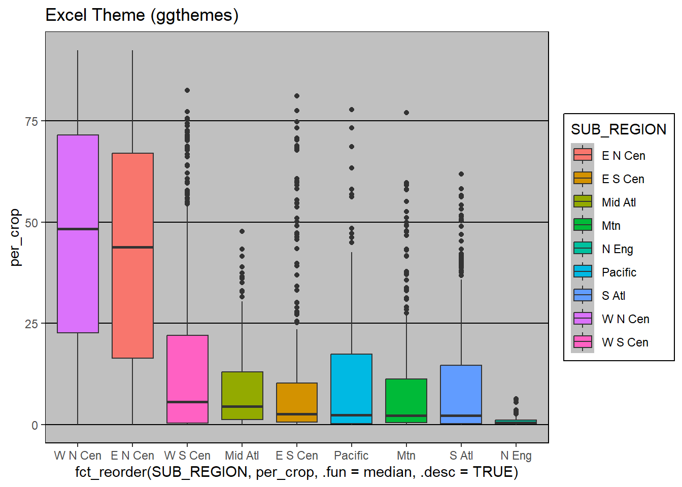
cntyD |> ggplot(aes(x=fct_reorder(SUB_REGION, per_crop, .fun=median, .desc=TRUE), y=per_crop, fill=SUB_REGION))+
  geom_boxplot()+
  theme_ipsum()+
  ggtitle("Ipsum Theme (hrbrthemes)")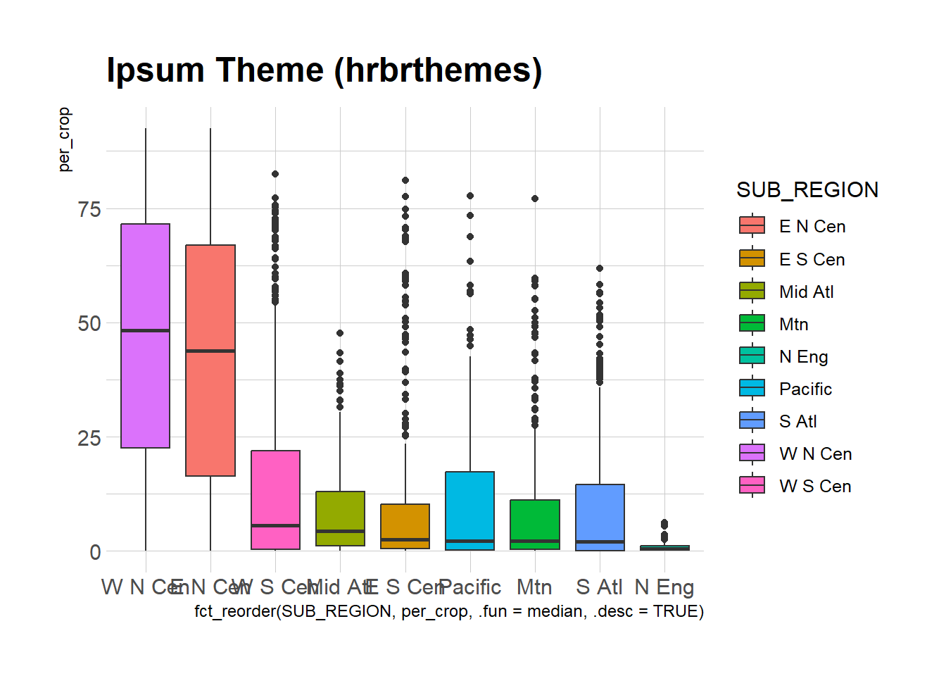
cntyD |> ggplot(aes(x=fct_reorder(SUB_REGION, per_crop, .fun=median, .desc=TRUE), y=per_crop, fill=SUB_REGION))+
  geom_boxplot()+
  theme_pubr()+
  ggtitle("PubR Theme (ggpubr)")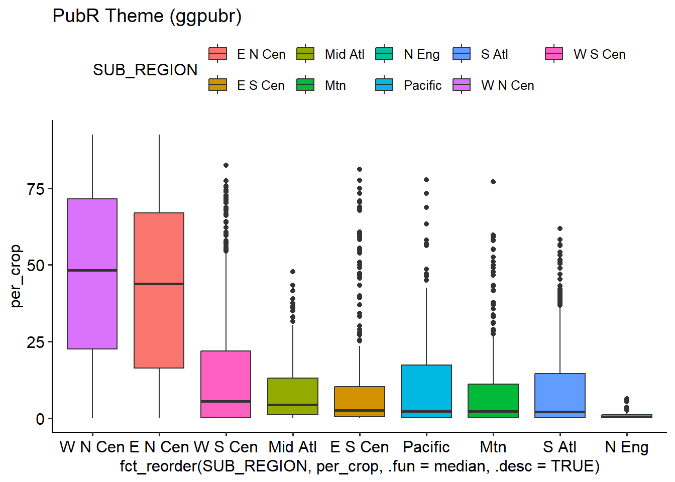
We like to use theme_classic() or theme_bw() as a good starting base. However, this is just our opinion, so we recommend experimenting with other options to find something that might better suite your needs.
cntyD |> ggplot(aes(x=fct_reorder(SUB_REGION, per_crop, .fun=median, .desc=TRUE), y=per_crop, fill=SUB_REGION))+
  geom_boxplot()+
  theme_classic()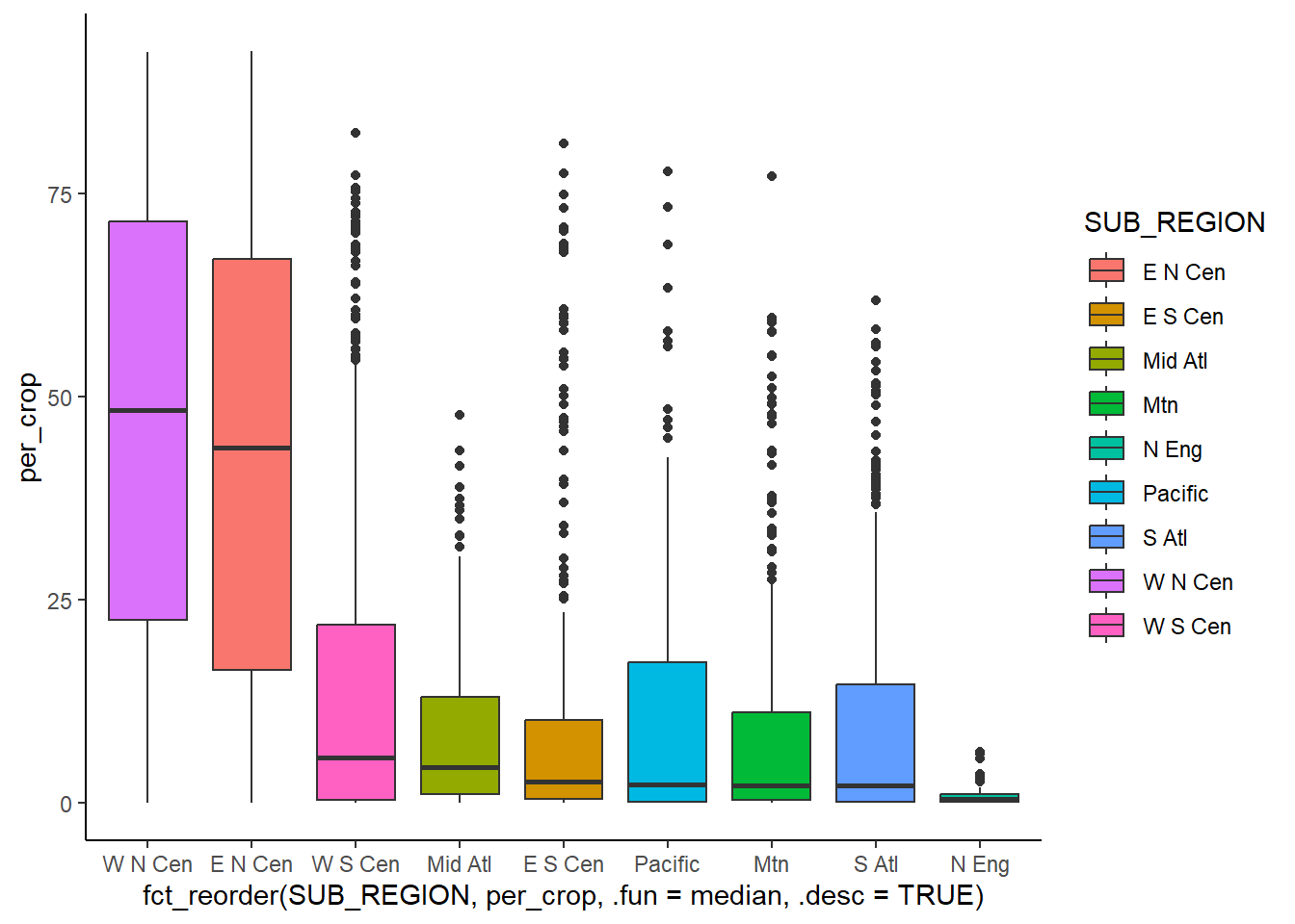
cntyD |> ggplot(aes(x=fct_reorder(SUB_REGION, per_crop, .fun=median, .desc=TRUE), y=per_crop, fill=SUB_REGION))+
  geom_boxplot()+
  theme_bw()
The base_size argument is useful for defining a base font size for a plot.
cntyD |> ggplot(aes(x=fct_reorder(SUB_REGION, per_crop, .fun=median, .desc=TRUE), y=per_crop, fill=SUB_REGION))+
  geom_boxplot()+
  theme_classic(base_size=14)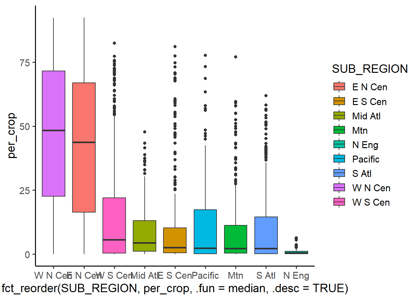
21.3.2 Defining Colors
There are multiple methods to define color in R. First, you can use a named R color. A full list of named R colors can be found here. Another option is to use a hex code, which requires starting the code with a # and using quotes. A red, green, blue (RGB) (i.e., additive color space) color can be defined using the rgb() function, which also allows for defining transparency using the alpha parameter. Note that RGB colors in R are defined using a range of 0 to 1 as opposed to 0 to 255 (i.e., 8-bit), which is common in many other software packages. Lastly, you can also define colors using hue, saturation and value via the hsv() function. Hue relates to the base color, saturation is conceptualized as mixing the base color with gray, and value relates to brightness. This is simply another way to define a color other than using RGB values.
We generally prefer to use hex codes; however, that is just a personal preference. We recommend checking out the Adobe Color website. This is a great tool for selecting colors and obtaining their associated hex codes or RGB values. It is also important to consider selecting colors not impacted by different types of color vision deficiency. Another great site for selecting color and color palettes is Color Brewer 2.0. As we discuss in the tmap chapter, the cols4all package is also a great tool for choosing and creating color palettes.
The code block below demonstrates different means to define colors.
cntyD |> ggplot(aes(x=dem, y=tempmn))+
  geom_point(color="darkgreen")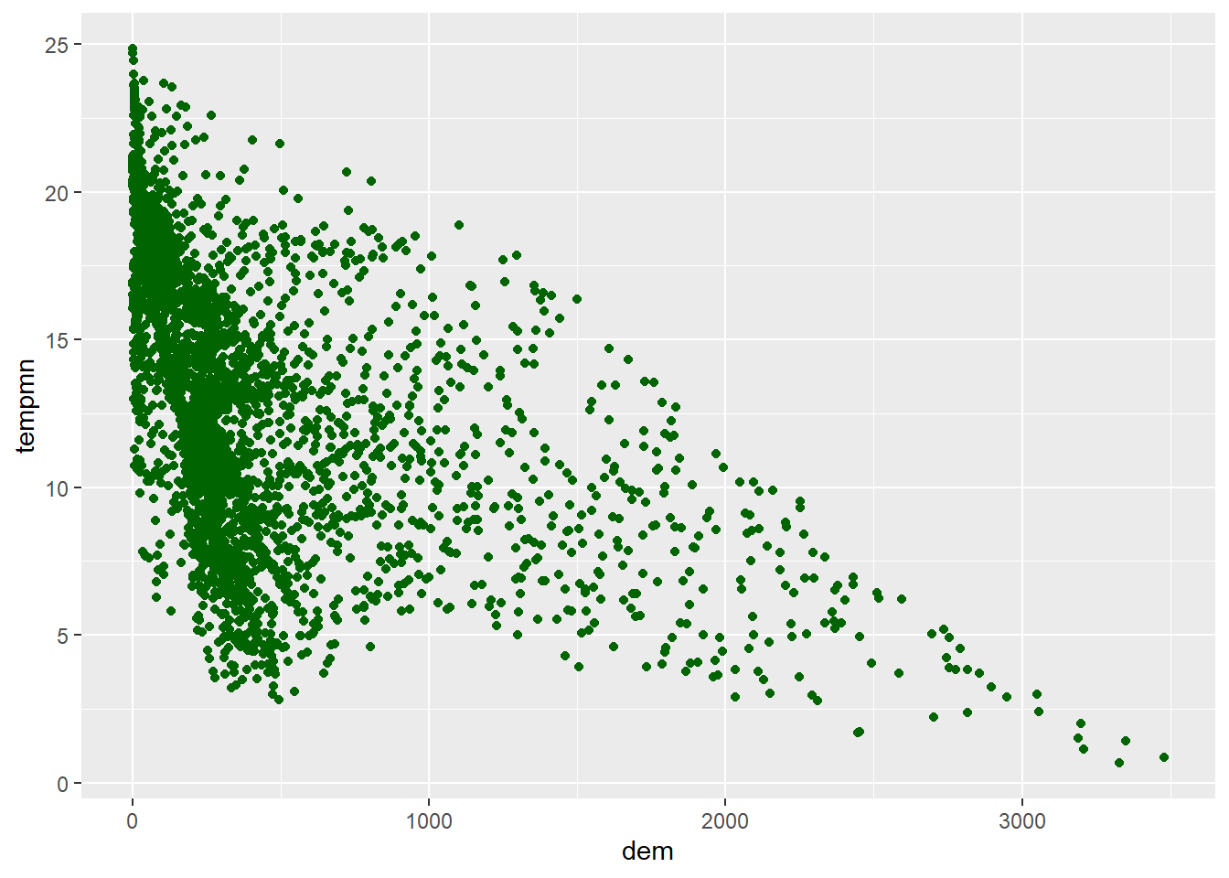
cntyD |> ggplot(aes(x=dem, y=tempmn))+
  geom_point(color="#A3142B")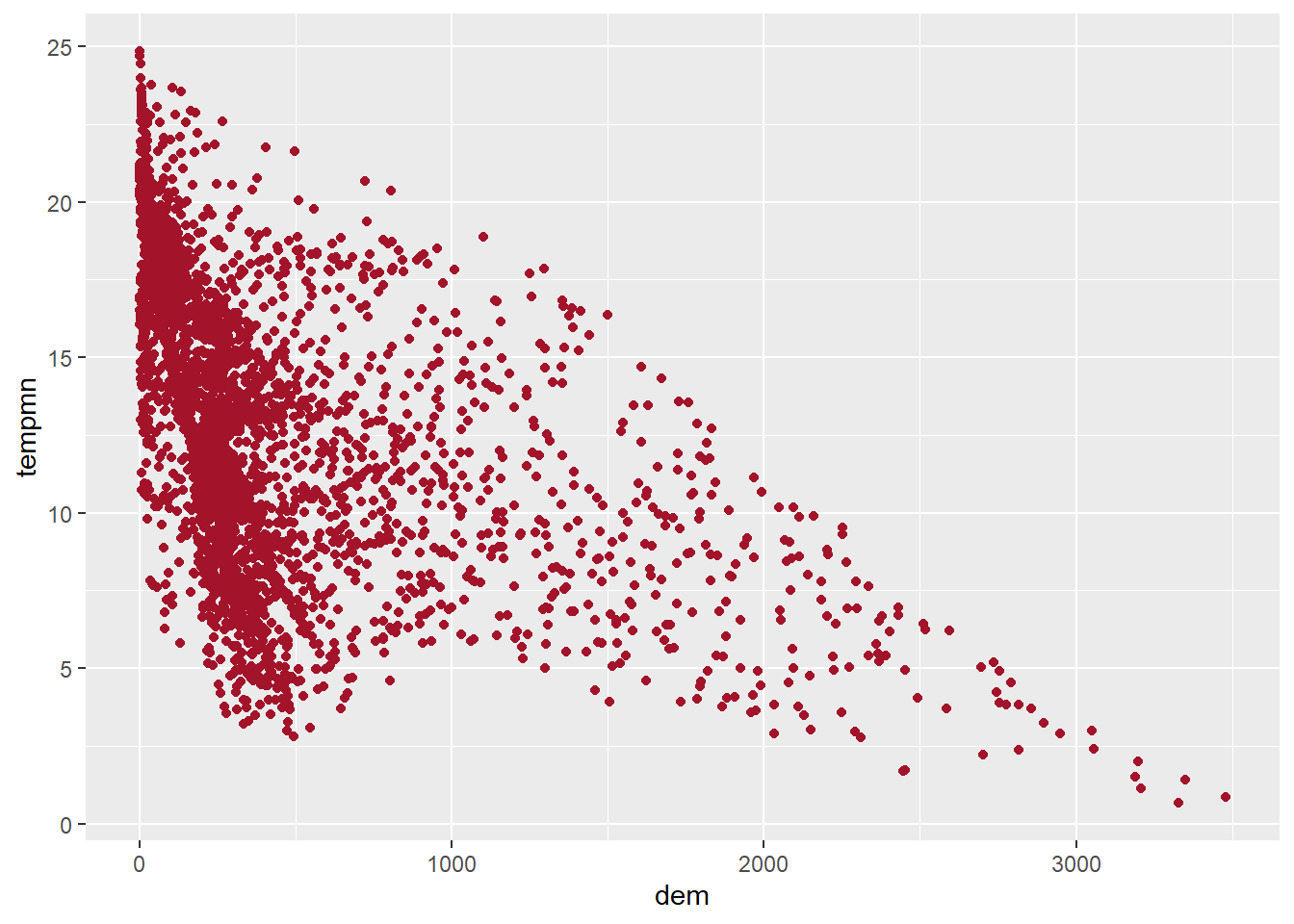
cntyD |> ggplot(aes(x=dem, y=tempmn))+
  geom_point(color=rgb(.2, .8, .1))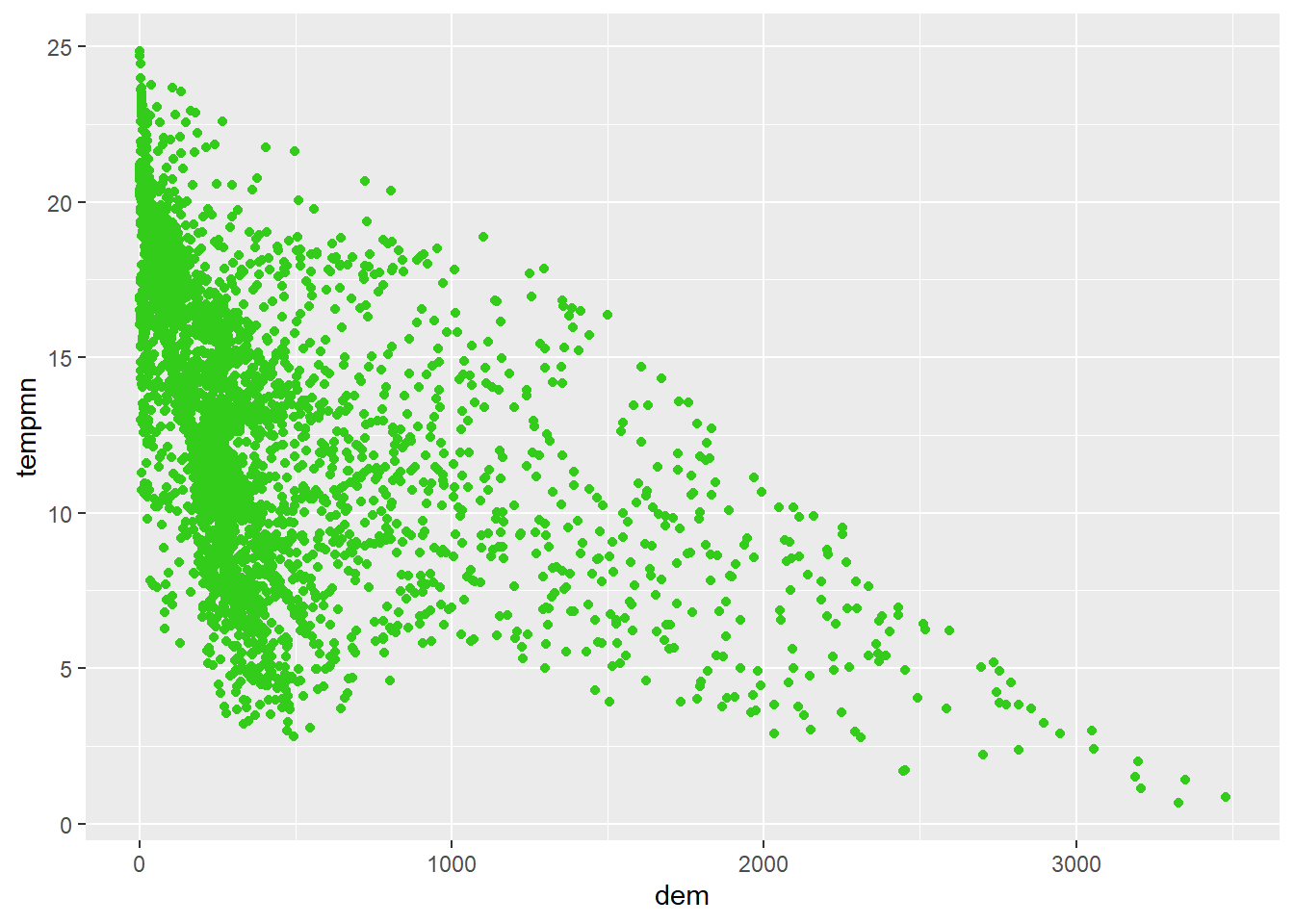
cntyD |> ggplot(aes(x=dem, y=tempmn))+
  geom_point(color=rgb(.2, .8, .1, alpha=.5))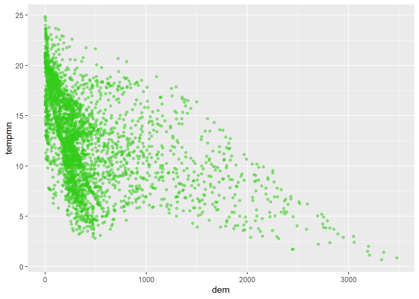
cntyD |> ggplot(aes(x=dem, y=tempmn))+
  geom_point(color=hsv(.75,.8,.7))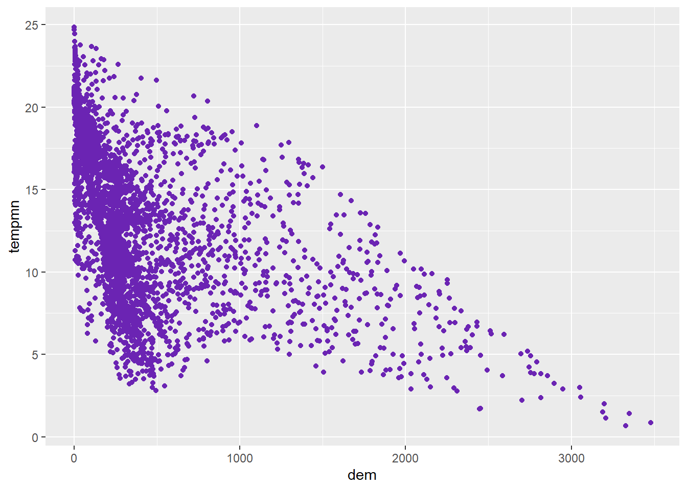
21.3.3 Setting Labels
The main plot title can be set using ggtitle() or using the title parameter within labs(). Axes titles can be set using the x and y arguments within labs. For different aesthetic mappings, their associated title in the legend can also be set using labs. In our example below, the title for the fill color is set using the fill parameter. It is a good idea to use meaningful and clean names within your graphs. Including codes, odd abbreviations, or odd column names is an indicator of a poorly designed graph.
cntyD |> ggplot(aes(x=fct_reorder(SUB_REGION, per_crop, .fun=median, .desc=TRUE), y=per_crop, fill=SUB_REGION))+
  geom_boxplot()+
  ggtitle("Percent Cropland by Sub-Region of the United States")+
  labs(x="Sub-Region",
       y = "Percent Cropland",
       fill="Sub-Region")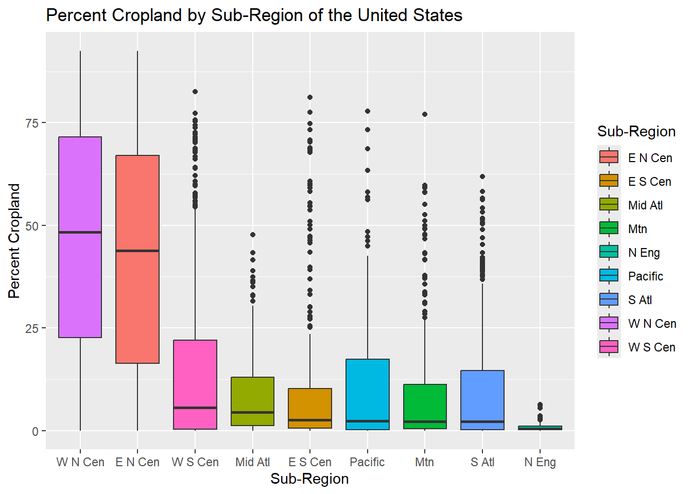
21.3.4 Formatting Scales
ggplot2 provides a variety of functions for editing scales, as described in Table 21.1. The general form is scale_AESTHETIC MAPPING_DATA TYPE(). For example, scale_y_continuous() is used for a continuous variable mapped to the y-axis. In contrast, scale_x_discrete() is used for a categorical or nominal variable mapped to the x-axis. scale_fill_continuous() is used for a continuous variable mapped to a fill color.
| Function | Use |
|---|---|
| scale_*_continuous() | Map a continuous color, size, or line thickness |
| scale_*_discrete() | Show discrete or categorial data with unordered colors, shapes, line types, or symbols |
| scale_*_binned() | Visualize continuous data using ordered colors, size, or thickness bins (i.e., a range of values are mapped to a single color or size) |
| scale_*_manual() | Manually assign color, size, shape, type to each discrete category |
| scale_*_date() | For date data |
| scale_*_datetime() | For date+time data |
| scale_*_sqrt() | Map raw value to square root of value |
| scale_*_log10() | Map raw value to base-10 log of value |
In our first example, we are using scale_y_continuous() to format the y-axis. The breaks parameter defines the tick marks or divisions, limits defines the start and end of the scale, and labels define how to label the tick marks. Note that the breaks and labels are matched based on position in the vectors; as a result, it is important that you define the labels in the correct order.
By default, ggplot2 places a gap between the plot content and the plot axes. This gap can be removed using expand = c(0, 0) if desired. You can also decrease or increase the gap using different values within expand().
It is also possible to use helper functions to define label formatting. In the second example, we use the label_percent() function from the scales package to format the tick labels as percentages. In the third example, where we are now showing median income, we use label_currency(). We highly recommend checking out the scales package, as this is often a much easier way to format tick mark labels than doing so manually. It is also generally less error prone.
cntyD |> ggplot(aes(x=fct_reorder(SUB_REGION, per_crop, .fun=median, .desc=TRUE), y=per_crop, fill=SUB_REGION))+
  geom_boxplot()+
  ggtitle("Percent Cropland by Sub-Region of the United States")+
  labs(x="Sub-Region",
       y = "Percent Cropland",
       fill="Sub Region")+
  scale_y_continuous(expand = c(0, 0),
                     breaks = c(0, 20, 40, 60, 80, 100),
                     limits= c(0, 100),
                     labels= c("0%", "20%", "40%", "60%", "80%", "100%"))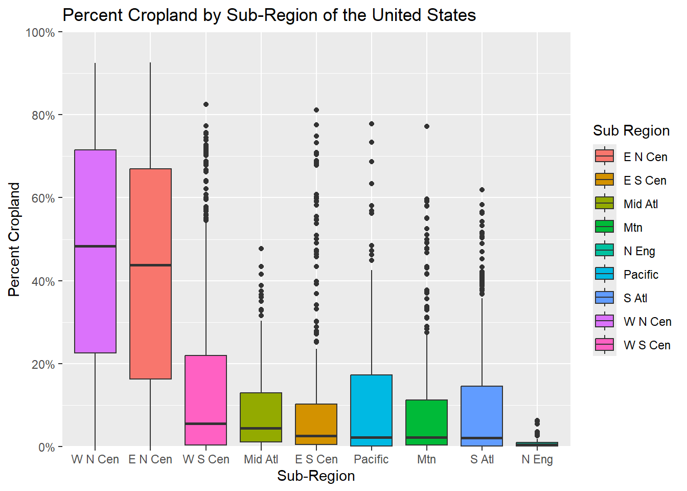
cntyD |> ggplot(aes(x=fct_reorder(SUB_REGION, per_crop, .fun=median, .desc=TRUE),
                    y=per_crop/100, fill=SUB_REGION))+
  geom_boxplot()+
  ggtitle("Percent Cropland by Sub-Region of the United States")+
  labs(x="Sub-Region",
       y = "Percent Cropland",
       fill="Sub Region")+
  scale_y_continuous(expand = c(0, 0),
                     breaks = seq(0,1, by=.1),
                     limits= c(0, 1),
                     labels= label_percent(accuracy=0.1))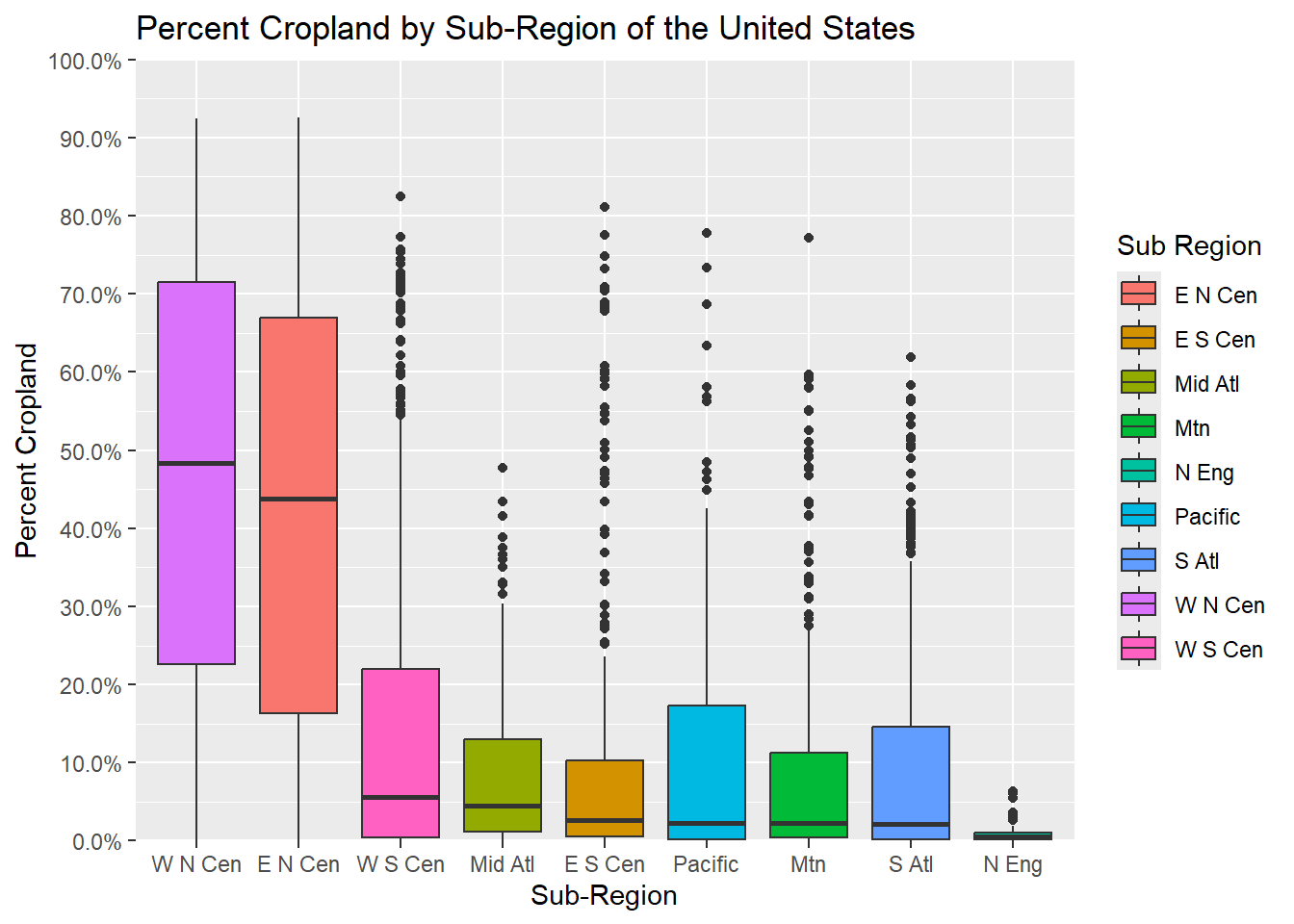
cntyD |> ggplot(aes(x=fct_reorder(SUB_REGION, med_income, .fun=median, .desc=TRUE), y=med_income, fill=SUB_REGION))+
  geom_boxplot()+
  ggtitle("Median Household Income by Sub-Region of the United States")+
  labs(x="Sub-Region",
       y = "Income",
       fill="Sub Region")+
  scale_y_continuous(expand = c(0, 0),
                     breaks = seq(0,150000, by=20000),
                     limits= c(0, 150000),
                     labels= label_currency(accuracy=1))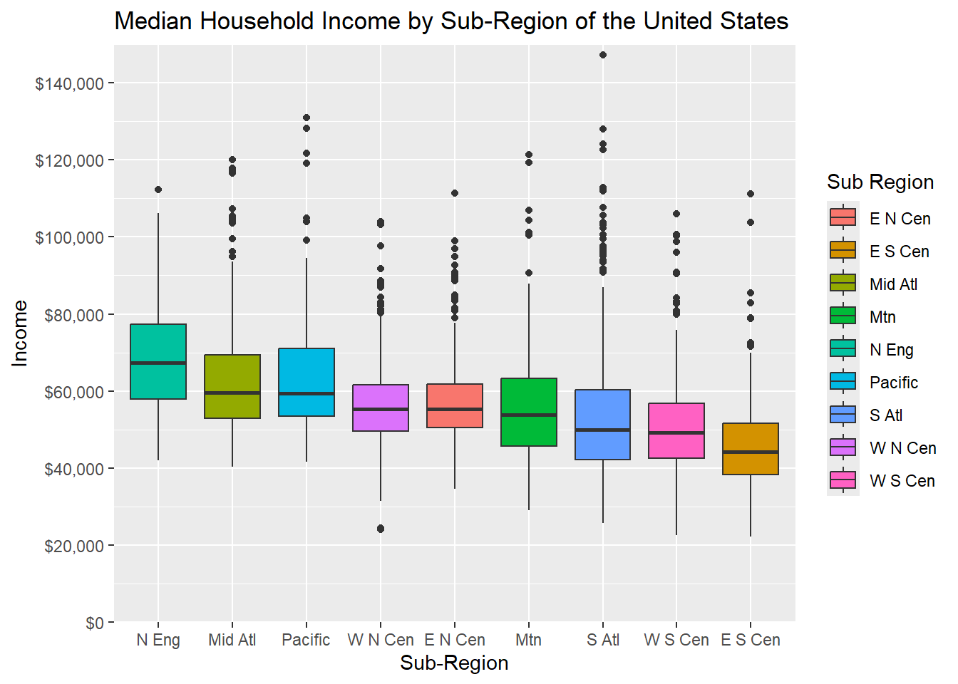
In this example, we expand upon the last graph by also editing the scale for the x-axis and fill color. This is accomplished using scale_fill_manual() and scale_fill_discrete(). These two functions are commonly confused. scale_*_manual() allows you to manually assign fill colors, outline colors, shapes, etc. and define the associated labels while scale_*discrete() allows you to format a discrete symbology. For example you could apply a different unordered color ramp to discrete data values. In our example, we are using scale_x_discrete() to change the names of the sub-regions while we are using scale_fill_manual() to update both the colors and sub-region names. Also, note the use of hex codes to define the colors. We also rotate the x-axis labels so that they do not overlap. We will talk about this in the next section.
cntyD$SUB_REGION <- cntyD$SUB_REGION |>
  fct_reorder(cntyD$per_crop, .fun=median, .desc=TRUE)

cntyD |> ggplot(aes(x=fct_reorder(SUB_REGION, per_crop, .fun=median, .desc=TRUE),
                    y=per_crop/100, fill=SUB_REGION))+
  geom_boxplot()+
  ggtitle("Percent Cropland by Sub-Region of the United States")+
  labs(x="Sub-Region", y = "Percent Cropland", fill="Sub Region")+
  scale_y_continuous(expand = c(0, 0),
                     breaks = seq(0,1, by=.1),
                     limits= c(0, 1),
                     labels= label_percent(accuracy=0.1))+
  scale_fill_manual(values = c("#1b9e77",
                               "#d95f02",
                               "#7570b3",
                               "#e7298a",
                               "#66a61e",
                               "#e6a61e",
                               "#e6761d",
                               "#666666",
                               "#45A1D3"),
                    labels = c("West North Central",
                               "East North Centeral",
                               "West South Centeral",
                               "Mid-Atlantic",
                               "East South Central",
                               "Pacific",
                               "Mountain",
                               "South Atlantic",
                               "New England"))+
  scale_x_discrete(expand = c(.075, .075),
                   labels = c("West North Central",
                              "East North Centeral",
                              "West South Centeral",
                              "Mid-Atlantic",
                              "East South Central",
                              "Pacific",
                              "Mountain",
                              "South Atlantic",
                              "New England"))+
  theme(axis.text.x = element_text(angle = 45, hjust=1))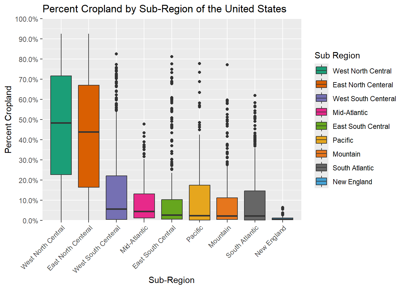
Understanding how to use the scale_*_*() functions are an important component of editing or building ggplot2 graphs. Fortunately, they are pretty intuitive once you understand the associated logic.
21.4 Additional Theme Editing
The theme() function allows you to change a variety of graph elements. In the example below, we are doing the following. These changes could have been made using only a single call to theme(); however, we find it easier to read if broken into multiple calls. This is just personal preference.
- Set the font size and font color of the y-axis tick labels
- Set the font size and font color and change the angle and horizontal position for the x-axis labels
- Make the main title bold, increase its font size, and change its color
- Set the font size and color for the axes labels
- Remove the legend
- Add y-axis lines
Sometimes legends are not necessary. In the example below, the legend is not necessary since the x-axis labels provide the sub-region names. If you want to remove the legend, this can be accomplished with theme(legend.position = "None").
cntyD |> ggplot(aes(x=fct_reorder(SUB_REGION, per_crop, .fun=median, .desc=TRUE),
                    y=per_crop/100, fill=SUB_REGION))+
  geom_boxplot()+
  theme_classic(base_size=12)+
  ggtitle("Percent Cropland by Sub-Region of the United States")+
  labs(x="Sub-Region",
       y = "Percent Cropland",
       fill="Sub Region")+
  scale_y_continuous(expand = c(0, 0),
                     breaks = seq(0,1, by=.1),
                     limits= c(0, 1),
                     labels= label_percent(accuracy=0.1))+
  scale_fill_manual(values = c("#1b9e77",
                               "#d95f02",
                               "#7570b3",
                               "#e7298a",
                               "#66a61e",
                               "#e6a61e",
                               "#e6761d",
                               "#666666",
                               "#45A1D3"),
                    labels = c("West North Central",
                               "East North Centeral",
                               "West South Centeral",
                               "Mid-Atlantic",
                               "East South Central",
                               "Pacific",
                               "Mountain",
                               "South Atlantic",
                               "New England"))+
  scale_x_discrete(expand = c(.075, .075),
                   labels = c("West North Central",
                              "East North Centeral",
                              "West South Centeral",
                              "Mid-Atlantic",
                              "East South Central",
                              "Pacific",
                              "Mountain",
                              "South Atlantic",
                              "New England"))+
  theme(axis.text.y = element_text(size=12, color="gray20"))+
  theme(axis.text.x = element_text(size=12, color="gray20", angle=45, hjust=1))+
  theme(plot.title = element_text(face="bold", size=18, color="gray20"))+
  theme(axis.title = element_text(size=14, color="gray20"))+
  theme(legend.position = "None")+
  theme(panel.grid.major.y = element_line(colour = "gray20", linetype="dashed"))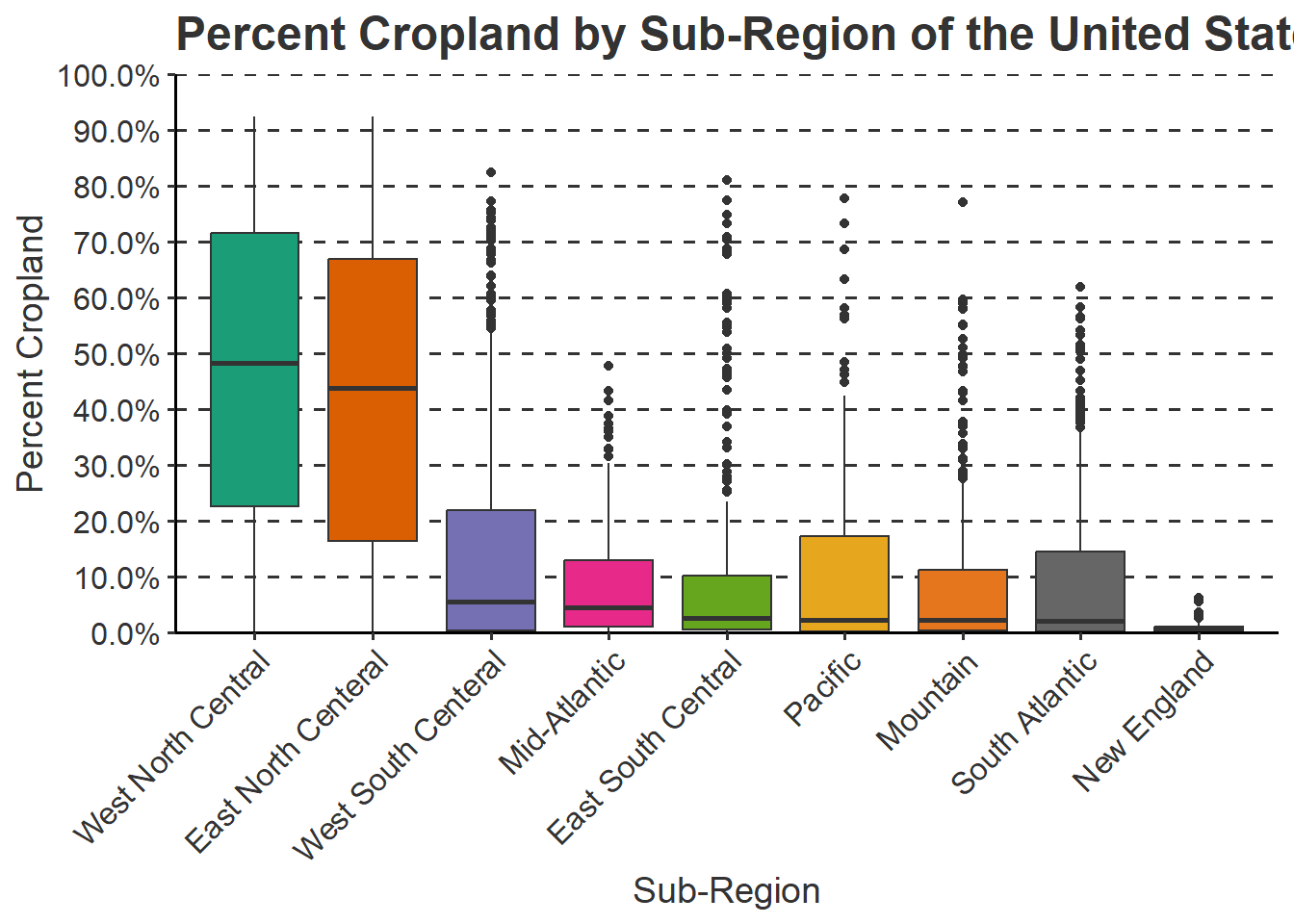
The are a variety of other theme elements that can be changed. We recommend searching the web or checking the ggplot2 documentation if you are trying to accomplish a specific task.
21.5 Example 1: Grouped Box Plot
In this first example, we step through the process of creating a polished grouped box plot of mean county elevation data for a subset of states from the entire data sets. This requires first filtering out the counties of interest using dplyr. This may seem like a complex set of code. However, once we break it down you will see that it is actually pretty intuitive.
- We are applying a new theme (
theme_classic()). Among other changes, this removes the default gray plot background. - We provide a title using the
ggtitle()function. - We provide axes titles and a title for the fill color using the
labs()function. - We would like to define our own colors to represent each state. This is accomplished using the
scale_fill_manual()function. This is a discrete scale, as opposed to a continuous scale, because a categorical variable is mapped to the fill color as opposed to a continuous variable. Thevaluesargument provides a vector of hex codes to represent different colors in 8-bit RGB color space. The number of colors provided must match the number of categories. Thelabelsparameter allows us to apply a specific label to each category, in this case states. Instead of using the full state name, we have used the state abbreviations. Note that the names and associated colors and labels must be in the same order so that they are correctly associated. In other words, the association is based on the position or index in the vector. - The state name is mapped to the fill color and the x-axis. So, we need to make similar adjustments for the x-axis aesthetic. Using
scale_x_discrete(), we apply the same labels to the x-axis as were applied for the fill color. By default, ggplot2 places a gap between the axes and the graph. This can be removed or altered using theexpandargument. We have set this to 0.075 in the right and left directions so that the gap distance is reduced. - Since a continuous variable is mapped to the y-axis, we use
scale_y_continuous()to make adjustments. We remove the gap between the axis and the graph using expand and a distance of zero in the up and down directions. Thebreaksargument defines the desired breaks, thelimitsargument defines the minimum and maximum values to plot on the axis, and thelabelsargument is used to change the break labels on the axis. - The remaining lines make manual alterations to the chosen theme, in this case
theme_classic(). We change the font size to 12-point for the x-axis and y-axis labels and change the color using a named color ("gray40"). We bold the title, changing the size to 18-point, and change the color. The x-axis and y-axis titles are changed to 14-point font. We remove the legend by setting thelegend.positionargument to"None".”Since the x-axis explains the colors, we don’t need a legend. Lastly, we add in gray grid lines with a dashed pattern for the major y-axis divisions. We could have included all of the theme changes in a singletheme()call. However, we find that it is easier to read when broken into separate components.
We encourage you to experiment with this example by making alterations, adding additional modifications, and/or commenting out lines. The best way to learn ggplot2 is to experiment. Remember to include a + at the end of each component to string them together. This site provides a great reference for ggplot2. Once you feel comfortable with this, try applying these methods to your own data.
cntyD |> filter(STATE_ABBR %in% c("CO", "UT", "WY", "MN", "NE", "ND", "SD", "KS")) |>
ggplot(aes(x=fct_reorder(STATE_NAME, dem, .fun= median, .desc=TRUE), y=dem, fill=STATE_NAME))+
geom_boxplot()+
theme_classic()+
ggtitle("Mean County Elevation by State")+
labs(x="State", y="Elevation (feet)", fill="state")+
scale_fill_manual(values = c("#1b9e77", "#d95f02", "#7570b3", "#e7298a", "#66a61e", "#e6a61e", "#e6761d", "#666666"), labels = c("CO", "UT", "WY", "MN", "NE", "ND", "SD", "KS"))+
scale_x_discrete(expand = c(.075, .075), labels = c("CO", "UT", "WY", "MN", "NE", "ND", "SD", "KS"))+
scale_y_continuous(expand = c(0, 0),breaks = c(500,1000, 1500, 2000, 2500, 3000, 3500), limits= c(0, 4000), labels= c("500", "1,000", "1,500", "2,000", "2,500", "3,000", "3,500"))+
theme(axis.text.y = element_text(size=12, color="gray40"))+
theme(axis.text.x = element_text(size=12, color="gray40"))+
theme(plot.title = element_text(face="bold", size=18, color="gray40"))+
theme(axis.title = element_text(size=14, color="gray40"))+
theme(legend.position = "None")+
theme(panel.grid.major.y = element_line(colour = "gray40", linetype="dashed"))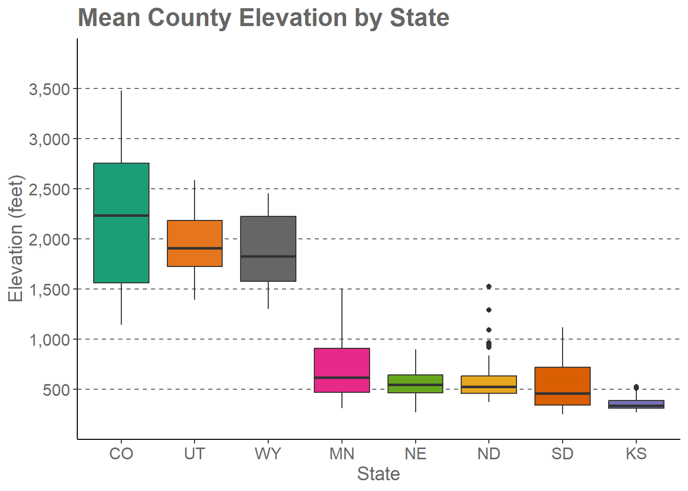
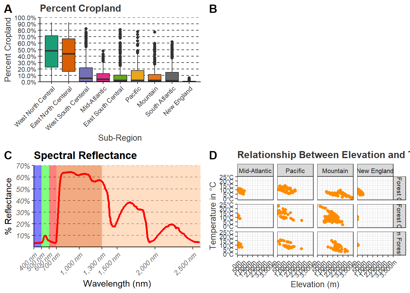
21.6 Example 2: Maple Leaf Spectral Reflectance Curve
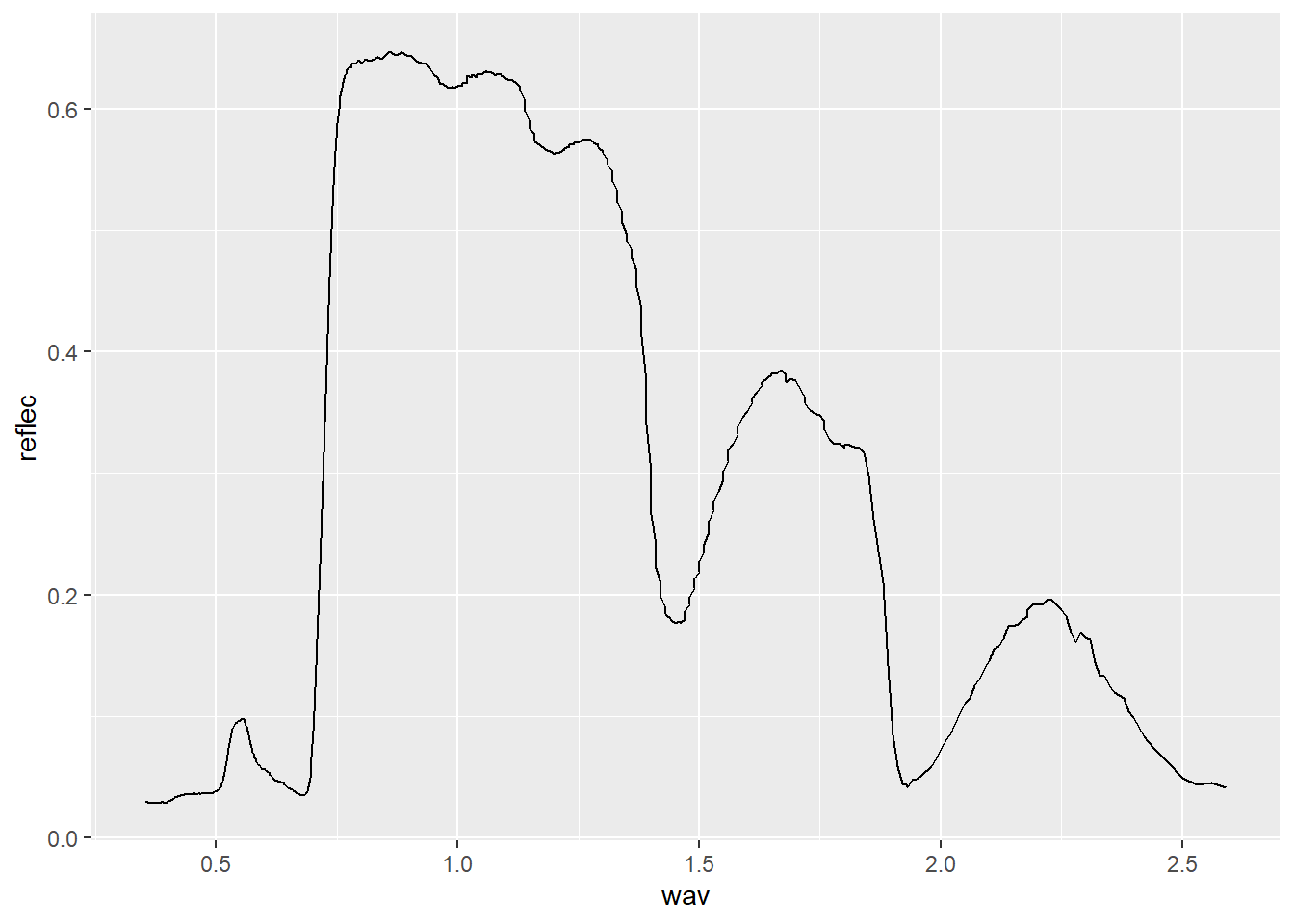
In the last section, we generated a spectral reflectance graph for a maple leaf using the code provided below.
Now, we will further modify the graph. We have provided the code below. Here are explanations for the key changes.
- We want to highlight the different spectral regions in the graph. To do so, we first create a data frame that provided the x- and y-extents of each range along with a label. We then used this data frame and
geom_rect()to define rectangular extents in the graph space that correspond to each spectral range. We apply a transparency of 50% using thealphaargument so that the graph background can be viewed beneath the rectangles. We also place the addedgeom_rect()function before thegeom_line()function that defines the spectral curve so that the curve is placed above the rectangles in the graph space. - Instead of using the default colors assigned to the spectral regions, we want to define our own colors and labels. This is accomplished using the
scale_fill_manual()function, hex codes to define colors, and a list of labels. Note again that the order must be the same so that categories, colors, and labels match up. - A title and axes labels are added using
ggtitle()andlabs(). - Using
scale_x_continuous()andscale_y_continuous(), we define our own breaks, labels, and extent for each axis. We also remove the gap between the graph and the axes using theexpandparameter. - We start with
theme_classic()then make modifications usingtheme(). Due to crowding issues, we rotate the x-axis labels using anangleargument. We then adjusted their horizontal positions usinghjust. For the legend, we place it in the graph space using x and ypositionarguments. The bottom-left corner is assigned a value of(0,0)while the top-right is assigned a value of(1,1). We have placed the legend at(0.9, 0.7)so that it does not overlap with the spectral curve. We also make the background gray and the border black. Since a legend title is unnecessary, it is removed usinglegend.title= element_blank(). Lastly, we edit the major y-axis lines.
region <- c("Blue", "Green", "Red", "NIR", "SWIR")
x1<- c(400, 500, 600, 700, 1300)
x2 <- c(500, 600, 700, 1300, 2600)
y1 <- c(0, 0, 0, 0, 0)
y2 <- c(70, 70, 70, 70, 70)
spec_reg <- data.frame(region, x1, x2, y1, y2)
spec_reg$region <- factor(spec_reg$region,
                          order=TRUE,
                          levels=c("Blue",
                                   "Green",
                                   "Red",
                                   "NIR",
                                   "SWIR"))

ggplot()+
  geom_rect(spec_reg, mapping=aes(xmin=x1, xmax=x2, ymin=y1, ymax=y2, fill=region), alpha=0.5)+
  geom_line(ml, mapping=aes(x=wav*1000, y=reflec*100), color=rgb(1, 0, 0), size=1.2)+
  ggtitle("Maple Leaf Spectral Reflectance")+
  labs(x="Wavelength (nm)", y="% Reflectance", fill="Region")+
  scale_fill_manual(values = c("#0000FF",
                               "#00FF00",
                               "#FF0000",
                               "#E35604",
                               "#FFBE89"),
                    labels = c("Green",
                               "Blue",
                               "Red",
                               "NIR",
                               "SWIR"))+
  theme_classic()+
  scale_x_continuous(expand = c(0, 0),
                     limits=c(400, 2600),
                     breaks=c(400, 500,600, 700, 1000, 1300, 1500, 2000, 2500),
                     labels =c("400 nm",
                               "500 nm",
                               "600 nm",
                               "700 nm",
                               "1,000 nm",
                               "1,300 nm",
                               "1,500 nm",
                               "2,000 nm",
                               "2,500 nm"))+
  scale_y_continuous(expand = c(0, 0),
                     limits=c(0, 70),
                     breaks= c(10,20, 30, 40, 50, 60, 70),
                     labels= c("10%",
                               "20%",
                               "30%",
                               "40%",
                               "50%",
                               "60%",
                               "70%"))+
  theme(axis.text.x = element_text(angle = 45, hjust=1))+
  theme(axis.text = element_text(colour = "gray40", face="italic"))+
  theme(plot.title = element_text(face="bold", size=16))+
  theme(axis.title = element_text(size=14))+
  theme(legend.position = c(.9, .7), legend.background = element_rect(fill="gray87", linewidth=0.5, linetype="solid", colour ="gray28"), legend.title= element_blank())+
  theme(panel.grid.major.y = element_line(colour = "gray40", linetype="dashed"))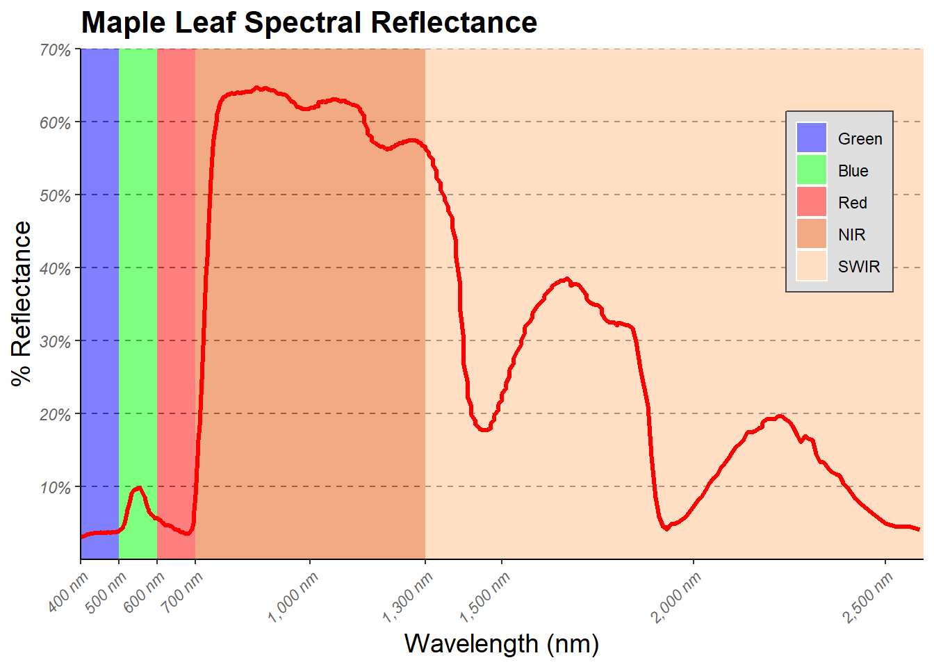
21.7 Facet Grids and Wraps
You may be interested in displaying data from different categories using separate graphs but with the same x and y axes and associated scales for more direct comparison. This is the use of facet_wrap() and facet_grid(). facet_wrap() allows you to use one variable to define the separate plots while facet_grid() allows for using two variables: one defining the rows and the other defining the columns.
In our first example, we are using facet_wrap() to generate a separate plot for each sub-region. The plots wrap around to fill the rows and columns. You can also specify the desired number of rows and columns using the nrow and ncol parameters, respectively. In the second example, we have specified that we want two rows returned, which results in five graphs in the first row and 4 in the second.
vars() is used as a helper function for column names or expressions derived from column names for later use.
cntyD |> ggplot(aes(x=dem, y=tempmn))+
  geom_point()+
  facet_wrap(vars(SUB_REGION))
cntyD |> ggplot(aes(x=dem, y=tempmn))+
  geom_point()+
  facet_wrap(vars(SUB_REGION), nrow=2)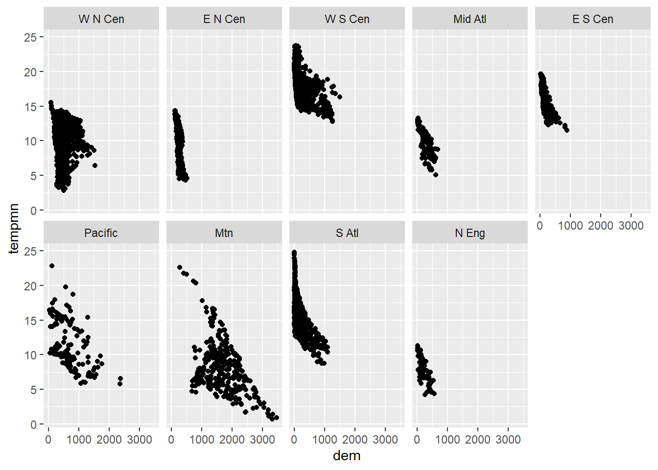
Renaming the facets can be conducted using the labeller() function. Below we have defined the desired new name for each original sub-region name using named vectors where the name is the the original name and the value is the desired new name. Quotes are required here due to spaces. Within the labeller() function, this named vector is used to rename the facets or factor levels associated with the “SUB_REGION” variable.
srLabels <- c("W N Cen" = "West North Central",
              "E N Cen" = "East North Centeral",
              "W S Cen" = "West South Centeral",
              "Mid Atl" = "Mid-Atlantic",
              "E S Cen" = "East South Central",
              "Pacific" = "Pacific",
              "Mtn" = "Mountain",
              "S Atl" = "South Atlantic",
              "N Eng" = "New England")

cntyD |> ggplot(aes(x=dem, y=tempmn))+
  geom_point()+
  facet_wrap(vars(SUB_REGION),
             labeller = labeller(SUB_REGION=srLabels))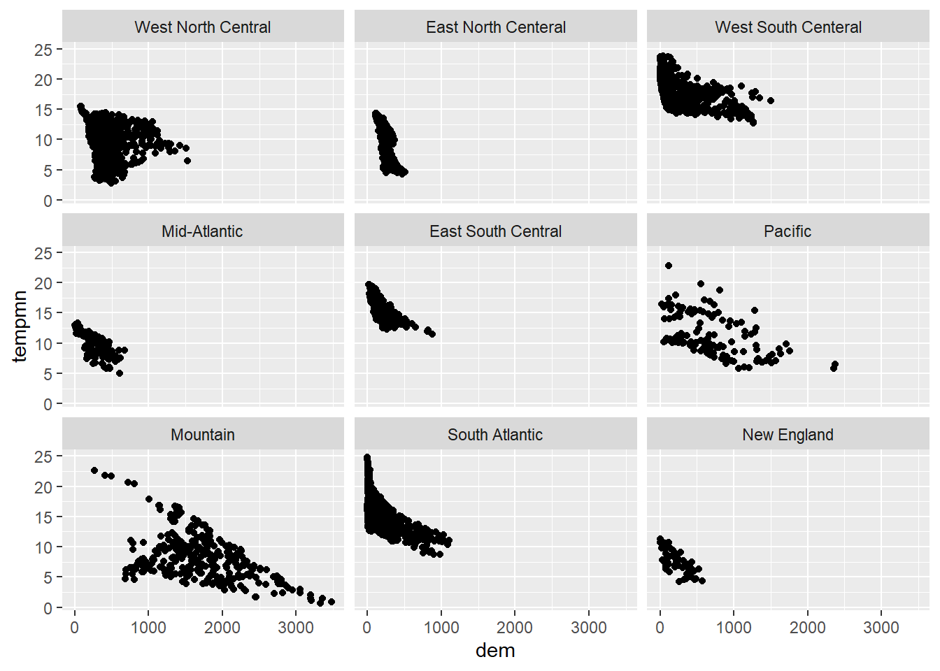
In this example, we have edited the faceted set of graphs using the methods discussed above.
cntyD |> ggplot(aes(x=dem, y=tempmn))+
  geom_point(color="darkorange")+
  facet_wrap(vars(SUB_REGION), labeller = labeller(SUB_REGION=srLabels))+
  ggtitle("Relationship Between Elev. and Temp. by Sub-Region")+
  labs(x="Elevation (m)",
       y="Temperature in \u00b0C")+
  theme_bw(base_size=11)+
  scale_y_continuous(expand=c(0.1,0.1),
                     breaks=seq(0,25, 5),
                     labels= label_number(suffix = "\u00b0C"))+
  scale_x_continuous(expand=c(0,0),
                     breaks=seq(0,3500,500),
                     limits=c(0,3500),
                     labels = label_comma(suffix = "m"))+
  theme(axis.text.y = element_text(size=12, color="gray20"))+
  theme(axis.text.x = element_text(size=12, color="gray20", angle=45, hjust=1))+
  theme(plot.title = element_text(face="bold", size=18, color="gray20"))+
  theme(axis.title = element_text(size=14, color="gray20"))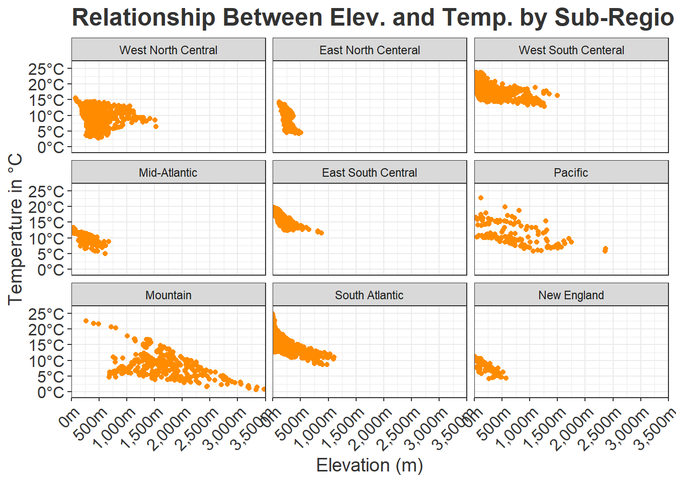
To experiment with facet_grid(), we use dplyr to create a column that categorizes the percent forest cover into three groupings. Also using dplyr, we subset out three of the sub-regions. facet_grid() allows us to facet on two variables. In our example, we are using the the percent forest groupings to define the rows and the sub-regions to define the columns. The syntax is as follows: ROW ~ COLUMN. We also define labels for the sub-regions as defined above. If we wanted to define labels for the percent forest groupings, we could define another named vector and add this to the labeller() function.
cntyD |>
  filter(SUB_REGION %in% c("Pacific", "Mtn", "Mid Atl", "N Eng")) |>
  ggplot(aes(x=dem, y=tempmn))+
  geom_point(color="darkorange")+
  facet_grid(per_for_grp~SUB_REGION,
             labeller=labeller(SUB_REGION=srLabels))+
  ggtitle("Relationship Between Elevation and Temperature by Sub-Region")+
  labs(x="Elevation (m)", y="Temperature in \u00b0C")+
  theme_bw(base_size=9)+
  scale_y_continuous(expand=c(0.1,0.1),
                     breaks=seq(0,25, 5),
                     labels= label_number(suffix = "\u00b0C"))+
  scale_x_continuous(expand=c(0,0),
                     breaks=seq(0,3500,500),
                     limits=c(0,3500),
                     labels = label_comma(suffix = "m"))+
  theme(axis.text.y = element_text(color="gray20"))+
  theme(axis.text.x = element_text(color="gray20", angle=45, hjust=1))+
  theme(plot.title = element_text(face="bold", color="gray20"))+
  theme(axis.title = element_text(color="gray20"))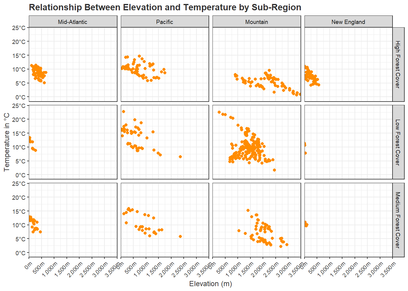
21.8 Multi-Graph Layouts
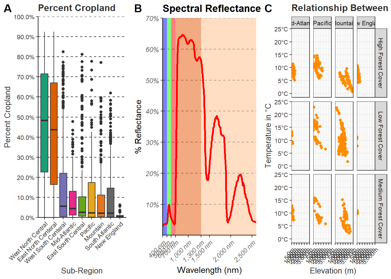
In contrast to using faceting, it is also possible to build a layout of graphs that are derived separately and that have different axes and/or axes scales. There are several means to accomplish this in R. Here, we demonstrate the plot_grid() function from the cowplot package. First, we regenerate three graphs and save them to variables. Once they are generated, they can be called within plot_grid(). In the first example, we are using a grid with two rows. In the second example, we use three columns. Note that it is possible to include labels for each plot. In the final example, we have left gaps in the plot grid. This is accomplished by using NULL in the list of graph objects.
graph1 <-cntyD |>
  ggplot(aes(x=fct_reorder(SUB_REGION, per_crop, .fun=median, .desc=TRUE),
             y=per_crop/100, fill=SUB_REGION))+
  geom_boxplot()+
  theme_classic(base_size=10)+
  ggtitle("Percent Cropland")+
  labs(x="Sub-Region", y = "Percent Cropland", fill="Sub Region")+
  scale_y_continuous(expand = c(0, 0),
                     breaks = seq(0,1, by=.1),
                     limits= c(0, 1),
                     labels= label_percent(accuracy=0.1))+
  scale_fill_manual(values = c("#1b9e77",
                               "#d95f02",
                               "#7570b3",
                               "#e7298a",
                               "#66a61e",
                               "#e6a61e",
                               "#e6761d",
                               "#666666",
                               "#45A1D3"),
                    labels = c("West North Central",
                               "East North Centeral",
                               "West South Centeral",
                               "Mid-Atlantic",
                               "East South Central",
                               "Pacific",
                               "Mountain",
                               "South Atlantic",
                               "New England"))+
  scale_x_discrete(expand = c(.075, .075),
                   labels = c("West North Central",
                              "East North Centeral",
                              "West South Centeral",
                              "Mid-Atlantic",
                              "East South Central",
                              "Pacific",
                              "Mountain",
                              "South Atlantic",
                              "New England"))+
  theme(axis.text.y = element_text(color="gray20"))+
  theme(axis.text.x = element_text(color="gray20", angle=45, hjust=1))+
  theme(plot.title = element_text(face="bold", color="gray20"))+
  theme(axis.title = element_text(color="gray20"))+
  theme(legend.position = "None")+
  theme(panel.grid.major.y = element_line(colour = "gray20", linetype="dashed"))+
  theme(legend.position = "None")
graph2 <- ggplot()+
geom_rect(spec_reg, mapping=aes(xmin=x1, xmax=x2, ymin=y1, ymax=y2, fill=region), alpha=0.5)+
geom_line(ml, mapping=aes(x=wav*1000, y=reflec*100), color=rgb(1, 0, 0), size=1.2)+
ggtitle("Spectral Reflectance")+
labs(x="Wavelength (nm)",
y="% Reflectance",
fill="Region")+
scale_fill_manual(values = c("#0000FF",
"#00FF00",
"#FF0000",
"#E35604",
"#FFBE89"),
labels = c("Green",
"Blue",
"Red",
"NIR",
"SWIR"))+
theme_classic()+
scale_x_continuous(expand = c(0, 0),
limits=c(400, 2600),
breaks=c(400, 500,600, 700, 1000, 1300, 1500, 2000, 2500),
labels =c("400 nm",
"500 nm",
"600 nm",
"700 nm",
"1,000 nm",
"1,300 nm",
"1,500 nm",
"2,000 nm",
"2,500 nm"))+
scale_y_continuous(expand = c(0, 0),
limits=c(0, 70), breaks= c(10,20, 30, 40, 50, 60, 70),
labels= c("10%",
"20%",
"30%",
"40%",
"50%",
"60%",
"70%"))+
theme(axis.text.x = element_text(angle = 45, hjust=1))+
theme(axis.text = element_text(colour = "gray40", face="italic"))+
theme(plot.title = element_text(face="bold"))+
theme(legend.position = c(.9, .7), legend.background = element_rect(fill="gray87", linewidth=0.5, linetype="solid", colour ="gray28"), legend.title= element_blank())+
theme(panel.grid.major.y = element_line(colour = "gray40", linetype="dashed"))+
theme(legend.position = "None")graph3 <- cntyD |>
filter(SUB_REGION %in% c("Pacific", "Mtn", "Mid Atl", "N Eng")) |>
ggplot(aes(x=dem, y=tempmn))+
geom_point(color="darkorange")+
facet_grid(per_for_grp~SUB_REGION,
labeller=labeller(SUB_REGION=srLabels))+
ggtitle("Relationship Between Elevation and Temperature by Sub-Region")+
labs(x="Elevation (m)", y="Temperature in \u00b0C")+
theme_bw(base_size=10)+
scale_y_continuous(expand=c(0.1,0.1),
breaks=seq(0,25, 5),
labels= label_number(suffix = "\u00b0C"))+
scale_x_continuous(expand=c(0,0),
breaks=seq(0,3500,500),
limits=c(0,3500),
labels = label_comma(suffix = "m"))+
theme(axis.text.y = element_text(color="gray20"))+
theme(axis.text.x = element_text(color="gray20", angle=45, hjust=1))+
theme(plot.title = element_text(face="bold", color="gray20"))+
theme(axis.title = element_text(color="gray20"))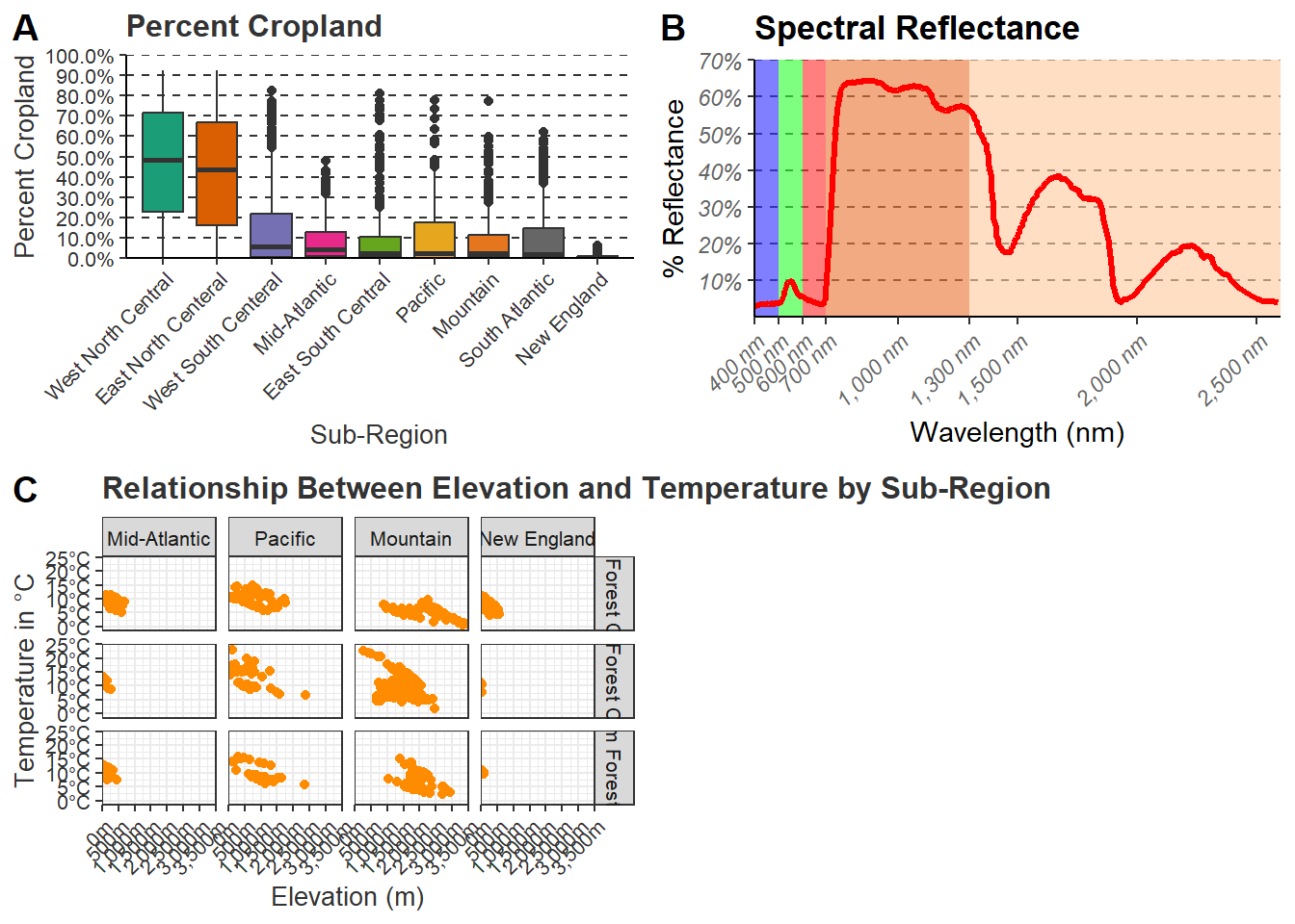
21.9 Saving Plots
Once the graph is saved to an object, ggsave() can be used to save it as a graphic file to disk. In the example, we save to a PDF, raster graphic (PNG), and a vector graphic (SVG). If you want to save the file to a compressed raster format, we recommend either the JPEG or PNG format. It could also be saved as a TIF file. If you would like to do additional editing in a vector graphics editing software, such as Inkscape or Adobe Illustrator, you should save to PDF or a vector format such as EPS or SVG. It is possible to set the size of the output along with the resolution (DPI).
fldSv <- "gslrData/chpt21/output/"

ggsave(filename=str_glue("{fldSv}leaf_spec_crv.pdf"),
       graph2,
       width=10,
       height=8,
       units="in",
       dpi=300)

ggsave(filename=str_glue("{fldSv}leaf_spec_crv.png"),
       graph2,
       width=10,
       height=8,
       units="in",
       dpi=300)

ggsave(filename=str_glue("{fldSv}leaf_spec_crv.svg"),
       graph2,
       width=10,
       height=8,
       units="in",
       dpi=300)
21.10 Concluding Remarks
We feel that we have covered a lot of ground in the last two chapters. You should now have experience creating and refining a variety of graph types. In this last chapter specifically, we focused on design techniques that we commonly use. If you start to use ggplot2 for your own data visualization needs, you will likely run into specific issues not covered here. Fortunately, there is a large ggplot2 user community. We rarely find an issue that we can’t resolve with an Internet search and/or a large language model (e.g., ChatGPT). If you find that accomplishing something very specific is difficult or impossible, you can always export to a vector graphic file or PDF and perform additional editing outside of R. For example, we have generally found working with specific fonts to be difficult in R, so we commonly make font changes in “post production”. Inkscape is a very powerful vector graphic editing software tool that is free and open-source.
Again, the best way to learn ggplot2 is to practice, so we encourage you to explore other data sets or your own data using this tool. We use ggplot2 throughout this text.
21.11 Questions
- Explain three different means to define a color in R.
- When defining a color using
hsv(), explain what h, s, and v refer to. - Explain the difference between
geom_*_manual(),geom_*_discrete(), andgeom_*_binned(). - From the scales package, explain the purpose of
label_scientific(),label_comma(),label_bytes(), andlabel_ordinal(). - Explain the difference between
facet_wrap()andfacet_grid(). - For
scale_*_continuous(), explain the purpose of thebreaks,limits, andlabelsparameters. - For
scale_*_manual(), explain the purpose of thevaluesandlabelsparameters. - Explain the difference between a vector and a raster graphic file.
21.12 Exercises
Graph 1
You have been provided with a CSV file of movie ratings (matts_movies.csv”) in the exercise folder for the chapter. Your goal is to create a well-formatted grouped box plot with a facet wrap that compares rating by genera across four different decades.
Preparation
- Read in the data.
- Make sure all character columns are treated as factors.
- Filter out only movies that were released in the 1980s or later (use the “ReleaseYear” column).
- Create a new column that provides a unique factor level for all movies released in the four included decades: 1980s, 1990s, 2000s, and 2010s.
- Re-order the factor levels for the new decade column so that they are in chronological order.
- Extract out the following genres: Action, Comedy, Drama, Fantasy, Horror, Romance, Sci-Fi, and Thriller.
Graph
Create a grouped box plot that meets the following criteria. Feel free to make additional adjustments.
- The genera (“Genre”) should be mapped to the x-axis and the fill color.
- The rating (“MyRating”) should be mapped to the y-axis,
- Use a facet wrap so that each decade is mapped to a separate graph.
- Define a base theme.
- Define the x and y axis labels and the main title.
- Define a color to use for each genre using
scale_fill_manual(). - Edit the y axis using
scale_y_continuous()so that it is scaled from 0 to 10 with a tick mark at every 1 interval. - Use
theme()to set the size and color of the axes labels and tick labels. Rotate the x axis labels to reduce overlap. - Remove the legend.
Graph 2
You have been provided with an urban tree dataset (portlandParkTrees.csv) for Portland, Oregon in the exercise folder for the chapter. These data are available here. Create a grouped box plot to compare the distribution of heights for a subset of genera.
Preparation
- Read in portlandTrees.csv.
- Select out the following columns: “Common_nam”, “Genus_spec”, “Family”, “Genus”, “DBH”, “TreeHeight”, “CrownWidth”, “CrownBaseH”, and “Condition”.
- Convert all character columns to factors.
- Rename the columns as follows:
- “Common_nam =”Common”
- “Genus_spec” = “Scientific”
- “Family =”Family”
- “Genus” = “Genus”
- “DBH” = “DBH”
- “TreeHeight” = “Height”
- “CrownWidth” = “CrownWidth”
- “CrownBaseH” = “CrownBaseHeight”
- “Condition” = “Condition”
- Remove all trees from the dataset that have a condition of “Dead”.
- Create a new common name column and lump all species that have less than 200 samples in the dataset into an “Other” class.
- Drop any rows with missing data.
Graph
Create a grouped box plot that meets the following criteria. Feel free to make additional adjustments.
- The genus (“Genus”) should be mapped to the x-axis and the fill color.
- The tree height (“Height”) should be mapped to the y-axis.
- Define a base theme.
- Define the x and y axis labels and the main title.
- Define a color to use for each genre using
scale_fill_manual(). - Edit the y axis using
scale_y_continuous()so that it is scaled from 0 to 200 with a tick mark at every 20 feet. - Use
theme()to set the size and color of the axes labels and tick labels. Rotate the x axis labels to reduce overlap. - Make sure the genus names are in italics for the x-axis labels.
- Remove the legend.
Graph 3
The laptop prices dataset (laptopPrice.csv) is provided in the exercise folder for the chapter. These data were downloaded from Kaggle. A brief description of each included column is provided below. Create a scatter plot that compares the spec rating and price with the CPU manufacturer differentiated by the point color.
- “brand”: laptop brand name
- “name”: name of laptop
- “price”: price in US Dollars×100 (divide by 100 to get price)
- “spec_rating”: specification score (0 to 100)
- “processor”: processor name
- “CPU”: central processing unit (CPU) specs
- “Ram”: amount of installed RAM
- “Ram_type”: type of RAM
- “ROM”: size of hard disk
- “ROM_type”: type of hard disk (SSD or Hard-Disk)
- “GPU”: installed graphics processing unit (GPU)
- “display_size”: size of display in inches
- “resolution_width”: resolution in width dimension in pixels
- “resolution_height”: resolution in height dimension in pixels
- “OS”: operating system
- “warranty”: length of warranty in years
Preparation
- Re-code the Ram factor levels as follows and convert to a numeric type (Original = New): “12GB” = “12”, “16GB” = “16”, “2GB” = “2”, “32GB” = “32”, “4GB” = “4”, “64GB” = “64”, “8GB” = “8”.
- Re-code the ROM factor levels as follows and convert to a numeric type (Original = New): “128GB” = “128”, “1TB” = “1000”, “256GB” = “256”, “2TB” = “2000”, “32GB” = “32”, “512GB” = “512”, “64GB” = “64”.
- Create a field that indicates whether the machine has a NVIDIA GPU.
- Create a single column that differentiates between Intel and AMD processors. Any other manufacturer should be coded as “Other”.
- Create a single column that differentiates between i3, i5, i7, and i9 Intel processors. All other processors should be coded as “Other”.
Graph
Create a scatter plot that meets the following criteria. Feel free to make additional adjustments.
- Map the “spec_rating” to the x axis.
- Map the price divided by 100 to the y axis; this should now represent US dollars.
- Map the CPU manufacturer to the point color.
- Set a base theme.
- Set axes, main title, and symbol color labels.
- Use
scale_y_continuous()to set the price range from 0 to 5,000 with ticks at every 1,000; make sure the numbers are formatted as currency. - Use
scale_x_continuous()to set the spec rating range from 60 to 90 with tick markers at an interval of 5. - Use
scale_color_manual()to specify colors to use to differentiate the CPU manufacturer. - Use themes to edit the main title, axes titles, and axes tick label text color and size.
Graph 4
The laptop prices dataset (laptopPrice.csv) is provided in the exercise folder for the chapter. These data were downloaded from Kaggle. Create a grouped box plot that compares the price for different i-series processors and manufacturers.
Preparation
- Re-code the Ram factor levels as follows and convert to a numeric type (Original = New): “12GB” = “12”, “16GB” = “16”, “2GB” = “2”, “32GB” = “32”, “4GB” = “4”, “64GB” = “64”, “8GB” = “8”.
- Re-code the ROM factor levels as follows and convert to a numeric type (Original = New): “128GB” = “128”, “1TB” = “1000”, “256GB” = “256”, “2TB” = “2000”, “32GB” = “32”, “512GB” = “512”, “64GB” = “64”.
- Create a field that indicates whether the machine has a NVIDIA GPU.
- Create a single column that differentiates between Intel and AMD processors. Any other manufacturer should be coded as “Other”.
- Create a single column that differentiates between i3, i5, i7, and i9 Intel processors. All other processors should be coded as “Other”.
- Filter out only computers that contain an Intel i3, i5, i7, or i9 processor.
- Filter out the following manufacturers: Acer, Asus, Dell, HP, Lenovo, MSI.
Graph
Create a grouped box plot that compares the price for different i-series processors and manufacturers.
- Map the processor to the x axis and fill color.
- Map the price divided by 100 to the y axis; this should now represent US dollar.
- Create a facet wrap using the computer manufacturer (should result in a grid of six graphs).
- Set a base theme.
- Set axes and main title labels.
- Remove the legend.
- Use
scale_y_continuous()to set the price range from 0 to 5,000 with ticks at every 1,000; make sure the numbers are formatted as currency. - Use
scale_fill_manual()to specify colors to use to differentiate the computer manufacturer. - Use themes to edit the main title, axes titles, and axes tick label text color and size.
Graph 5
The laptop prices dataset (laptopPrice.csv) is provided in the exercise folder for the chapter. These data were downloaded from Kaggle. Create an array of scatter plots that compare the spec rating and price with the computer manufacturer and CPU manufacturer differentiated.
Preparation
- Re-code the Ram factor levels as follows and convert to a numeric type (Original = New): “12GB” = “12”, “16GB” = “16”, “2GB” = “2”, “32GB” = “32”, “4GB” = “4”, “64GB” = “64”, “8GB” = “8”.
- Re-code the ROM factor levels as follows and convert to a numeric type (Original = New): “128GB” = “128”, “1TB” = “1000”, “256GB” = “256”, “2TB” = “2000”, “32GB” = “32”, “512GB” = “512”, “64GB” = “64”.
- Create a field that indicates whether the machine has a NVIDIA GPU.
- Create a single column that differentiates between Intel and AMD processors. Any other manufacturer should be coded as “Other”.
- Create a single column that differentiates between i3, i5, i7, and i9 Intel processors. All other processors should be coded as “Other”.
- Filter out only computers that contain an Intel i3, i5, i7, or i9 processor.
- Filter out the following manufacturers: Acer, Asus, Dell, HP, Lenovo, MSI.
Graph
Create an array of scatter plots that compare the spec rating and price with the computer manufacturer and CPU manufacturer differentiated.
- Map the spec rating to the x axis.
- Map the price divided by 100 to the y axis; this should now represent US dollar.
- Create a facet grid where the columns are defined by the computer manufacturer and the rows are defined by the CPU manufacturer (should result in a grid with 4 columns and 2 rows).
- Set a base theme.
- Set axes and main title labels.
- Use
scale_y_continuous()to set the price range from 0 to 5,000 with ticks at every 1,000; make sure the numbers are formatted as currency. - Use
scale_x_continuous()to set the spec rating range from 0 to 70 with tick marks at an interval of 10. - Use themes to edit the main title, axes titles, and axes tick label text color and size.
Graph 6
Make a box plot showing the distribution of monthly runoff in a stream using the provided runoff_data_by_month.csv dataset provided in the exercise folder for the chapter. These data are for a specific stream in the Fernow Experimental Forest near Parsons, West Virginia, USA. The runoff (“runoff”) measurements have been aggregated by month (“month”) and are in mm units.
Preparation
- The months should be re-ordered by calendar progression (January, February, March…..) as opposed to alphabetically.
Graph
Create a grouped box plot showing the distribution of monthly runoff. Months should define the groups.
- Map the month (“month”) to the x-axis and fill color. Make sure they are in chronological, as opposed to alphabetical, order.
- Map runoff (“runoff”) to the y-axis.
- The y-axis title should be “Runoff [mm]” and the x-axis title should be “Month”.
- Provide a descriptive main title.
- Remove the legend (since the x-axis labels provides the month names, you don’t need an additional legend for the fill color).
- Change the theme to a theme of your choosing.
- Change the axes titles, axes labels, and main title font size.
- Change the y-axis scale to include the following breaks (0, 50, 100, 150, 200, 250, 300), limits of 0 to 300, and labels including the unit of measurement (for example, “50 mm”).