Spatial Analysis with Python
The goal of this module is to introduce a variety of libraries and modules for working with, visualizing, and analyzing geospatial data using Python. Currently, there are a variety of options, each of which have their own pros and cons. Below is a list of some common tools for geospatial analysis in Python.
- ArcPy: Python site package integrated into the ArcGIS Desktop and ArcGIS Pro software environments. ArcPy can be used within ArcMap and ArcGIS Pro via the Python window. ArcGIS Desktop and ArcGIS Pro now include Jupyter Notebook as part of the base installation. You can also work within notebooks inside of ArcGIS Pro. Since these technologies are not free and open-source, we will not discuss them in this course. However, they are very powerful and worth investigating. I use ArcPy a lot in my own work. Further, it is very well documented.
- GeoPandas: expands Pandas to allow for working with vector data using the Series and DataFrame structures. I will provide an introduction to GeoPandas in this module, which will build upon our prior discussion of Pandas. GeoPandas relies on several dependencies including the following which we have already discussed: NumPy, Pandas, and matplotlib. It also relies on the following libraries/modules:
- Shapely: used to perform geometric and overlay operations.
- Fiona: used to read and write geospatial data files via links to the Geospatial Data Abstraction Library (GDAL)
- PyProj: interface to PROJ and allows for reading and transformation of geographic and projected coordinate systems.
- MapClassify: allows for choropleth mapping.
- Descartes: use vector geospatial features with matplotlib.
- Rasterio: allows for reading, writing, and manipulation of raster geospatial data. This package relies heavily on NumPy so that rasters can be manipulated as arrays.
- Contextily: allows for retrieval of raster tile layers for use as base maps within matplotlib plots.
- EarthPy: expands the functionality of GeoPandas and Rasterio. Very useful for raster and multispectral image analysis.
- WhiteboxTools: provides more than 440 tools for analyzing geospatial data, including tools for data preparation, vector analysis and overlay, raster and image analysis, geomorphometric analysis, hydrological analysis, and LiDAR processing. These tools can be accessed in Python, R, QGIS, and via a command-line interface. They can also be accessed via a graphical user interface (GUI) known as Whitebox GAT. This tool set was developed by Dr. John Lindsay of the Geomorphometry & Hydrogeomatics Research Group at the University of Guelph.
I honestly struggled with which tool sets to discuss. After some research, I landed on the following objectives. After working through this module you will be able to:
- read and write vector geospatial data using GeoPandas.
- read and write raster geospatial data using Rasterio.
- visualize geospatial data and make maps using GeoPandas, Rasterio, and matplotlib.
- perform a wide variety of spatial analysis tasks using WhiteboxTools.
Since there are many interrelated libraries and modules that depend on one another, setting up an environment for working with geospatial data in Python can be tricky. So, make sure to watch the provided set-up video.
In this first set of code, I am reading in the required libraries. At this point, you should be familiar with loading in NumPy, Pandas, and matplotlib. Once installed, GeoPandas, Contextily, Rasterio, and EarthPy are easy to import.
The WhiteboxTools import is a bit different. Have a look at the installation and use within Python directions made available as part of the software documentation.
I have used the standard alias names for all of the packages or modules in the imports below.
import numpy as np
import pandas as pd
import matplotlib.pyplot as plt
%matplotlib inline
import geopandas as gpd
import contextily as ctx
import rasterio as rio
import whitebox
wbt = whitebox.WhiteboxTools()
import earthpy as et
import earthpy.spatial as es
import earthpy.plot as ep
plt.rcParams['figure.figsize'] = [10, 8]
GeoPandas
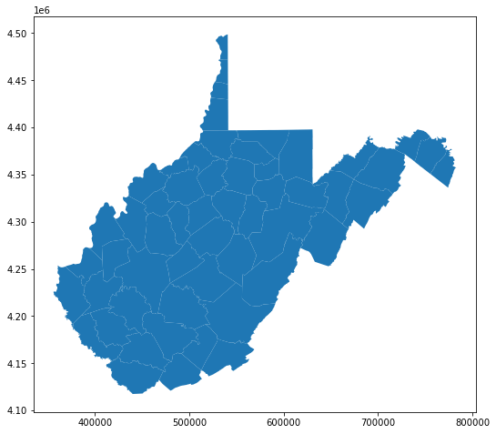
First, I am reading in a polygon vector layer of West Virginia county boundaries using GeoPandas. The plot() method is then used to display the data using matplotlib and some default settings. The axes values represent measurements within the projected coordinate system.
wv_c = gpd.read_file("C:/Users/amaxwel6/python_ds/data/spatial/wv_counties.shp")
wv_c.plot()
<AxesSubplot:>
Using the head() method, you can see that the structure of these data are very similar to a Pandas DataFrame. In fact, it is a Pandas DataFrame with one key addition: the geometric information is stored in a column in the table. If you are familiar with vector data models, this is similar to other object-based models in which the geometric and tabulated data are stored in the same object or table. This is similar to a feature class in a file geodatabase or an sf object in R.
On of the advantages of referencing our vector data using this method is that we can apply the Pandas methods discussed in the prior module to our geospatial data. For example, you can query and subset records, add new columns, group and summarize, and perform table joins.
print(wv_c.head())
           AREA      PERIMETER        NAME  STATE  FIPS STATE_ABBR  \
0  2.819364e+08   69539.619328        Ohio     54 -1146         WV
1  8.071574e+08  125167.039523    Marshall     54 -1148         WV
2  1.686168e+09  179373.536795     Preston     54 -1145         WV
3  5.954419e+08  145624.281267      Morgan     54 -1147         WV
4  9.470626e+08  164158.984954  Monongalia     54 -1147         WV

   SQUARE_MIL  POP2000  POP00SQMIL  MALE2000  ...   1999   1990   2000   2001  \
0     106.176    47427       446.7     22177  ...  47719  50871  47427  46653
1     306.994    35519       115.7     17288  ...  34968  37356  35519  35294
2     648.324    29334        45.2     14535  ...  29814  29037  29334  29299
3     228.983    14943        65.3      7343  ...  13895  12128  14943  15227
4     361.159    81866       226.7     41291  ...  77006  75509  81866  82315

    2002   2003   2004   2005   2006  \
0  46241  45612  45309  44958  44662
1  34999  34837  34602  34250  33896
2  29628  29684  29817  30052  30384
3  15317  15545  15745  15987  16337
4  82705  83670  84034  84592  84752

                                            geometry
0  POLYGON ((522753.988 4431484.270, 522933.396 4...
1  POLYGON ((522753.988 4431484.270, 522920.947 4...
2  POLYGON ((605953.930 4397497.446, 606406.156 4...
3  POLYGON ((749219.462 4385550.735, 749158.156 4...
4  POLYGON ((549590.510 4396972.754, 550334.558 4...

[5 rows x 51 columns]
The crs attribute lists the spatial coordinate system information for the file. It is generally a good idea to explore this information to make sure that the projection information is read in correctly. Projections are referenced using European Petroleum Survey Group (EPSG) codes. Here, you can see that the data are projected into UTM Zone 17 North. The geographic coordinate system or datum is the North American Datum of 1983. The easting and northing measurements are reported in meters. The area of use of the coordinate system is also defined.
wv_c.crs
<Derived Projected CRS: EPSG:26917>
Name: NAD83 / UTM zone 17N
Axis Info [cartesian]:
- E[east]: Easting (metre)
- N[north]: Northing (metre)
Area of Use:
- name: North America - between 84°W and 78°W - onshore and offshore. Canada - Nunavut; Ontario; Quebec. United States (USA) - Florida; Georgia; Kentucky; Maryland; Michigan; New York; North Carolina; Ohio; Pennsylvania; South Carolina; Tennessee; Virginia; West Virginia.
- bounds: (-84.0, 23.81, -78.0, 84.0)
Coordinate Operation:
- name: UTM zone 17N
- method: Transverse Mercator
Datum: North American Datum 1983
- Ellipsoid: GRS 1980
- Prime Meridian: Greenwich
The bounds() method provides the rectangular bounds of each feature in the data set relative to the coordinate system as a Pandas DataFrame.
In contrast, the total_bounds() method provides the bounds for the entire dataset as an array.
print(wv_c.bounds.head())
            minx          miny           maxx          maxy
0  522261.974350  4.429689e+06  541040.468414  4.448459e+06
1  511107.417585  4.396784e+06  541195.100727  4.431487e+06
2  594643.292184  4.339496e+06  630729.073926  4.397910e+06
3  717612.679003  4.363827e+06  755619.845699  4.397837e+06
4  549531.827256  4.365691e+06  605990.034387  4.397497e+06
wv_c.total_bounds
array([ 355936.99218436, 4117434.51500363,  782843.89838413,
       4498773.09408554])
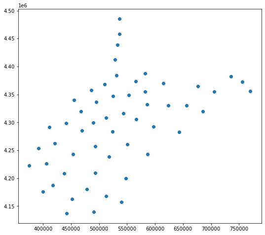
The GeoPandas centroid method returns the centroid of each feature in the data set. There are a variety of spatial operations that can be performed using GeoPandas and its dependencies. However, we will focus on WhiteboxTools in this course. If you are interested in the operations available, please review the GeoPandas documentation referenced above.
wv_cen = wv_c.centroid
wv_cen.plot()
<AxesSubplot:>
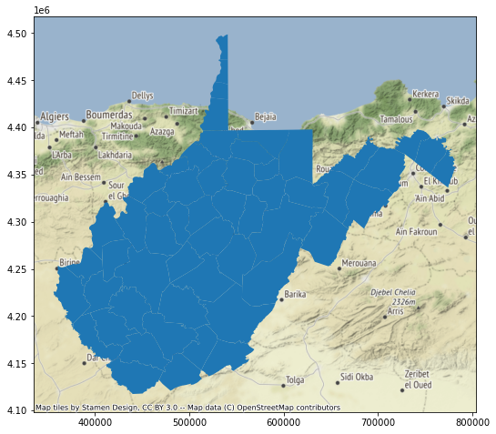
Contextily allows for raster tile base maps to be added to maps produced with matplotlib.
In the example below, the geospatial data are not drawing at the correct location. This is because the raster tile base maps are referenced to the Web Mercator projection whereas the counties data are referenced to UTM Zone 17 North. Python is not able to perform projection on-the-fly operations. So, it is important that data layers have the same spatial reference system.
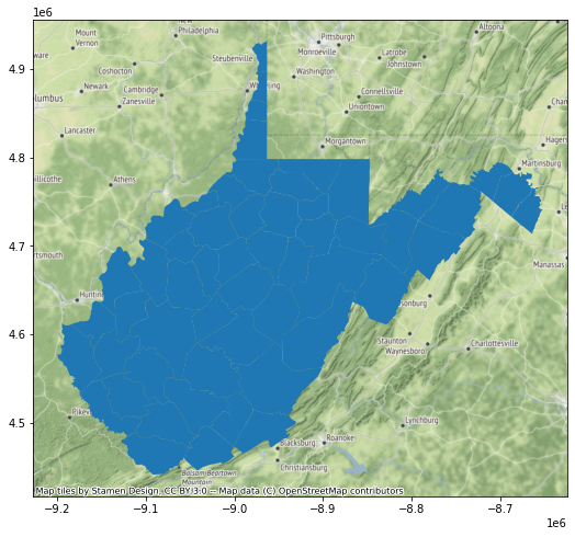
So, in the next set of code I use the to_crs() GeoPandas method and appropriate EPSG code to create a copy of the counties data that have been transformed to the Web Mercator projection. When I recreate the map and add the base map, everything lines up. So, it is important that you consider the impact of projections and make changes where necessary. When performing overlay and spatial analysis, it is preferable that all of your data layers are referenced to the same spatial coordinate reference system.
wv_map = wv_c.plot()
ctx.add_basemap(wv_map)
wv_cWebM = wv_c.to_crs("EPSG:3395")
wv_map = wv_cWebM.plot()
ctx.add_basemap(wv_map)
The to_file() GeoPandas method allows you to save results back to disk. Since GeoPandas uses Fiona and GDAL, a variety of formats can be read and written.
wv_cWebM.to_file("D:/data/out/wv_counties_wm.shp")
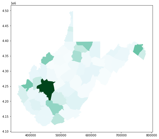
The GeoPandas plot() method allows you to plot or map your vector data using matplotlib. The column parameter allows you to symbolize relative to attribute data (population data in this example). You can also use color ramps available via matplotlib or make your own.
Here is a link to a list of named matplotlib color ramps.
wv_c.plot(column="2006", cmap="BuGn")
<AxesSubplot:>
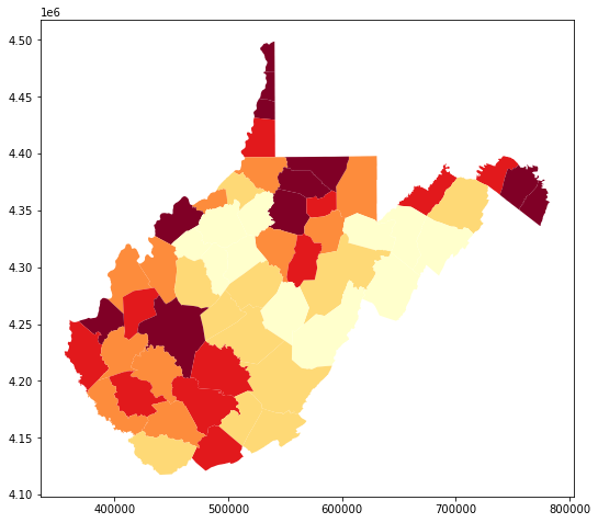
Using methods that we have already discussed in relation to Pandas, I am generating a new population density field from the available population and area attributes. I then symbolize relative to this new field. The scheme argument allows you to specify a classification method.
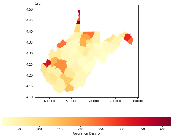
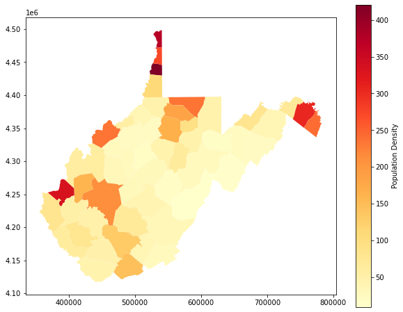
You can also add a legend, change its position, and set a title as demonstrated in the following examples.
wv_c['pop_den'] = wv_c['2006']/wv_c['SQUARE_MIL']
wv_c.plot(column="pop_den", cmap="YlOrRd", scheme="quantiles")
<AxesSubplot:>
fig, ax = plt.subplots(1, 1)
wv_c.plot(column='pop_den', cmap="YlOrRd", ax=ax, legend=True, legend_kwds={'label': "Population Density", 'orientation': "horizontal"})
<AxesSubplot:>
plt.rcParams['figure.figsize'] = [10, 8]
fig, ax = plt.subplots(1, 1)
wv_c.plot(column='pop_den', cmap="YlOrRd", ax=ax, legend=True, legend_kwds={'label': "Population Density", 'orientation': "vertical"})
<AxesSubplot:>
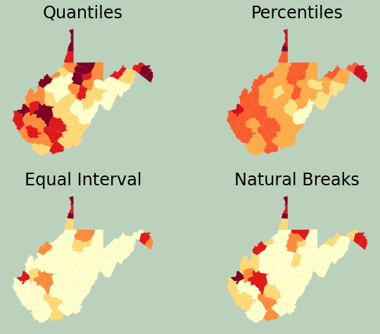
Referencing back to the data visualization module, here I am creating a figure with multiple axes in which to place several maps. I change the scheme argument to compare different legend classification methods.
plt.rcParams['figure.figsize'] = [10, 8]
fig, ax = plt.subplots(2, 2)
wv_c.plot(column="pop_den", ax=ax[0,0], cmap="YlOrRd", scheme="Quantiles")
ax[0,0].set_title("Quantiles", fontsize=24, color="#000000")
ax[0,0].axis("off")
wv_c.plot(column="pop_den", ax=ax[0,1], cmap="YlOrRd", scheme="Percentiles")
ax[0,1].set_title("Percentiles", fontsize=24, color="#000000")
ax[0,1].axis("off")
wv_c.plot(column="pop_den", ax=ax[1,0], cmap="YlOrRd", scheme="EqualInterval")
ax[1,0].set_title("Equal Interval", fontsize=24, color="#000000")
ax[1,0].axis("off")
wv_c.plot(column="pop_den", ax=ax[1,1], cmap="YlOrRd", scheme="NaturalBreaks")
ax[1,1].set_title("Natural Breaks", fontsize=24, color="#000000")
ax[1,1].axis("off")
fig.patch.set_facecolor('#bcd1bc')
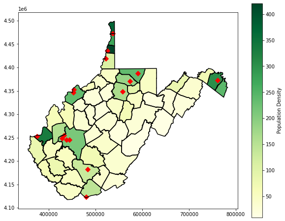
Lastly, I generate a map layout that incorporates multiple layers. The population density is displayed then overlaid with the county boundaries using boundary.plot(). I then include some point data representing towns. To make sure that all of these layers plot in the same map space, I reference the same axis with the ax parameter.
Here are some helpful links for setting marker and line styles:
plt.rcParams['figure.figsize'] = [10, 8]
fig, ax = plt.subplots(1, 1)
wv_c.plot(column='pop_den', cmap="YlGn", ax=ax, legend=True, legend_kwds={'label': "Population Density", 'orientation': "vertical"})
wv_c.boundary.plot(ax=ax, edgecolor="black")
wv_t = gpd.read_file("D:/data/spatial/towns.shp")
wv_t.plot(ax=ax, marker="D", color="red", markersize=50)
<AxesSubplot:>
Rasterio
We will now move on to discuss working with raster geospatial data using Rasterio and EarthPy.
The Rasterio open() method allows for data to be read from disk in either reading or writing mode. Here, we will primarily use reading mode, which is the default, since we just want to connect to the data and not manipulate it on the disk. Rasterio can read a variety of raster data types and formats due its reliance on GDAL.
Once a connection is made to a raster data layer, a variety of attributes are available to describe and explore the data. In the example below, I have printed the file name, number of bands, number of columns, number of rows, bounding geometry, and spatial coordinate system as an EPSG code.
When you are done using a layer, it is generally recommend to disconnect using the close() method.
elev = rio.open("D:/data/spatial/elevation1.tif")
print(elev.name)
print(elev.count)
print(elev.width)
print(elev.height)
print(elev.bounds)
print(elev.crs)
#elev.close()
D:/data/spatial/elevation1.tif
1
2114
1923
BoundingBox(left=551467.8904750665, bottom=4335184.114613933, right=614887.8904750665, top=4392874.114613933)
EPSG:26917
Once a connection is made to a data layer, it can be read into memory as a NumPy array, since raster data are essentially arrays. This is convenient because we can now use NumPy operations, functions, and methods on our gridded data. This is accomplished using the read() method.
elev_arr = elev.read(1)
print(elev_arr)
[[404 411 419 ... 511 513 515]
 [402 409 416 ... 513 514 517]
 [399 406 412 ... 513 516 519]
 ...
 [310 311 312 ... 607 593 590]
 [312 316 315 ... 592 576 577]
 [315 317 315 ... 577 560 565]]
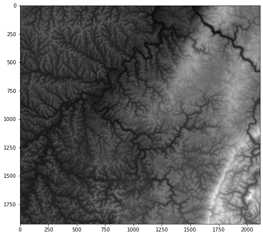
Once the raster data are written to memory as a NumPy array, they can be mapped or visualized with matplotlib using the imshow() method that was demonstrated in the prior data visualization module.
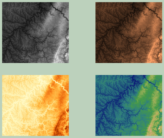
In the following example, I am using multiple axes to display the data using different color ramps.
plt.rcParams['figure.figsize'] = [10, 8]
plt.imshow(elev_arr, cmap="gist_gray")
<matplotlib.image.AxesImage at 0x27242cca940>
plt.rcParams['figure.figsize'] = [10, 8]
fig, ax = plt.subplots(2, 2)
ax[0,0].imshow(elev_arr, cmap="gist_gray")
ax[0,0].axis("off")
ax[0,1].imshow(elev_arr, cmap="copper")
ax[0,1].axis("off")
ax[1,0].imshow(elev_arr, cmap="YlOrBr")
ax[1,0].axis("off")
ax[1,1].imshow(elev_arr, cmap="gist_earth")
ax[1,1].axis("off")
fig.patch.set_facecolor('#bcd1bc')
It is also possible to read in multiband raster data, such as multispectral imagery, using the same method as that used for a single-band data set. In the example below, I am reading in a Landsat 8 image. Using the available attributes, you can see that there are 7 bands present in the data set.
ls8 = rio.open("D:/data/spatial/ls8example.tif")
print(ls8.name)
print(ls8.count)
print(ls8.width)
print(ls8.height)
print(ls8.bounds)
print(ls8.crs)
D:/data/spatial/ls8example.tif
7
2018
1817
BoundingBox(left=475547.7429123717, bottom=5422062.195491019, right=536094.5524265328, top=5476568.37203741)
EPSG:32610
If no arguments are provided to the read() method, then all bands will be read into the NumPy array. You can also specify a specific band to read in. Unlike most indexing in Python, the band indexing for read() starts at 1.
In the first example below, I have read in all of the bands and obtaining a NumPy array of shape (7, 1817, 2018). When I specify a specific band, I obtain a NumPy array of shape (1817, 2018).
ls8_arr = ls8.read()
print(ls8_arr.shape)

ls8_arr2 = ls8.read(5)
print(ls8_arr2.shape)
(7, 1817, 2018)
(1817, 2018)
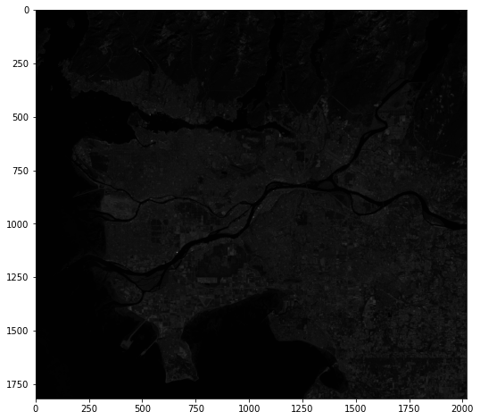
In the example below, I am using bracket notation to display one of the bands from the data set. Specifically, I am specifying the index associated with the 7th band, or SWIR2. This display is a bit dim because there is no stretching applied and the values do not fill the full radiometric range. In the next line of code, I investigate the distribution of the values then use this information to set min and max values to improve the display. This is accomplished using the vmin and vmax arguments.
plt.rcParams['figure.figsize'] = [10, 8]
plt.imshow(ls8_arr[6,:,:], cmap="gist_gray")
<matplotlib.image.AxesImage at 0x27242bf8370>
print(ls8_arr[6,:,:].max())
print(ls8_arr[6,:,:].min())
print(ls8_arr[6,:,:].mean())
255
0
9.92667778654738
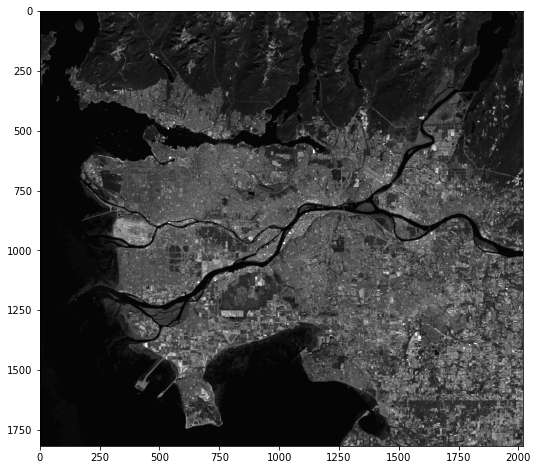
plt.rcParams['figure.figsize'] = [10, 8]
plt.imshow(ls8_arr[6,:,:], cmap="gist_gray", vmin=0, vmax=50)
<matplotlib.image.AxesImage at 0x272489c80a0>
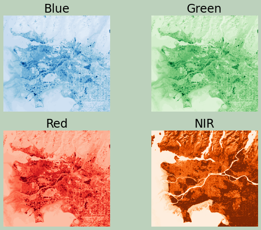
Now, I am using multiple axes to display the blue, green, red, and NIR bands. This is the band order in this data set:
- 1: Blue Edge
- 2: Blue
- 3: Green
- 4: Red
- 5: NIR
- 6: SWIR1
- 7: SWIR2
Make sure you understand how the array indexing was used to reference the correct band for each map.
plt.rcParams['figure.figsize'] = [10, 8]
fig, ax = plt.subplots(2, 2)
ax[0,0].imshow(ls8_arr[1,:,:], cmap="Blues", vmin=0, vmax=25)
ax[0,0].axis("off")
ax[0,0].set_title("Blue", fontsize=24, color="#000000")
ax[0,1].imshow(ls8_arr[2,:,:], cmap="Greens", vmin=0, vmax=25)
ax[0,1].axis("off")
ax[0,1].set_title("Green", fontsize=24, color="#000000")
ax[1,0].imshow(ls8_arr[3,:,:], cmap="Reds", vmin=0, vmax=25)
ax[1,0].axis("off")
ax[1,0].set_title("Red", fontsize=24, color="#000000")
ax[1,1].imshow(ls8_arr[4,:,:], cmap="Oranges", vmin=0, vmax=50)
ax[1,1].axis("off")
ax[1,1].set_title("NIR", fontsize=24, color="#000000")
fig.patch.set_facecolor('#bcd1bc')
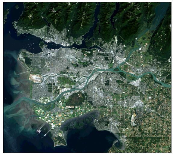
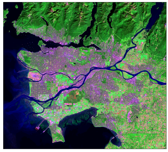
I prefer to use the EarthPy library for displaying multispectral data as true color and false color composites. This can be accomplished with the plot_rgb() function and mapping the desired bands to the red, green, and blue color channels. Here, I am displaying the data using simulated true color where red is mapped to red, green is mapped to green, and blue is mapped to blue. Again, indexing starts at 0. The stretch argument allows for a contrast stretch to be applied, and the str_clip argument allows the specification of the percentage of high and low values to clip.
In the following examples, I generate different false color composites. Again, make sure you understand the band indexing.
ep.plot_rgb(ls8_arr,
            rgb=[3, 2, 1],
            stretch=True,
            str_clip=1)
plt.show()
ep.plot_rgb(ls8_arr,
            rgb=[4, 3, 2],
            stretch=True,
            str_clip=1)
plt.show()
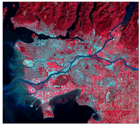
ep.plot_rgb(ls8_arr,
            rgb=[6, 4, 2],
            stretch=True,
            str_clip=1)
plt.show()
The plot_bands() function allows for each band to be plotted separately using multiple axes within a single figure.
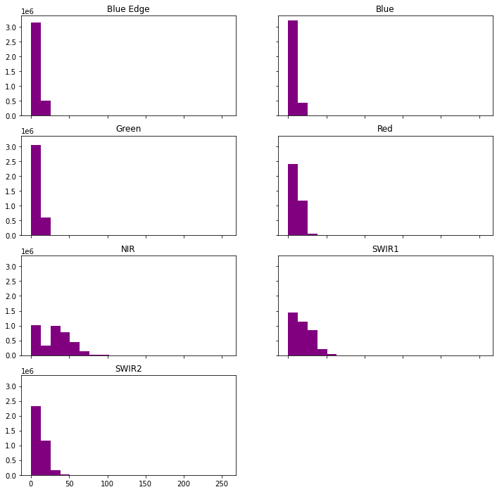
The hist() function will produce a histogram for each image band.
ep.plot_bands(ls8_arr)
plt.show()
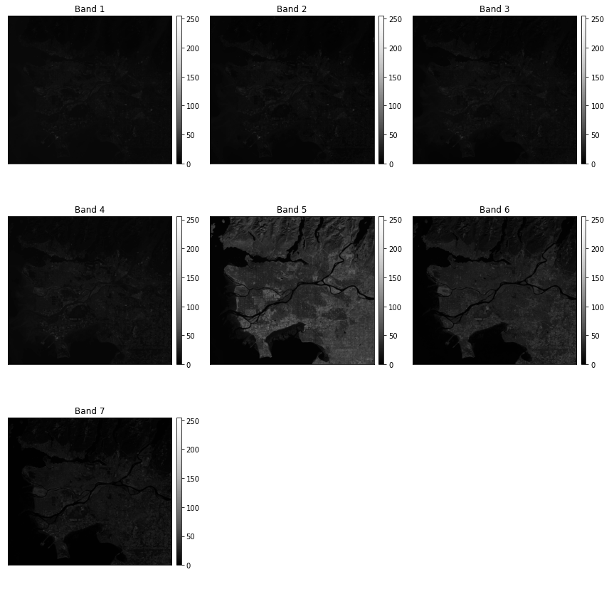
band_titles = ["Blue Edge", "Blue", "Green", "Red",
               "NIR", "SWIR1", "SWIR2"]
ep.hist(ls8_arr,
        title=band_titles)
plt.show()
Again, there are some functions and methods available for analyzing raster data with Rasterio and EarthPy. However, that will not be covered here. If you are interested in that topic, please consult the documentation referenced above.
WhiteboxTools for Spatial Analysis
Here, we will focus on using WhiteboxTools for performing spatial analysis operations. I have decided to focus on this tool set because the functions are easy to implement and a large number of tools are available. Another benefit is that WhiteboxTools does not require a lot of dependencies and is, thus, easy to set up. Again, there are other options, including GeoPandas, Rasterio, and ArcPy. Throughout this section I will use GeoPandas, Rasterio, and matplotlib to visualize the input data and results.
First, I create variables to reference the path to a set of data layers stored on my local disk. This will simplify the later code. Also, I turn off the verbose mode for WhiteboxTools so that progress information is not printed to my console. I am mainly doing this to make a cleaner web page; you do not need to do this for your own analyses. In fact, I would recommend maintaining the default verbose printing, as this can be informative.
wshed = "D:/data/spatial/watersheds.shp"
wv_t = "D:/data/spatial/towns.shp"
wv_c = "D:/data/spatial/wv_counties.shp"
riv = "D:/data/spatial/rivers.shp"
elev = "D:/data/spatial/elevation1.tif"
elev2 = "D:/data/spatial/elev_lidar.tif"
lc = "D:/data/spatial/lc_example.tif"
pnts = "D:/data/spatial/example_points.shp"
t1 = "D:/data/spatial/harvest.csv"
out_fold = "D:/data/out/"
wbt.verbose=False
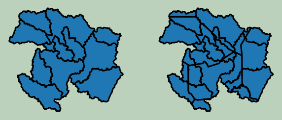
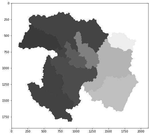
Example 1: Dissolve
First, I perform a simple dissolve on a set of watershed boundaries. Note that the output is saved to disk as opposed to memory, which is generally how WhiteboxTools operates. I am also specifying a field on which to dissolve. If no field is defined, then all features will be dissolved to a single feature.
Currently, WhiteboxTools only supports shapefiles. So, you will need to convert other vector formats for use.
Once the results are obtained, I read them back in using GeoPandas then plot using matplotlib.
wbt.dissolve(
    wshed,
    out_fold + "wshed_diss.shp",
    field="ICU",
    snap=0.0,
)
0
wshed2 = gpd.read_file(wshed)
diss = gpd.read_file(out_fold + "wshed_diss.shp")
plt.rcParams['figure.figsize'] = [10, 8]
fig, ax = plt.subplots(1, 2)
wshed2.plot(ax=ax[0], legend=False)
ax[0].axis("off")
diss.plot(column='ICU', cmap="Dark2", ax=ax[1])
ax[1].axis("off")
fig.patch.set_facecolor('#bcd1bc')
Example 2: Table Join
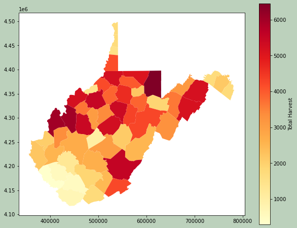
This example is actually not a WhiteboxTools example. However, I will use the results in a later example.
Here, I am using Pandas to perform a table join to associate some deer harvest data from the West Virginia Division of Natural Resources with each county. Since the common field has a different name in each dataset, I use the rename() method to change one of the names to match. I then use merge() to perform the join. Specifically, I use a left join so that all counties are maintained. I then print the resulting table.
The geometry information is maintained, so I am able to map the results.
wshed2 = gpd.read_file(wv_c)
harv = pd.read_csv(t1, sep=",", header=0, encoding="ISO-8859-1")
wshed2.rename(columns={'NAME':'COUNTY'}, inplace=True)
dnr_merge = pd.merge(wshed2, harv, how="left", on="COUNTY")
print(dnr_merge.head())
           AREA      PERIMETER      COUNTY  STATE  FIPS STATE_ABBR  \
0  2.819364e+08   69539.619328        Ohio     54 -1146         WV
1  8.071574e+08  125167.039523    Marshall     54 -1148         WV
2  1.686168e+09  179373.536795     Preston     54 -1145         WV
3  5.954419e+08  145624.281267      Morgan     54 -1147         WV
4  9.470626e+08  164158.984954  Monongalia     54 -1147         WV

   SQUARE_MIL  POP2000  POP00SQMIL  MALE2000  ...   2005   2006  \
0     106.176    47427       446.7     22177  ...  44958  44662
1     306.994    35519       115.7     17288  ...  34250  33896
2     648.324    29334        45.2     14535  ...  30052  30384
3     228.983    14943        65.3      7343  ...  15987  16337
4     361.159    81866       226.7     41291  ...  84592  84752

                                            geometry  OID_  BUCK  ANTLERLESS  \
0  POLYGON ((522753.988 4431484.270, 522933.396 4...   NaN   527         625
1  POLYGON ((522753.988 4431484.270, 522920.947 4...   NaN  1719        1658
2  POLYGON ((605953.930 4397497.446, 606406.156 4...   NaN  2041        2825
3  POLYGON ((749219.462 4385550.735, 749158.156 4...   NaN   680         772
4  POLYGON ((549590.510 4396972.754, 550334.558 4...   NaN  1808        2138

   MUZZLELOAD   BOW  TOTALDEER           REGIONNAME
0         117   273       1542   Northern Panhandle
1         277   506       4160   Northern Panhandle
2         512  1075       6453  Mountaineer Country
3         109   163       1724    Eastern Panhandle
4         415   709       5070  Mountaineer Country

[5 rows x 58 columns]
plt.rcParams['figure.figsize'] = [10, 8]
fig, ax = plt.subplots(1, 1)
dnr_merge.plot(column='TOTALDEER', cmap="YlOrRd", ax=ax, legend=True, legend_kwds={'label': "Total Harvest", 'orientation': "vertical"})
fig.patch.set_facecolor('#bcd1bc')
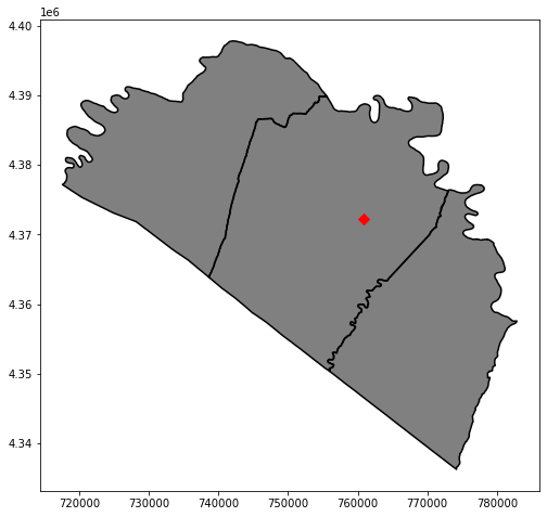
Example 3: Vector Clip
Using the joined attributes, I now use Pandas to extract out counties that are in the Eastern Panhandle region, information that was originally in the deer harvest table.
I then save this result to file using the GeoPandas to_file() method. Lastly, I use this county subset to perform a clip to extract towns in the Eastern Panhandle. The results are then mapped.
ep = dnr_merge[(dnr_merge["REGIONNAME"]=="Eastern Panhandle")]
ep.to_file(out_fold + "ep.shp")
ep2 = out_fold + "ep.shp"
wbt.clip(
    wv_t,
    ep2,
    out_fold + "ep_towns.shp"
)
0
ep3 =  gpd.read_file(out_fold + "ep.shp")
ep_t = gpd.read_file(out_fold + "ep_towns.shp")
plt.rcParams['figure.figsize'] = [10, 8]
fig, ax = plt.subplots(1, 1)
ep.plot(ax=ax, color="gray")
ep.boundary.plot(ax=ax, edgecolor="black")
ep_t.plot(ax=ax, marker="D", color="red", markersize=50)
<AxesSubplot:>
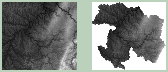
Example 4: Raster Clip
It is also possible to clip raster data relative to vector polygon boundaries. Here, I am clipping the elevation data relative to the watershed boundaries. The maintain_dimensions argument is set to False. If set to True, the extent of the input data will be maintained, with any cells outside of the mask or clip extent set to NoData.
I then map the results. The same min and max values are used for both grids so that the color ramps are directly comparable. Also, I am using Rasterio to read in the data and convert them to NumPy arrays.
wbt.clip_raster_to_polygon(
    elev,
    wshed,
    out_fold + "dem_clip.tif",
    maintain_dimensions=False,
)
0
elev_x = rio.open(elev)
elev_x_arr = elev_x.read()
elev_y = rio.open(out_fold + "dem_clip.tif")
elev_y_arr = elev_y.read()
plt.rcParams['figure.figsize'] = [10, 8]
fig, ax = plt.subplots(1, 2)
ax[0].imshow(elev_x_arr[0,:,:], cmap="gist_gray", vmin=elev_x_arr[0,:,:].min(), vmax=elev_x_arr[0,:,:].max())
ax[0].axis("off")
ax[1].imshow(elev_y_arr[0,:,:], cmap="gist_gray", vmin=elev_x_arr[0,:,:].min(), vmax=elev_x_arr[0,:,:].max())
ax[1].axis("off")
fig.patch.set_facecolor('#bcd1bc')
Example 5: Intersection
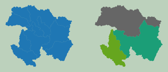
Below, I am performing an intersection of the county and watershed boundaries. Only boundaries within the overlapping or shared area are maintained.
wbt.intersect(
    wshed,
    wv_c,
    out_fold + "isect.shp",
    snap=0.0,
)
0
wshed2 = gpd.read_file(wshed)
isect2 = gpd.read_file(out_fold + "isect.shp")
plt.rcParams['figure.figsize'] = [10, 8]
fig, ax = plt.subplots(1, 2)
wshed2.plot(ax=ax[0], edgecolor="black", linewidth=3, legend=False)
ax[0].axis("off")
isect2.plot(ax=ax[1], edgecolor="black", linewidth=3, legend=False)
ax[1].axis("off")
fig.patch.set_facecolor('#bcd1bc')
Example 6: Raster Resample
A function is available to resample raster data, or change the cell size. The following methods are available: nearest neighbor ("nn"), bilinear interpolation ("bilinear"), and cubic convolution ("cc"). Here, I am using cubic convolution.
By comparing the number of rows and columns in the original and new data sets, you can see that the spatial resolution has been reduced.
wbt.resample(
    elev,
    out_fold + "elev_re.tif",
    cell_size=100,
    base=None,
    method="cc",
)
0
elev_x = rio.open(elev)
elev_y = rio.open(out_fold + "elev_re.tif")
print(elev_x.height)
(elev_y.height)
1923


577
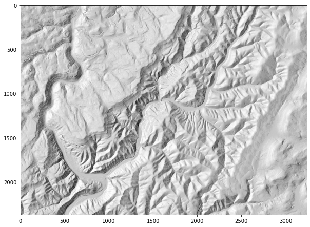
Example 7: Multidirectional Hillshade
WhiteboxTools has a large set of terrain and geomorphic analysis tools available. Here, I will demonstrate a few using a high spatial resolution digital elevation model (DEM) derived from LiDAR. In the first example, I am creating a multidirectional hillshade from the DEM. In contrast to a traditional hillshade, multidirectional hillshades combine multiple illuminating positions. The altitude parameter allows you to set the height of the sun above the horizon while the full_mode parameter relates to the number of sun positions used. A zfactor can be defined for exaggeration or if the vertical units are different from the horizontal units.
wbt.multidirectional_hillshade(
    elev2,
    out_fold + "md_hs.tif",
    altitude=45.0,
    zfactor=None,
    full_mode=False,
)
0
md_hs = rio.open(out_fold + "md_hs.tif")
md_hs2 = md_hs.read()
plt.rcParams['figure.figsize'] = [10, 8]
plt.imshow(md_hs2[0,:,:], cmap="gist_gray")
<matplotlib.image.AxesImage at 0x27245d54460>
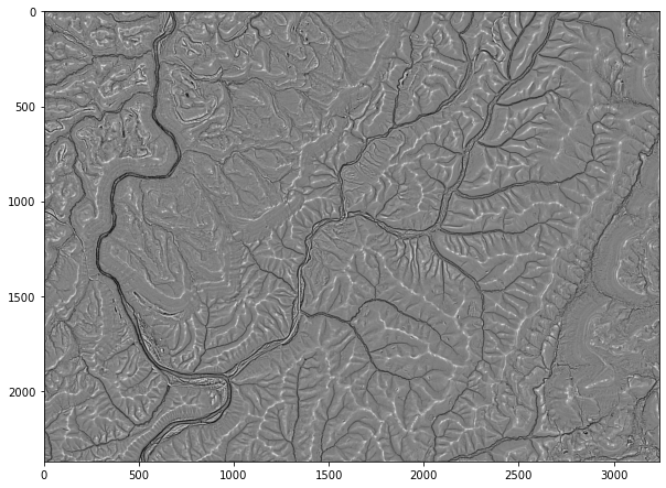
Example 8: Relative Topographic Position
This example shows how to create a relative topographic position index, which is essentially a measure of hillslope position (ridge vs. valley). This is an example of a tool that relies on a moving window, so the size of the window is defined using the filterx and filtery parameters. Larger window sizes will produce more generalized patterns.
wbt.relative_topographic_position(
    elev2,
    out_fold + "tp.tif",
    filterx=11,
    filtery=11,
)
0
tp = rio.open(out_fold + "tp.tif")
tp2 = tp.read()
plt.rcParams['figure.figsize'] = [10, 8]
plt.imshow(tp2[0,:,:], cmap="gist_gray")
<matplotlib.image.AxesImage at 0x27245da1be0>
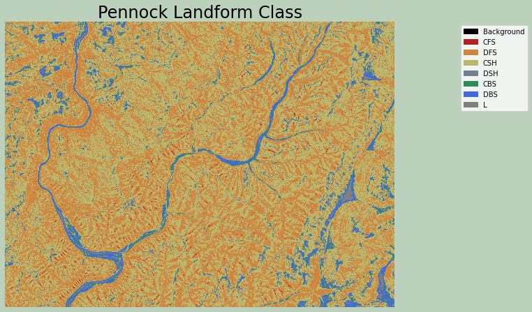
Example 9: Pennock Landform Classification
The Pennock landform classification generates a categorical raster that differentiates the following classes based on slope gradient, profile curvature, and plan curvature:
- CFS: convergent footslope
- DFS: divergent footslope
- CSH: convergent shoulders
- DSH: divergent shoulders
- CBS: convergent backslope
- DBS: divergent backslope
- L: level terrain
Symbolizing a raster grid categorically with matplotlib is a bit complex. My example was derived from this example from Earth Lab. Here is a summary of the process:
- Import the required modules from matplotlib.
- Define a color map using the matplotlib ListedColormap method, which generates an object of the Colormap class.
- Define the data intervals to map to each color using the BoundaryNorm method, which generates a colormap index based on discrete intervals.
- Use the defined color map and boundaries to render the raster using the cmap and norm arguments of imshow.
- Add a legend and define legend labels as a dictionary to associate each color with a category name.
Here, I used named matplotlib colors. A list of named colors is provided here. You can also use RGB values or hex codes.
wbt.pennock_landform_class(
    elev2,
    out_fold + "plf.tif",
    slope=3.0,
    prof=0.1,
    plan=0.0,
    zfactor=None,
)
0
from matplotlib.patches import Patch
from matplotlib.colors import ListedColormap
import matplotlib.colors as colors

plf = rio.open(out_fold + "plf.tif")
plf2 = plf.read()

cmap = ListedColormap(["black", "firebrick", "peru", "darkkhaki", "slategray", "seagreen", "royalblue", "Gray"])
norm = colors.BoundaryNorm([0, 1, 2, 3, 4, 5, 6, 7, 8], 8, clip=False)

fig, ax = plt.subplots(figsize=(10, 8))
chm_plot = ax.imshow(plf2[0,:,:],
                     cmap=cmap,
                     norm=norm)
ax.set_title("Pennock Landform Class", fontsize=24, color="#000000")
legend_labels = {"Black": "Background", "firebrick": "CFS", "peru": "DFS", "darkkhaki": "CSH", "slategray": "DSH", "seagreen": "CBS", "royalblue": "DBS","gray": "L"}
patches = [Patch(color=color, label=label)
           for color, label in legend_labels.items()]
ax.legend(handles=patches,
          bbox_to_anchor=(1.35, 1),
          facecolor="white")
ax.set_axis_off()
fig.patch.set_facecolor('#bcd1bc')
plt.show()
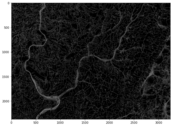
Example 10: Find Ridges
The code below demonstrates the identification of ridges from a DEM. The output is a categorical raster, where cells coded as 1 represent mapped ridges. You can also post-process the result to thin ridge lines.
wbt.find_ridges(
    elev2,
    out_fold + "ridge.tif",
    line_thin=True,
)
0
rid = rio.open(out_fold + "ridge.tif")
rid2 = rid.read()
plt.rcParams['figure.figsize'] = [10, 8]
plt.imshow(rid2[0,:,:], cmap="gist_gray")
<matplotlib.image.AxesImage at 0x27245d12f40>
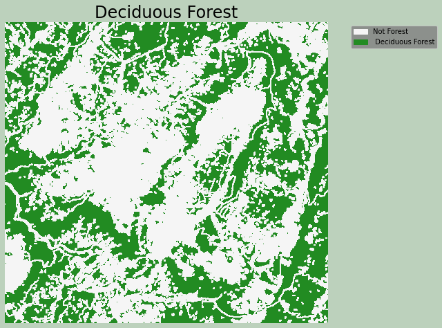
Example 11: Raster Equal To
WhiteboxTools includes a variety of logical, mathematical, and statistical operations that can be applied to raster data, similar to the math and Raster Calculator functions available in ArcGIS Pro and QGIS. It is also possible to perform mathematical and logical operations using NumPy once raster grids are converted to NumPy arrays.
In the example below, I am finding all grid cells in a land cover data set that are coded to the value 41, which represents deciduous forest. I then plot the result using a categorical symbology, which was explained above.
wbt.equal_to(
    lc,
    41,
    out_fold + "for.tif"
)
0
for1 = rio.open(out_fold + "for.tif")
for2 = for1.read()

cmap = ListedColormap(["whitesmoke", "forestgreen"])
norm = colors.BoundaryNorm([0, 1, 2], 2, clip=False)

fig, ax = plt.subplots(figsize=(10, 8))
chm_plot = ax.imshow(for2[0,:,:],
                     cmap=cmap,
                     norm=norm)
ax.set_title("Deciduous Forest", fontsize=24, color="#000000")
legend_labels = {"whitesmoke":"Not Forest", "forestgreen":" Deciduous Forest"}
patches = [Patch(color=color, label=label)
           for color, label in legend_labels.items()]
ax.legend(handles=patches,
          bbox_to_anchor=(1.35, 1),
          facecolor="gray")
ax.set_axis_off()
fig.patch.set_facecolor('#bcd1bc')
plt.show()
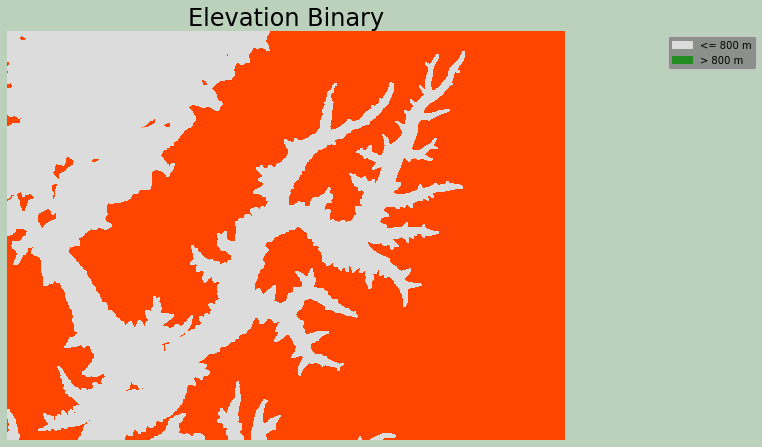
Example 12: Raster Greater Than
This is an example of applying the greater than operation to a raster grid. The output will be binary, where 0 represents False and 1 represents True. The incl_equals argument when set to False means greater than while True indicates greater than or equal to.
I have specifically used this function to find all cells in a DEM with an elevation value greater than 600 meters. These cells are coded to 1, and all other cells are coded to 0.
wbt.greater_than(
    elev2,
    600,
    out_fold + "elev_bi.tif",
    incl_equals=False
)
0
ebi1 = rio.open(out_fold + "elev_bi.tif")
ebi2 = ebi1.read()

cmap = ListedColormap(["gainsboro", "orangered"])
norm = colors.BoundaryNorm([0, 1, 2], 2, clip=False)

fig, ax = plt.subplots(figsize=(10, 8))
chm_plot = ax.imshow(ebi2[0,:,:],
                     cmap=cmap,
                     norm=norm)
ax.set_title("Elevation Binary", fontsize=24, color="#000000")
legend_labels = {"gainsboro":"<= 800 m", "forestgreen":"> 800 m"}
patches = [Patch(color=color, label=label)
           for color, label in legend_labels.items()]
ax.legend(handles=patches,
          bbox_to_anchor=(1.35, 1),
          facecolor="gray")
ax.set_axis_off()
fig.patch.set_facecolor('#bcd1bc')
plt.show()
Example 13: Extract Raster Values at Points
Raster values can be extracted at point locations. If the out_text parameter is set to True, the result will be provided as text. If it is set to False, the result will be added to the point attribute table.
ele_ext = wbt.extract_raster_values_at_points(
    elev,
    pnts,
    out_text=True,
)
print(ele_ext)
0
Example 14: Raster Zonal Stats
Similar to extracting values at point locations, you can also obtain summary statistics relative to zones. This tool will not accept vector polygon zones; instead, the zones must be provided as a categorical raster grid. So, in the example I first convert the watershed boundaries to a raster using the FID as the unique identifier. The base argument is used to align the result to the origin and extent of the DEM layer.
I then use the raster zones to summarize the DEM data. Specifically, I obtain the mean elevation by watershed. The result is written to a raster, where each cell in a watershed is assigned the mean elevation of the watershed. It is also possible to write the output to a table in HTML format.
zones1 = wbt.vector_polygons_to_raster(
    wshed,
    out_fold + "ws_r.tif",
    field="FID",
    nodata=True,
    cell_size=None,
    base=elev,
)
wbt.zonal_statistics(
    elev,
    features=out_fold + "ws_r.tif",
    output=out_fold+"ele_mn.tif",
    stat="mean",
    out_table=None
)
0
elemn = rio.open(out_fold + "ele_mn.tif")
elemn2 = elemn.read()
plt.rcParams['figure.figsize'] = [10, 8]
plt.imshow(elemn2[0,:,:], cmap="gist_gray", vmin=300, vmax=600)
<matplotlib.image.AxesImage at 0x2724587cdc0>
Example 15: LiDAR Class Filter
In these last two examples, I will introduce some tools for working with LiDAR data. There are a wide variety of tools available, so if you are interested in working with and analyzing LiDAR data, I recommend investigating the documentation.
First, I create a copy of the LiDAR data that only includes points classified as ground. Ground points are assigned a code of "2", so all other codes are excluded to filter out just ground returns. Here is what the codes indicate:
- "0": Never Classified
- "1": Unclassified
- "7"/"18": Noise or Outliers
las1 = "C:/Users/amaxwel6/python_ds/data/spatial/CO195.las"
wbt.filter_lidar_classes(
    las1,
    out_fold + "las_grd.las",
    exclude_cls='0,1,7,18',
)
0
Example 16: LiDAR Rasterization
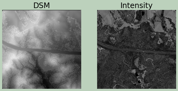
Here, I am generating a digital surface model (DSM) from the point cloud. Next, I created a first return intensity image.
The two surfaces are then visualized using matplotlib after reading the results back in and converting them to NumPy arrays.
wbt.lidar_digital_surface_model(
    las1,
    output=out_fold+"dsm.tif",
    resolution=1.0,
    radius=0.5,
    minz=None,
    maxz=None,
    max_triangle_edge_length=None
)
0
wbt.lidar_idw_interpolation(
    las1,
    output=out_fold + "las_int.tif",
    parameter="intensity",
    returns="first",
    resolution=1.0,
    weight=1.0,
    radius=2.5,
    exclude_cls='7,18',
    minz=None,
    maxz=None,
)
0
dsm = rio.open(out_fold + "dsm.tif")
dsm2 = dsm.read()
fint = rio.open(out_fold + "las_int.tif")
fint2 = fint.read()
plt.rcParams['figure.figsize'] = [10, 8]
fig, ax = plt.subplots(1, 2)
ax[0].imshow(dsm2[0,:,:], cmap="gist_gray", vmin=620, vmax=760)
ax[0].set_title("DSM", fontsize=24, color="#000000")
ax[0].axis("off")
ax[1].imshow(fint2[0,:,:], cmap="gist_gray", vmin=128, vmax=16200)
ax[1].set_title("Intensity", fontsize=24, color="#000000")
ax[1].axis("off")
fig.patch.set_facecolor('#bcd1bc')
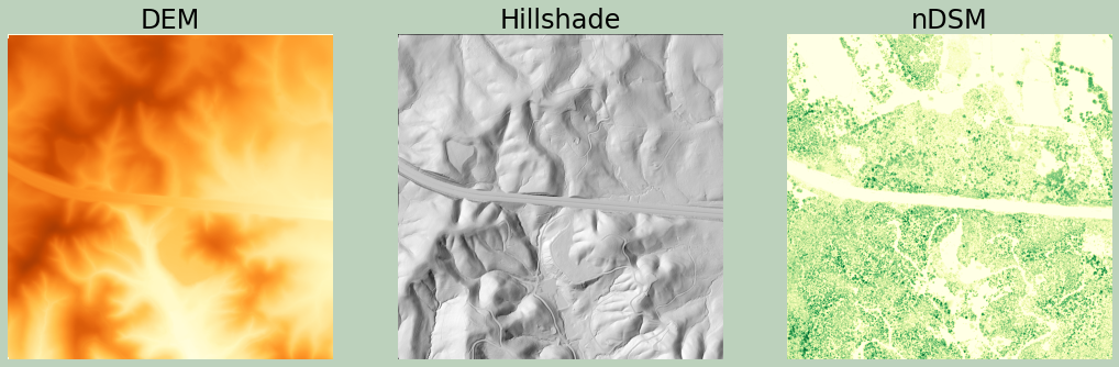
Using only the ground returns, which were filtered out above, I generate another DSM. Since only ground returns are used, this is actually a digital terrain model (DTM). Next, I create a hillshade from the DTM.
In order to created a normalized digital surface model (nDSM), I convert the DSM and DTM to NumPy arrays and then subtract them to obtain a measure of height of features above the ground.
Finally, I plot all three results.
wbt.lidar_digital_surface_model(
    out_fold + "las_grd.las",
    output=out_fold+"dem.tif",
    resolution=1.0,
    radius=0.5,
    minz=None,
    maxz=None,
    max_triangle_edge_length=None
)
0
wbt.multidirectional_hillshade(
    out_fold + "dem.tif",
    out_fold + "lid_hs.tif",
    altitude=45.0,
    zfactor=None,
    full_mode=False,
)
0
dem = rio.open(out_fold + "dem.tif")
dem2 = dem.read()
lhs = rio.open(out_fold + "lid_hs.tif")
lhs2 = lhs.read()

ndsm = dsm2[0,:,:] - dem2[0,:,:]

plt.rcParams['figure.figsize'] = [18, 12]
fig, ax = plt.subplots(1, 3)
ax[0].imshow(dem2[0,:,:], cmap="YlOrBr", vmin=620, vmax=760)
ax[0].set_title("DEM", fontsize=24, color="#000000")
ax[0].axis("off")
ax[1].imshow(lhs2[0,:,:], cmap="gist_gray", vmin=0, vmax=30000)
ax[1].set_title("Hillshade", fontsize=24, color="#000000")
ax[1].axis("off")
fig.patch.set_facecolor('#bcd1bc')
ax[2].imshow(ndsm, cmap="YlGn", vmin=0, vmax=35)
ax[2].set_title("nDSM", fontsize=24, color="#000000")
ax[2].axis("off")
fig.patch.set_facecolor('#bcd1bc')
Again, WhiteboxTools contains more than 440 tools for working with and analyzing geospatial data. As you can see from the provided examples, the syntax is similar for each tool, and the package is generally easy to use. If you are interested in investigating WhiteboxTools further, please review the documentation.
Concluding Remarks
In this module, I demonstrated the use of GeoPandas, Rasterio, and matplotlib for reading, writing, and visualizing geospatial data using Python. I then provides some examples of spatial analysis operations that can be performed using WhiteboxTools. If you have specific interests or needs, I think you will find that my examples, the provided library/module documentation, and online help and forums will be adequate to get you started.
Lastly, there is still active development of geospatial libraries/modules for use in Python. So, you may find new tools to apply to your work. With an understanding of basic Python, GIS, and data science, you should be able to use examples and documentation to apply techniques to your own analyses.