Visualizing Spatial Data in R with tmap
Objectives
- Apply aesthetic mappings to map features
- Visualize a wide range of spatial data types and attributes using tmap
- Create map layouts using tmap
- Produce interactive maps with tmap
- Export layouts and interactive maps
Overview
In this section we will explore visualizing and mapping geospatial data in R. The ggmap package offers a mapping extension for ggplot2. However, this requires an API key for Google Maps, so I will not cover that method here. If you would like to learn ggmap, there are many resources online to do so. Instead, we will explore the tmap package. The name stands for thematic maps, and it offers a variety of methods to visualize categorical and continuous variables over map space using vector and raster data.
In this section we will make use of many packages including tmap, tmaptools, rgdal, sf, raster, and OpenStreetMap. You will need to install all of these packages before proceeding. In the first code block, I am calling these packages in.
The link at the bottom of the page provides the example data and R Markdown file used to generate this module.
library(tmap)
library(tmaptools)
library(rgdal)
library(sf)
library(raster)
library(OpenStreetMap)
We will use several spatial data layers in the example maps. Here is a brief explanation of each.
- cities2.shp: major cities in US
- states.shp: state boundaries
- tracks.shp: major Amtrak routes in US
- dem_example.tif: example digital elevation model (DEM) from the National Elevation Dataset (NED)
- lc_example.tif: example land cover from 2011 National Land Cover Database (NLCD)
- tucker_dem2.tif: 30 m DEM of Tucker County, WV from NED
- tucker_hs2.tif: 30 m hillshade of Tucker County, WV
In the following code block I am reading in the vector data layers using st_read() from the sf package and raster grids using raster() from the raster package.
cities <- st_read("tmap/cities2.shp")
states <- st_read("tmap/states.shp")
tracks <- st_read("tmap/tracks.shp")
dem <- raster("tmap/dem_example.tif")
lc <- raster("tmap/lc_example.tif")
tucker_dem <- raster("tmap/tucker_dem2.tif")
tucker_hs <- raster("tmap/tucker_hs2.tif")
Visualizing Vector Data
The tmap syntax is very similar to ggplot2. A map is initiated using tm_shape() and the data visualization and additional map elements are defined using additional arguments. The components are combined using +. Here is a list of some key functions to visualize different data types.
- tm_polygons(): polygons with fill and border
- tm_fill(): polygons with just fill
- tm_border(): polygons with just border
- tm_dots(): points as dots
- tm_markers(): points as markers
- tm_squares(): points as squares
- tm_bubbles(): points as bubbles with size, fill, and border
- tm_lines(): lines with color, type, and width
- tm_raster(): display categorical and continuous raster grids
- tm_rgb(): raster as RGB image
- tm_basemap(): add base map tiles
- tm_text(): add map text and labels
- tm_iso(): add isolines or contour lines
There are additional functions for adding map elements, altering the layout, and saving the resulting map to disk.
- tm_compass(): add map compass or north arrow
- tm_scale_bar(): add scale bar
- tm_credits(): add map credits as text
- tm_graticules(): add graticules (latitude/longitude grid)
- tm_layout(): make changes to layout
- tm_layout(): change tmap style
- tm_facets(): create multiple maps as facets (similar to facet_grid() in ggplot2)
- tm_save(): save map layout to file
- tm_mode(): switch between “view” and “plot” modes
Let’s start using these functions to create some maps.
Points
In this first example, I am symbolizing cities based on population using tm_bubbles(). Similar to ggplot2, we can map constants or variables to graphic parameters using aesthetic mappings. Here are a few notes about this map.
- I am adding an Open Street Maps base map using the osm_map() function from the OpenStreetMap package. I specify the extent of the base map using the bounding box of the states object. The bounding box is extracted using st_bbox() from sf. tm_shape() is used to define that I want to include the base map layer, and it is drawn using tm_rgb().
- The points are added using tm_shape() and symbolized using tm_bubbles(). The size of the bubble is mapped to a continuous variable of population. I indicate that the title associated with the size should be “Population of City”, which will be used in the legend.
- Using tm_layout(), I specify that I want the legend to print outside of the map space and at the bottom of the map.
Again, the best way to learn is to experiment, so feel free to make changes and see how they impact the result.
us_bb <- st_bbox(states)
osm_map <- read_osm(us_bb)
tm_shape(osm_map)+
tm_rgb()+
tm_shape(cities)+
tm_bubbles(size="pop2007b", title.size = "Population of City")+
tm_layout(legend.outside=TRUE, legend.outside.position = "bottom")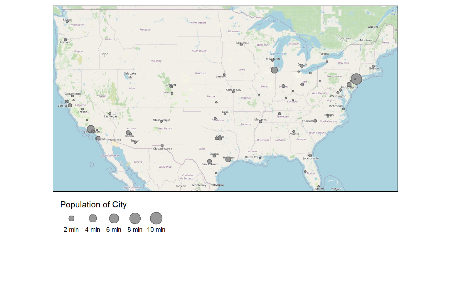
I generally use tm_bubbles() to show point data. However, it is also possible to use tm_dots() or tm_markers() as demonstrated in the next two maps. Note that no legend is printed since no variables are mapped to graphical parameters.
us_bb <- st_bbox(states)
osm_map <- read_osm(us_bb)
tm_shape(osm_map)+
tm_rgb()+
tm_shape(cities)+
tm_dots(size=.75, col="red")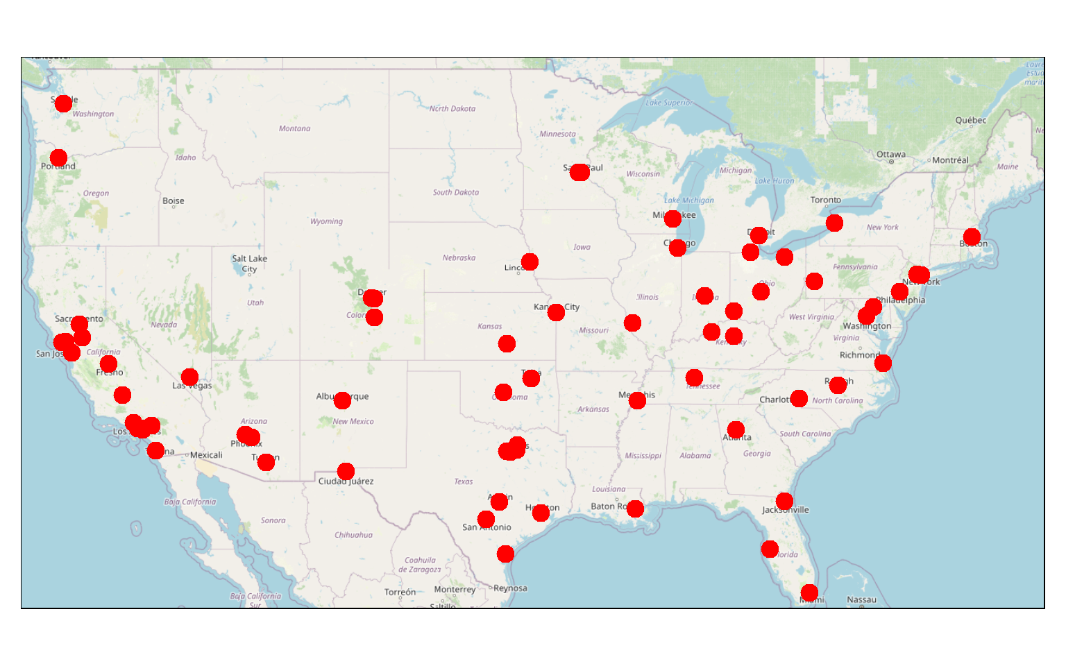
us_bb <- st_bbox(states)
osm_map <- read_osm(us_bb)
tm_shape(osm_map)+
tm_rgb()+
tm_shape(cities)+
tm_markers()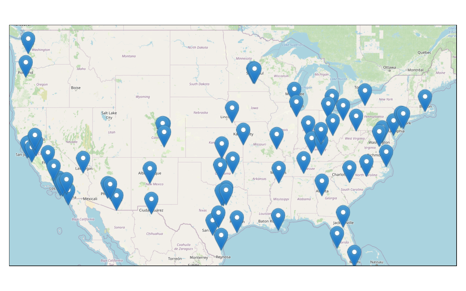
Lines
Here are some explanations relating to the following map.
- I am using a base map as already described above.
- The tracks are symbolized using tm_lines(). Here, I am not mapping data variables to graphical parameters. Instead, I just specify the color, size, and line type desired. However, it is possible to map continuous variables to size, continuous or categorical variables to color, or categorical variables to line type.
us_bb <- st_bbox(states)
osm_map <- read_osm(us_bb)
tm_shape(osm_map)+
tm_rgb()+
tm_shape(tracks)+
tm_lines(col= "black", lwd= 2, lty= "dotted")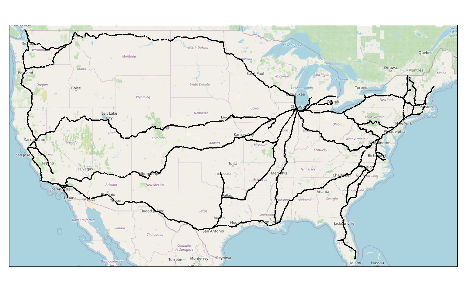
Polygons
Polygon features are generally symbolized using tm_polygons(). When using this function, you can map variables or constants to color, and it is possible to represent continuous or categorical variables. Here, I am not mapping any data variables to a graphical parameter, so no legend is provided.
I have also added a north arrow using tm_compass() and a scale bar using tm_scale_bar(). They are both positioned at the bottom-left of the map space.
Lastly, I am using tm_layout() to add a main title, which will be rendered outside of the map space by default.
tm_shape(states) +
tm_polygons(col="gray")+
tm_compass(position = c("left", "bottom"))+
tm_scale_bar(position = c("left", "bottom"))+
tm_layout(main.title = "States")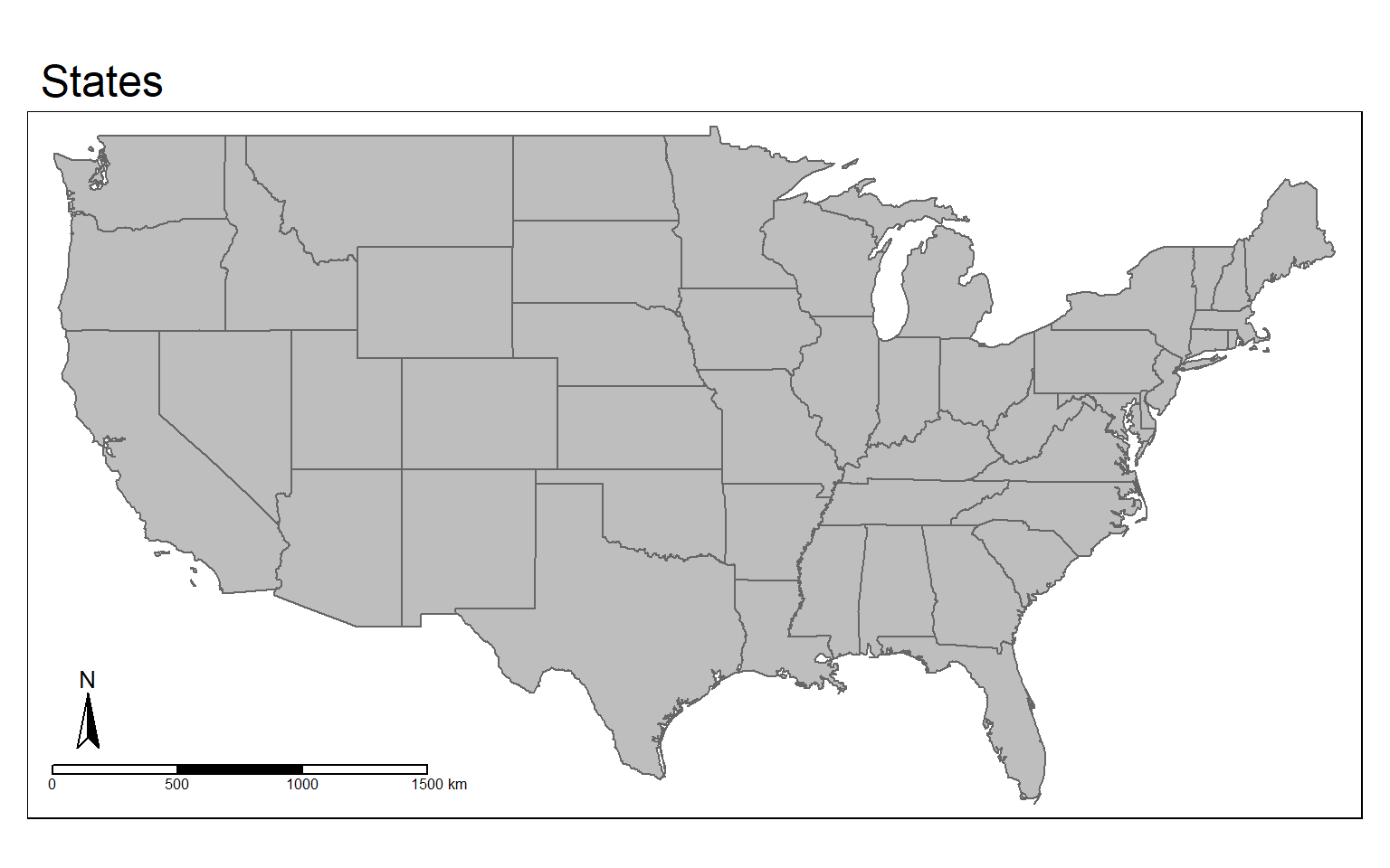
tm_fill() and tm_borders() can be used to just display the polygons using a fill color with no outline or just using a border or outline with no fill, respectively. The next two maps demonstrate these options.
tm_shape(states) +
tm_fill(col="gray")+
tm_compass(position = c("left", "bottom"))+
tm_scale_bar(position = c("left", "bottom"))+
tm_layout(main.title = "States")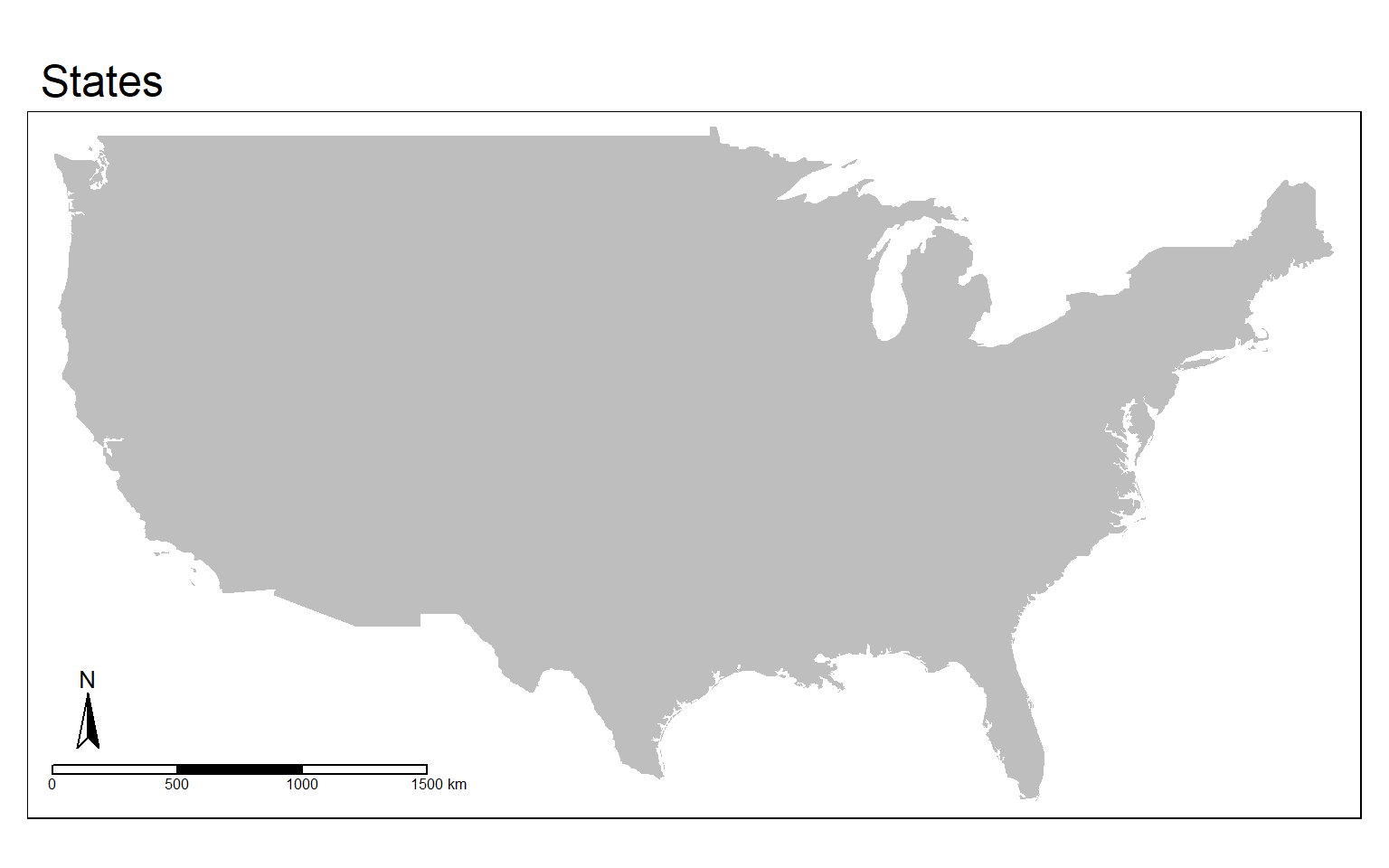
tm_shape(states) +
tm_borders(col="red", lwd=2)+
tm_compass(position = c("left", "bottom"))+
tm_scale_bar(position = c("left", "bottom"))+
tm_layout(main.title = "States")
Here, I am combining tm_fill() and tm_borders() to provide both a fill and a border.
tm_shape(states) +
tm_fill(col="gray")+
tm_borders(col="red", lwd=2)+
tm_compass(position = c("left", "bottom"))+
tm_scale_bar(position = c("left", "bottom"))+
tm_layout(main.title = "States")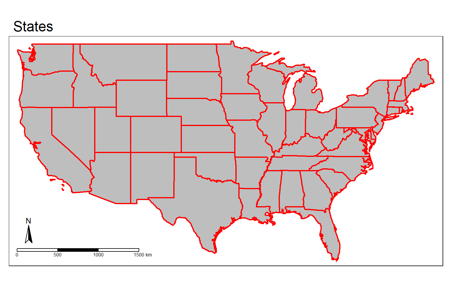
In this example, I have added a base map beneath the polygons displayed using tm_borders(). Similar to ggplot2, layers added later will draw above prior layers. So, I would not want to provide the state boundaries first since they would get covered up by the base map.
us_bb <- st_bbox(states)
osm_map <- read_osm(us_bb)
tm_shape(states)+
tm_borders()+
tm_shape(osm_map)+
tm_rgb()+
tm_shape(states) +
tm_borders(col="red", lwd=2)+
tm_compass(position = c("left", "bottom"))+
tm_scale_bar(position = c("left", "bottom"))+
tm_layout(main.title = "States")
It is possible to include labels using tm_text(). In this example, the STATE_ABBR field provides the state abbreviation, which I am rendering to text labels. I have also scaled the text size relative to the area of the state.
tm_shape(states) +
tm_polygons(col="gray")+
tm_compass(position = c("left", "bottom"))+
tm_scale_bar(position = c("left", "bottom"))+
tm_layout(main.title = "States")+
tm_text("STATE_ABBR", size="AREA")
We will now explore mapping variables to colors. The tmaptools package provides a palette_explorer() function that can be used to explore available color palettes made available by ColorBrewer. If you are a GIS professional, you might be familiar with the ColorBrewer2 website by Cynthia Brewer of Penn State that offers guidance for the selection of colors for choropleth maps. These color ramps can also be accessed in R, and a variety of sequential, diverging, and qualitative palettes are provided.
I have commented out the code example below because this will cause a Shiny window to open that allows you to explore the color palettes interactively. If you want to open this window, feel free to run the code. Shiny allows for the generation of interactive web content from R. I have provided a screen capture of the Shiny page below.
Once you have selected a color palette, you can apply it in tmap.
#tmaptools::palette_explorer()
ColorBrewer2 Palettes
In this example, I am displaying a continuous variable, population density, using a sequential color ramp defined by ColorBrewer2. I am using 5 classes and a quantile classification scheme. Also, I set the title for tm_polygons() to “People/Sq. Mi.”, as I want this to print as part of the legend.
The legend is plotted in the map space at the bottom-right position while the north arrow and scale bar are plotted at the bottom-left position. I have provided a main title that plots outside of the map frame.
Similar to the example above, I am providing text labels using tm_text().
tm_shape(states) +
tm_polygons(col="POP05_SQMI", title="People/Sq. Mi.", style="quantile", palette=get_brewer_pal(palette="OrRd", n=5, plot=FALSE))+
tm_compass(position = c("left", "bottom"))+
tm_scale_bar(position = c("left", "bottom"))+
tm_layout(main.title = "Population Density", title.size = 1.5,
title.position = c("right", "top"),
legend.outside=FALSE, legend.position= c("right", "bottom"))+
tm_text("STATE_ABBR", size="AREA")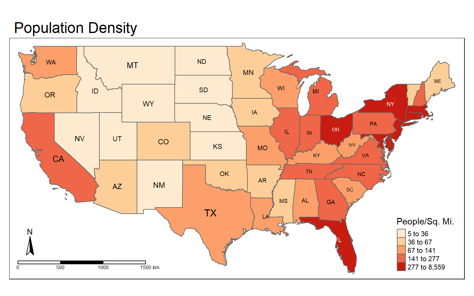
It is also possible to use color to map a categorical variable. In this example, I have selected a color ramp using ColorBrewer that is suitable for qualitative data, in this case sub-regions of the country. The style is set to “cat” to indicated that I want to represent categorical data. I have set n to 9 because there are 9 different sub-regions to differentiate. I have set the title argument to a blank string within tm_polygons() so that no legend title is plotted. Other than that, the code is the same as the example above.
tm_shape(states) +
tm_polygons(col="SUB_REGION", title="", style="cat", palette=get_brewer_pal(palette="Set1", n=9, plot=FALSE))+
tm_compass(position = c("left", "bottom"))+
tm_scale_bar(position = c("left", "bottom"))+
tm_layout(main.title = "Subregions", title.size = 1.5,
title.position = c("right", "top"),
legend.outside=FALSE, legend.position= c("right", "bottom"))+
tm_text("STATE_ABBR", size="AREA")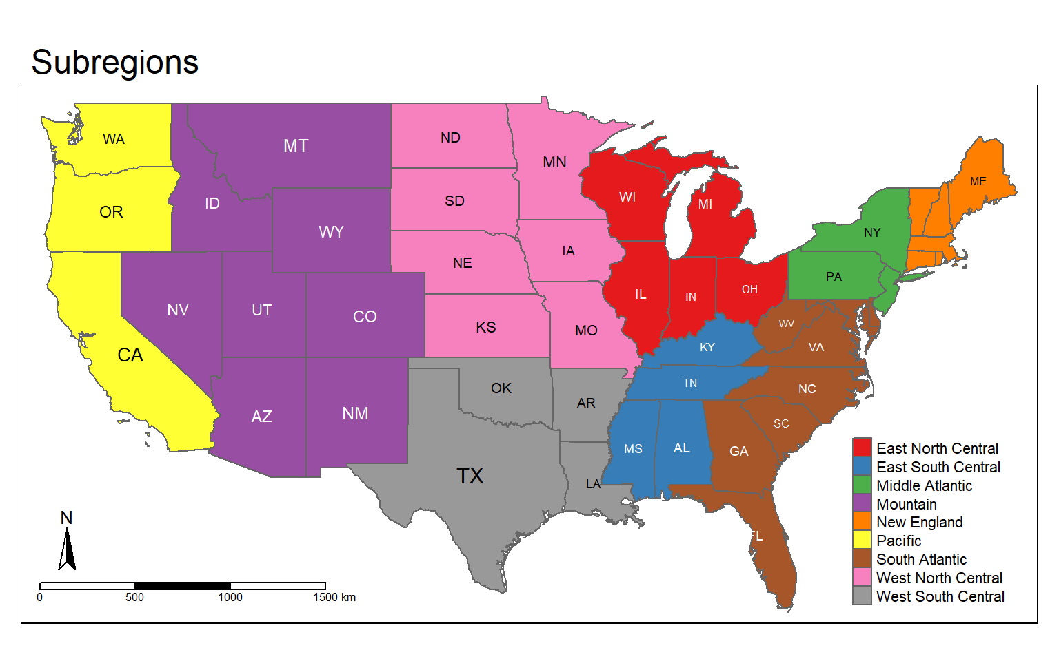
In this example, I am using tm_facets() to separate the map into multiple components by sub-region. Again, this is pretty similar to facet_grid() in ggplot2. You will need to use a categorical variable to define the facets.
tm_shape(states) +
tm_polygons(col="POP05_SQMI", title="People/Sq. Mi.", style="quantile", palette=get_brewer_pal(palette="OrRd", n=5, plot=FALSE))+
tm_layout(main.title = "Population Density by Subregion", title.size = 1.5,
title.position = c("right", "top"),
legend.outside=FALSE, legend.position= c("right", "bottom"))+
tm_text("STATE_ABBR", size="AREA")+
tm_facets(by="SUB_REGION", nrow=3)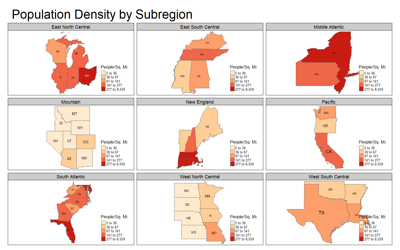
Final Vector Examples
In this example, I have combined several components to create a map of Amtrak lines across the country. Here are some explanations.
- The states are symbolized using tm_polygons() with the color mapped to the sub-region name. I use a color palette from ColorBrewer2 and set the style to “cat.” I set the title in tm_polygons() to a blank string so that a title is not included in the legend.
- The Amtrak lines are symbolized using tm_lines() with a black color and a width of 2.
- The cities are symbolized using tm_bubbles() with the size representing population. I have also provided a title to use in the legend.
- A scale bar and north arrow have been provided at the bottom-left position.
- I have provided a title, title size, and placed the legend outside of the map frame using tm_layout()
tm_shape(states) +
tm_polygons(col="SUB_REGION", title="", style="cat", palette=get_brewer_pal(palette="Set1", n=9, plot=FALSE))+
tm_shape(tracks)+
tm_lines(col= "black", lwd= 2)+
tm_shape(cities)+
tm_bubbles(size="pop2007b", title.size = "Population of City")+
tm_compass(position = c("left", "bottom"))+
tm_scale_bar(position = c("left", "bottom"))+
tm_layout(title = "Amtrak Map", title.size = 1.5, legend.outside=TRUE)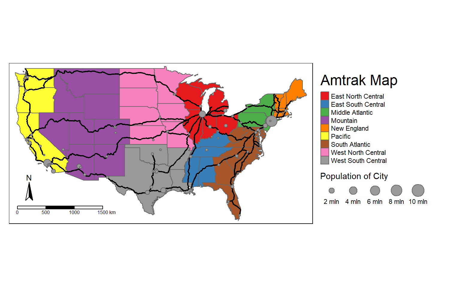
What if you wanted to make a layout in a different coordinate system or map projection? To do this you should convert all layers to the desired projection before making the layout. In the next two code blocks I have converted the layers to a Lambert Conformal Conic projection using st_transform() and a PROJ string then recreated the map from above in this projection.
cities2 <- st_transform(cities, crs="+proj=lcc +lat_1=20 +lat_2=60 +lat_0=40 +lon_0=-96 +x_0=0 +y_0=0 +datum=NAD83 +units=m +no_defs")
states2 <- st_transform(states, crs="+proj=lcc +lat_1=20 +lat_2=60 +lat_0=40 +lon_0=-96 +x_0=0 +y_0=0 +datum=NAD83 +units=m +no_defs")
tracks2 <- st_transform(tracks, crs="+proj=lcc +lat_1=20 +lat_2=60 +lat_0=40 +lon_0=-96 +x_0=0 +y_0=0 +datum=NAD83 +units=m +no_defs")
crs(cities2)
Output:  CRS arguments:
Output:   +proj=lcc +lat_0=40 +lon_0=-96 +lat_1=20 +lat_2=60 +x_0=0 +y_0=0
Output: +datum=NAD83 +units=m +no_defstm_shape(states2)+
tm_polygons(col="SUB_REGION", title="", style="cat", palette=get_brewer_pal(palette="Set1", n=9, plot=FALSE))+
tm_shape(tracks2)+
tm_lines(col= "black", lwd= 2)+
tm_shape(cities2)+
tm_bubbles(size="pop2007b", title.size = "Population of City")+
tm_compass(position = c("left", "bottom"))+
tm_scale_bar(position = c("left", "bottom"))+
tm_layout(title = "Amtrak Map", title.size = 1.5, legend.outside=TRUE)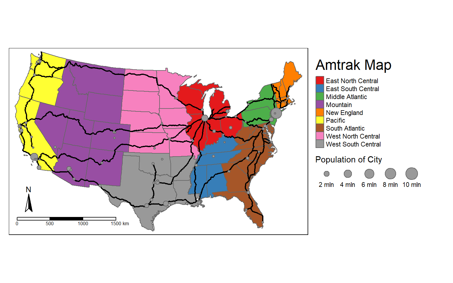
tmap provides a tmap_arrange() function that allows you to place multiple maps in the same layout space. This is similar to the plot_grid() function from cowplot. It is different from facet_grid() and tm_facets() since we are not using categorical variables to define the component maps.
In this example, I first convert the state boundaries to different coordinate systems. I then create four maps using the different projections. The maps are saved to objects so that they can be used in a later function.
In these maps, I have also provided a main title outside of the map frame that names the coordinate system used and added tm_graticules() to render graticules, or a latitude/longitude grid. The states are assigned colors using the “MAP_COLORS” field with a defined palette.
Lastly, the maps are combined to a single layout space using tmap_arrange(). This provides a nice side-by-side comparison of the different coordinate systems.
states_geog <- states
states_albers <- st_transform(states_geog, crs="+proj=aea +lat_1=20 +lat_2=60 +lat_0=40 +lon_0=-96 +x_0=0 +y_0=0 +ellps=GRS80 +datum=NAD83 +units=m +no_defs ")
states_lambert <- st_transform(states_geog, crs="+proj=lcc +lat_1=20 +lat_2=60 +lat_0=40 +lon_0=-96 +x_0=0 +y_0=0 +datum=NAD83 +units=m +no_defs")
states_mercator <- st_transform(states_geog, crs="+proj=merc +lon_0=0 +k=1 +x_0=0 +y_0=0 +datum=WGS84 +units=m +no_defs ")
geog_map <- tm_shape(states_geog)+
tm_polygons(col="MAP_COLORS", palette="Accent")+
tm_layout(legend.show=FALSE, frame=TRUE, main.title="Geographic")+
tm_graticules()
albers_map <- tm_shape(states_albers)+
tm_polygons(col="MAP_COLORS", palette="Accent")+
tm_layout(legend.show=FALSE, frame=TRUE, main.title="Albers Equal Area")+
tm_graticules()
lambert_map <- tm_shape(states_lambert)+
tm_polygons(col="MAP_COLORS", palette="Accent")+
tm_layout(legend.show=FALSE, frame=TRUE, main.title="Lambert Conformal Conic")+
tm_graticules()
mercator_map <- tm_shape(states_mercator)+
tm_polygons(col="MAP_COLORS", palette="Accent")+
tm_layout(legend.show=FALSE, frame=TRUE, main.title="Mercator")+
tm_graticules()
tmap_arrange(geog_map, mercator_map, albers_map, lambert_map, nrow=2)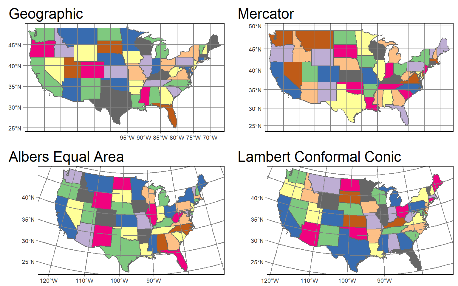
Visualizing Raster Data
Continuous Raster Grids
In tmap, single-band raster data are symbolized using tm_raster() as demonstrated in the next code block. This is a DEM, which is a continuous raster.
tm_shape(dem)+
tm_raster()+
tm_layout(legend.outside = TRUE)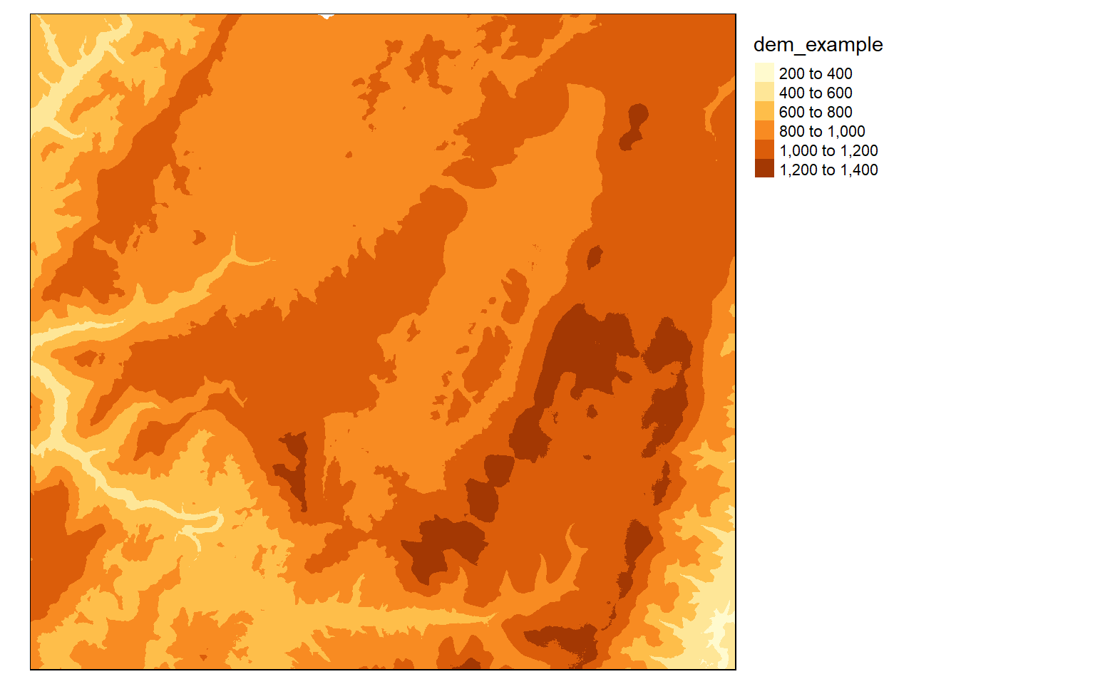
Similar to most GIS software packages, data values can be grouped or binned to represent a range of values with one color. Some common methods used include the following:
- Equal Interval: equal range of data values in each bin
- Quantiles: equal number of map features or grid cells in each bin
The next two examples demonstrate these different classification schemes.
tm_shape(dem)+
tm_raster(style= "equal")+
tm_layout(legend.outside = TRUE)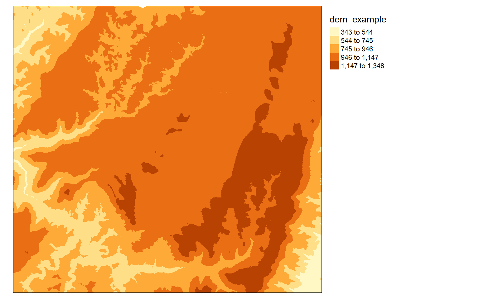
tm_shape(dem)+
tm_raster(style= "quantile")+
tm_layout(legend.outside = TRUE)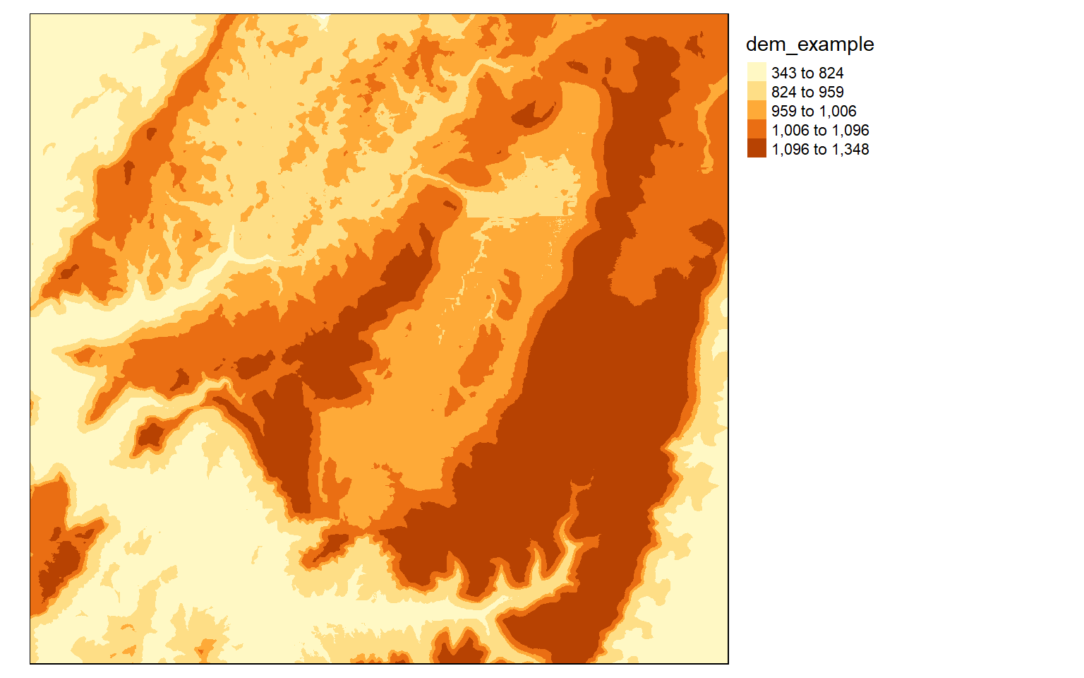
If you do not want to group colors into ranges or bins, you can use the continuous method where a color ramp is used to display the data without binning.
tm_shape(dem)+
tm_raster(style= "cont")+
tm_layout(legend.outside = TRUE)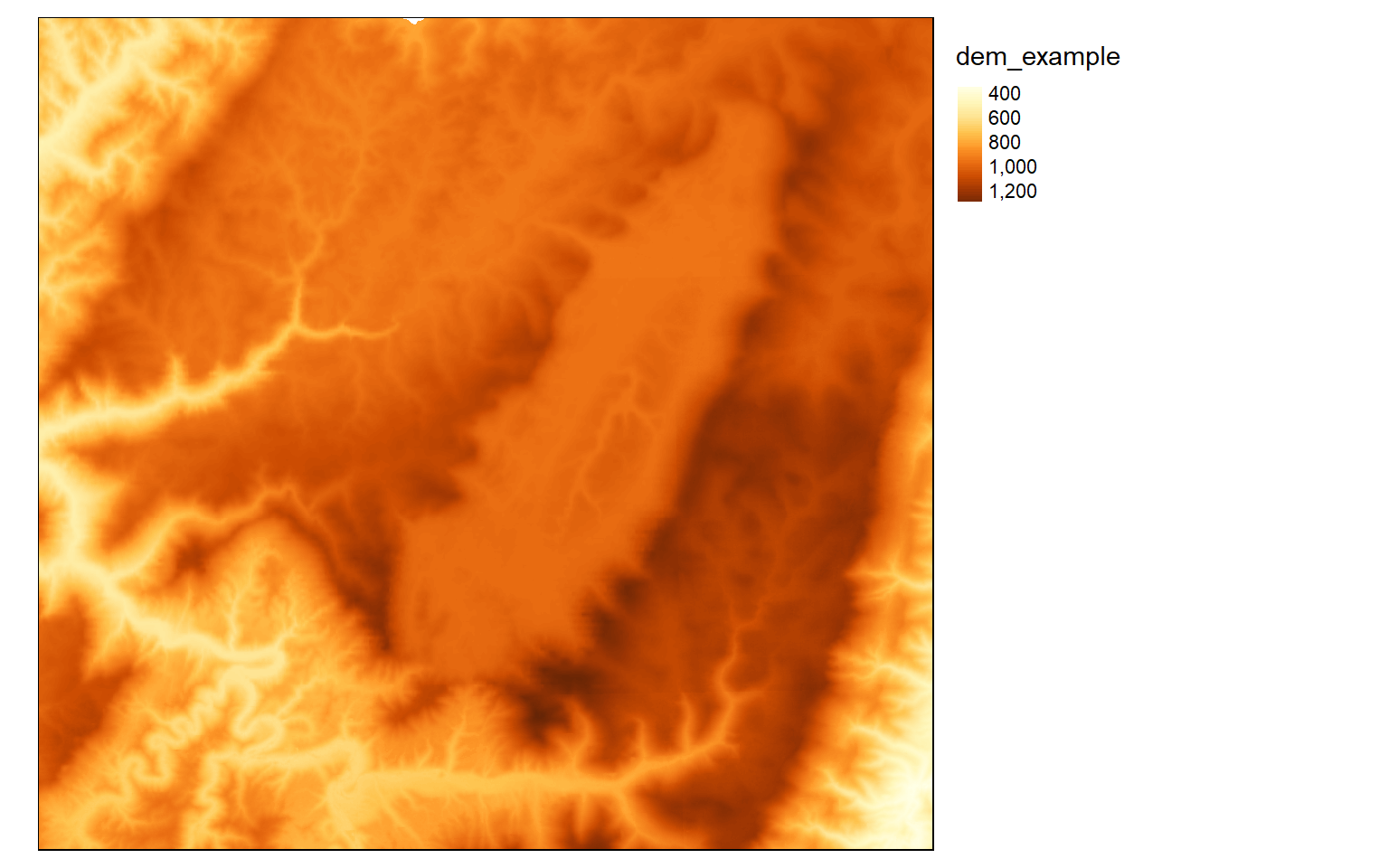
The next set of examples demonstrate applying ColorBrewer2 color ramps to this continuous raster surface. Note that these ramps can be applied when using classified or continuous methods.
tm_shape(dem)+
tm_raster(style= "quantile", n=7, palette=get_brewer_pal("Blues", n = 7, plot=FALSE))+
tm_layout(legend.outside = TRUE)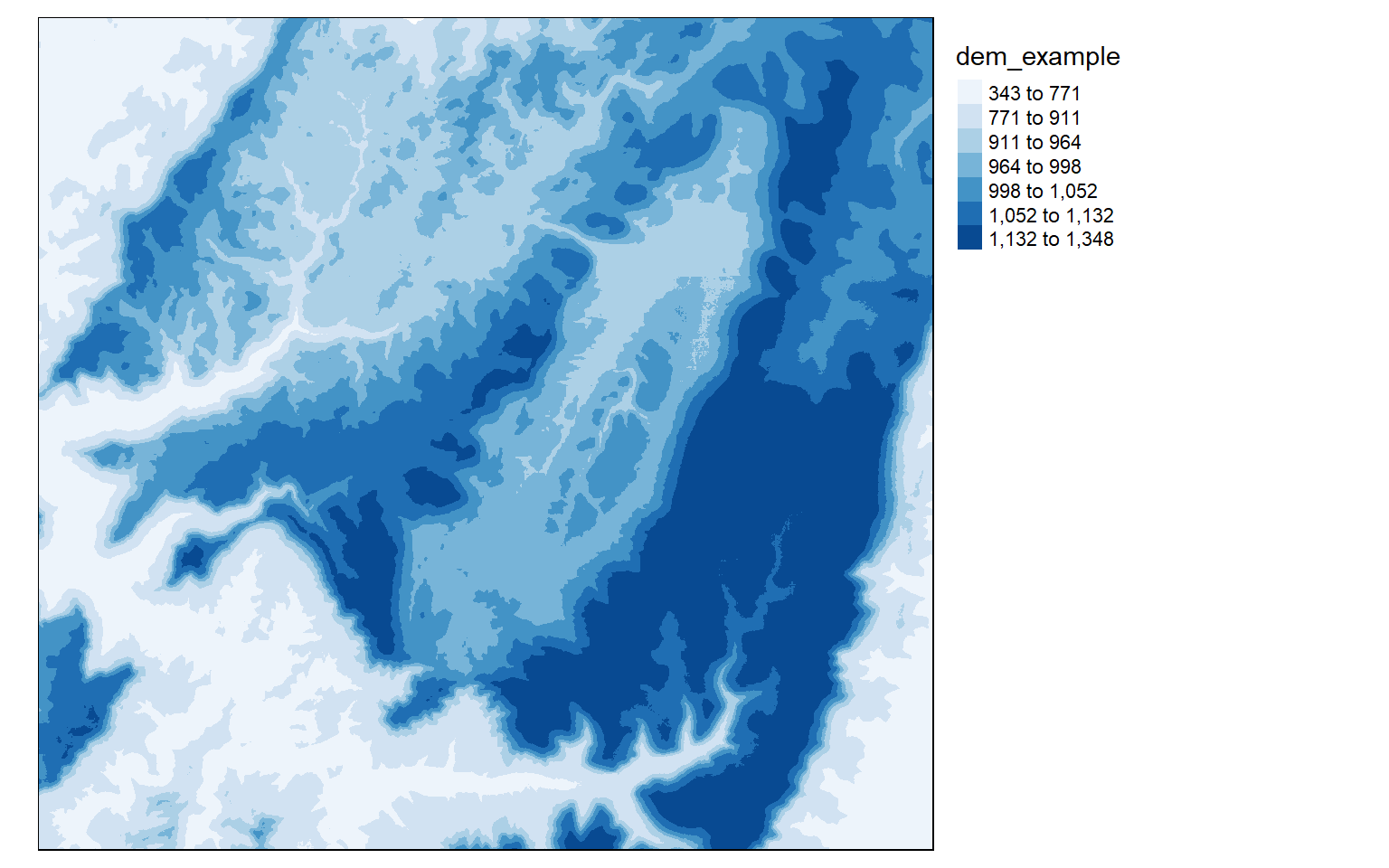
tm_shape(dem)+
tm_raster(style= "quantile", n=7, palette=get_brewer_pal("Greys", n = 7, plot=FALSE))+
tm_layout(legend.outside = TRUE)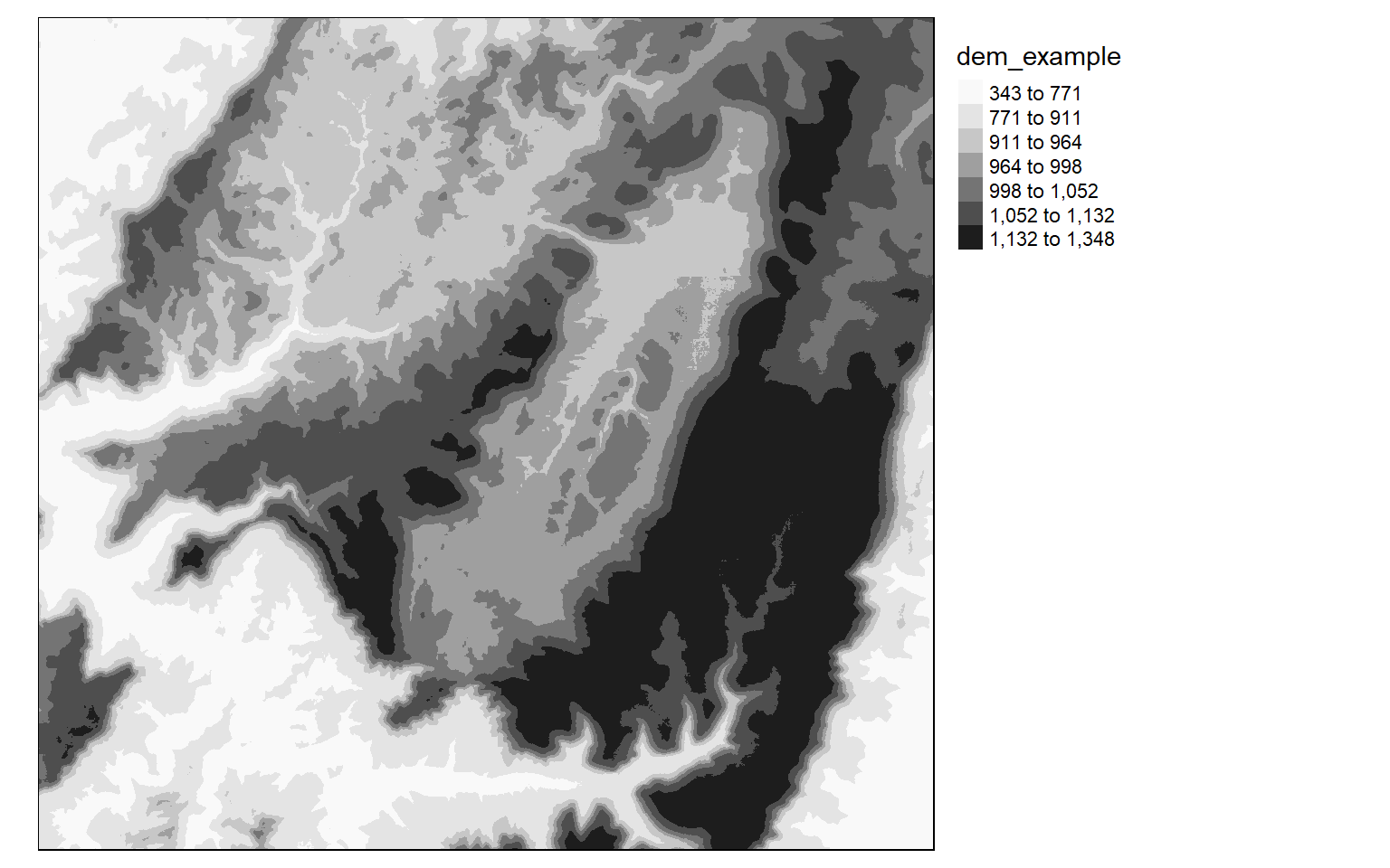
tm_shape(dem)+
tm_raster(style= "cont", palette=get_brewer_pal("Greys", plot=FALSE))+
tm_layout(legend.outside = TRUE)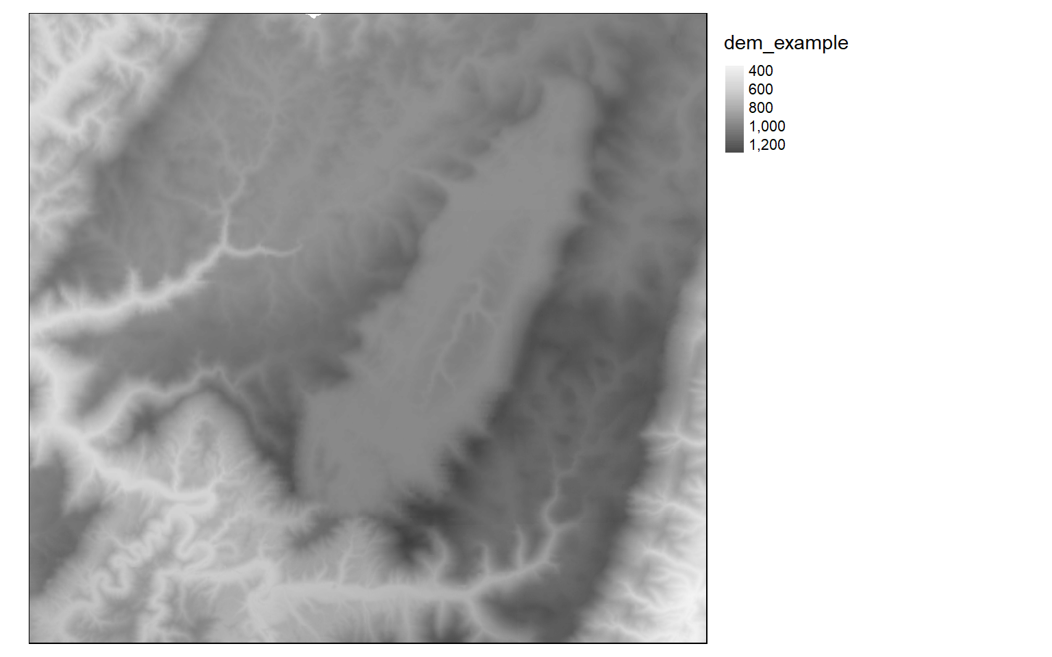
It is also possible to invert the color ramp by adding a negative sign to the name.
tm_shape(dem)+
tm_raster(style= "cont", n=7, palette=get_brewer_pal("-Greys", plot=FALSE))+
tm_layout(legend.outside = TRUE)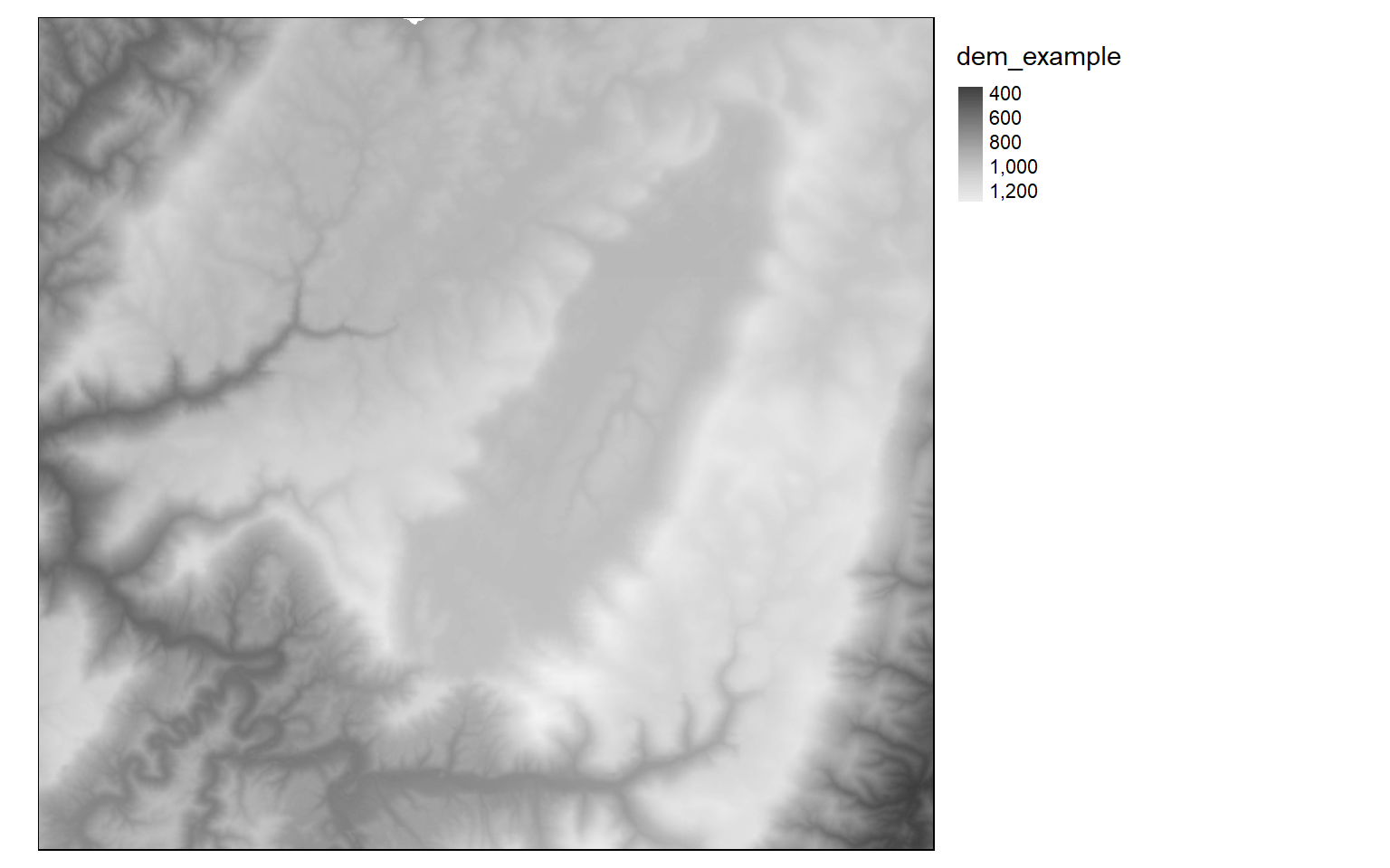
Categorical Raster Grids
Now we will investigate symbolizing categorical raster data. This can be accomplished by setting the style argument equal to “cat.”
tm_shape(lc)+
tm_raster(style= "cat", title="Land Cover")+
tm_layout(legend.outside = TRUE)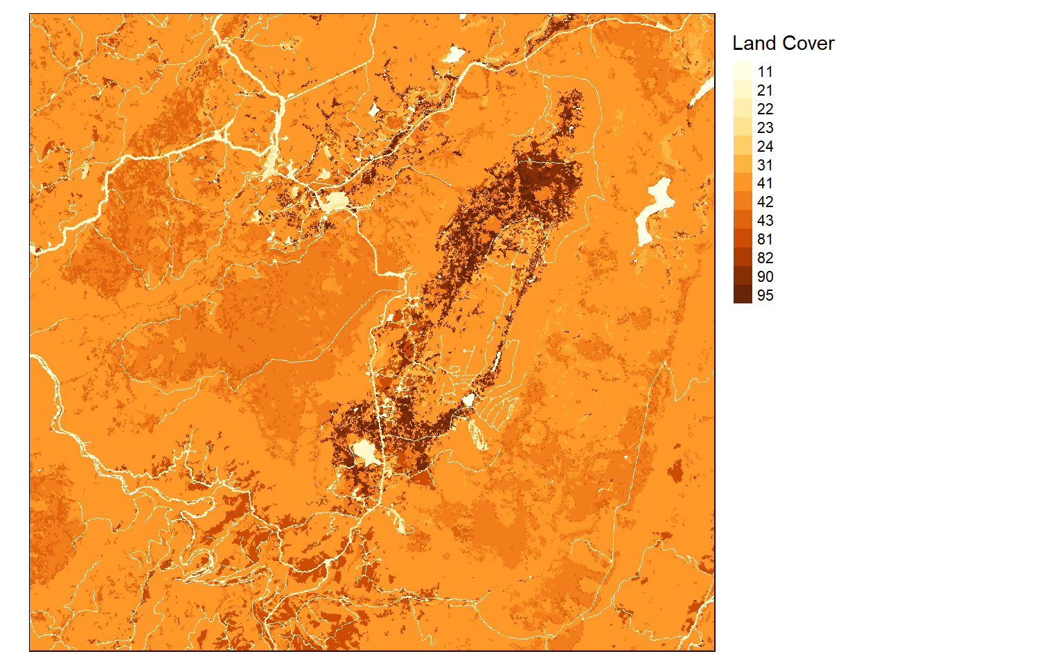
I generally find that I need to provide my own labels and colors for categorical data. In this example, I am providing labels for each code so that the land cover category is displayed as opposed to the stand-in cell value. I also provide my own color palette using named R colors. Similar to ggplot2, the codes, labels, and colors must be in the same order so that they match up correctly, since this is based on the position or index only. Note that you could also provide hex codes or RGB values to define desired colors.
tm_shape(lc)+
tm_raster(style= "cat",
labels = c("Open Water", "Developed Open", "Developed Low Int.", "Developed Med. Int.", "Developed High Int.", "Barren", "Deciduous Forest", "Evergreen Forest", "Mixed Forest", "Pasture/Hay", "Cultivated Crop", "Woody Wetland", "Emergent Wetland"),
palette = c("deepskyblue", "brown1", "brown2", "brown3", "brown4", "darkgrey", "darkolivegreen", "darkolivegreen1", "darkseagreen1", "goldenrod3", "darkorange", "darkorchid1", "darkorchid4"),
title="Land Cover")+
tm_layout(legend.outside = TRUE)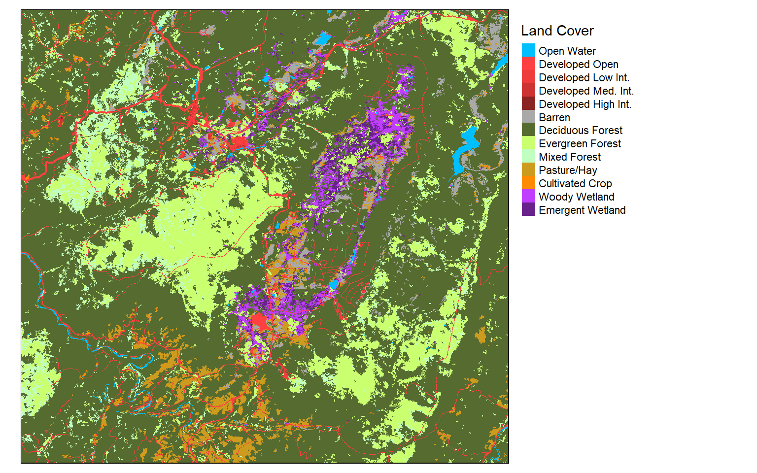
Final Raster Examples
In this final raster example, I am creating a terrain visualization using a hillshade and DEM. The DEM is placed below the hillshade, and I have set alpha equal to 0.6 to apply a transparency. I also provide a compass, scale bar, and data credits. All of the elements are plotted within the map frame. I have specified the credit position using values as opposed to named positions. This works the same as in ggplot2.
Again, it would be good to experiment with this example to see if you can figure out how to make some desired changes or add more data layers.
tm_shape(tucker_hs)+
tm_raster(palette="-Greys", style="cont", legend.show=FALSE)+
tm_shape(tucker_dem)+
tm_raster(alpha=.6, palette="cividis", style="cont", title="Elevation (m)")+
tm_compass(type="arrow", position=c(.15, .05))+
tm_scale_bar(position = c(0.2, .005), text.size=.8)+
tm_layout(title = "Tucker County Elevation", title.size = 1.5, title.position = c("right", "top"))+
tm_credits("Data from NED", position= c(.87, .03))+
tm_layout(legend.position= c("left", "bottom"))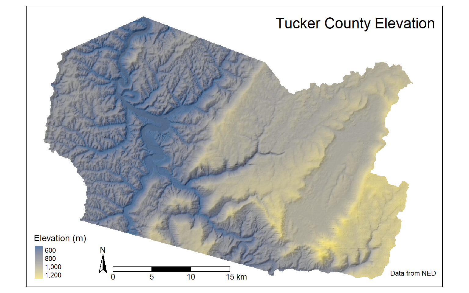
Plots vs. Views
Throughout this module, we have been using “plot” mode as opposed to “view” mode. In “plot” mode, you are working in a layout space. In contrast, “view” mode allows you to generate an interactive map that you can navigate and move within. The default mode is “plot”. The first example here shows “plot” mode while the second shows “view” mode. It is generally a good idea to restore the mode to “plot” after using “view”. Note also that base maps are defined differently in “plot” and “view” modes.
tmap_mode("plot")
us_bb <- st_bbox(states)
osm_map <- read_osm(us_bb)
tm_shape(states)+
tm_borders()+
tm_shape(osm_map)+
tm_rgb()+
tm_shape(states) +
tm_borders(col="red", lwd=2)+
tm_compass(position = c("left", "bottom"))+
tm_scale_bar(position = c("left", "bottom"))+
tm_layout(main.title = "States")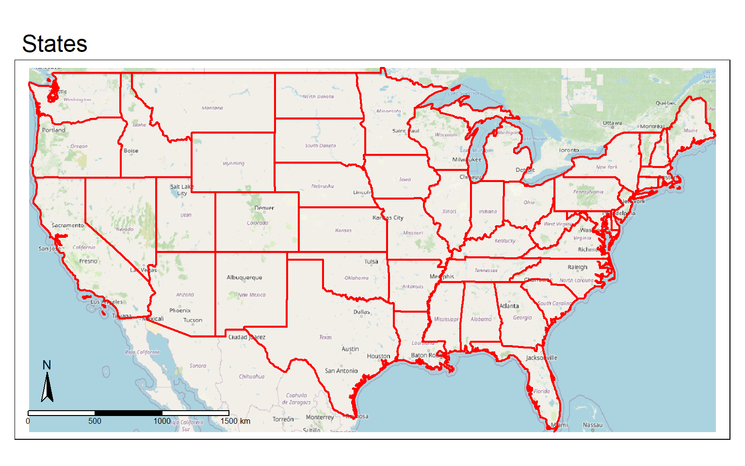
tmap_mode("view")
tm_basemap("OpenStreetMap")+
tm_shape(states)+
tm_borders(col="red", lwd=2)Write to File
Similar to ggplot2, layouts can be written to disk as vector or raster graphic files. This is accomplished using the tmap_save() function. In the first example, I am saving the map as SVG and PDF files. The map must be saved to an object so that it can be called or referenced in the tmap_save() function. If you don’t want to save these files to your computer, you should not run these examples.
amtrak_map <- tm_shape(states2) +
tm_polygons(col="SUB_REGION", title="", style="cat", palette=get_brewer_pal(palette="Set1", n=9, plot=FALSE))+
tm_shape(tracks2)+
tm_lines(col= "black", lwd= 2)+
tm_shape(cities2)+
tm_bubbles(size="pop2007b", title.size = "Population of City")+
tm_compass(position = c("left", "bottom"))+
tm_scale_bar(position = c("left", "bottom"))+
tm_layout(title = "Amtack Map", title.size = 1.5, legend.outside=TRUE)
tmap_save(amtrak_map, filename="amtrak.svg", height=8.5, width=11, units="in", dpi=300)
tmap_save(amtrak_map, filename="amtrak.pdf", height=8.5, width=11, units="in", dpi=300)
In this example, I am exporting to raster graphic formats as JPEG and TIFF files.
tucker_map <- tm_shape(tucker_hs)+
tm_raster(palette="-Greys", style="cont", legend.show=FALSE)+
tm_shape(tucker_dem)+
tm_raster(alpha=.6, palette="cividis", style="cont", title="Elevation (m)")+
tm_compass(type="arrow", position=c(.15, .05))+
tm_scale_bar(position = c(0.2, .005), size=.8)+
tm_layout(title = "Tucker County Elevation", title.size = 1.5, title.position = c("right", "top"))+
tm_credits("Data from NED", position= c(.87, .03))+
tm_layout(legend.position= c("left", "bottom"))
tmap_save(tucker_map, filename="tucker.jpeg", height=8.5, width=11, units="in", dpi=300)
tmap_save(tucker_map, filename="tucker.tiff", height=8.5, width=11, units="in", dpi=300)
When using “view” mode, you can also write the interactive map out as an HTML file for viewing in a web browser.
tmap_mode("view")
interactive <- tm_basemap("OpenStreetMap")+
tm_shape(states)+
tm_borders(col="red", lwd=2)
tmap_save(interactive, "interactive.html")
tmap_mode("plot")
Concluding Remarks
That’s it! Now, you should be able to symbolize a variety of data types and variables using tmap, generate map layouts, and export your maps as layouts or webpages. If you would like to learn more about tmap, here is a link to the documentation. As with ggplot2, you will likely run into specific issues that I did not cover; however, you should be able to troubleshoot using the documentation and/or a web search. Throughout the remainder of the course, you will see more tmap examples as we visualize output from analyses.
I provided a light introduction to interactive web maps in this module; however, there is much more functionality made available through Leaflet, which is accessible via the leaflet R package. We will explore this package in a later module.