Graphs with ggplot2: Part I
Objectives
- Learn to apply aesthetic mappings in ggplot2
- Produce a variety of univariate graphs including histograms, kernel density plots, box plots, and violin plots
- Compare groups in graph space
- Create multivariate graphs including scatter plots and line graphs
- Explore techniques to combat overplotting
Overview
Multiple packages are available to produce graphs in R. Graphing functionality is even made available through base R. We will make use of some base R graphics in this course, but we will not focus on this topic. The grids package provides a low-level graphics system that other packages have used to expand the graphing capabilities of R. These packages include lattice and ggplot2. In this course, we will explore ggplot2, which is based on the Grammar of Graphics by Leland Wilkinson. This philosophy suggests breaking graphs up into semantic components such as scales and layers. In fact, the package name means “Grammar of Graphics Plots 2”. Practically, this translates to mapping constants, such as specific colors, sizes, or symbols, or variables, such as your data values, to graphical parameters, such as position along the x-axis or y-axis, size or shape of point symbols, width of lines, and color of point symbols or lines. This is the concept of aesthetic mappings.
ggplot2 is my preferred method for making graphs. I have found it to be very intuitive, powerful, and adaptable to a wide variety of needs. Once a graph is produced, you can easily export it as a vector graphic for editing outside of R. In this first section on ggplot2 we will focus on the basics of the package and how to define aesthetic mappings. We will also explore a variety of different types of graphs. In the second section, we will explore methods to improve and refine graphs.
Before working through these examples, you will need to install the ggplot2 package. Also, you will need to load in some example data. First, we will work with the high_plains_data.csv file. The elevation (“elev”), temperature (“temp”), and precipitation (“precip2”) data were extracted from raster grids provided by the PRISM Climate Group at Oregon State University. The elevation data are provided in feet, the temperature data represent 30-year annual normal mean temperature in Celsius, and the precipitation data represent 30-year annual normal precipitation in inches. The original raster grids have a resolution of 4-by-4 kilometers and can be obtained here. I also summarized percent forest by county (“per_for”) from the 2011 National Land Cover Database (NLCD). NLCD data can be obtained from the Multi-Resolution Land Characteristics Consortium (MRLC). The link at the bottom of the page provides the example data and R Markdown file used to generate this module.
library(ggplot2)
hp_data <- read.csv("D:/ossa/ggplot2_p1/high_plains_data.csv", sep=",", header = TRUE, stringsAsFactors=TRUE)
Here is a link to a cheat sheet for ggplot2. This sheet can also be accessed in RStudio under Help –> Cheat Sheets.
Univariate Graphs
Univariate graphs involve visualizing a single variable and include histograms, kernel density plots, and box plots.
Histograms
A histogram plots the count or number of data points in each defined data range or bin. The x-axis represents the data values and the y-axis represents the count. My goal with the first graph is to inspect the distribution of percent forest cover by county. Since this is the first example of a ggplot2 graph, I will explain the syntax in detail. All ggplot2 graphs start with the ggplot() function. Within this function I specify the data frame being referenced and the aesthetic mappings using aes(). Here, I only need to define the x value. Next, I must define the geometry desired. geom_histogram() is used to create histograms. The binwidth argument specifies the range of values to aggregate into each bin for counting. I used 5, so each bin will contain a range of 5%. Note that multiple lines of code are associated using +. This is a key component of how ggplot2 works. Also, note that field names do not need to be placed in quotes.
ggplot(hp_data, aes(x=per_for))+
geom_histogram(binwidth=5)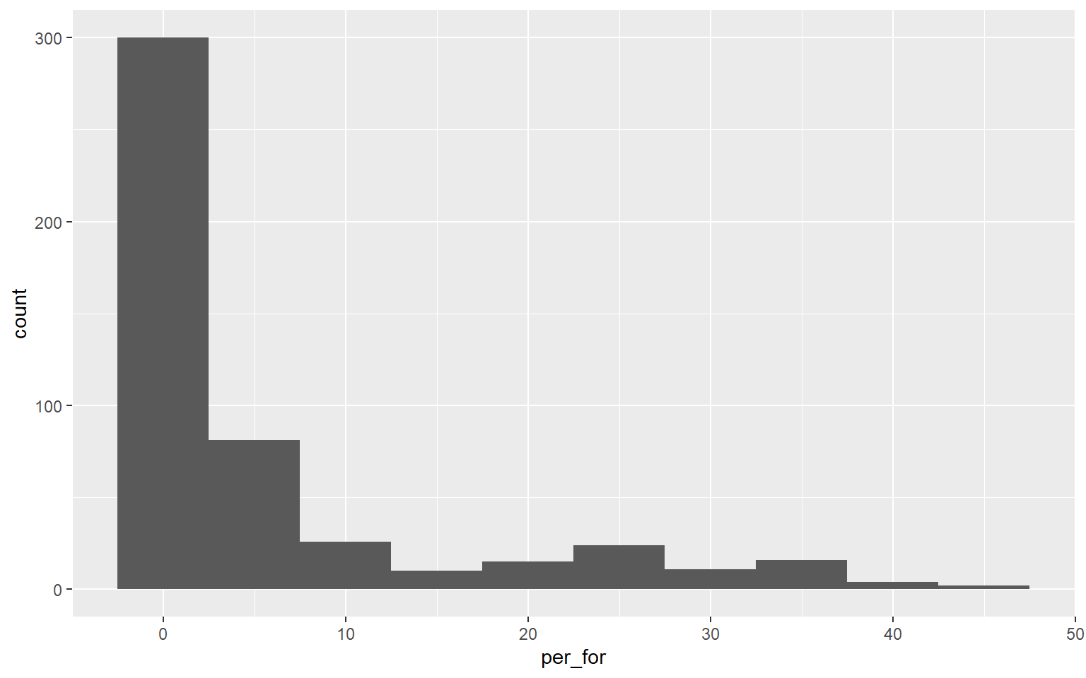
This graph is the same as the one created above. However, I have changed the binwidth to 2. So, each bin is now narrower or aggregates a smaller range of values, and more detail in the distribution is visualized. There is not necessarily a correct binwidth, as this is case specific and partially depends on whether you are interested in visualizing a general trend or more local information.
ggplot(hp_data, aes(x=per_for))+
geom_histogram(binwidth=2)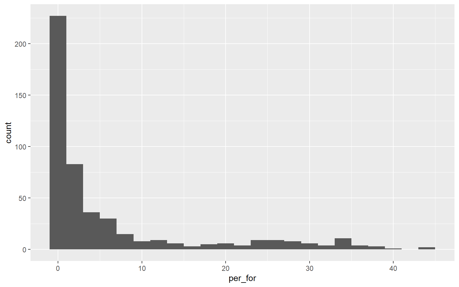
At this point, you might be thinking that these graphs don’t look great. Remember that we are focusing on exploring the basics of ggplot2 and aesthetic mappings in this section. You will learn to make your graphs pretty in the next module.
Here is another example of a histogram representing the distribution of mean annual temperature by county. Take some time to make sure you understand the aesthetic mappings.
ggplot(hp_data, aes(x=temp))+
geom_histogram(binwidth=2)
Kernel Density Plots
Another means to represent the distribution of a single variable is a kernel density plot, in which a kernel density function is used to represent a generalized or smoothed version of the distribution of a variable. The syntax is very similar to that for the histograms created above. Temperature is assigned to the x variable. I have added a ..density.. argument in the aes() function to indicate that I want the y-axis to show density. I am now using geom_density() as opposed to geom_histogram(). Lastly, I have provided a fill argument to make the density area green.
ggplot(hp_data, aes(x=temp, ..density..))+
geom_density(fill="Green")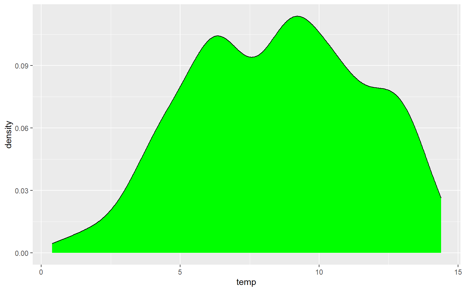
In the next graph I have changed ..density.. to ..count.. to alter the y-axis mapping. I also changed the fill to red, the color to gray, and the size to 3. color for a kernel density plot defines the color of the outline while size defines the thickness of the outline.
ggplot(hp_data, aes(x=temp, ..count..))+
geom_density(fill="red", color="gray", size=3)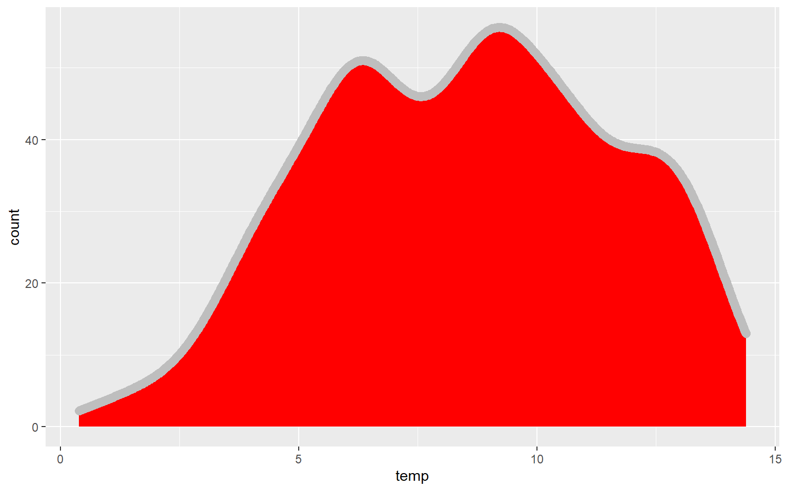
In this example, I have set fill to NA so that there is no fill color applied.
ggplot(hp_data, aes(x=temp, ..count..))+
geom_density(fill=NA, color="red", size=1.5)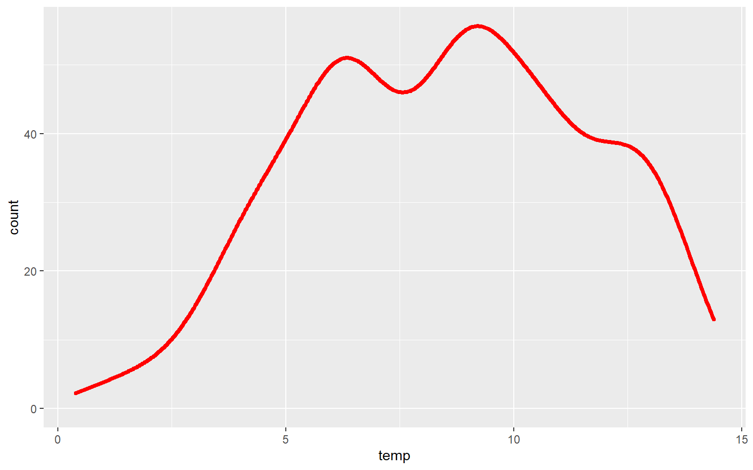
Similar to the binwidth argument for a histogram, the adjust argument can be used to indicate the generalization of the kernel density function. Smaller values will result in a more detailed distribution that shows more local patterns, as demonstrated in the next graph. In the following graph a larger value is used, which results in a very generalized pattern. Similar to histogram binning, there isn’t necessarily a correct value, as this depends on the purpose of the graph and the patterns being explored.
ggplot(hp_data, aes(x=temp, ..density..))+
geom_density(fill="Green", adjust=.25)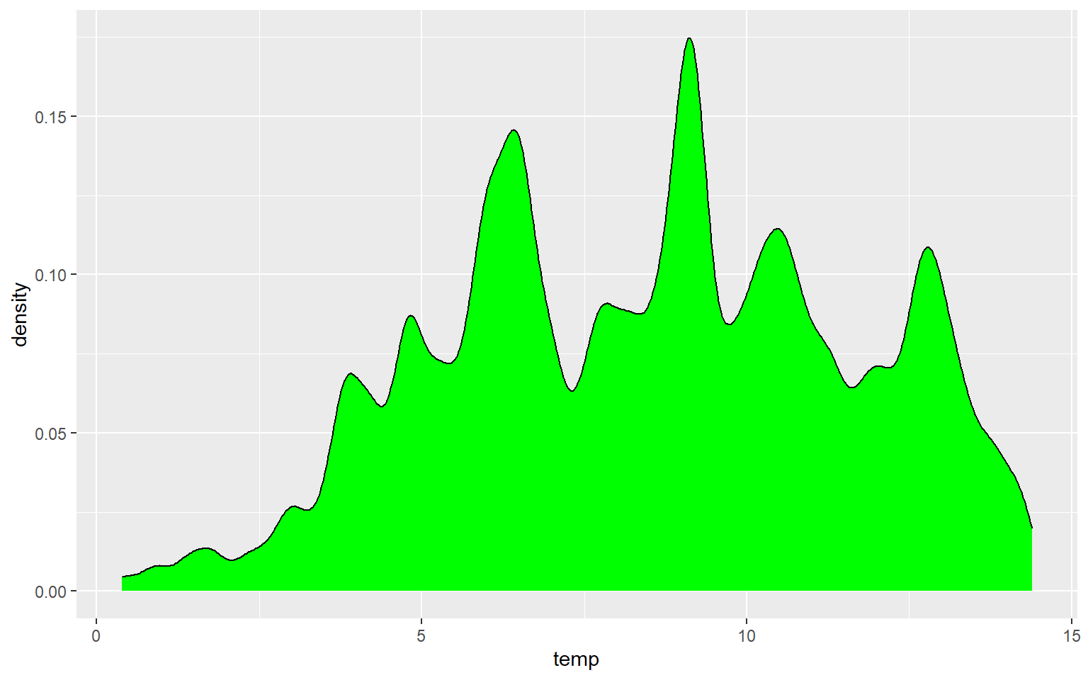
ggplot(hp_data, aes(x=temp, ..density..))+
geom_density(fill="Green", adjust=5)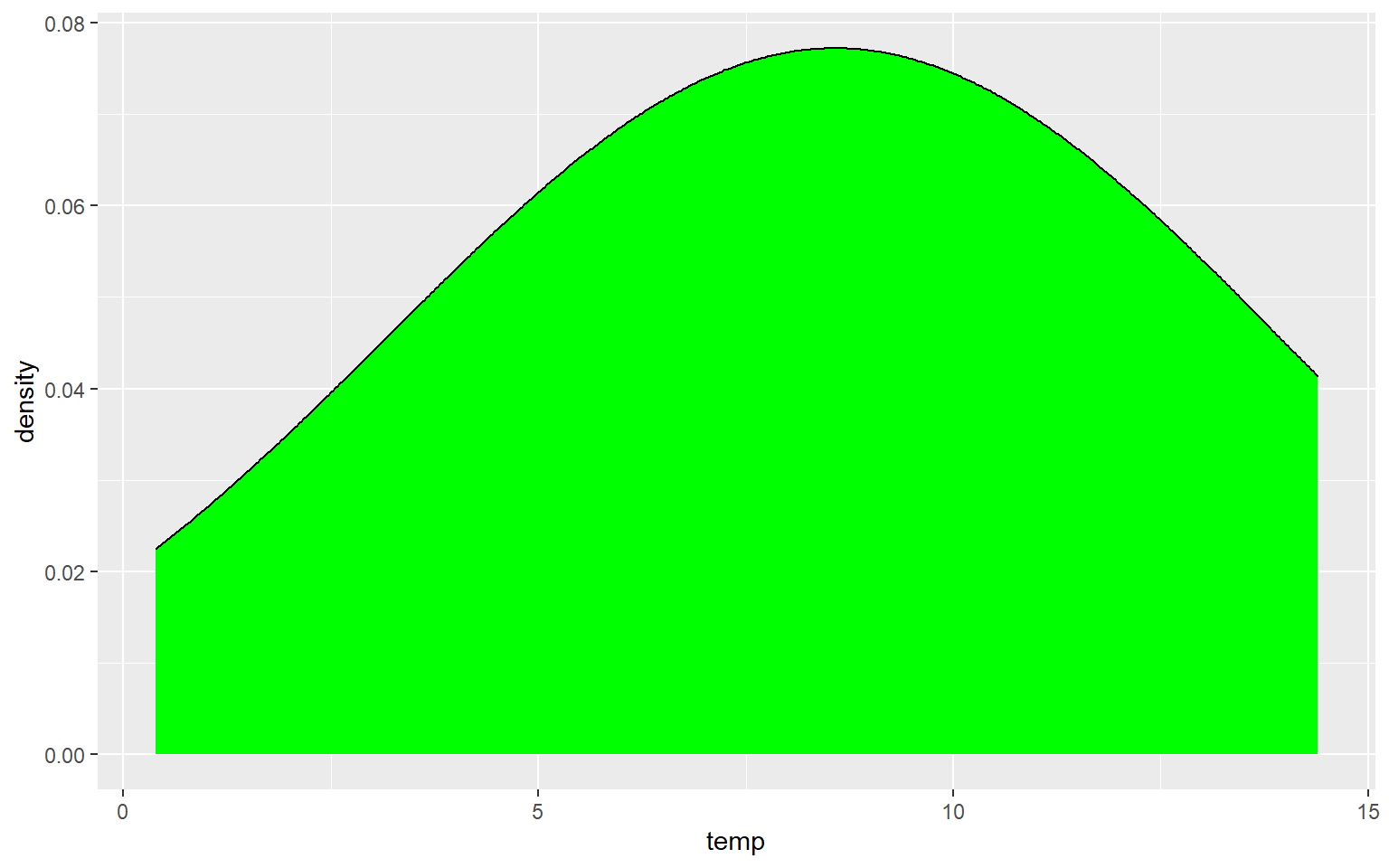
Box Plots
Data distribution can also be summarized using box plots. A box plot shows the minimum, 1st quartile, median, 3rd quartile, maximum, and interquartile range (IQR), as shown in the image below. Note that the mean is not generally included.

Boxplot explanation
I am using geom_boxplot() to show the distribution of mean elevation by county. Note that any small values that are more than 1.5 IQR from the 1st quartile and any high values that are more than 1.5 IQR from the 3rd quartile are plotted as points. If you would like to not show these points, then you can set the outlier.shape parameter equal to NA, as demonstrated in the second example. However, this may be a misrepresentation of your data as it implies that these more extreme values don’t exist. If you do choose to not plot the outliers, I would recommend at least noting that this was done so that viewers are aware.
ggplot(hp_data, aes(y=elev))+
geom_boxplot()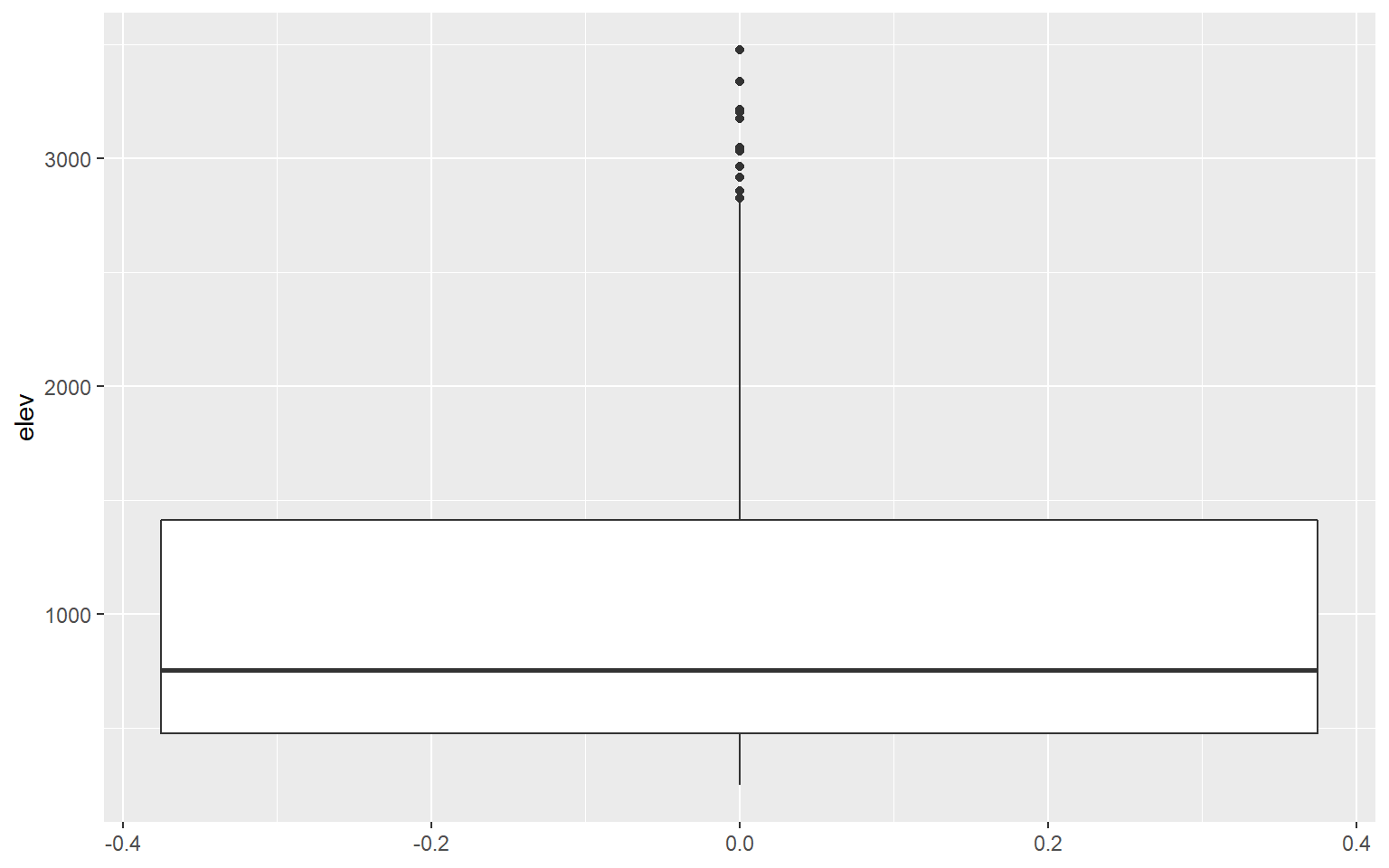
ggplot(hp_data, aes(y=elev))+
geom_boxplot(outlier.shape=NA)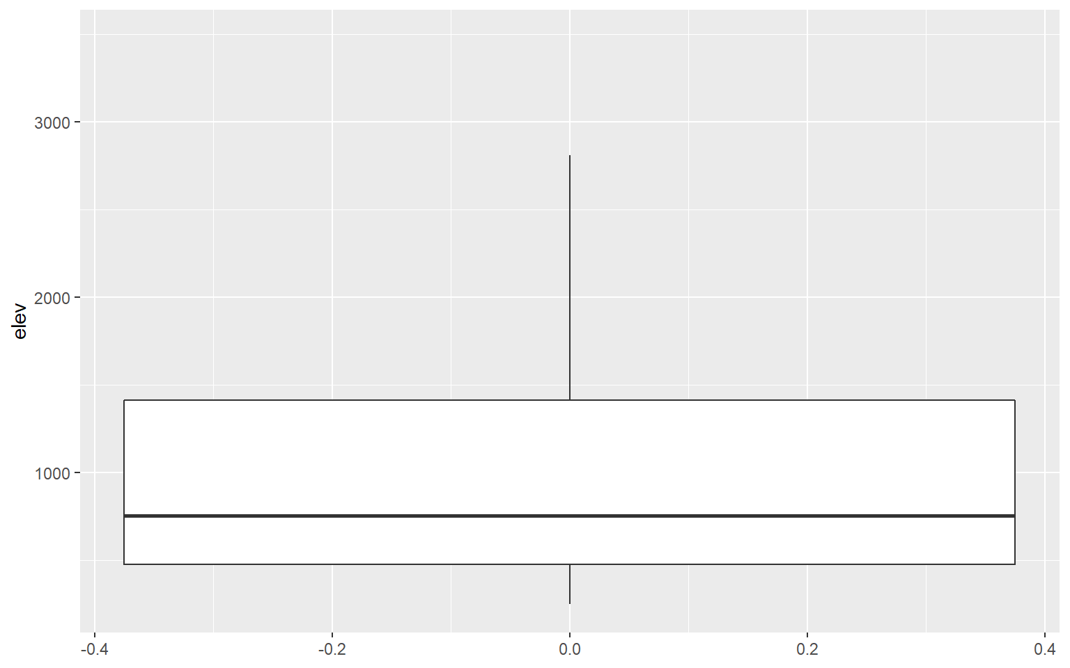
Comparing Categories
It is common to compare the distribution of a continuous variable for different categories in the same graph space. In the following example, I first subset out the counties for three states using the filter() function from dplyr. I then generate a kernel density plot in which temperature is mapped to the x-axis, density to the y-axis, and the state name to the fill color. The result is three separate density curves. In order to better visualize the distributions in overlapping areas, I have also applied a 50% transparency using the alpha argument. ggplot2 automatically generates a legend to explain the different colors. We will talk more about legends and legend design in the next section.
library(dplyr)
hp_UT_ND_KS <- hp_data %>% dplyr::filter(STATE_NAME == "North Dakota" | STATE_NAME == "Utah" | STATE_NAME == "Kansas")
ggplot(hp_UT_ND_KS, aes(x=temp, ..density.., fill=STATE_NAME))+
geom_density(alpha=0.5)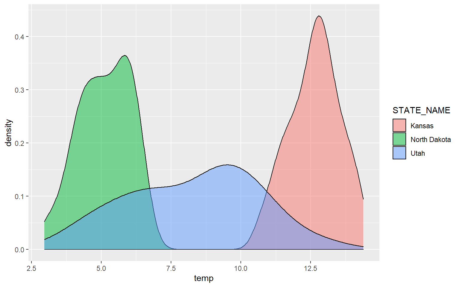
The next example provides the same comparison but for precipitation.
ggplot(hp_UT_ND_KS, aes(x=precip2, ..density.., fill=STATE_NAME))+
geom_density(alpha=0.5)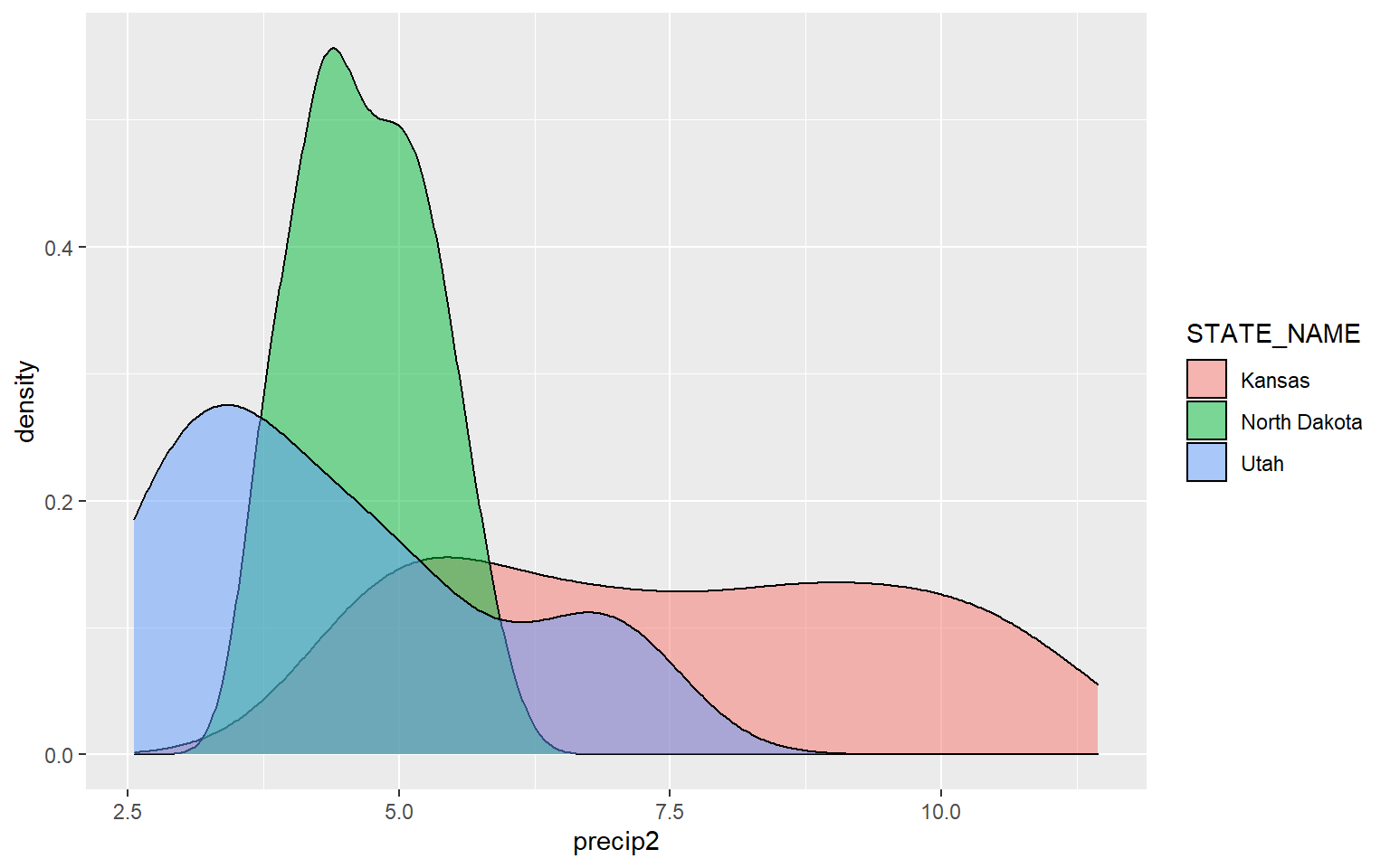
Similar comparisons could be made using box plots. In this example, I am comparing the mean elevation by county for all states in the data set. Note that I did not provide a mapping to the x-axis in the prior box plot examples. Now, I am mapping a categorical variable to this axis.
ggplot(hp_data, aes(x=STATE_NAME, y=elev))+
geom_boxplot()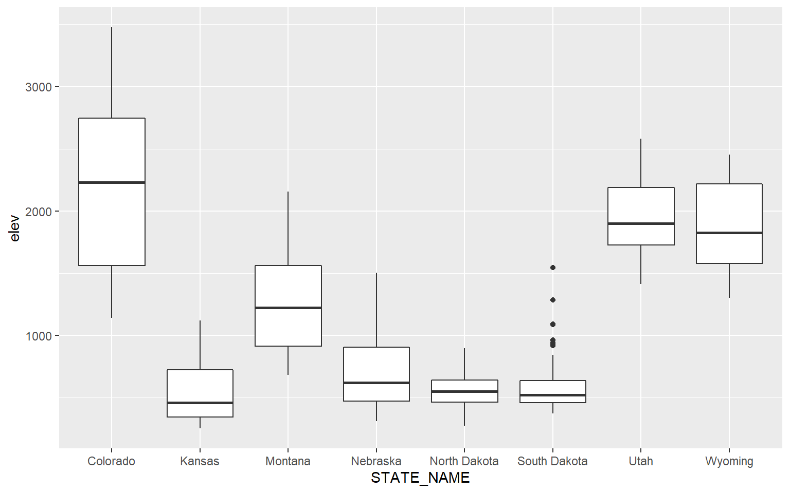
You can map the same variable to more than one graphical parameter. In this example, I am mapping the state name to the x-axis and to the fill color. A legend is automatically generated.
ggplot(hp_data, aes(x=STATE_NAME, y=elev, fill=STATE_NAME))+
geom_boxplot()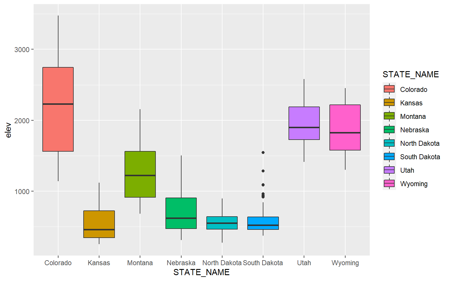
This is a similar example, but for precipitation as opposed to elevation.
ggplot(hp_data, aes(x=STATE_NAME, y= precip2, fill=STATE_NAME))+
geom_boxplot()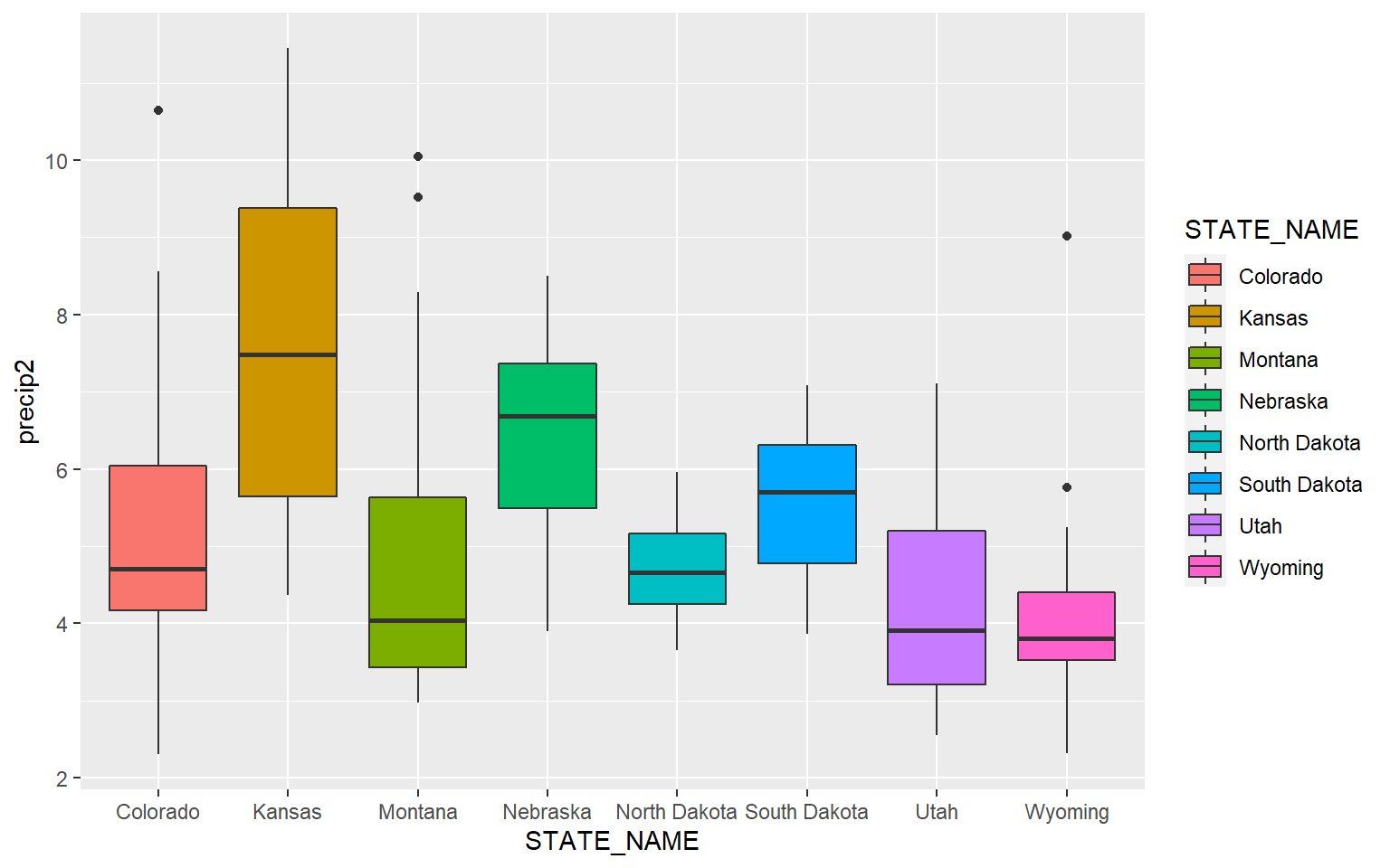
Similar to kernel density plots, the fill argument relates to the fill color while the color argument applies to the outline color. This is demonstrated in the code block below by changing the fill argument to color.
ggplot(hp_data, aes(x=STATE_NAME, y= precip2, color=STATE_NAME))+
geom_boxplot()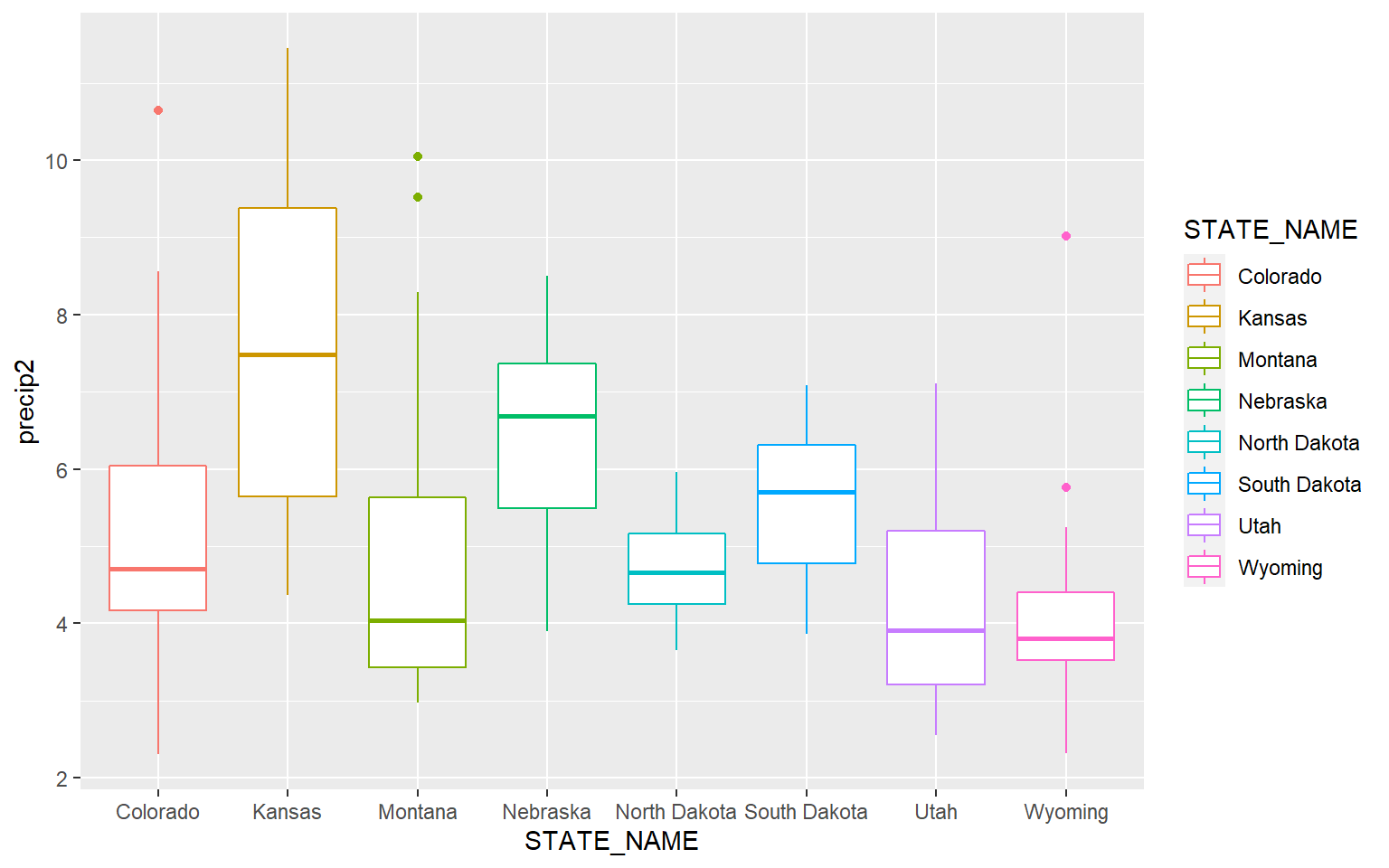
It is possible to define a desired order for categorical variables. In this example, I have reordered the states based on the median mean county elevation. This was accomplished using fct_reorder() from the forcats package.
library(forcats)ggplot(hp_data, aes(x=fct_reorder(STATE_NAME, elev, .fun= median, .desc=TRUE), y=elev, fill=STATE_NAME))+
geom_boxplot()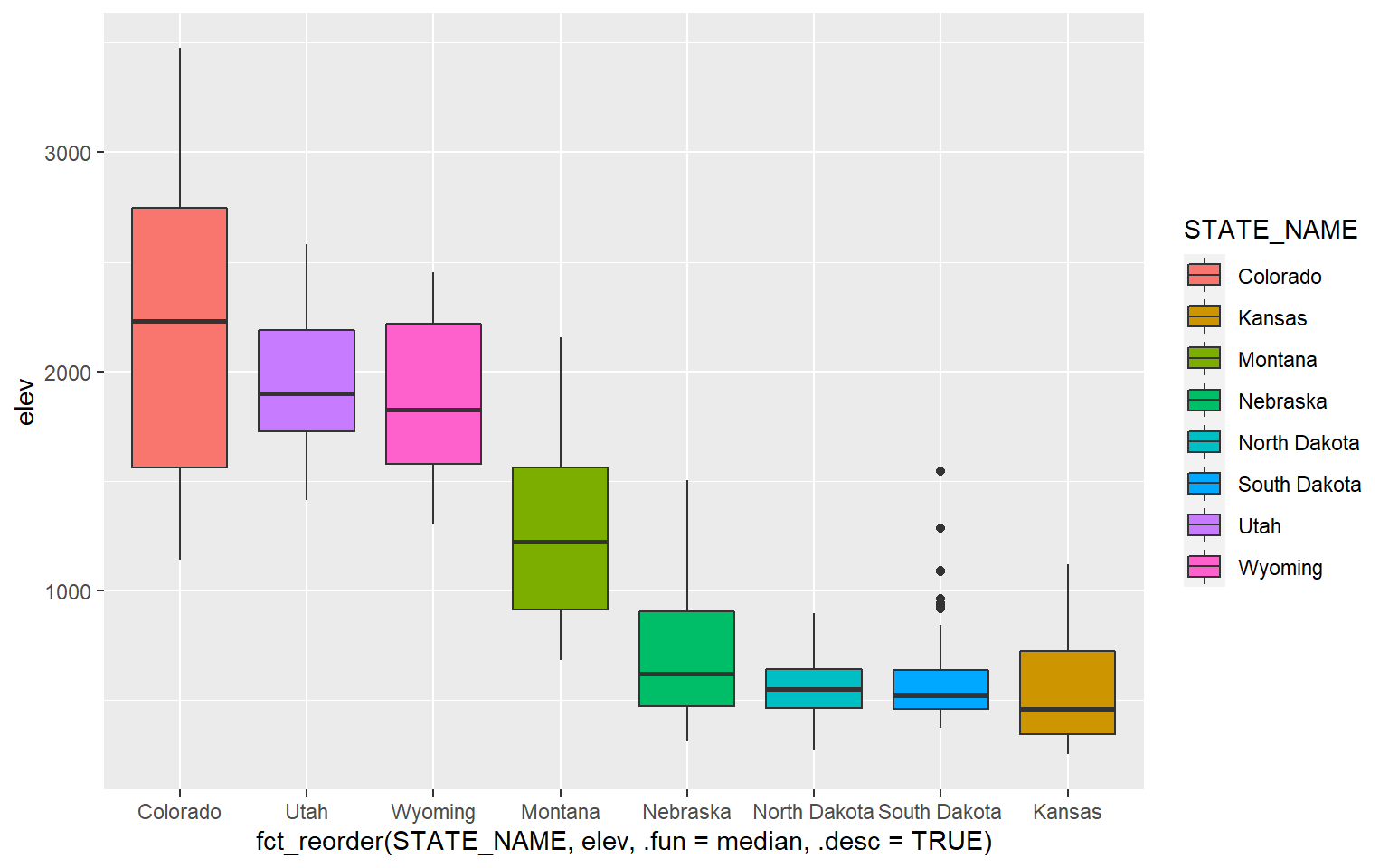
An alternative to a box plot is a violin plot, which is basically a mirrored kernel density surface turned on its side.
ggplot(hp_data, aes(x=STATE_NAME, y= precip2, fill=STATE_NAME))+
geom_violin()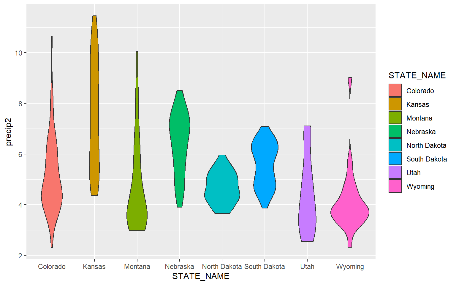
Since box plots and violin plots can share the same axes assignments, they can be plotted in the same space. Here, I am specifying two geoms. The last geom provided will plot above prior geoms.
ggplot(hp_data, aes(x=STATE_NAME, y= precip2, fill=STATE_NAME))+
geom_violin()+
geom_boxplot()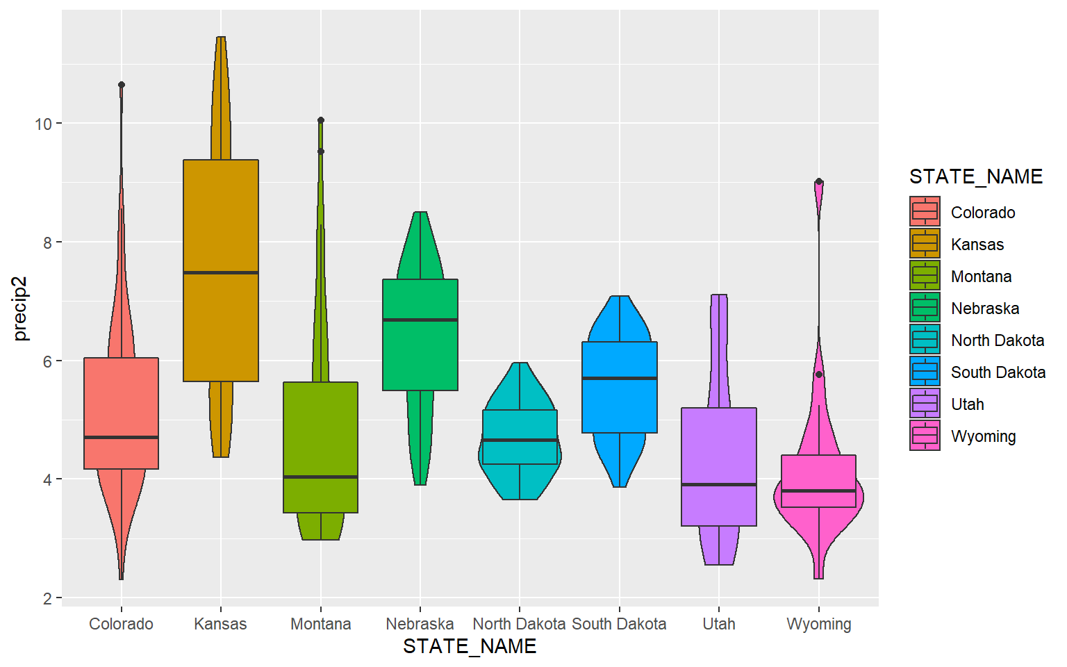
In order to make the box plots fit inside of the violin plots, I decrease the width to 0.1. I also make the box plots gray so that they stand out against the violin plots.
ggplot(hp_data, aes(x=STATE_NAME, y= precip2, fill=STATE_NAME))+
geom_violin()+
geom_boxplot(width=0.1, fill="gray")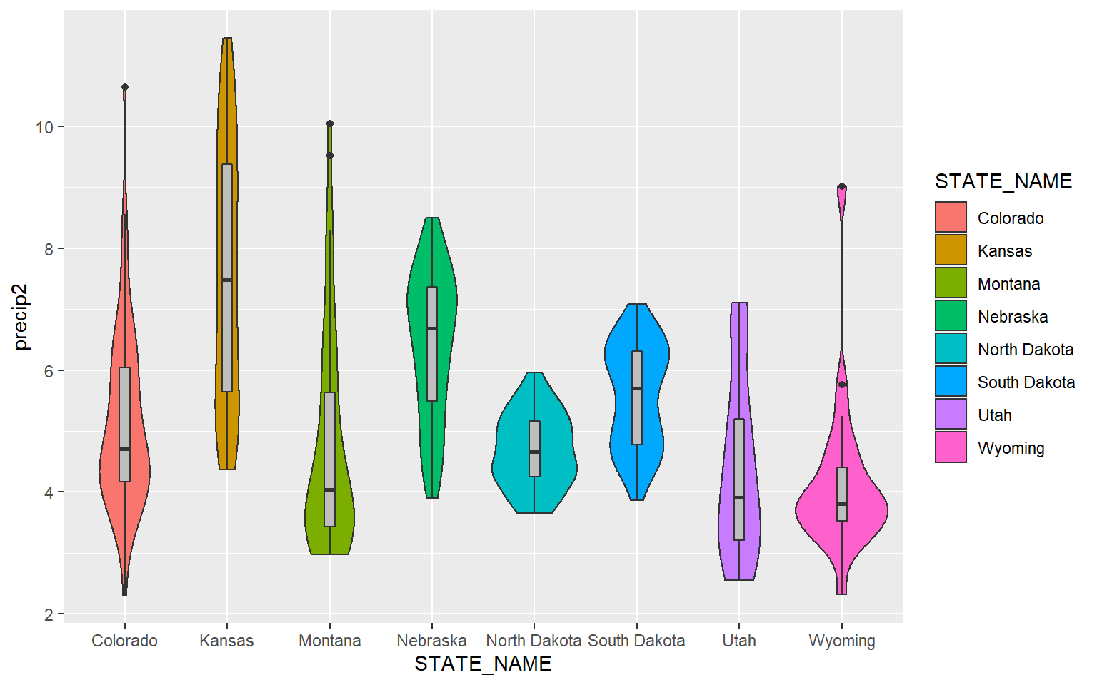
This example is similar to the prior. However, I have made the violin plots gray and the box plot colors different for each state. Note that mappings set in the geom arguments will supersede those set in ggplot().
ggplot(hp_data, aes(x=STATE_NAME, y= precip2, fill=STATE_NAME))+
geom_violin(fill="gray")+
geom_boxplot(width=0.1)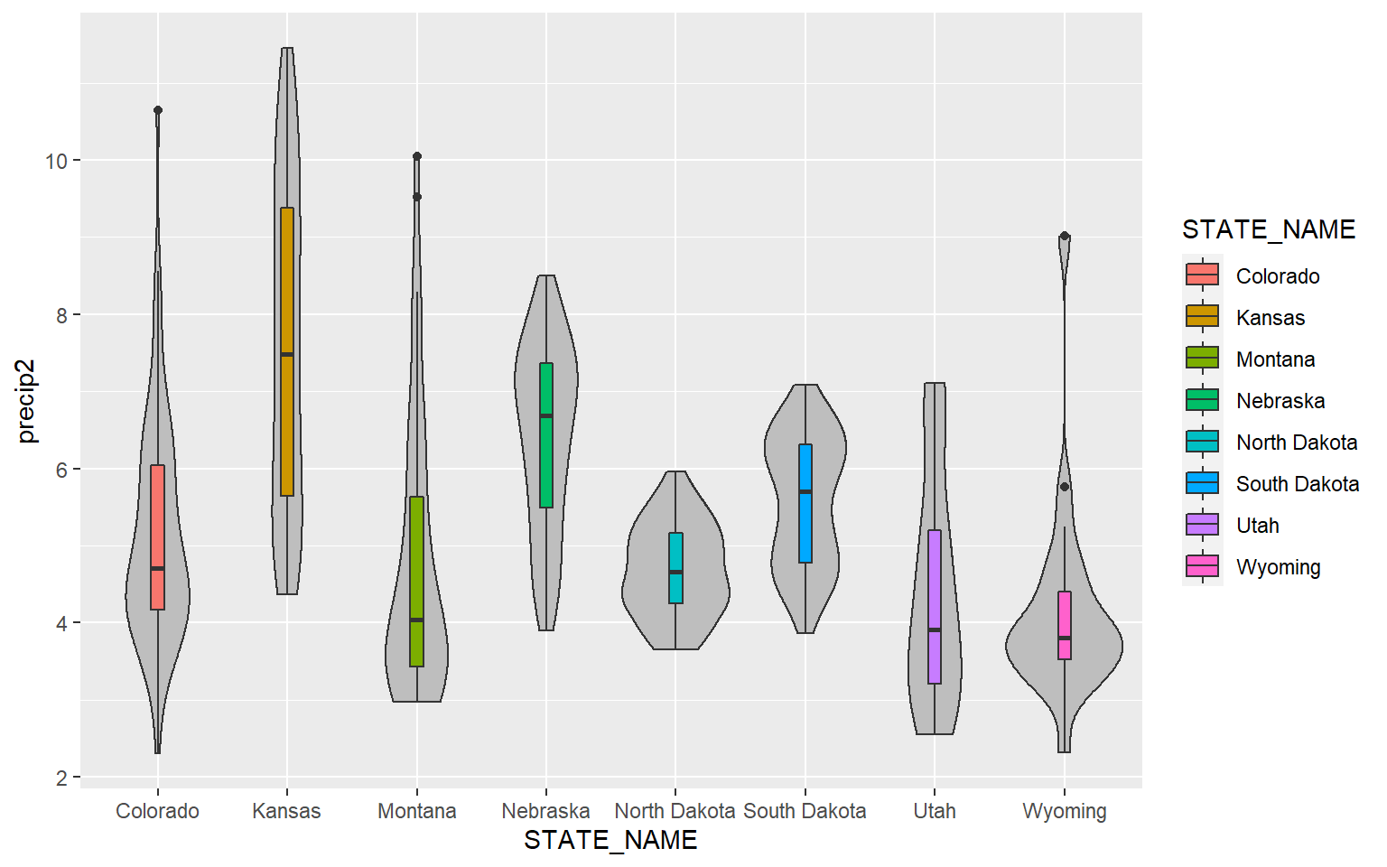
Lastly, here is an example with just three states.
library(dplyr)hp_UT_ND_KS <- hp_data %>% dplyr::filter(STATE_NAME == "North Dakota" | STATE_NAME == "Utah" | STATE_NAME == "Kansas")
ggplot(hp_UT_ND_KS, aes(x=STATE_NAME, y=temp, fill=STATE_NAME))+
geom_violin()+
geom_boxplot(width=.15, fill="gray")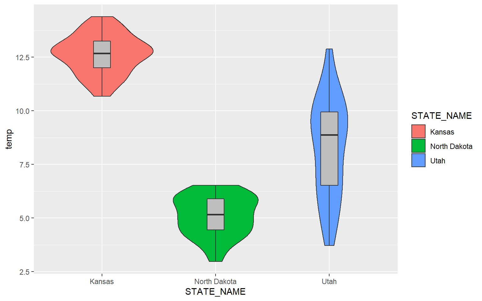
Additional Univariate Graphs
There are some alternatives for comparing a continuous variable between categories graphically. In this example geom_point() is being used to map the mean elevation for six randomly chosen counties.
hp_sub <- hp_data %>% sample_n(6, replace=FALSE)
ggplot(hp_sub)+
geom_point(aes(x=NAME_1, y=elev), size=2)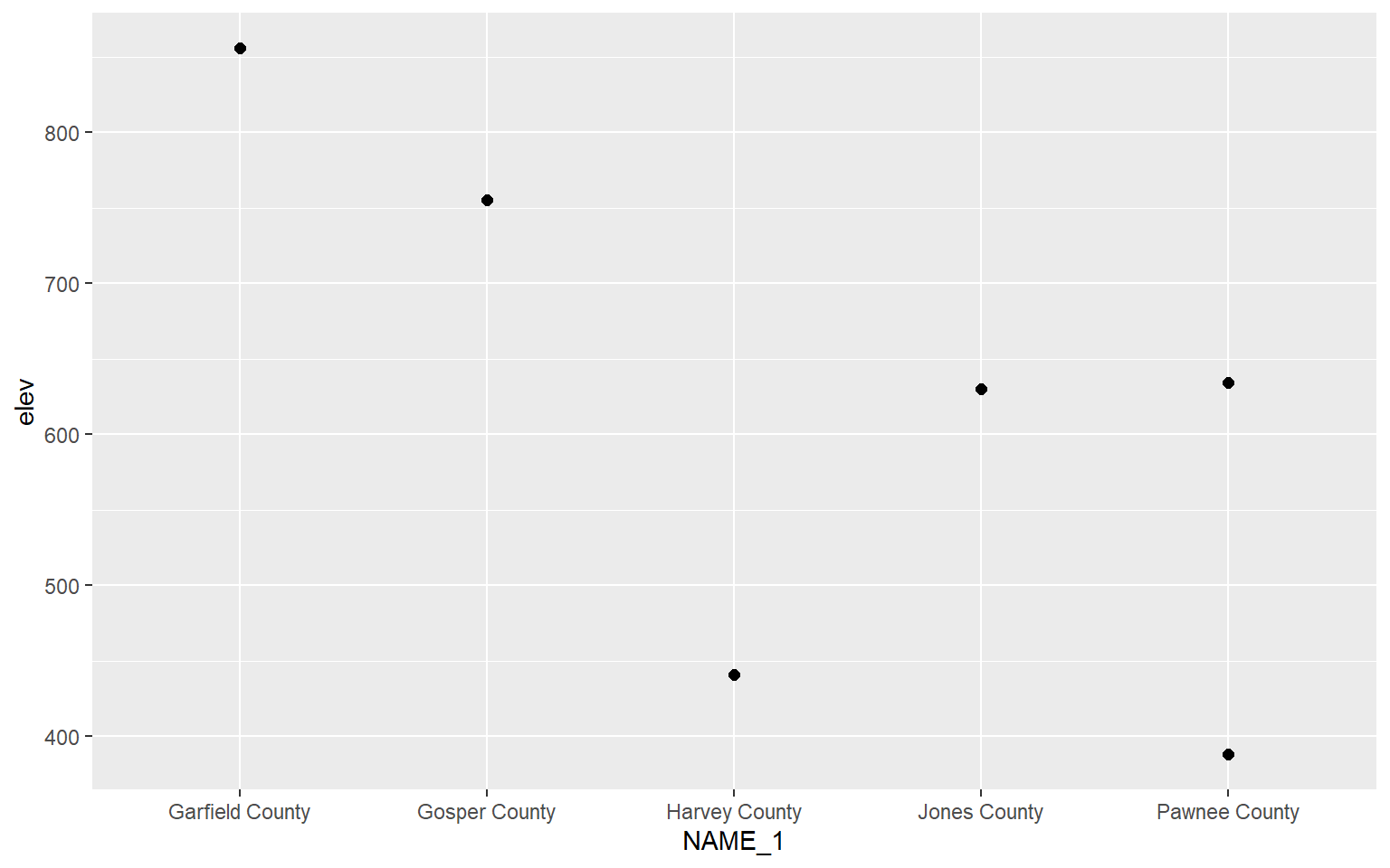
Bar graphs can be created using geom_bar(). stat=“identity” indicates that the height of the bar should represent the magnitude of the variable mapped to the y-axis.
hp_sub <- hp_data %>% sample_n(6, replace=FALSE)
ggplot(hp_sub, aes(x=NAME_1, y=elev), size=2)+
geom_bar(stat="identity")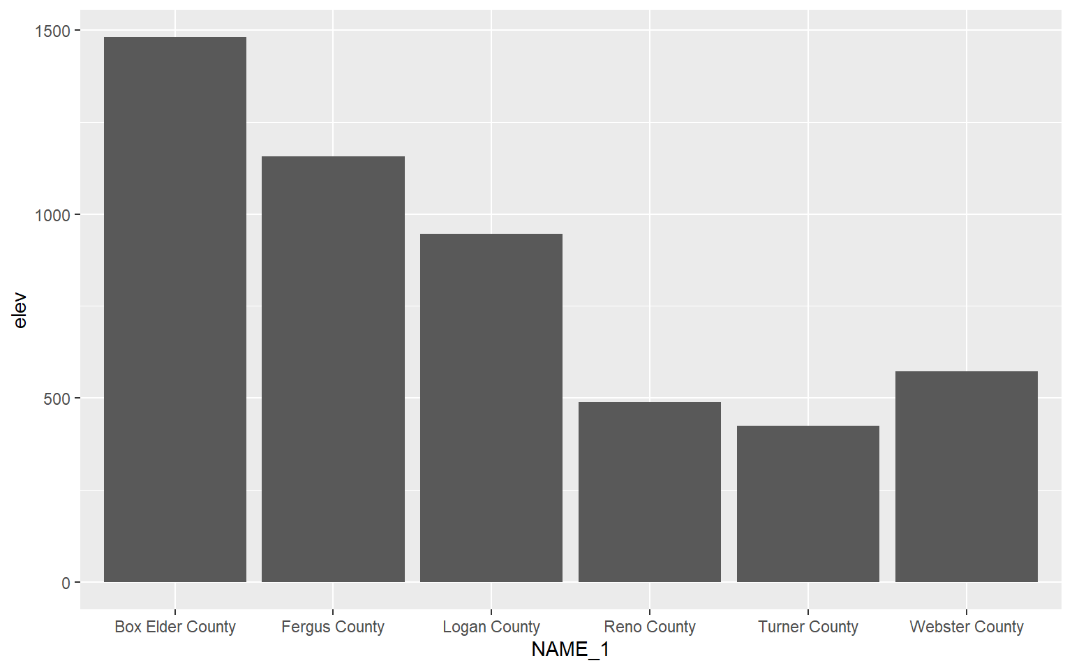
Multivariate Graphs
Multivariate graphs involve visualizing the relationship between two or more variables, and they include scatter plots and line graphs. We will now explore these graph types.
Scatter Plots
Scatter plots in ggplot2 are created using geom_point(), and continuous variables should be mapped to both the x-axis and y-axis. In this first example, I map elevation to the x-axis and temperature to the y-axis. You can see evidence of a inverse or indirect relationship between temperature and elevation: higher elevation tends to result in lower temperature.
ggplot(hp_data, aes(x=elev, y=temp))+
geom_point()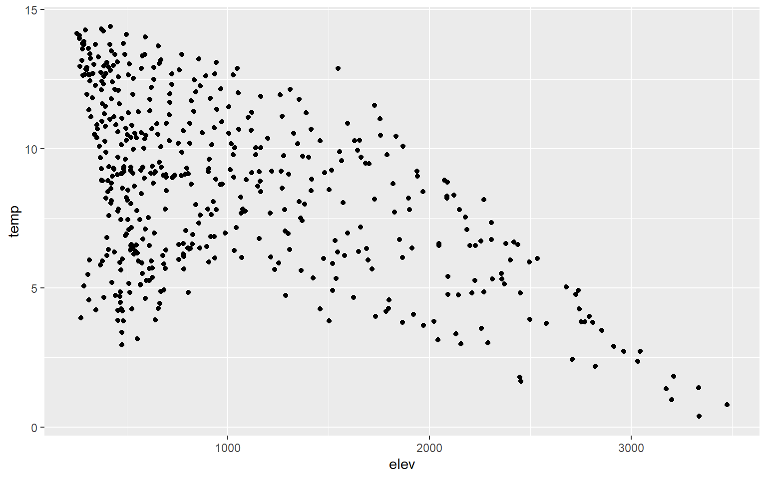
You can change the point symbol used by specifying a shape argument. You can also change the size of the point symbol. Some point symbols will have both a fill and color aesthetic while others will only have a single color that can be defined. Quick-R provides a summary of available point symbols. In this example, I pick a new symbol, increase the size, and define outline and fill colors.
hp_data_ord <- hp_data[hp_data$per_for,]
ggplot(hp_data, aes(x=elev, y=temp))+
geom_point(shape=23, color="blue", fill="red", size=2)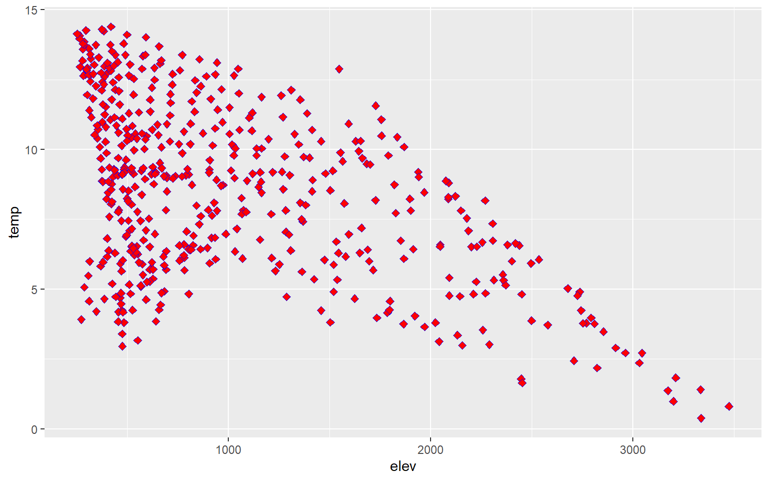
You can also add trend lines to scatter plots using geom_smooth(). Here, I have added a linear trend (method=lm).
hp_data_ord <- hp_data[hp_data$per_for,]
ggplot(hp_data, aes(x=elev, y=temp))+
geom_point()+
geom_smooth(method=lm)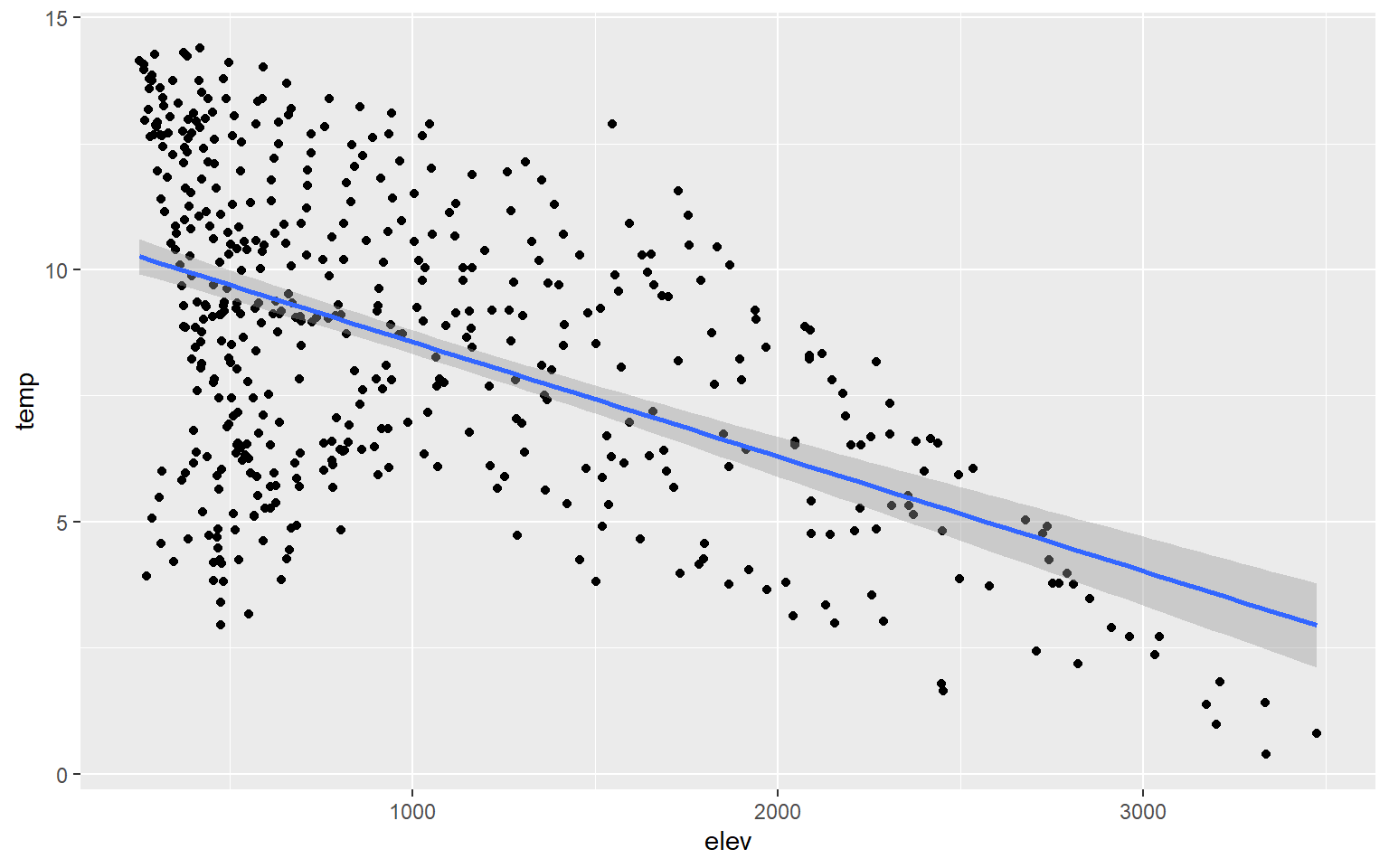
You can change the line symbol using the lty argument and the width using lwd. A list of line styles are also summarized on Quick-R.
hp_data_ord <- hp_data[hp_data$per_for,]
ggplot(hp_data, aes(x=elev, y=temp))+
geom_point()+
geom_smooth(method=lm, lty=2, lwd=3)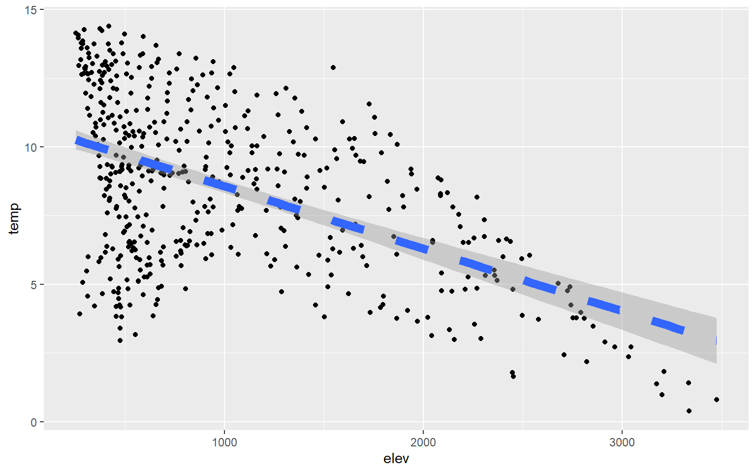
You may have noticed that a gray outline is placed around the trend. This is a 95% confidence interval and is added by default. To not show this, simply add se=FALSE.
hp_data_ord <- hp_data[hp_data$per_for,]
ggplot(hp_data, aes(x=elev, y=temp))+
geom_point()+
geom_smooth(method=lm, se=FALSE)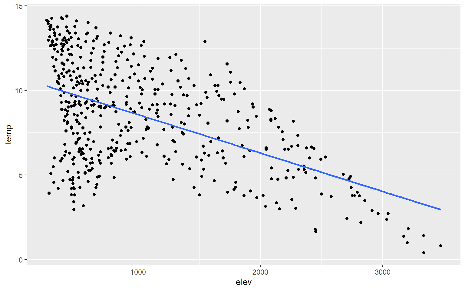
Instead of plotting a linear trend, you can also use a loess function (method=loess). This is basically a local-window or moving average and would be more appropriate when a linear relationship does not exist between the two variables being graphed.
hp_data_ord <- hp_data[hp_data$per_for,]
ggplot(hp_data, aes(x=elev, y=temp))+
geom_point()+
geom_smooth(method=loess)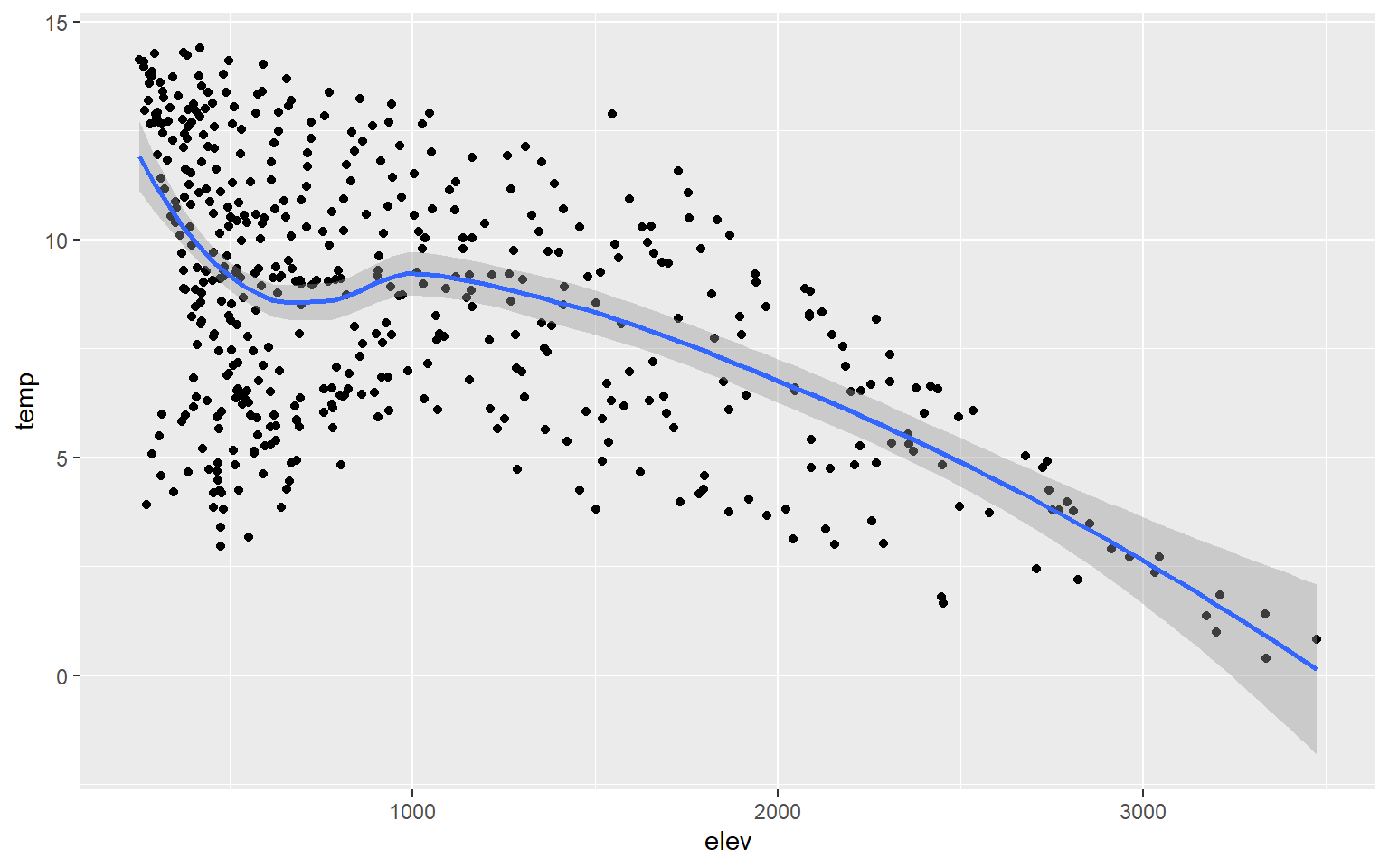
If you would like to show more than two variables on a scatter plot, then you can use additional aesthetic mappings and graphical parameters. In this example, I have mapped percent forest cover (a continuous variable) to the point size and the state to the point color (a categorical variable). I would argue that this is not necessarily effective; it is simply an example of how you can apply or use additional aesthetic mappings.
ggplot(hp_data, aes(x=elev, y=temp, size=per_for, color=STATE_NAME))+
geom_point()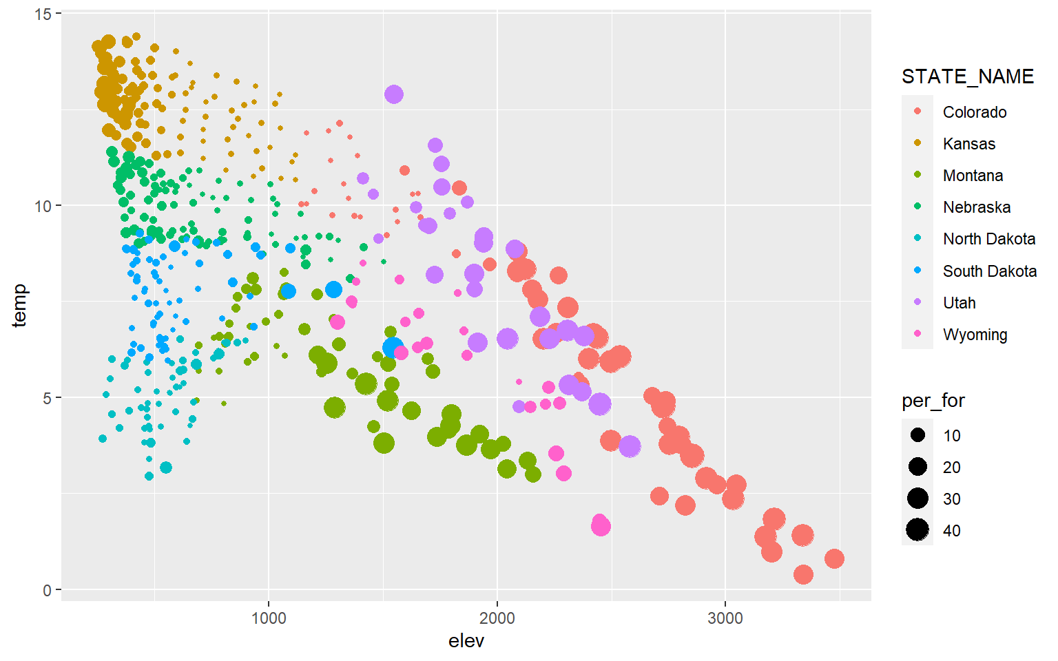
You can also label data points by adding geom_text() and providing a text variable or text constant using label.
library(dplyr)hp_sub <- hp_data %>% sample_n(10, replace=FALSE)
ggplot(hp_sub, aes(x=elev, y=temp))+
geom_point()+
geom_text(aes(label=NAME_1))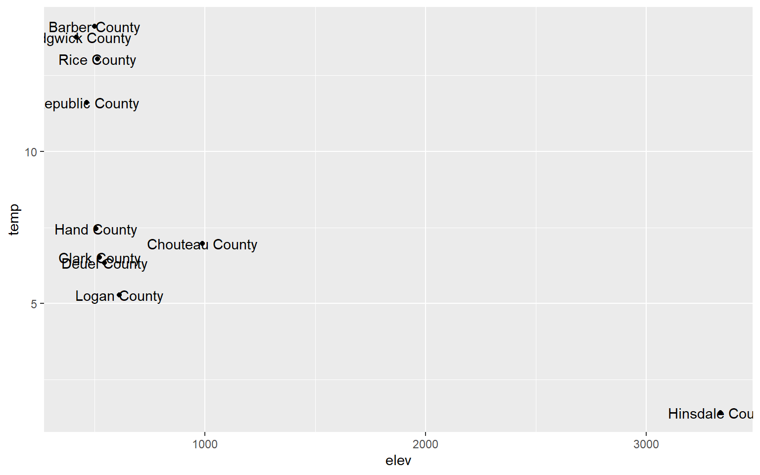
Line Graphs
Line graphs connect adjacent data points with a line as opposed to representing each data value as a separate point. They are often used to represent trends, such as trends over time in a time series graph. Since the x-axis and y-axis can be the same for scatter plots and line graphs, they can be combined to one plot using multiple geoms.
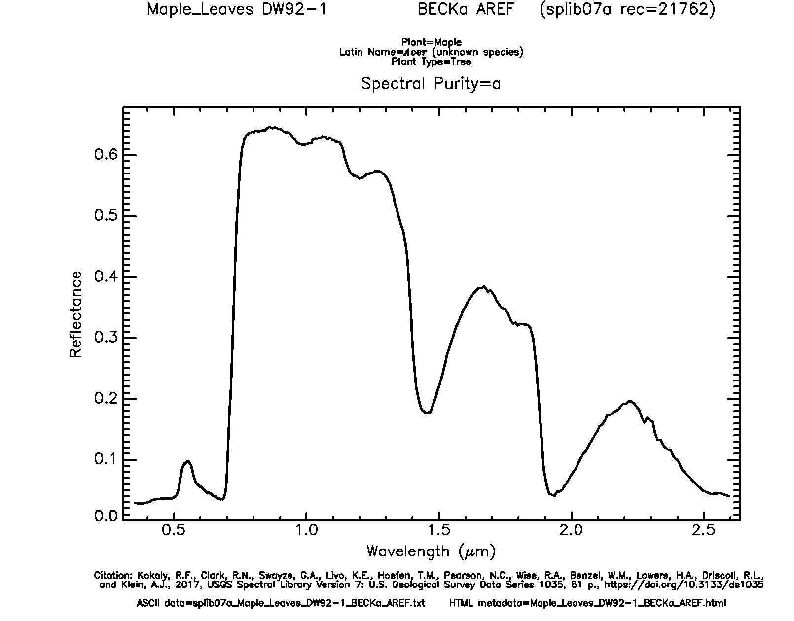
We will now read in a new data set: maple_leaf.csv. This is spectral reflectance data for a maple leaf from the United States Geologic Survey (USGS) Spectral Library. The original data can be found here.
leaf <- read.csv("D:/ossa/ggplot2_p1/maple_leaf.csv", header=TRUE, sep=",")Line graphs are created using geom_line(). In this example, I am plotting wavelength (in micrometers) to the x-axis and spectral reflectance (as a proportion) to the y-axis. This generates a spectral reflectance curve where peaks represent reflectance and troughs represent absorption. This should be familiar if you have studied remote sensing.
ggplot(leaf, aes(x=wav, y=reflec))+
geom_line()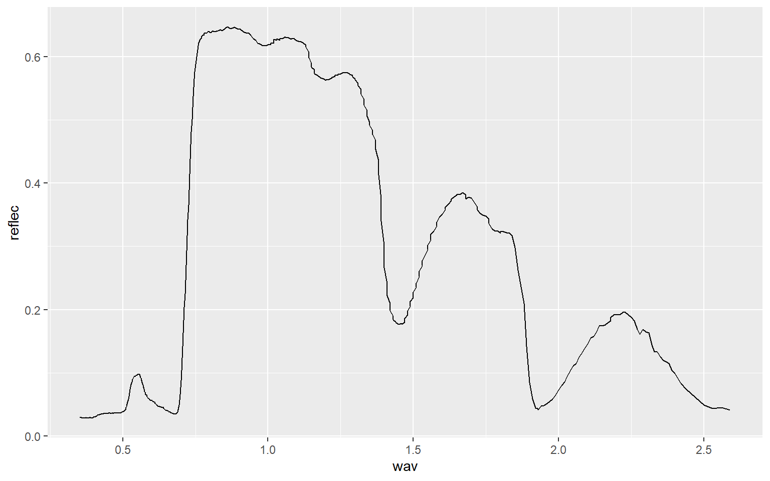
As another example, we will now read in data from the AVIRIS hyperspectral sensor showing spectral reflectance at four different locations or pixels. Using the str() function, you can see that the center wavelength of each band has been provided (in nanometers (nm)) and that data for each location is in separate columns (A through D). Spectral reflectance values have been multiplied by 100 to store them using an integer as opposed to a double data type.
aviris <- read.csv("D:/ossa/ggplot2_p1/aviris_spectral_data.csv", header=TRUE, sep=",")
str(aviris)
'data.frame':   207 obs. of  5 variables:
 $ Center: num  366 376 385 395 405 ...
 $ A     : int  2299 2404 2576 2679 2719 2932 3048 3070 3104 3103 ...
 $ B     : int  2983 2795 2793 2958 3016 3289 3444 3491 3540 3570 ...
 $ C     : int  1381 1787 1896 1957 2005 2174 2267 2253 2237 2209 ...
 $ D     : int  1865 1954 2051 2150 2200 2341 2454 2483 2463 2457 ...
In this first example, I plot spectral reflectance at Site A. Wavelength was assigned to the x-axis and spectral reflectance to the y-axis. Within the aes() function I divide the values in “A” by 100 to return spectral reflectance as a percent.
ggplot(aviris, aes(x=Center, y=A/100))+
geom_line()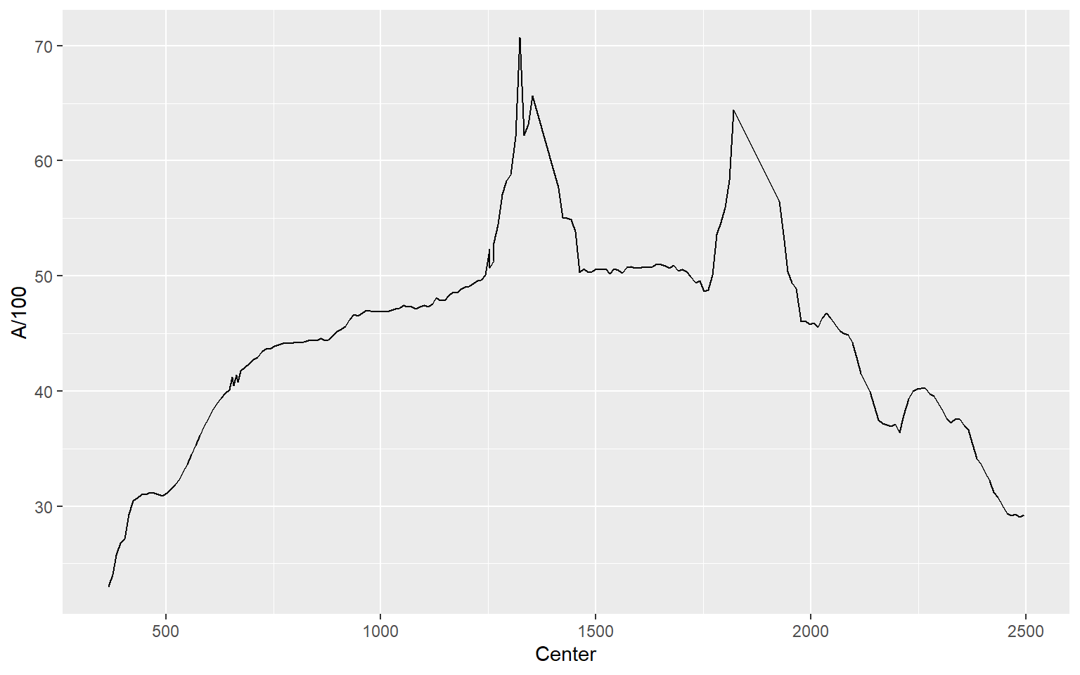
In this example, I plot all four locations as separate lines using different colors. You might be wondering why I simply didn’t assign the sample location as a categorical variable to the color aesthetic. This is because each location is stored as a separate column as opposed to storing the sample as a categorical variable in a single column. So, these data are in a different “shape” then the examples above and must to be treated differently. Note again that you can add multiple geoms to the same plot.
ggplot(aviris, aes(x=Center, y=A/100, color="red"))+
geom_line()+
geom_line(aes(color="yellow", y=B/100))+
geom_line(aes(color="blue", y=C/100))+
geom_line(aes(color="green", y=D/100))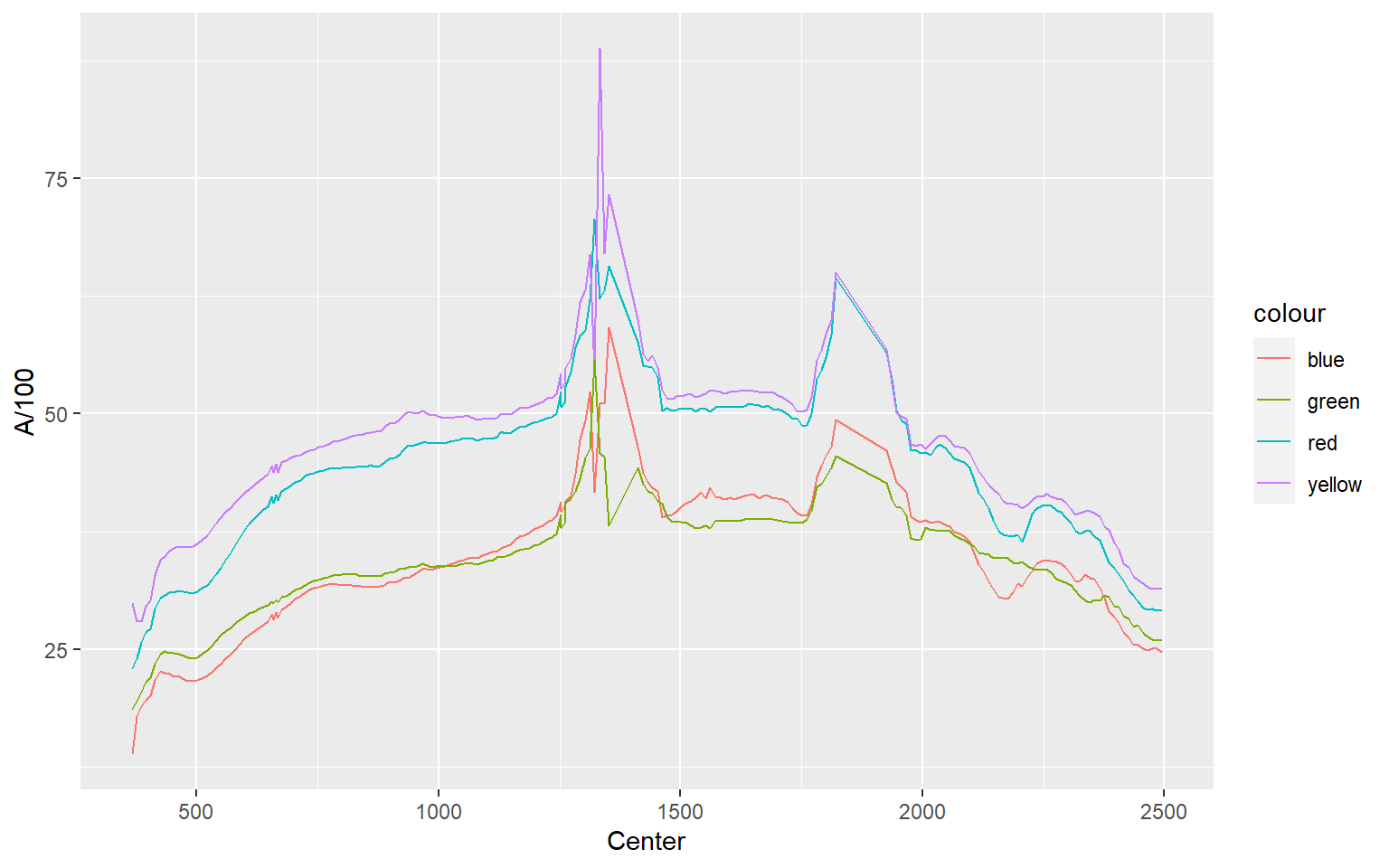
Overplotting
We will now discuss means to deal with overplotting. Overplotting occurs when you have a large number of data points that cannot be easily distinguished in the graph space due to crowding and overlap.
Hexagonal Binning
As an example, the graph below contains 15,000 points, which were generated using the rnorm() function. There are too many data points in the plot space to see a clear pattern.
d1 <- rnorm(15000, mean=0, sd=1)
d2 <- rnorm(15000, mean=0, sd=1)
d3 <- data.frame(d1, d2)
ggplot(d3, aes(x=d1, y=d2))+
geom_point()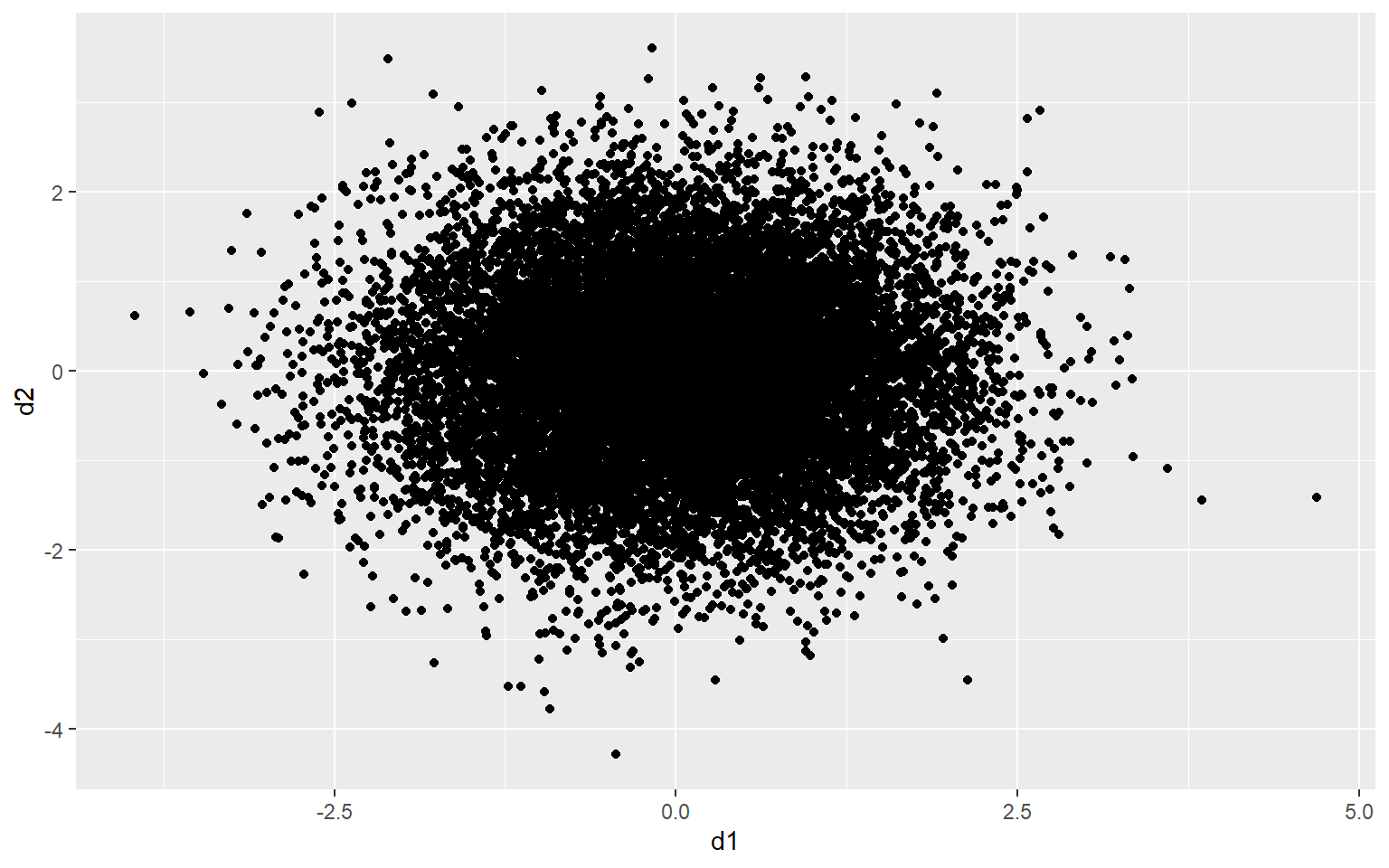
One method to deal with this issue is to use hexagonal binning where the two-dimensional graph space is divided into hexagons of equal size and the number of data points in each hexagon are counted. You can change the size argument to obtain larger or smaller hexagons. Creating hexagonal bins with ggplot2 requires the hexbin package, so this package may need to be installed to execute the example.
ggplot(d3, aes(x=d1, y=d2))+
geom_hex(size=10)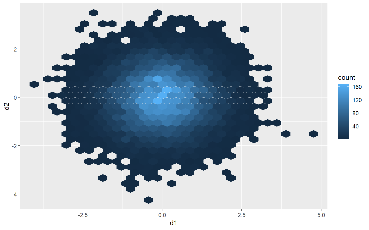
Rectangular Binning
As opposed to using hexagonal bins, you can obtain rectangular or square bins with geom_bin2d(). Here, each bin measures 1 by 1 units.
ggplot(d3, aes(x=d1, y=d2))+
geom_bin2d(binwidth=c(1,1))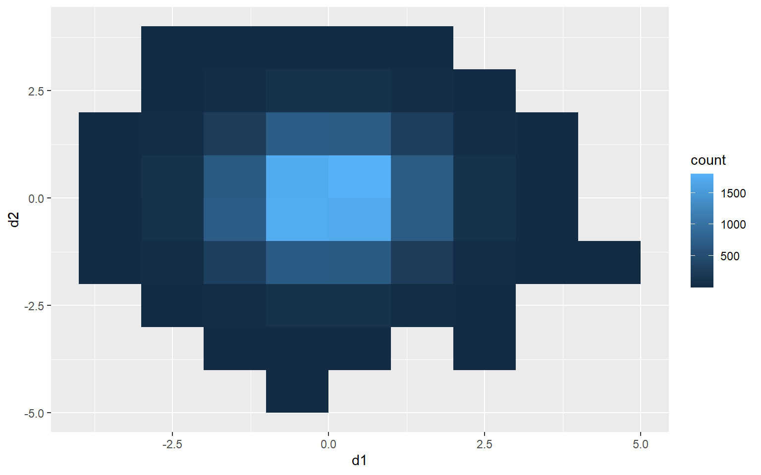
2D Kernel Density
Another option is using a two-dimensional kernel-density surface. This is the same as a raster-based kernel density surface that is used to estimate the density of point features over a map space. I am using stat_density2d() to generate the kernel density estimate. I am then plotting contours using geom_density2d().
ggplot(d3, aes(x=d1, y=d2))+
stat_density2d(aes(fill=..level..), alpha=.5, size=2, bins=10, geom="polygon")+
geom_density2d(color="black")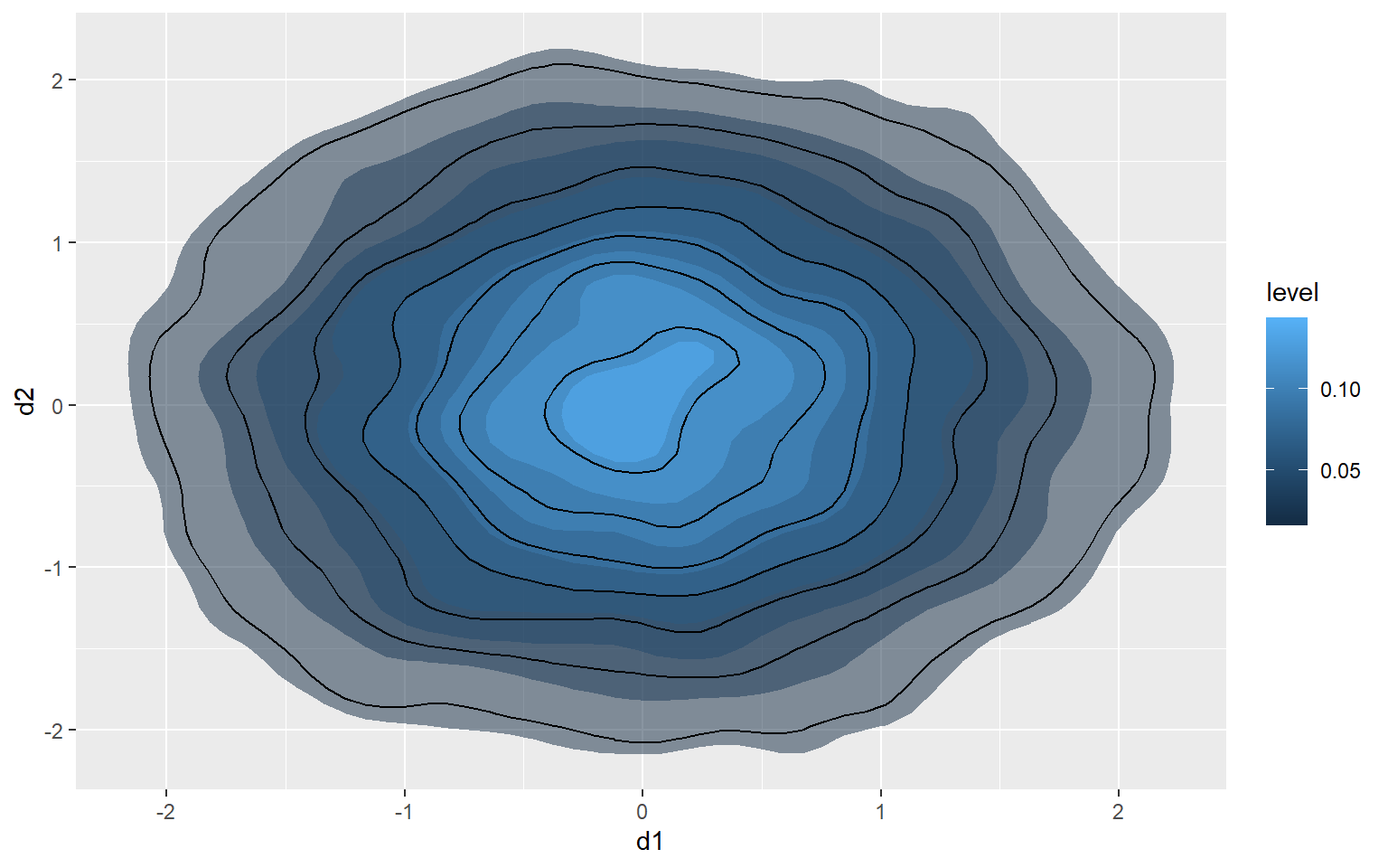
Jitter
You can also add random noise to data points to provide more separation. This can be accomplished using geom_jitter(). In the first graph, the points are being plotted at the exact specified coordinates. In the second graph, random noise has been added in the x and y directions.
a1 <- rep(c(1, 2, 3, 4, 5), 5)
l1 <- rep(c(1), 5)
l2 <- rep(c(2), 5)
l3 <- rep(c(3), 5)
l4 <- rep(c(4), 5)
l5 <- rep(c(5), 5)
a2 <- c(l1, l2, l3, l4, l5)
a3 <- data.frame(a1, a2)
ggplot(a3, aes(x=a2, y=a1))+
geom_point(size=3)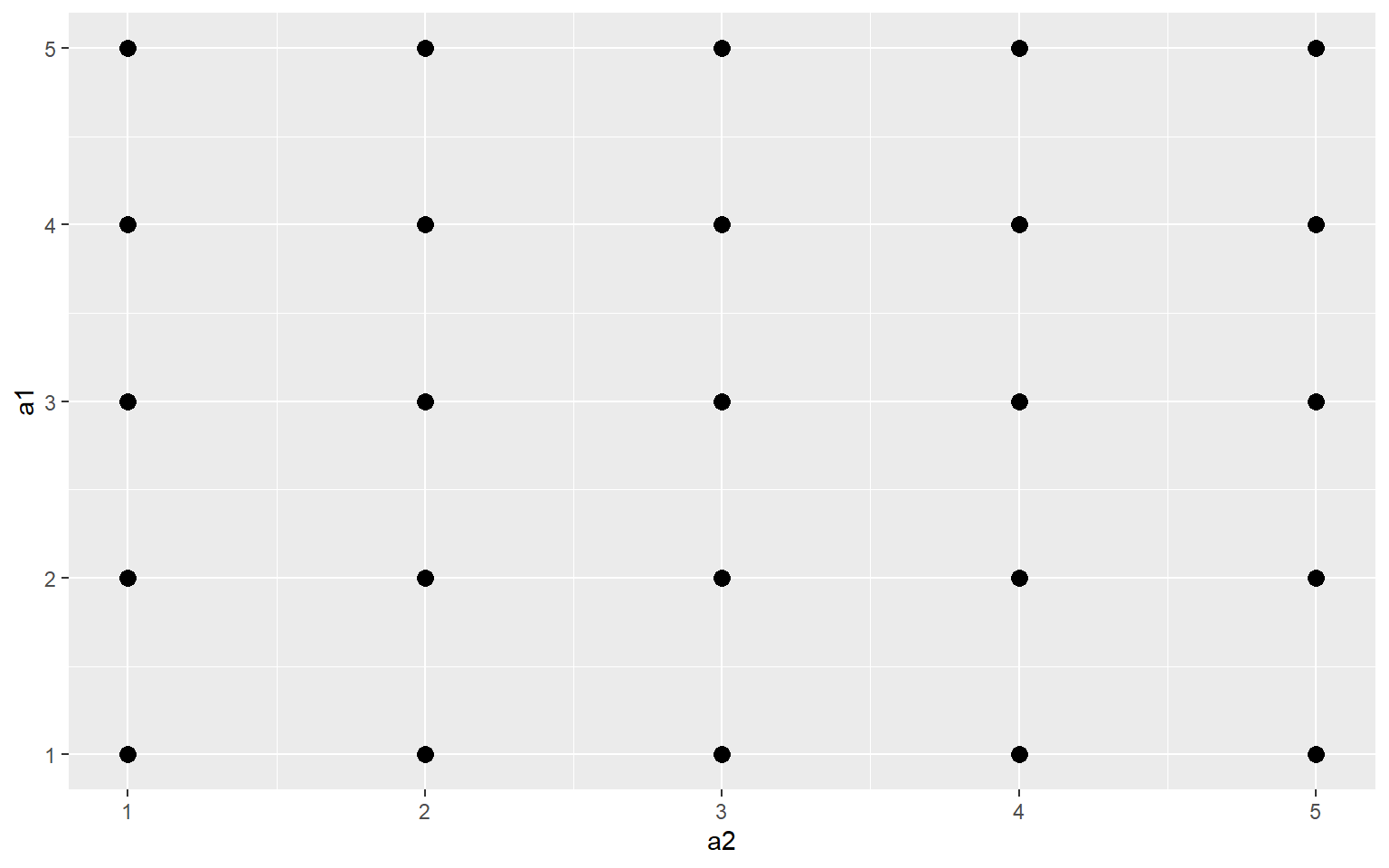
ggplot(a3, aes(x=a2, y=a1))+
geom_jitter(size=3)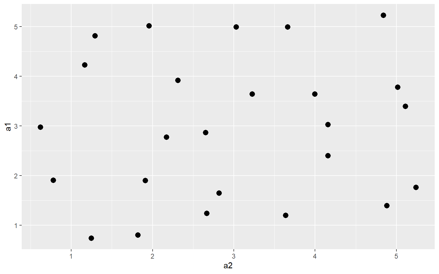
A Note on Graphical Primitives
All graph elements in ggplot2 are created using graphic primitives to plot line segments, paths, polygons, etc. This is demonstrated in the following graph where I have defined coordinates to represent a polygon, a rectangle, and a line segment to plot in the graph space. These primitives can be used to generate more complex graph features.
library(ggplot2)
poly <- data.frame(y=c(4,2,1,2), x=c(2,4,1,1))
ggplot(poly)+
geom_polygon(aes(x=x, y=y), colour="gray", fill="red", size=2)+
geom_rect(xmin=1, xmax=3, ymin=3, ymax=4, fill=NA, color="Yellow", size=2)+
geom_segment(aes(x=2, xend=4, y=2, yend=3), size=2, color="blue")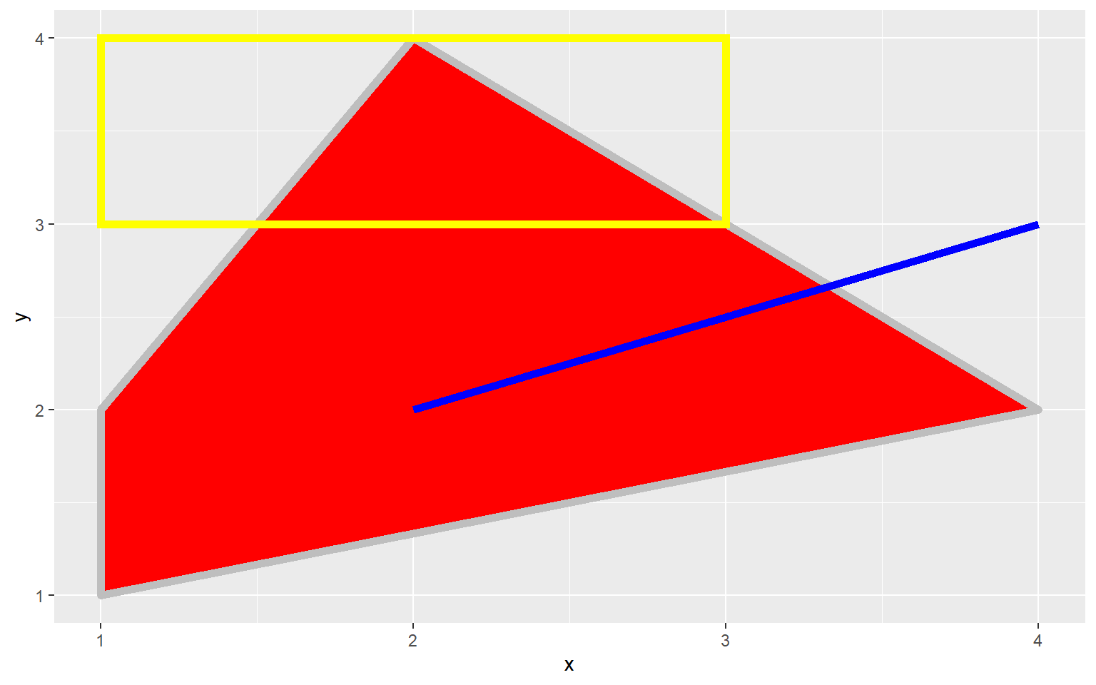
A Note on Coordiate Systems
We have been making use of Cartesian coordinate systems throughout this section. However, other systems are available. Below is an example of a graph created using polar coordinates. This is a Coxcomb Plot where the angle represented a category and the size represents a quantity. You can also make maps using map coordinates and the ggmap package.
library(ggplot2)
x1 <- c("A", "B", "C", "D", "E")
y1 <- c(14, 28, 31, 17, 14)
data1 <- data.frame(x1, y1)
pcord <- ggplot(data1, aes(x=x1, y=y1))+
geom_bar(stat="identity")
pcord + coord_polar()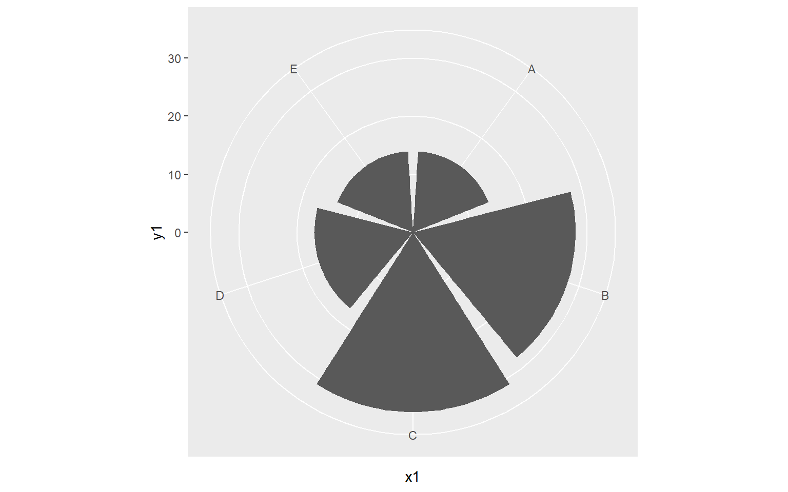
Concluding Remarks
I hope this introduction to ggplot2 has provided you an adequate understanding of the package’s terminology, syntax, and aesthetic mappings. The graphs generated here would need some work before they could be considered final products for a presentation, report, write-up, or publication. In the next section, we will explore a variety of techniques to make ggplot2 graphs pretty including adding text, editing axis scales and labels, changing fonts and colors, using themes, customizing legends, adding geometric features, and combining multiple graphs to a single layout. We will also explore how to export graphs as raster and vector graphics.